
Recently, in July 2025, we presented a high-level review in my article Frequency Performance Payments 44 days in.
This article breaks down the outcomes into individual fuel type groupings and unit-level contributions.
Fuel type and region
We start with an overview, grouping by fuel type. Calculated costs (or payments) for each group are normalised by aggregate estimated spot energy market revenue to form a percentage.
Observations:
- Categories with a longer bar left of zero are losing more of their spot energy market revenue to regulation and PFR costs, for example solar in QLD1.
- Performance of diesel units in NSW was from intermittent operation.
- Categories with a large green bar indicate payments from PFR are large relative to spot energy market revenue, for example Battery Storage in QLD1.
- In many cases the green positive PFR payment is outweighed by the red negative PFR payment resulting in a net PFR cost.
- Battery storage, hydro and coal groups typically bucked that situation and saw net positive PFR payments (green bar bigger than red bar).
- The negative regulation costs are split into used and unused portions (raise and lower = ‘REG‘).
- When added to the PFR costs produce the net position for the group.
- On the mainland, solar units appear to be incur the highest relative costs.
- In Tasmania wind units shoulder the majority of costs relative to aggregate spot revenue.
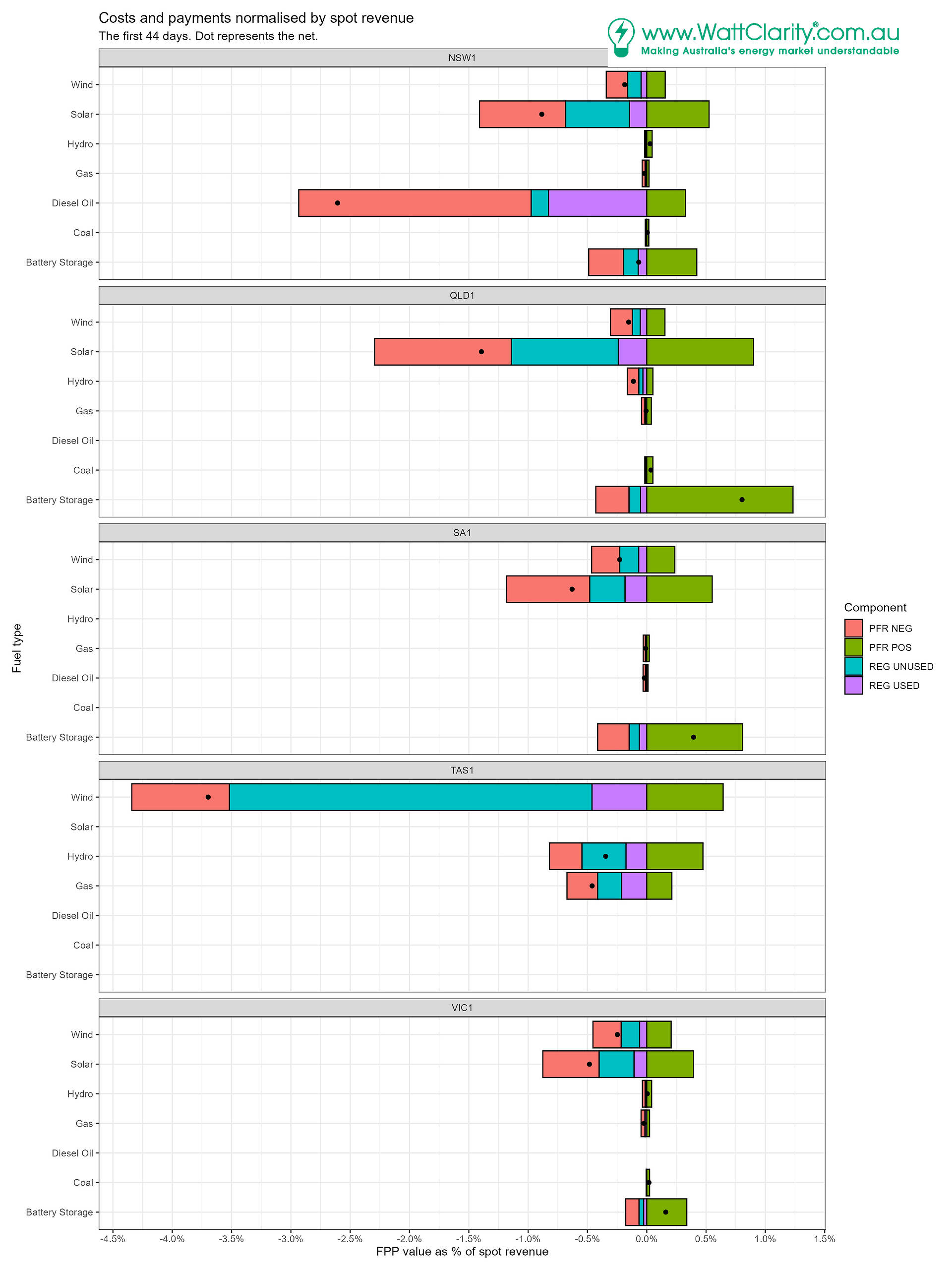
We did perform some data ‘cleaning’ in the analysis process, key aspects are documented at the end.
At a unit-level
In the next chart unit costs (or payments) are again presented as a percentage of spot market revenue, but we aggregate regulation costs, and we aggregate PFR costs and payments forming a net PFR value. The units are ordered in terms of net percentage.
On the mainland, solar units look to be seeing the largest (negative) percentages; funding regulation and PFR. This was consistent with the overview chart above.
Wind units tend to be next, followed by scheduled thermal and hydro units and lastly batteries. Yet a unit’s fuel type (or technology) does not guarantee a predetermined position in the ranking. We see some units (e.g. batteries) appearing at the left and middle areas of the charts. Some units that run intermittently also feature towards the left (e.g. gas, diesel and hydro).
- Batteries are taking the lion’s share of FPR payments.
- Coal units appear near the 0% region. Costs (if any) are swamped by estimated spot revenue.
Region specifics
NSW1
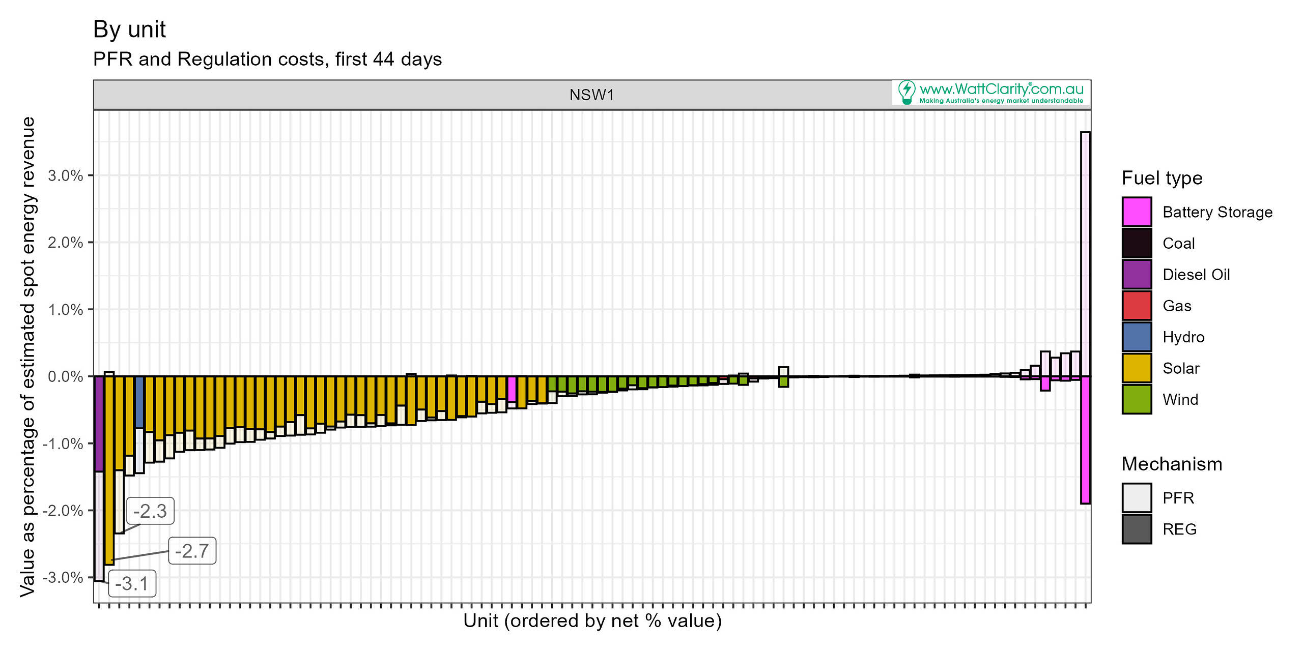
The left-most unit is the diesel Hunter Economic Zone unit. Rebid reasons for this unit indicate it was undergoing testing during the period.
Second from the left is Junee solar farm which actually earned a net positive PFR payment but attracted a large relative portion of cost for regulation FCAS recovery (‘REG’).
There is one battery with a small net-negative cost. That’s Waratah which was undergoing commissioning.
The battery with the greatest net-positive percentage was the Queanbeyan battery. Yet its PFR payments offset a relatively strong regulation cost.
The hydro unit 5th from the left is Hume Hydro.
QLD1
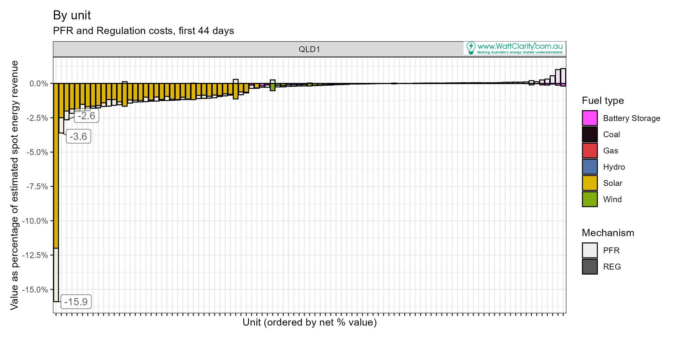
The Kennedy Energy Park’s solar farm saw regulation costs at 12% and PFR costs at 4%. That’s the left-most unit in the chart.
Most other solar units saw total costs less than about 2.5% of spot revenue.
Dulacca wind farm (not quite possible to clearly see, but it is 7th from the right) ended up with a positive net percentage over the period. As a percentage (+0.2%), it net performance was ahead of the coal units in the region, on this scale.
SA1
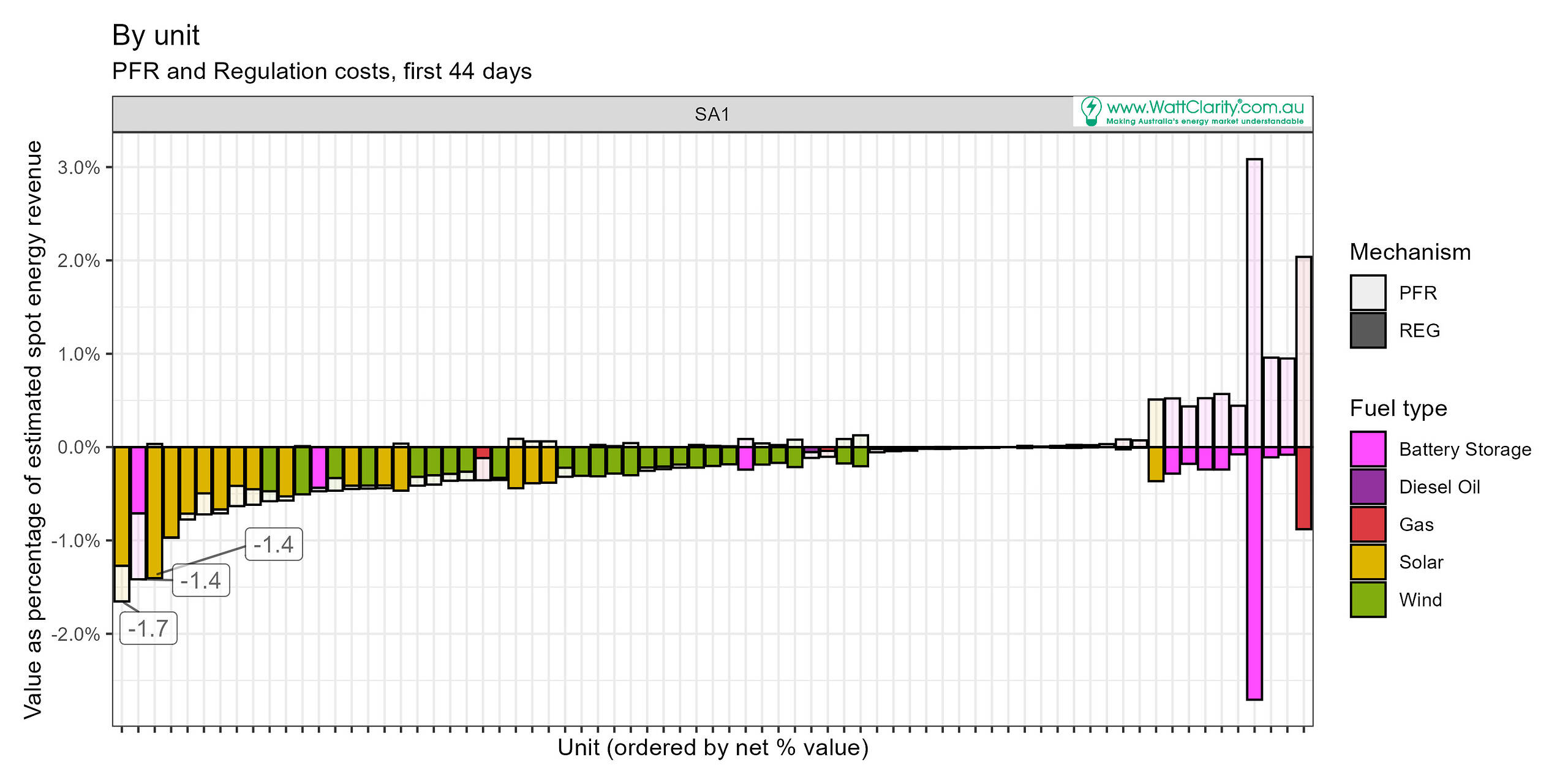
In SA, Dalrymple North battery attracted net negative PFR cost. And while it and most solar units tended to be at the left of the chart, the percentages were below 1% of spot revenue.
The battery unit that stands out for large negative regulation cost and positive PFR payment is the Adelaide Desalination Plant’s battery. Ahead of this unit in net percentage performance is the Torrens Island battery and the Hornsdale Power Reserve and Ladbroke Grove unit 2 (gas).
TAS1
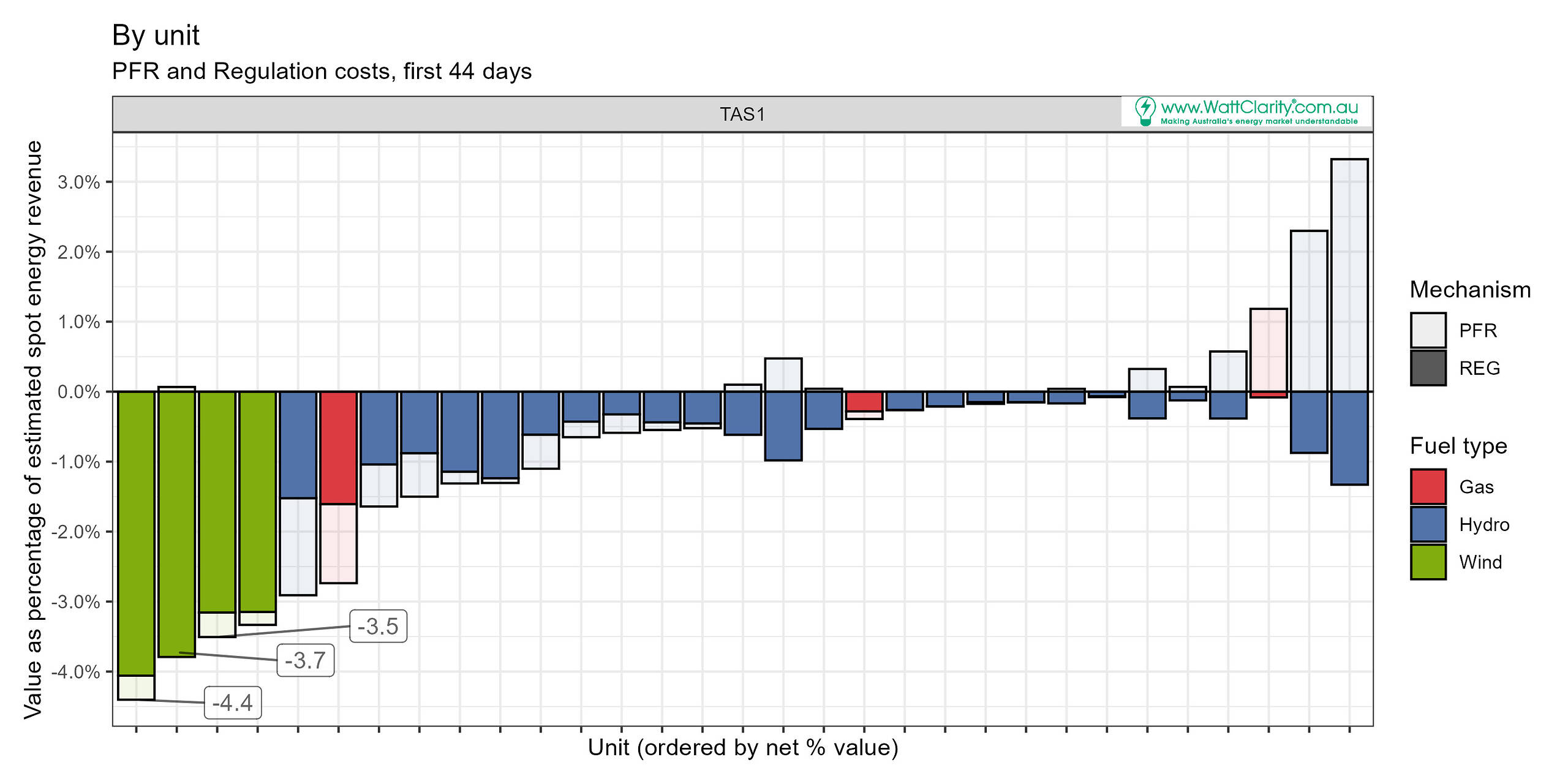
Costs for TAS units were proportionally high, particularly wind units, following high costs for local FCAS requirements (Frequency Performance Payments 44 days in).
Three semi-scheduled wind units and one non-scheduled unit (with appropriate metering for FPP calculations) ended up with large REG percentages but encouragingly small (relatively) PFR costs.
Hydro units make up the bulk of the units list in TAS, but three gas units (Bell Bay 1&2 and Tamar Valley) were also in the mix. One of which, we might argue, performed poorly in these rankings.
Cethana and John Butters (right of chart) hydro units appear to be benefitting well from PFR performance (if we judge that by having the largest payment amount relative to estimated unit spot revenues).
VIC1
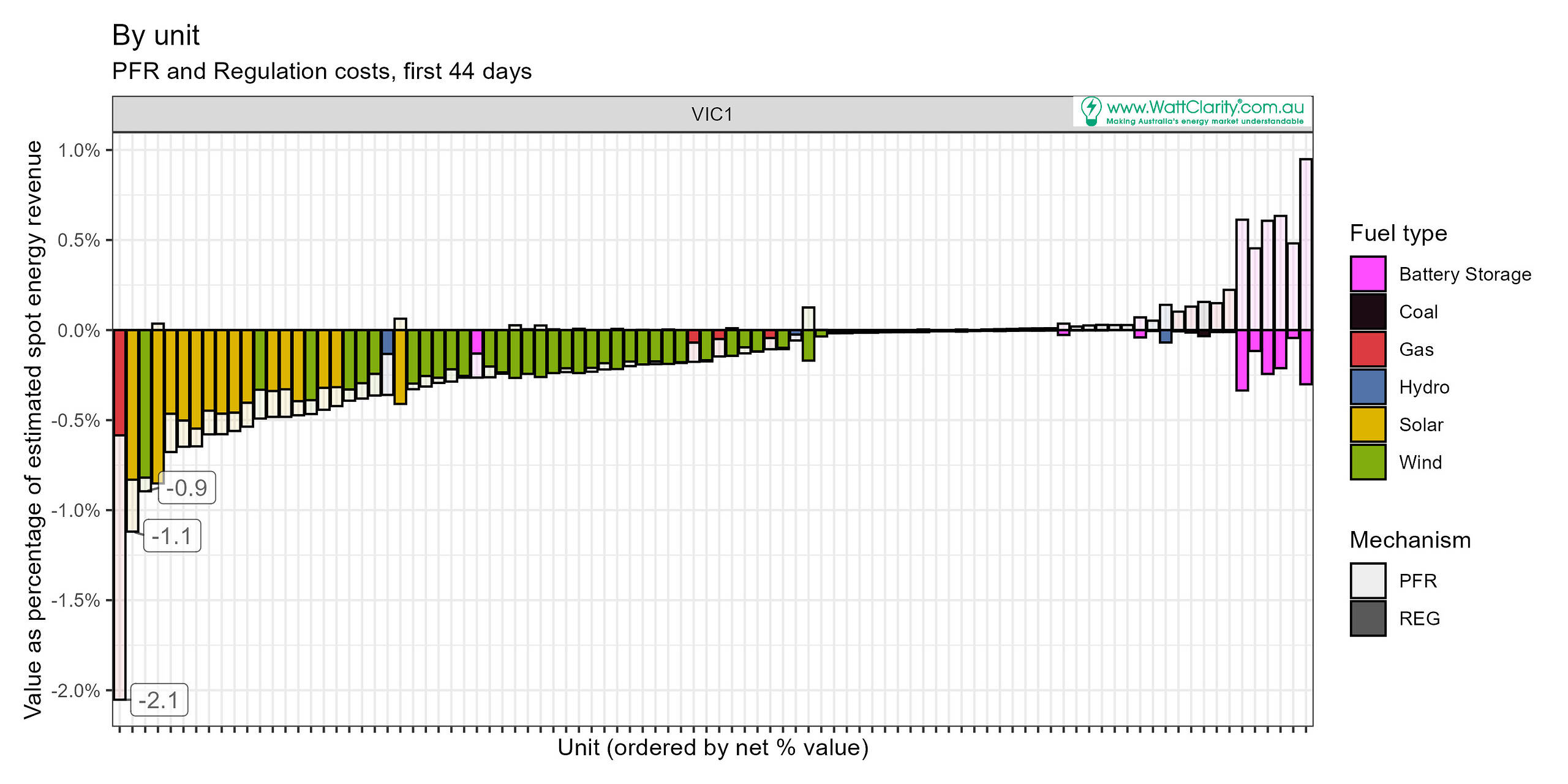
Valley Power unit 6 shows up with the most negative costs relative to estimated spot revenue, with PFR costs contributing the most to the overall net position.
The list (left to right) is populated as generally expected with solar, then wind, then thermal units. Battery storage units are on the right with net positive outcomes thanks to PFR payments.
Latrobe Valley battery is positioned among the wind units but rebid reasons indicate was being done during our analysis period. This suggests its relative performance will change in future.
Other coverage
In AEMO’s QED for Q2 2025 we see additional analysis of PFR costs and payments for the quarter (8th to 30th June). That chart presents aggregate dollar values (payments and costs) by fuel type. It therefore provides a good perspective of how the fuel-type groups performed in the quarter, in absolute dollar terms. Find it in section 2.6.
On Data Processing
Normalising the units
The ideal denominator remains an open question. For this assessment I applied an estimate of spot market energy revenue. This didn’t work well for all cases, we discuss below.
Exclusions
We excluded Tarong North PS. Over the analysis period it was offering 0 MW availability, targets were 0 MW, yet it remained online and there was some incidental energy consumption recorded in the unit MW data available to us, which in turn produced negative revenue estimates. Non-zero FPP contribution factors were also applicable. When negative revenue was calculated, the normalising process made the regulation FCAS cost percentage become positive.
We excluded loads (e.g. hydro pumping loads) yet it is important to note that regulation FCAS cost recovery and PFR allocations do apply to load units.
Units with estimated energy revenue < $50 in the period were excluded. This threshold captured units that didn’t operate much during the period or were in commissioning. Of note, the threshold caught (excluded) Eraring, Tarong, Ulinda Park and Mannum batteries. Rebid reasons indicate all these were undergoing commissioning and testing. It also excluded Tarong North PS as well as some other units that ran infrequently or not at all.
Spot revenue
Initial and final megawatt readings were used to estimate energy as-generated in the dispatch interval, and we combined this with MLF and energy RRP for the revenue. We didn’t apply any auxiliary load factors.
Unexpected unit outcomes
Eight battery storage units attracted negative PFR costs over the aggregation period we studied. Reasons for this are might be guessed at, but generally the common aspect is commissioning periods when testing is being conducted. For this reason we shouldn’t anticipate negative PFR costs to be a common theme among batteries once past commissioning. The exception may be the Dalrymple North battery, an anomaly where a FPR cost was calculated (0.7% of estimated spot revenue).
We didn’t drop into a further level of detail for answering exactly why these rankings eventuated the way they did. Nonetheless, one possible feature that arises in this author’s view is the the positioning of fast-start units (gas, diesel, some hydro) and extent to which FPP performance is difficult to maintain as units start up and shut down.
Leave a comment