With the first of the hot weather arriving in Sydney, the New South Wales region of the NEM is seeing a number of Lack of Reserve (LOR) warnings.
Editor’s Note – worth highlighting in particular Wednesday 27th November 2024, where LOR3 (load shedding) was forecast but not enacted, but RERT (Reserve Trader) was triggered.
Moreover, recent contract price outcomes in the region are higher than at almost any other time save for the energy crisis of 2022. All signs point to a precarious position for consumers as we enter summer 2024-25 and beyond that through 2025.
Against this backdrop, it seems timely to survey recent outcomes for price, demand and generation in NSW and to ask the question: what is happening to the price of energy in NSW, and who are the winners and losers?
Historical spot prices in NSW
We start by considering the basics – what are the recent outcomes for NSW spot prices, and how does this compare to historical outcomes? Chart 1 shows average annual spot prices for each of the mainland regions of the NEM on a calendar year basis from 2000 to 2024 YTD. We have highlighted the current year-to-date average for NSW of $126.70 per MWh. NSW spot prices are currently the highest of all four NEM regions, and are at an all-time high save for 2022, when outcomes were driven by the energy crisis.
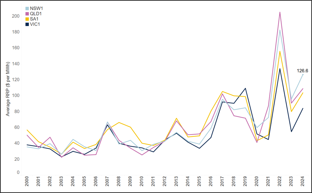
Chart 1 – NSW Spot Prices are at record levels save for the 2022 energy crisis
Annual average spot prices on a calendar year basis for mainland regions of the NEM, 2000 to 2024 YTD
But this is not the whole story. Chart 2 shows the breakdown of these average prices into three bands:
- Prices above $300 per MWh, shown in light blue.
- Prices below $300 per MWh but above $0 per MWh, shown in dark blue.
- Negative prices, shown in red.
The combined height of the three bars represents the time-weighted average price for the quarter, as shown in Chart 1. The different components show the contribution of each category of prices to the annual average. The recent outcomes for NSW in 2024 YTD show that the +$300 per MWh component prices are at record levels of $32.53 per MWh, with most of December still to come. Even during the energy crisis of 2022, the value of the cap never reached these levels.
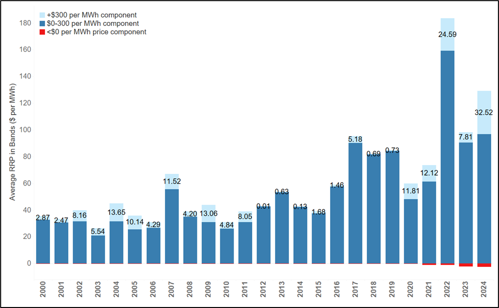
Chart 2 – The value in the cap is at an all-time record level for NSW
Annual average prices by price band, NSW, 2000 to 2024 YTD
Is a rising market price cap the culprit?
One factor that has not been constant over the period shown in chart 3 is the market price cap (MPC). Chart 3 shows the historical progression of the market price cap since 2003 (ie, when the MPC rose to $10,000 per MWh) versus the average value of +$2000 per MWh prices (ie, prices representing scarcity pricing). We have capped all prices above $10,000 per MWh to show normalise for the effect of rises in the MPC. Even after adjusting for this, 2024 has been a record year, although the higher market price cap is making a substantial contribution to the additional value in the cap. This is not to say this is unwarranted, but merely to observe that changes in the market price cap over time are only partly responsible for the higher levels of cap prices.
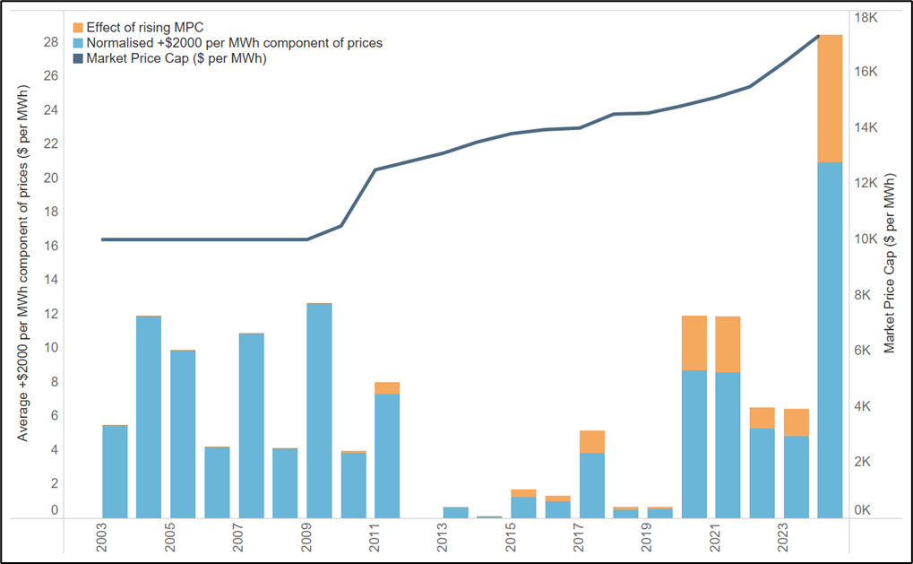
Chart 3 – Even after accounting for a rising MPC, 2024 represents a new record for +$2000 MWh value
Count of number of intervals where NSW price exceeds $2000 per MWh by quarter, Q1 2005 to Q4 2024
What’s been happening with demand?
What more can we learn about what is happening here? For starters, it is helpful to have the background of what has happened to demand in NSW over the last 25 years. Chart 4 shows a plot of every 5-minutes of demand since 2000. By way of explanation:
- Each panel of the chart shows the outcomes for a single year.
- We have included only every second year (ie, 2000, 2002, 2004, …, 2024 YTD).
- We have added a line to each panel showing the average demand for each year.
- To aid in visualisation we have added a colour scale.
The change in the shape of demand is striking. Solar PV has crushed demand in the middle of the day, leaving two sharp peaks in the early morning and late afternoon/early evening. However, the time-of-day plot reveals that there are still extensive periods where the system needs to be able to cope with high levels of demand. Put another way, falling average demand has not removed the maximum levels of demand that we see in the system.
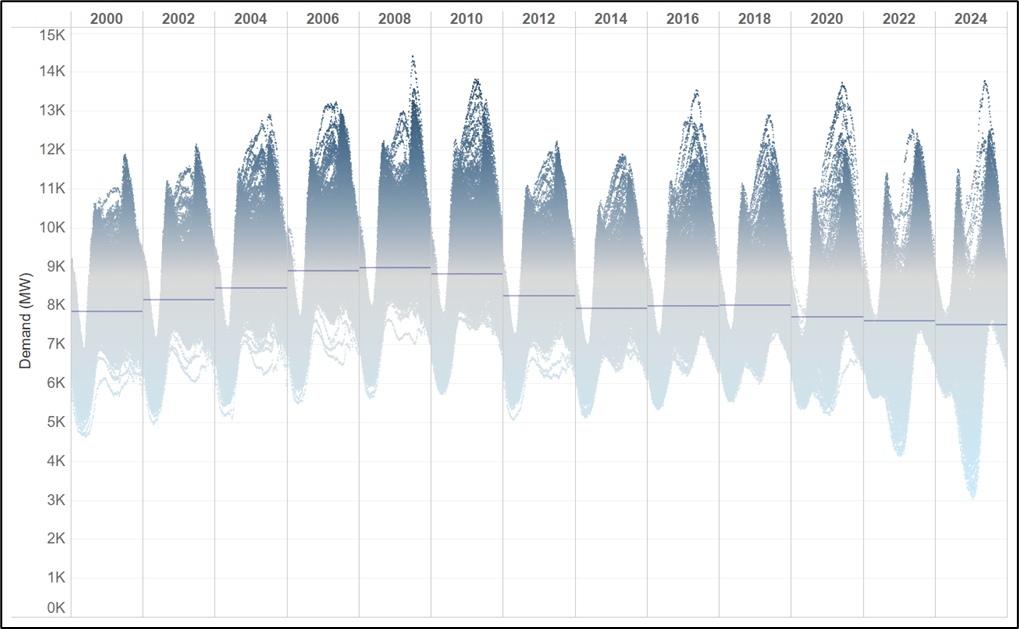
Chart 4 – The shape of demand has changed drastically over the last 25 years
Plot of all NSW demand outcomes by time-of-day for every second year, 2000 to 2024 YTD
We see a similar story for residual demand, ie, demand minus large-scale solar and wind. Chart 5 shows the same analysis as Chart 4, but for residual demand. Once again, the change is striking, with residual demand for NSW now reaching down to levels of almost zero net demand for energy. And yet we still see the upper envelope of maximum and peak demand remaining stubborn – periods remain where the system is reliant on dispatchable generation for the morning and evening peaks.
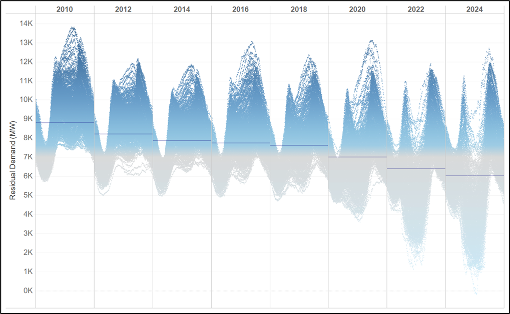
Chart 5 – Residual demand has reduced from around 9000 MW to 6000 MW in the last 15 years
Plot of all NSW residual demand outcomes by time-of-day for every second year, 2010 to 2024 YTD
So what is the relationship between extreme price outcomes (ie, where price exceeds $2000 per MWh) and demand? Chart 6 shows the count of the number of such intervals by quarter, coloured by the overall level of demand. We see that the outcomes over the past year are unprecedented – we have never before seen so many high-priced events for four consecutive quarters. What is more, these outcomes are occurring at relatively low levels of demand, often less than 10,000 MW.
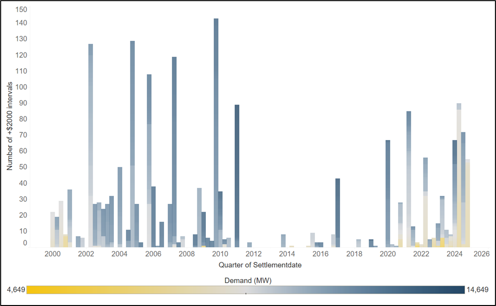
Chart 6 – We have not seen 4 consecutive quarters with this frequency of +$2000 per MWh events
Count of number of intervals where NSW price exceeds $2000 per MWh by quarter, Q1 2005 to Q4 2024
Who are the winners and losers?
So prices are high and these high prices are being heavily driven by extreme price events, many of which are occurring at moderate levels of demand. Who are the winners and losers? To understand this, we have compiled a chart showing the dispatch weighted prices earned by each of the main technology types in NSW: solar, wind, gas, hydro, and coal. We note that this is only part of the story – the contract market has not been factored into our analysis. But our analysis still sheds light on the underlying question of what a generator can earn in the spot market – a relevant reference point for a Power Purchase Agreement (PPA), a standardised contract, or a physical hedge.
Perhaps unsurprisingly, the chart shows that gas and hydro are making record dispatch-weighted prices – even higher than during the 2022 energy crisis. But more remarkable is that coal is earning an astonishing $141 per MWh this year. Wind is also doing well relative to historical levels, with prices exceeding $100 per MWh in 2024. In contrast, solar is only seeing modest returns of $63 per MWh – about half of the average price in NSW.
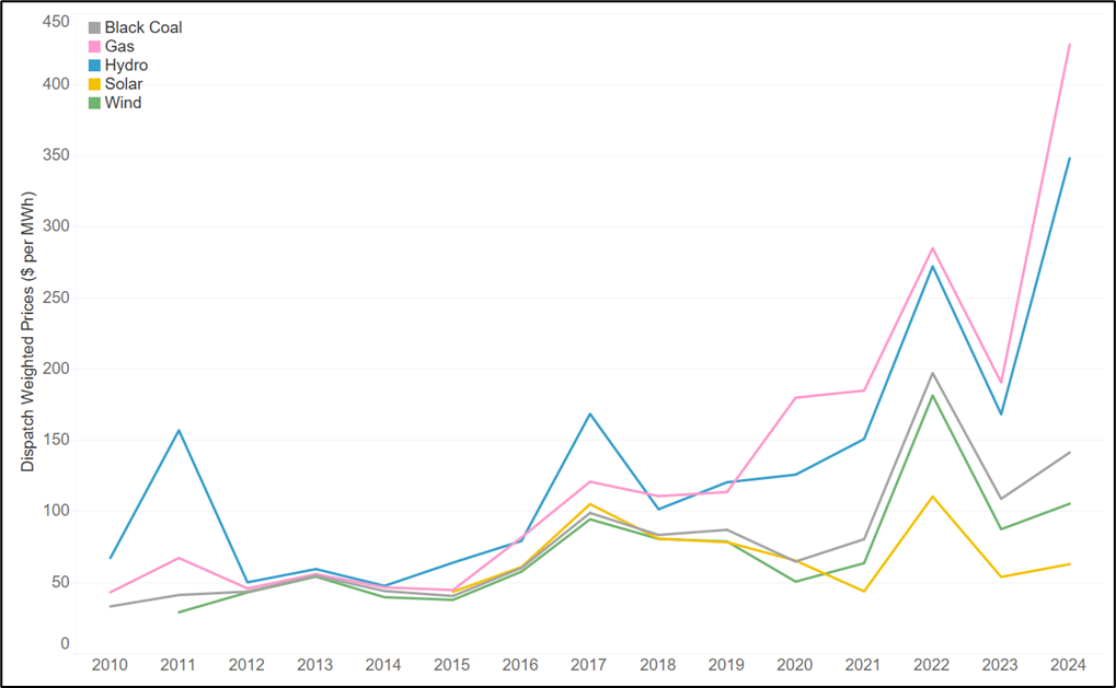
Chart 7 – Gas and hydro are making record returns in NSW, while solar struggles
Dispatch-weighted prices for black coal, gas, hydro, wind and solar in NSW, 2010 to 2024 YTD
Conclusion
The prices in NSW are unprecedented, in terms of the amount of value that we are seeing in the +$300 per MWh component of prices. The big winners out of this are the thermal generators that can shape their generation to capture these prices. To a lesser degree, intermittent generators that are producing at all (ie, wind) during high price events are also capturing value. The clear losers are consumers, particularly residential consumers who draw more power during hotter weather. They can expect to be faced with much higher prices once these cap and swap prices flow through to the Default Market Offer. In addition, the frequency of high price events and the low levels of demand at which these are occurring suggests that the system is under extreme stress. If the trends to date continue in summer cap values will likely reach new records. Far from seeing prices fall as some commentators and institutions have suggested, the market is signalling that the wholesale component of bills in NSW will rise markedly.
This article was originally posted on the Endgame Analytics blog on Wed 4th December 2024, and has been republished here with permission.
About our Guest Author
 |
Oliver Nunn is the Managing Director of Endgame Analytics.
Oliver has extensive experience building mathematical models that represent economic dispatch and long-term investment in electricity markets. He has built models that capture complex aspects of power system and market operation, such as decisions to start and stop plant, game-theoretic bidding, and decision making in the presence of uncertainty about the future. In addition, Oliver has experience as a regulatory economist and expert in market design. He has extensive experience working as an advisor to the market bodies that oversee the energy sector, the participants that operate in the markets, and the network businesses that own the transmission and distribution assets that are part of the physical power system. You can find Oliver on LinkedIn here. |


Be the first to comment on "Mercury Rising: Recent NSW prices and the impact on customers"