This article was posted on Tuesday 13th October 2020, at which point the headline was written, and included the word ‘tripping’ to reflect the rapid & coincident reduction in output across the numerous QLD solar farms. At the time, limited information was available to explain the precise cause of these coincident ‘trips’ – but we did try to deduce what it might be, below.
Readers are referred to subsequent pieces of analysis that explains more context:
1) Next day (Wed 14th Oct) Part 2 of the Case Study; and
2) WHEN? Part 3 of the Case Study.
.
I was focused elsewhere this morning, but an SMS alert triggered from our ez2view application (also available in NEMwatch Platinum) alerted me to a price spike to the Market Price Cap of $15,000/MWh.
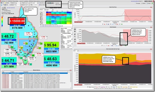
In this snapshot from NEMwatch v10 (entry level dashboard) we use the ‘Playback’ function that was introduced way back in 2003 to replay market events, I’ve wound back to look at 09:45:
There’s a couple things highlighted here – but readers need to be very careful at jumping to conclusions about a sequence of events:
Observation #1) We can clearly see the dispatch price in QLD for the 09:45 dispatch interval spike in QLD to $15,000/MWh
This price was determined by AEMO’s NEMDE algorithm at 09:40 based on such things as:
1) the initial conditions in the market at 09:40;
2) the expected level of demand in the QLD region and elsewhere (i.e. the ‘Target’ demand); and
3) generator’s bids … including assumed Available Generation from AWEFS (for wind farms) and ASEFS (for solar farms).
Observation #2) We can also see that the Scheduled Demand target for QLD in the 09:50 dispatch interval (4,982MW) was considerably (194 MW) lower than the target for 09:45 (5,176MW) … which might be some loss of load, or it might be because of the spot-exposed Demand Response at large energy users (of the type that we help to facilitate).
We can guess at some of the energy users who might have responded in this way … and with access to some Powerlink-provided data we update through ez2view we can hone in to help to confirm our guesses.
Observation #3) We can also see that the Initial MW, aggregated for all Large Solar Farms in QLD, dropped from 1,158MW in the 09:45 dispatch interval (i.e. measured at 09:40 or shortly beforehand) down to 559MW in the 09:50 dispatch interval (i.e. measured at 09:45 or shortly beforehand) … which is a collective drop in output of 599MW.
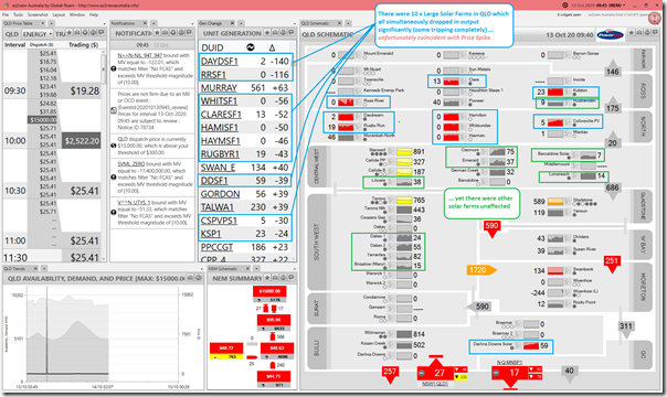
Using the ‘Time-Travel’* function built within our ez2view (higher-end dashboard) product we can clearly see which solar farms were involved in sharp reductions in load:
Observation #4) In the above, we can see that the 599MW collective drop in output at the Solar Farms was spread across
#4a) Note (*)that in the image above, ‘Time Travel’ (which evolved out of the earlier ‘Playback’ in NEMwatch) was tweaked in the more recent versions of ez2view:
i. to make the ‘Gen Change’ and ‘QLD Schematic’ widgets work with reference to ‘Final MW’ figure (i.e. Initial MW shifted to the point in time where it is metered) in order to better show everything occurring at the same point in time.
ii. as such, unexpected trips across all these units could not have contributed to the price spike … as the price was set before the Solar Farms tripped.
#4b) The red colour coding (denoting change >15%) makes it clear that there has been a steep drop in output at 10 separate Large Solar Farms … most in northern QLD but also at Darling Downs Solar Farm nearer the NSW border.
#4c) However not all QLD Solar was affected, with 10 others showing no marked drop in output at this same point in time.
#4d) The yellow (>5%) and orange (>10%) colouring on some of the thermal plant indicate those which ramped up, presumably via Contingency and Regulation FCAS in addition to whatever the increase in Target was otherwise, to take up the slack caused by the missing Solar Farms.
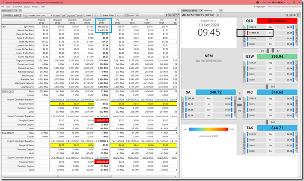
Observation #5) Adding in the ‘Swim Lanes’ widget in the next image also highlights that the Raise 6 second (FCAS Contingency) price went sky-high as well.
—
There’s insufficient information here to understand exactly what went on especially the sequence, but will look forward to reviewing further when we have access to today’s Private Data.


Hey Paul
I think you’ll find it was due to NQLD system strength constraints – won’t be in the public data until tomorrow given constraints only have 1 DUID on LHS. Seems more severe than normal – combination of a network outage and crossing one of the demand thresholds I expect.
Yep, wondered about that. Would also explain coincident price spike (i.e. NEMDE factors in loss of generation in the dispatch process).
PS HR10,
More details here today:
https://wattclarity.com.au/articles/2020/10/casestudy-p2-rooftoppv-kills-largesolar/
… with part 3 to come later