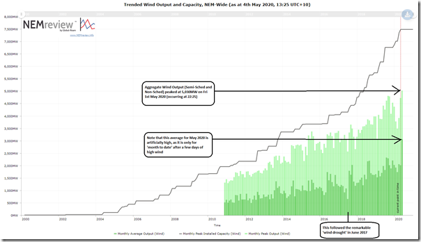
In parallel with these machinations underway on Friday in the QLD region, it’s also worth noting briefly that aggregate output from all wind farms in the NEM* peaked above 5,000MW for the first time:
* this aggregates all wind farms – both Non-Scheduled and Semi-Scheduled.
The query above uses this trend query in NEMreview v7. A few quick notes:
1) Output data is not published until late 2010 by the AEMO;
2) However before that we can see the growth in installed capacity (i.e. using ‘Maximum Capacity’ registered with the AEMO).
3) The peak shown on the chart for May 2020 is correct, reflecting the peak in aggregate initial MW in the 22:25 dispatch interval on Friday – so technically metered at 22:20 on the evening. However the average shown for May 2020 is incorrect, as it’s only averaging just over 3 days in the month!
4) Given that there’s only 2 wind farms in QLD currently incorporated in the data, it’s worth noting that the constraints on exports from QLD won’t really have affected this much.
5) The remarkable ’wind drought’ that occurred in June 2017 is noted as a stand-out low harvest month in the chart.
6) This occurred just over a year after wind output climbed past 4,000MW.
——-
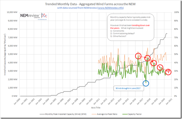
Out of curiosity I threw the numbers together to produce this trend of monthly Capacity Factor, and see that the peak in each calendar year (which typically occurs during mid-year) has been declining over the past few years. I wonder why?
Interested in reader’s thoughts about what has been contributing to this decline in peak capacity factor?
———————
PS Tuesday 5th May
That same question has been asked in a number of different locations – which I have linked here to help those who want to remain a part of the conversation in various places:
1) Here on LinkedIn
2) Here on Twitter
3) Also added in as a comment to Giles’ article on RenewEconomy.


Regarding the peak CF trend:
1) Law of large numbers? (larger population means smoother statistics)
2) Increasing geographical diversity (fewer wind farms reach high CF at the same time)
3) There are more partially completed wind farms and wind farm size is getting larger so your aggregate installed capacity value is leading the actual installed capacity by larger and larger amounts? Your graph shows aggregate capacity currently at about 7.4 GW but it is actually only about 6.5 GW as of today. There’s nearly 900 MW of capacity still under construction/commissioning: Dundonnell, Yendon, Coopers Gap, Lincoln Gap,
Mt Gellibrand, Cherry Tree, Granville Harbour, Cattle Hill, Elaine. Most of these appear to be just in the usual process of connecting WTGs are they are completed and maybe some are at “hold points”.
4) More occasions where output is constrained especially in SA.
5) More occasions where wind storms are destroying transmission lines? (or am I imagining this)
Re the reduced ACF of wind farms the relatively recent rule changes, especially for SA, requiring larger specified synchronous generators to run to supply “system strength” may also have led to less “headroom” for wind generation, hence constraints. No idea about effects in other regions though.
I am looking to a time when some more old coal plants are gone and we start to depend on the wind and sun for continuous power. Then there is the issue of the low points when there is not so much wind about. The aggregate is one of the metrics and it is exciting to see the penetration, especially with the projects that are in the pipeline and the impetus will build with RE investment for recovery. Still, the average is important as well as the aggregate and the low points are important as well because they have to be bridged with batteries and pumped hydro.