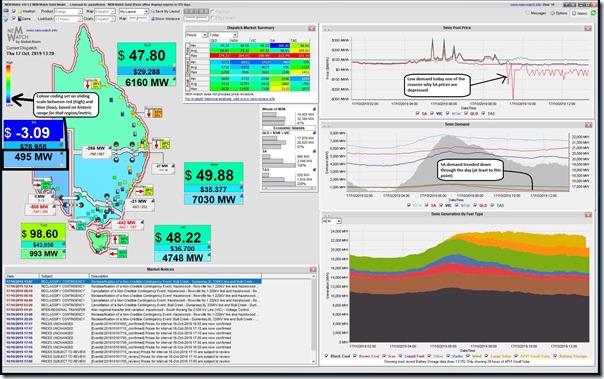
A quick article today given I was distracted, anyway, by an email alert triggered by one of our dashboard copies of NEMwatch v10 running in the office to capture the this image in an email alert from the 13:20 dispatch interval:
As readers and clients might have deduced, the bulk of our development investment is being targeted to:
1) our ez2view (higher-end dashboard product), which is benefiting the growing number of clients onboard that platform – but also allows us to prepare increasingly detailed Case Studies for broader benefit (like Monday’s one for Ross River Solar Farm revealing some interesting behaviours last week); and
2) NEMreview v7, in conjunction with this (given it shares common components to the Trends Engine inside of ez2view); plus
2) some other initiatives we’re not yet ready to say too much about.
That does not mean we’ve forgotten about NEMwatch, with designs developed for a major upgrade to NEMwatch v11 that we’ll roll onto at some point. It’s a product that’s still used across a diverse client base as an excellent entry-level dashboard to the NEM and (by virtue of this Email Alert which has triggered increasingly of late) has let us know of a dispatch interval where the “Scheduled Demand” has dropped below 500MW in the South Australian region.
For the gory details of all the different definitions used for something that seems as simple as “Demand” please refer to this prior “Explainer about electricity demand” on WattClarity. Readers might also reflect on the proliferation of these measures in the light of comments we made in Theme 14 within Part 2 of our Generator Report Card 2018.
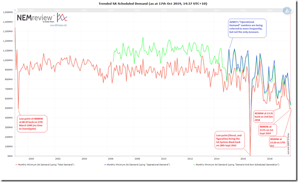
Curious to see how minimum demand levels have been trending, I quickly cranked up NEMreview v7 and produced this quick trend of minimum demand levels of three different measures of demand in South Australia:
Whilst each measure of demand has its own merits, it is “Total Demand” I’m most interested in here as it is the same as what’s shown in NEMwatch, and also is the one that has the longest history accessible.
With the exclusion of the SA System Black event, we see that today’s demand was down very close to the minimum demand experienced in South Australia over the 21 years that the NEM has been operational – with only Sept 2019, Dec 2018 and March 1999 experiencing lower monthly minimums. We’d expect to see these types of levels occur more frequently in future as the “duck curve” takes further hold…
—
Oh, and I will hope that one of the long-time NEM junkies might be able to help us out with a comment below about what happened way back on 17th March 1999. Thanks in advance!


Before my time, but… Wasn’t 1999 a time when SA max payment was say $1,000/MWh and the market max was say $10,000/MWh and anytime the price spiked above $1000 SA would have rolling blackouts to cut demand? Maybe this is just an old NEM tall tale…