Back on 4th July 2016, I posted this review of Q2 (2016) prices and posed the question – whether there was a short-term excursion, or more systemic change in pricing patterns?
Well, we have just seen the end of Q2 2017 and, based on the results we’ve seen in similar analysis (posted below) it seems more likely that the changes seen in Q2 are both more systemic, and actually increasing over time.
(a) It’s clear that there are a number of factors behind these changes, and that these factors play different weights in different regions;
(b) This will have huge implications all the way through the electricity supply chain – for generators, retailers, traders, and for energy users (small and large).
For context, I have used the same analytical framework presented a year ago, and just added the results for trading prices across all regions through Q2 at the end. For most regions, they stick out a mile:
1) Average prices in Q2 up across all regions
One of the interesting points to keep in mind, with respect to Q2 prices, is that this has (traditionally) been one of the “boring” quarters – with low demand-induced pricing volatility.
Last year we saw how time-weighted average prices for Q2 2016 were significantly higher than all prior years, with the exception of the drought-affected Q2 2007.
1a) Queensland trended stats
Again, we’re starting at the top of the NEM to work our way around:
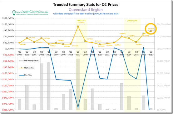
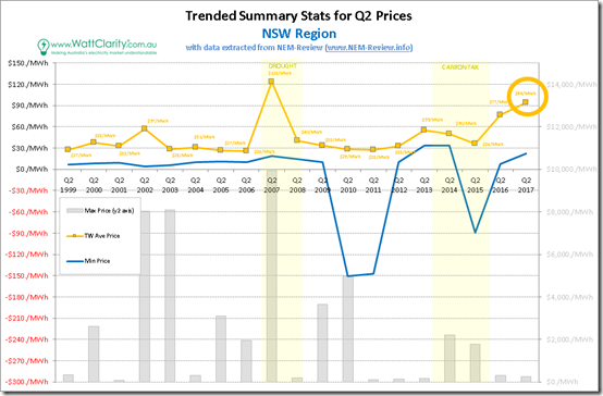
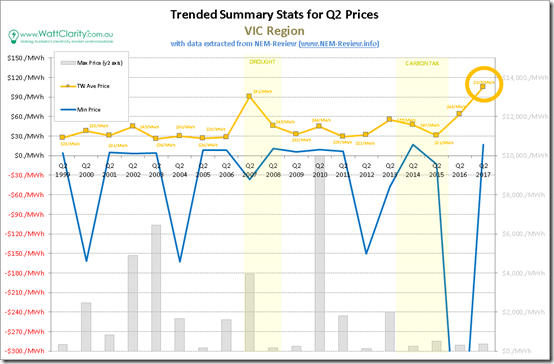
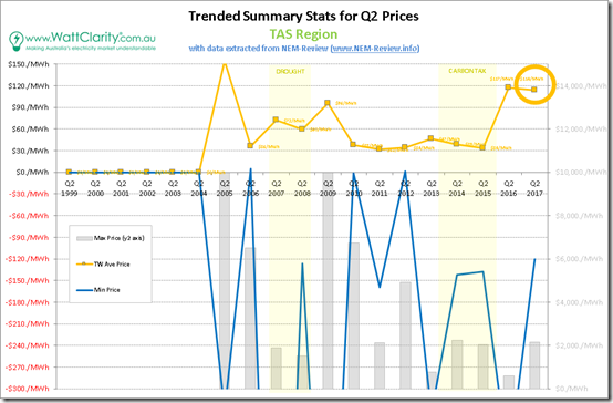
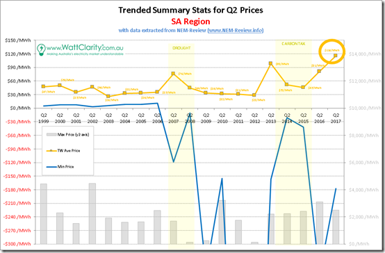
In these charts, we’re showing Minimum, Maximum and Average Prices over the quarter – and for ease of readability, we’ve moved the quarterly maximum trading (i.e. 1/2 hourly) prices to the Y2-axis and shown this data series as a bar chart.
1. We can see that, for Queensland in Q2 2017, the peak price was well below $1000/MWh (only $256.70/MWh), but this did not stop the time-weighted average climbing above the high level of a year before to reach $85.83/MWh.
2. This has been the second highest result seen across all 19 years of NEM operation, with the only year that was higher was the drought year of 2007 (which took a heavy toll on Queensland’s power generation fleet, along with threatening water supplies to the south-east corner of the state).
3. For those who view high prices as a challenge, Q2 2017 was a worse result than seen in Q2 2016. A result double what was held to be a long-run marginal cost position for power stations what seems like a lifetime ago.
Moving south to NSW …
1b) NSW trended price stats
Moving into NSW, we see the average price for the Quarter ($93.62/MWh) higher than seen in Queensland, and at $17/MWh higher than the prior year also a higher step upwards:
As was the case for Queensland:
1. This high average price was delivered despite a peak price across the whole quarter being only $255.14/MWh (slightly lower than in QLD and in the same trading period – 07:00 on 3rd May 2017, a period in which prices were at similar levels also in VIC, TAS and SA).
2. It was also the second highest result in NSW, exceeded only in the drought-affected Q2 2007. Whilst that year suffered from transient issues, it is looking like what’s affecting prices in the NEM is now more deep-seated, multi-faceted, and systemic.
Continuing south to Victoria…
1c) Victoria trended price stats
In Victoria, we see , we see the average price for the Quarter break $100/MWh (up at $104.92/MWh) – a gut-wrenching level for the vast majority of energy users in what has traditionally been one of the more “boring” quarters:
In Victoria, we see that average Q2 prices have never been higher, across all 19 years of NEM history.
We can clearly see in the chart that average wholesale prices in Q2 2017 are up 64% compared to the prior yearwhich was already historically high. This just happens to straddle the closure of Hazelwood – and makes a mockery of both:
(i) the roll call of “energy experts” who produced precise forecasts of what the impact of the closure would be; and
(ii) the greater number of people who believed one particular batch of forecasts from their favourite consultant.
… though please note, to be pedantic, that:
(i) it is more than the Hazelwood closure that’s produced this extreme outcome.
(ii) most forecasts were focused on retail, and domestic, which means the percent change is lower than the above because of other (non-wholesale) costs loaded in.
In March I posted this quick review of how the Q1 2017 Base futures contract for VIC was trading up towards $150/MWh – so from this we can say:
(i) thankfully the spot settled somewhat lower than that level (though $104/MWh is still extreme); but
(ii) it did show that even “the market”, collectively, did not have a perfect view.
It’s also , and is the reason why I have repeatedly noted that forecasting is a mug’s game, and
Over the water to Tasmania …
1d) Tasmania trended stats
Remembering that Tasmania was faced with massive supply challenges in Q2 2016 (with perilously low hydro reserves coupled with a long-term outage on Basslink) that garnered plenty of media and political attention, it is mind-numbing to see that Q2 2017 was very nearly as bad (despite reasonable hydro reserves and working interconnection, and a fraction of the media attention):
The average price seen in Tasmania for Q2 2017 was $114.27/MWh, which was both:
1. Only $3.20/MWh lower than the crisis levels of Q2 2016; and
2. Almost $10.00/MWh higher than those seen in neighbouring Victoria.
Finally west to South Australia …
1e) South Australia trended price stats
Saving (in this case) the worst for last, we then step over to South Australia where the time-weighted average price for the quarter reached a staggering $115.93/MWh:
Here, the situation really does look extreme.
1. The price for Q2 2017 was fully $34.92/MWh higher than the level seen in Q2 2016; and
2. Is clearly the highest Q2 average price South Australia has seen over the 19 year history of the NEM.
3. Was incidentally pretty much spot on the money in terms of where the Q2 2017 Base futures contract was (thinly) traded in South Australia just prior to the start of the quarter (highlighted in my post here on Hazelwood in March 2017).
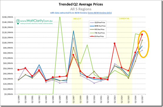
1f) Summing up average Q2 prices all regions
In the following chart, we sum up the sorry state of NEM pricing seen across all regions of the NEM, but particularly in VIC, TAS and SA:
In the same vein as last year, the most important take-aways from this analysis should be:
1. That the outcome for Q2 2017 was even more remarkable than Q2 2016; and
2. That it appears that we’re entering a new environment that’s distinctly different from the years that preceded; and
3. That this affects everyone, right across the NEM ; and finally that
4. Those pre-disposed to draw overly simplistic “it was due to … [this one factor]” conclusion are unlikely to be correct, and could be dangerously misleading.
With respect to the [this one factor], I have seen a number, including the following:
Over-simplification #1 = it’s all due to Hazelwood closure (and Northern before it, and so on)
Over-simplification #2 = it’s all due to high gas prices
Over-simplification #3 = it’s all due to intermittency
Over-simplification #4 = it’s all due to those greedy incumbent gentailers
Over-simplification #5 = it’s all due to the wind drought in May/June 2017
Over-simplification #6 = it’s all the outcome of uncertainty and change created in the privatisation of NSW generators, in relation to coal supply re-pricing
… and the list goes on…
As I noted late last week, our need to rapidly increase the capacity of our thinking, to deal with a greatly increased number of wildly changing variables, currently seems to have far outstripped our collective willingness, or ability, to do this (or, in most cases, even an awareness that this intelligence gap has opened).
That’s most likely to end in tears.
2) A majority (in some regions) of prices in the $100’s
Once again, if Q2 2016 pricing was unusual, then the pattern of pricing seen in Q2 2017 was mind-blowing.
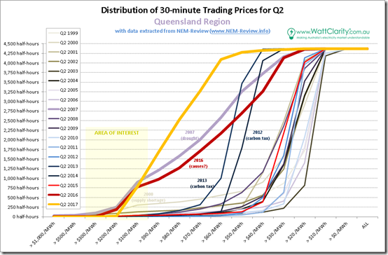
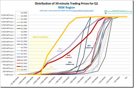
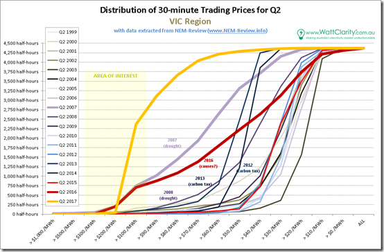
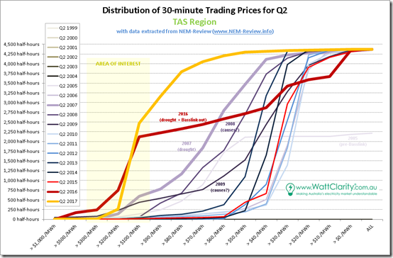
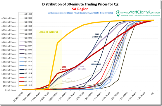
As I did last year, I’ve taken all 4,368 half-hour periods through the quarter (through each of the 19 quarters of the NEM-to-date) and apportioned prices into buckets, depending on the level at which they fell. This delivers 19 discrete curves have then been overlaid on a chart for each region, with particular years of interest highlighted.
2a) Distribution of prices in QLD
Starting again at the top of the NEM, here’s the chart for Queensland:
I highlighted, last year when I posted the chart above, what were the outlier years at the time:
1. The supply-constrained early years in QLD;
2. The drought year of 2007;
3. The two years of carbon tax; and
4. The massive result for Q2 2016 just passed.
However the results for Q1 2017 are even more extreme. Instead of the median price being in the $20/MWh to $30/MWh range, the median price is seen to be up at $83.94/MWh. That’s a staggering increase and is just $2/MWh lower than the all-hours average for the quarter!
To sum up, compounding the staggering rise in prices above $100/MWh we saw occur in Q2 2016 (with the incidence for Q1 2017 being much the same), practically all other prices have shifted up by something like $50/MWh.
There were less than 100 half-hours with prices experienced below $50/MWh.
2b) Distribution of prices in NSW
Progressing further south, it should probably not surprise readers (by now) that we see a similar pattern:
Again we see the distribution for Q2 2017 far exceed the (already extreme) results for Q2 2007 and Q2 2016 (which I noted, last year, were “standing out like sore thumbs”).
Prices seen in the carbon tax years, with the uplift of $23/tonne or so factored in, are meagre by comparison.
2c) Distribution of prices in VIC
Moving into Victoria, we see the same picture:
Last year I highlighted “2007 and 2016 as the standouts” – however those years pale into insignificance to the onslaught of Q2 2017. More than half of all half-hours through the quarter saw spot prices greater than $100/MWh.
2d) Distribution of prices in TAS
Down in Tasmania, we see a somewhat different picture – though still with similarities:
Remembering that the local issues of 2016 pushed Tasmanian electricity supplies to crisis levels, the distribution curve for prices seen in Q2 2017 is deeply disturbing – with prices under $50/MWh having completely evaporated, and an even higher incidence of prices over $100/MWh (though the reduced instance of “very high” prices, compared with Q2 2016, being the obvious reason why the average in 2017 turned out slightly lower).
2e) Distribution of prices in SA
Finally, we land at South Australia and see a truly horrendous picture, with way more than half of all half-hourly prices being more than $100/MWh (i.e. 2,945 half-hours in 4,368 in total – or 67% of the time – almost triple the incidence in Q2 2016):
Is it any wonder that large energy users are closing their doors, permanently.
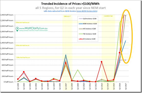
2f) Summing up, for all regions
Selecting just the incidence of prices above $100/MWh for each region and trending over time, we see the following summary:
Quite literally, the incidence for South Australia and Tasmania are both off the chart, with Victoria just scraping in below 2,400 half hours (still more than 50% of the time).
This is a far more excessive outcome than either Q2 2016 and Q2 2007 (the drought year), and there seems to be worrying signs that:
1. This is a continued pattern; whilst, all the while
2. Our political leaders fiddle whilst Rome burns….
In a complex system (such as the NEM) it’s almost certain that, with most events, there are always multiple contributing factors.
When I have a bit more time, I will return to analysing the various contributing factors – including those identified above…


It all makes you wonder whether the structure of the NEM is not appropriate. While it seemed to work reasonably well when demand and consumption was increasing with little impact from intermittent generation, the outcomes of Paul’s assessment is that we are seeing a seismic shift that warrants a look at whether the NEM as structured is fit for purpose.
While agreeing with Paul that there is no one cause, what he has left out is whether the degree of competition (or lack of it) that now exists is contributing to the problem. After all,the NEM is predicated on vibrant and vigorous competition.
Another option might be whether the government owned vertically integrated model that existed before 1995 might have resulted in lower costs than we see now
Hi Paul McArdle |
Absolutely excellent report and summary.
Your Someone who understands (or at least may 80% of a complex electrical system). Way more than most .
I’ve been following the AMEO dash Board for some time and predicted that soon as they started shutting down coal stations the price was going move up and much more that the experts said.
The people making these decision seem to have little idea of how this system works and how no or delayed decision are going to effect very body. There seems there was no transition plan mapped out or thought given to spinning reserve requirements. would have though NEO could have just lifted the price for auxiliary service some year or so before . The Governments had chances to leave the major coal station/s (now shut down)on operation stand by until the newables/ storage were bedded in. I note the reason the history SA northern station was build was to give SA security and control of their state Elect Costs from Vic coal supply (strikes), Sounds like they don’t read the history , what’s that old saying , “those who don’t learn will repeat the mistake.” SA even took generation out of the hand of private companies make it state owned,
Maybe run a check how many companies
own all the generators? Can analysis gaming the market?
keep it up
Thanks Simo
well said “truth”. But who is listening ?
How is it NOT the RET that’s causing the lack of dispatchable SUPPLY and the higher prices? It’s the RET’s subsidies to the most inefficient power source that are killing off the base load source and causing shortage of SUPPLY…IMO
The gentailers see the huge RET subsidies and favoured status for RE inexorably making coal and gas unprofitable…. and seeing the writing on the wall , they hedge by investing in intermittent sources and putting FF… their coal plants especially…on death row…announcing that they’ll be shut down soon because they can’t compete with the subsidised undispatchable wind and solar..
The privatised gentailers cannot be forced by government to keep unprofitable FF generators operating because they have shareholders and are bound by company laws.
Therefore FF generation shuts down …or is marked for shutdown and SUPPLY dwindles.
Hazelwood closed because Engie saw that writing on the wall…and its closure diminished SUPPLY.
Greens , weak governments and government disregard for the concerns of landowners closed down CSG in NSW and Victoria…diminishing SUPPLY of gas…but had there been no RET ….no VRE with their huge subsidies…and without climate hysteria running Australia’s energy policy there would have been no need to resort to CSG IMO.
Climate change hysteria and the divestment campaigns…and claims that ALL FF will be phased out in favour of RET-susbsidised VRE…. caused a drop in new gas searches and subsequent shortfalls in conventional gas SUPPLY.
The wind drought caused lack of wind electricity SUPPLY.
Gentailers are in the box seat..having covered themselves for all eventualities…and can price the scarce SUPPLY as they wish.
AGL and ORIGIN appear to be running the show now-AGL favouring herding solarPV owners into virtual power stations…to MANAGE their demand…a venture they and their Californian partners SUNVERGE in whose operation AGL is the largest investor at $20million…expect to be very lucrative.
Both AGL’s Vesey and AEMO’s Audrey Zibelman are American RE zealots whose energy plans for Australia are exactly in sync with Labor’s not LNP’s.What sort of government except one seeking to deceive its constituents lets that happen?
The Americans apparently see Australia as an opportunity for their RE experimentation…having not a care in the world that unlike America, Australia has no other country ‘to run an extension lead to’.
Zibelman told her alarmed New York State property-owners in her former job….that they could always run a lead from NYState to Canada if NY became energy-insecure due to her policy there.
They seem to have no knowledge and don’t give a damn that Australia is COMPLETELY ALONE in being the only industrialized country in the world that’s without alternative energy…no massive hydro or nuclear power…and yet is killing off the only energy…coal …that can keep us industrialised and competitive.
There is NO OTHER first world country that’s without hydro and nuclear…. that can do without COAL…NONE!
The shutdown of Australia has already begun as Malcolm Turnbull fiddles.
The LCOE for 100% renewable supply at current component cost and absolute best finance charge is $700/MWh. The prospect of that getting lower is not in sight.
As more renewables are forced into the NEM the cost of wholesale electricity will approach the $700/MWh.
The NEM is a network that takes advantage of economy of scale. It suits coal fired generation. It is inappropriate for a ubiquitous energy source that has no benefit of scale.
The concept of transition to renewable generation supplying the grid is fundamentally flawed. Renewables should be all local supply sources feeding their dedicated loads; never attached to the grid.
Hi Paul,
Nice work.
2017 pricing to-date are truly scary and this doesn’t bode well for those of us who want an orderly transition to a renewable grid (or even for industry or the grid itself to survive).
I agree that there appears to be a systemic shift in the market, which is not obviously explained with off the cuff simplistic explanations tossed around (without any data). As Simon above mentioned a non-functional market must at least be one of the possible explanations.
I think all the bidding data is public but maybe not easily accessible. Has anyone done a comparison of the bidding stacks for say 2017 vs 2015? OR is there a public forum where I could contribute analysis?
Discussions on topics like – how has the average price tripled in the middle of the night, when there is ample excess coal base load capacity – would be very interesting. Further, it would at least be worth illuminating the bidding behavior of certain market participants.
thanks Adrian
One of the price tipping points for Victoria, which flows through to SA and Tasmania, is that there is now insufficient coal-fired generation to support even the night-time load. So even at night, spot prices are set by open cycle gas (Mortlake and Newport). According to the Aneroid Energy website, there are currently only 3,700 MW of coal-fired generation operating in Victoria, with Loy Yang A4 and Yallourn W S2 not operating (with a combined capacity of 900 MW). Night-time load is about 4,200 MW. When Hazelwood was operating, its low bid prices would feed through to low night-time prices in SA and Tasmania. These low-price periods no longer occur.
Another new feature is AEMO’s constraint of wind output in SA to 1200 MW if there are only 3 gas generators operating on the 275 kW network. This has led to curtailment of ~200 MW on recent high wind days (during both night-time and the morning peak), and good prices (~$70/MWh) for non-curtailed wind farms, whereas previously at times of high wind output and low demand, prices would become negative. So again, no tail of low-priced periods.
A timely article, Paul. I am wondering if anyone has done any research comparing price forecasts with actually observed spot prices. As the price pattern changes, forecasts based on historical trends should be getting less relevant