With 7 competitions run over summer, it’s taken a while to cycle through them all and to post about what’s happened through summer with respect to all 7 metrics.
Leaving the best region to last (we live here, so we’re biased) we finally come to look at Queensland’s demand patterns today.
1) What actually eventuated?
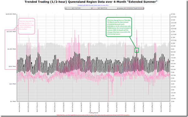
For one last time in this series, we power up NEM-Review to produce this trend of demand over the summer:
Note, with this chart, that the pricing scale (y1 axis) is shown in log form because of the remarkable volatility seen in Queensland over summer 2014-15 – unlike other regions, but similar to what’s happened in 2013-14 and 2012-13 especially (i.e. summers where actions possible following the “3-into-2 generator merger” combined with other factors to make it possible).
As noted, Queensland’s peak demand over this period was a massive 8,892MW at 16:50 on Thursday 6th* March 2015 (* oops 5th, thanks Richard) – and that this peak demand was only 52MW off the all-time record.
As it happens, we were actually watching the market closely on that day, so were able to publish this analysis at the time of what happened. As noted there, this peak demand would have been considerably higher (probably a new all-time record) if it had not been for injections of power behind the meter from distributed small-scale PV, even though those injections were declining rapidly so late in the day (and were completely gone when demand rose again early that evening to almost register a new peak).
2) How well was this expected?
This summer, in conjunction with our traditional “main prize”, we also offered to give away a “consolation prize” for the closest to the market at guesstimating what the peak demand would be for the Queensland region (this was Competition #2 of a total of 7 competitions this summer).
2a) Was it expected, by our competition entrants?
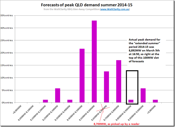
Collating all the entries and plotting a distribution, we see this pattern:
As I did for Tasmania, I used a 100MW step for the distribution curve – much finer grained than for the other 3 regions because of the “less peaky” nature of Queensland demand.
As can be seen, the actual peak demand surprised most of our entrants.
SO WHO WINS THE “CONSOLATION” PRIZE FOR COMPETITION #2 (QLD PEAK) THIS SUMMER?
All good give-aways come to an end, so the last winner of the consolation prize (their new portable BBQ prize, from Barbeques Galore), is revealed here…
We did see a few courageous entries further up the scale, including entries above 9,000MW – perhaps a summer too early?
2b) Was it expected, by AEMO?
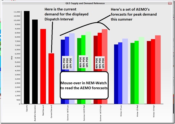
On 24th December, I posted these tips about what might be expected in Queensland’s peak demand for summer. We also published this tip about how you might use NEM-Watch to reference the AEMO’s forecast for peak summer demand, in the context of current market action.
For ease of reference, this image is copied here:
Just eyeballing this chart, we see that the actual level achieved (8,892MW) was at the upper end of the AEMO’s forecasts for Queensland this summer – i.e. a High Economic Growth scenario, and a 10% POE weather shape (i.e. extreme weather). It was certainly hot on that day!
3) Looking in more detail?
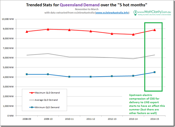
As we did for other regions last week, we include this trend of the headline stats for QLD for the “5 hot months” of 2014-15 and the 6 preceding financial years:
Unlike what we saw for all four other regions, we see that all three metrics in Queensland increase for summer 2014-15.
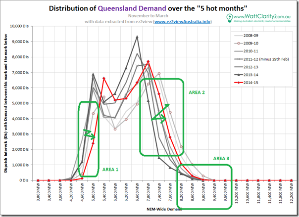
To provide more detail, we generated the following distribution curve for QLD:
With respect to this curve, a few key points are evident:
3a) Minimum demand
As illustrated by the zig-zag arrow on the chart above, all-hours demand (at the bottom end of the curve – shown as Area 1) has increased significantly from 2013-14 to 2014-15 as electricity used in upstream compression of CSG supplies for LNG export has reversed the smaller decline seen over several summers.
3b) Afternoon demand
In the afternoon demand part of the curve (shown as Area 2) we see that, like other regions, solar PV (amongst other factors) had been successful in reducing afternoon demand – especially because Queensland had been boom town for solar developments, at least in part because of:
1. Better solar yield than the southern regions; and
2. A very generous, long-lived 44c feed in tariff that encouraged something like 400,000 residential customers to sign up (including me).However these reductions have been almost fully reversed over the past 12 months with the increase in industrial use of electricity. Demand is trending back towards the levels last seen in the “all-time max” summer of 2009-10.
3c) Peak demand
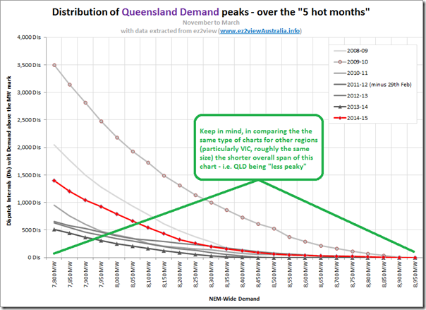
Zooming in on the peak end of the curve, whilst keeping in mind that Queensland is much less peaky than regions like Victoria and South Australia, we see the following cumulative distribution:
In this chart we can see how Queensland’s peak demand shape was much flatter in 2014-15 than it was in 2009-10, and yet we know (from the above) that the actual peak demand achieved in 2014-15 was only 52MW off the all-time record.
In a market where peak capacity* is funded by payments made per MWh (as opposed to being made per MW) this is a significant – and, evidently, growing – challenge.
* The “peak capacity” I refer to here is both network, and energy supply.
4) Looking ahead to summer 2015-16
Over the past 2 weeks in writing this series of articles, I have been asked by a number of people – what it means for the future. I’ll note some observations quickly here for Queensland, and return to this later – as time permits….
In the past 2 weeks we’ve walked around the NEM and seen a very clear picture (at least this summer) of a tale of two very different markets:
1. SOUTH of the border, we’ve seen regions where peak demand disappointed and, as a result, prices barely budged off “boring”. We’ve also seen how moderate weather has been the biggest contributor to this.
2. NORTH of the border, however, we’ve seen the continuation of the summer volatility that we’ve been seeing each summer since 2012-13, following behaviour made possible by the 3-into-2 merger (which was created as a way of staunching the red ink assaulting the state government’s finances). This has been partially possible due to peak (and average) demand remaining resilient – and rebounding – compared to its southern cousins.It does make me wonder what might be the case come summer 2015-16 after three big changes are made:
4a) Demand is higher still in Queensland
Upstream electric compression still has a way to run – we keep a keen eye on this through the Powerlink data fed through our ez2view software. We wrote about a mysterious jump in Queensland demand as we believe current explanations only tell part of the story, and offered to dig further, but it did not make it to the top of our priority list.
By next summer, we expect many more 100MWs of upstream demand to be functional.
Hence, it’s reasonable to assume average demand will be higher next summer and, depending on what happens with the weather, we may well see a new demand peak set in 2015-16.
4b) Conversely, gas generation slides further down
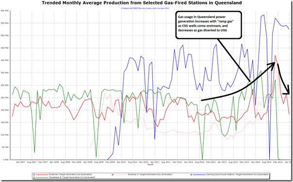
For the same reason, but on the other side of the coin, it seems almost certain that gas generation will wind back further in the sunshine state as all available supplies are corralled into tankers on their way to Asia.
This has already begun, as shown here in the trended monthly average production from selected gas-fired generation across Queensland (again from NEM-Review):
With this will come a significant tightening of available supplies – especially independent supplies not owned by Stanwell and CS Energy, the dominant government-owned generators.
4c) 3-into-2 becomes 2-into-1?
We’re not sure if this will happen yet, but it still seems a possibility, despite reservations being raised by a number of people, including the ACCC.
The 3-into-2 merger unlocked possibilities for the 2 dominant portfolios to deliver market volatility in summer 2012-13 – and so increase average spot prices (which flowed through to the forward curve). Since 2012-13, we have seen 2013-14 and now 2014-15 similarly volatile – though not to the same extent, I think.
What kind of pain would we see in 2015-16, with a 2-into-1 merger likely to deliver so much more of the same?
Sitting on the outside, looking in, this does call to mind those famous words of Sir Humphrey Appleby in advising Minister Jim Hacker about what would have been “a very brave decision” to create a “StanCS” monster in an environment where demand is increasing, and competition evaporating.
Of course, the silver lining in all of this (for some) might be what it does to “democratised” renewables in Queensland.
I can picture the advertising now – “buy your solar now to hedge against the price rises as the “big, bad, monopoly generator” runs rough-shod over the spot market and drives your power bills higher”. Might return Queensland solar to the boom-time sales trajectory, and without the added cost of the generous 44c feed-in-tariff of yesteryear?
Problem is, it would also be “creative advertising”, and may even exacerbate the situation, with peak demand shifting later in the day – and even, potentially, to after the sun’s gone down – as shown in this example here.
As a keen market observer, we will continue to watch with interest what happens, moving forwards – however this is not without a degree of trepidation in terms of how the outcomes that emerge might effect our organisations such as our clients, on all stages down the supply chain.
Being a unashamed fan of the Sunshine state, and it facing some very big imminent challenges (like those above), we will be particularly watchful of what happens here, moving forwards….


I presume you mean Thursday 5 March 2015 (not the 6 March), when half-hourly operational demand reached a maximum of 8,831 MW at 17:00, 66 MW off the all-time record.
The maximum temperature on 5 March 2015 was 36.9 degrees and the mean temperature was 28.3 degrees (at Archerfield). While not doubting this was a hot day, it ranks around the 10th percentile in historic weather terms, which may be loosely associated with a 90 POE demand. This would imply that the actual recorded demand was significantly above AEMO’s forecast.
Thanks for the correction, Richard – I see I had it right in the image, but wrong in the transcription. Noted this above.
Thanks also for the clarification of where temperature was at on that day – but not sure I understand the which was around the 10th percentile (i.e. average or peak) and how this translates to a 90% POE. Apologies that I’m slow on that translation.
As per the chart above, that day was certainly different than the days either side!
Paul