
With energy and greenhouse continuing to be under the spotlight during 2015 we thought it useful to have a look at what happened in the National Electricity Market (NEM) during 2014.
[This is a summary of a more detailed paper that I put together which can be downloaded at www.greenmarkets.com.au .]
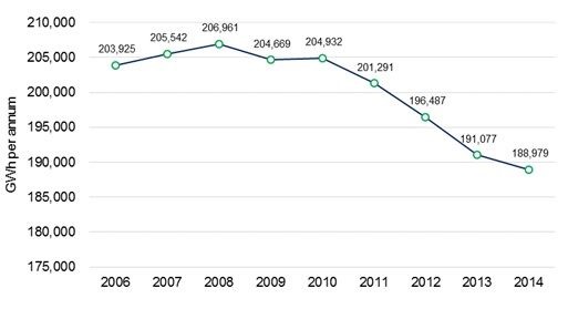
Electricity consumption (measured as scheduled demand from NEM-Review) in the NEM continued to fall in 2014, dropping by 1.1 per cent (2,098 GWh) compared to 2013 levels. Electricity consumption fell in all states except Queensland which increased by 0.9 per cent. Victoria experienced the biggest fall of 3.5 per cent due largely to the closure of the Point Henry aluminium smelter at the end of July 2014.
Figure 1) Metered scheduled demand from 2006 to 2014
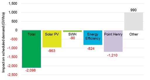
The reduction in electricity consumption masks the contribution that solar and energy efficiency activities have made. We estimate that solar installations supported by the Renewable Energy Target and energy efficiency activities supported by the various state based schemes will have contributed 1,877 GWh in 2014 or 89 per cent of the observed reduction in demand for 2014.
Nearly 700 MW a year of roof-top solar PV was installed in NEM states and created certificates under the Renewable Energy Target over the 2013 and 2014 period. This is estimated to have generated an additional 963 GWh in 2014 and accounts for 46 per cent of the reduction in overall consumption. The contribution of solar hot water and an array of energy efficiency activities supported by state based energy savings schemes (in Victoria, NSW, ACT and South Australia) have also contributed to lower electricity consumption (further 914 GWh).
Figure 2) Reduction in electricity demand (2014 cf: 2013)
There was a dramatic drop in the level of renewable generation in 2014, falling from 13.8 per cent share of the market to 11.8 per cent. This drop is due to a 25 per cent reduction in hydro generation levels and was only slightly offset by a 6.4 per cent increase in wind generation. Brown coal and gas-fired generation increased their output making up for the lower hydro generation. Brown coal-fired generation increased by 4 per cent and gas-fired generation increased by 11.5 per cent in 2014.
Figure 3) Differences in metered generation by fuel (2014 cf: 2013)
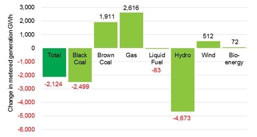
Wind generation increased by 6.4 per cent largely due the commencement of three new wind farms and a full year’s output of several wind farms that commenced operating late in 2013. Overall 2014 was less windy than 2013 with those wind farms that were fully operational on 1 January 2013 producing 11 per cent less in 2014 than in 2013. The average capacity factor for these wind farms dropped from 35.1 per cent in 2013 to 31.1 per cent in 2014. Wind accounted for 34 per cent of South Australia’s total generation in 2014, slightly higher than the 32 per cent achieved in 2013.
Three new wind farms started generating for the first time in 2014; Boco Rocks (NSW), Taralga (NSW) and Snowtown 2 North in South Australia. Five fossil fuel plants ceased generating in 2014.
Greenhouse gas emissions increased by 1 per cent in 2014, notwithstanding a 1.1 per cent reduction in electricity consumption. With the increase in fossil fuel generation, the emission intensity of the NEM increased by 2.1 per cent.
This article is based on work originally published here and follows reporting of this at other locations such as at RenewEconomy.
It has been included on WattClarity because it adds to the articles previously posted here about declining demand in the NEM (and is also a useful update to the analysis completed by Hugh Saddler for the Australia Institute in Dec 2013).
About our Guest Author
|
|
Ric Brazzale is Managing Director at Green Energy Markets.
Green Energy Markets is a dynamic research and advisory business with a focus on reducing greenhouse gas emissions, increasing renewable energy and distributed generation, and improving energy efficiency. The aim of the company is to inform clients’ decision making through the provision of rich environmental market insights
Connect with Ric via LinkedIn here. . |


How was the estimate of solar PV generation done?
What is the assumed fleet-average capacity factor of PV installations that are actually still operating? How do you know?
What proportion of the originally installed PV installations are still operating? How do you know?
Why would they not be operating? The panels have a 20 year warranty and last much longer than that. If your inverter breaks it’s pretty cheap to replace.
[I answered this previously but the comment has been deleted.]
Tom,
Re-read and try again. Not the words “fleet average” are significant.
If Green Markets ws genuinely concerned about reducing global GHG emissions, or Australia contributing to global reduction – as distinct from just pushing jobs, income, economic growth off shore – you’d be advocating for nuclear power not renewable energy.
1. Nuclear power is a much cheaper way to substantially reduce global GHG emissions than renewable energy.
2. Nuclear power has the capacity to provide all humans energy needs effectively indefinitely.
3. RE cannot sustain modern society, let alone in the future as per capita energy consumption continues to increase as it has been doing since humans learnt to control fire.
4. There is much greater capacity to reduce the cost of nuclear energy than renewable energy.
5. The issue with nuclear is political, not technical. The anti-nukes and RE advocates are the block to progress and they have been for the past 50 years.
You are a joke.
Hinkley C tender price was $170/MWh. That’s at close to 100% CF. If we went 100% nuclear we would have 60% CF and closer to $230/MWh.
If you wanted to use breeder designs it would cost even more again. Uranium from the ocean? Fuel costs go up 6 times.
“Much greater capacity to reduce cost” Just because it’s so expensive doesn’t mean it is going to get cheaper. Nuclear power has increased in cost over the last 50 years. Renewables have plummeted in the last couple of decades.
I can’t wait until all the old pro-nuke dinosaurs die out of the energy industry. You are a waste of oxygen.
Tom,
Re-read and try again. Not the words “fleet average” are significant.
[Ignore repeat comment.]
The CSIRO ‘MyPower’ calculator shows that, even in Australia where we have cheap, high quality coal close to the main population centres and where nuclear power is strongly opposed, nuclear power would be the cheapest way to reduce emissions: http://www.csiro.au/Outcomes/Energy/MyPower.aspx
Below is a comparison of options with different proportions of electricity generation technologies (move the sliders to change the proportions of each technology). The results below show the change in real electricity prices and CO2 emissions in 2050 compared with now.
Change to 2050 in electricity price and emissions by technology mix:
1. 80% coal, 10% gas, 10% renewables, 0% nuclear:
electricity bills increase = 15% and emissions increase = 21%
2. 0% coal, 50% gas, 50% renewables, 0% nuclear:
electricity bills increase = 19% and emissions decrease = 62%.
3. 0% coal, 30% gas, 10% renewables, 60% nuclear:
electricity bills increase = 15% and emissions decrease = 77%.
4. 0% coal, 20% gas, 10% renewables, 70% nuclear:
electricity bills increase = 17% and emissions decrease = 84%.
5. 0% coal, 10% gas, 10% renewables, 80% nuclear:
electricity bills increase = 20% and emissions decrease = 91%.
Source: CSIRO ‘MyPower’ calculator
Points to note:
• For the same real cost increase to 2050 (i.e. 15%), BAU gives a 21% increase in emissions c.f. the nuclear option a 77% decrease in emissions (compare scenarios 1 and 3)
• For a ~20% real cost increase, the renewables option gives 62% decrease c.f. nuclear 91% decrease in emissions (compare scenarios 2 and 5).
• These costs do not include the additional transmission and grid costs. If they did, the cost of renewables would be substantially higher.
That site uses old BREE data. They have since updated.
For 2020:
nuclear – $100 to $170 (assumes plant lifetime longer than ever achieved, no decommissioning cost, free fuel infrastucture)
wind – $60 to $110
PV – $70 to $190
I agree that if you want to go 100% clean power you need nuclear, batteries are still in their infancy. We haven’t got the political will to even get 25% clean power. May as well choose the cheaper option which is clearly large scale wind and rooftop PV.
Tom,
As usual you haven’t a clue what you are talking about. The BREE are projections for 2030 and 2050, and they are the updated data. You didn’t even bother to read any of it did you. And the plant lives are generous for renewables and penalise nuclear. you really haven’t a clue.
And we haven’t even included the cost of transmission and the risk (almost certain) that renewables cannot do the job the advocates claim
Furthermore, the differences between the 2012 and 2013 are trivial compared with the very large superiority of nuclear over renewables.
You are basically ignorant of any of this
The MyPower links to information are broken. They used to say they used the 2103 BREE AETA report data. However, the linkt to “what are the numbers based on” now takes you to eFutrure and that data is based on 201
Correction: “and they are the updated data”
This statement may be incorrect. The links to the data source are broken. My recollection is that they were updated some time last year to the 2013 AETA report and the information links said so. There were discussions about it at the time. Now the only link (perhaps out of date) points to eFurture assumptions and that says it is based on 2012 AETA report. My recollection is that MyPower was updated to 2013 data, but I could be wrong. But the differences are still insignificant in context.
Right, so we should stop reducing emissions now and wait until 2050 when nuclear MIGHT be cheaper. Got it.
All transmission costs are borne by the generator. It’s the law.
This includes connection, frequency control, and reactive power support.
Maybe you’d know that if you worked in the power sector.
Again,, you demonstrate you don’t know what you are talking about. Transmission cost is not borne by the generator; it’s borne by the consumer. Wind farms pay only for the connection to the grid. But the cost of transmissions for a largely renewable energy generation system is huge.
Nuclear is far cheaper than renewables now. It can be far cheaper than renewables when the impediments on it – imposed as a result of 50 years of anti nuke propaganda and disinformation – are wound back.
Sorry, Tom, you haven’t got any understanding of any of this and your confirmation bias prevents you from doing any unbiased research. You don’t even Accept BREE and CSIRO figures when they don’t say what you want to hear.
You are an example of the people who have been blocking progress for the past 50 years or so.
The connection cost includes any transmission line additions required to connect to the grid. Any new customer or generator has to pay for line additions and they do not own them either. WFs also pay transmission charges like all generators. You are imagining that large new transmission lines are being built on the public dollar for the sole purpose of connecting a WF. In that case it would be expensive. But it doesn’t happen.
I’m not trying to stand in the way of nukes. I’d be happy for them to be included in the RET. I’m annoyed with you for spreading misinformation about RE.
Tom,
You are misunderstanding. you clearly have not read the link I gave you. To greatly reduce GHG emissions we need a large proportion of electricity generated by low emissions technologies – such as nuclear and/or RE. The additional transmission cost for say 50% nuclear is very much smaller than for 50% of electricity supplied by renewables – e.g. rough estimate $37/MWh for renewables v $2/MWh for nuclear (this is addition to the existing grid). Very rough but gives you some idea of scale.
Correction:
The additional transmission cost for say 50% elecgtricity supplied by nuclear is very much less than for 50% of electricity supplied by renewables – e.g. rough estimate $18/MWh for renewables v $2/MWh for nuclear (this is addition to the existing grid). Very rough but gives you some idea of scale.
Tom,
You said: “I’m annoyed with you for spreading misinformation about RE.”
I don’t believe I am. I believe you don’t understand the relevant facts. You’ve made many unsubstantiated, and pedantic and irrelevant, assertions but you have not shown that the important, relevant facts are incorrect, let alone shown they are wrong by a sufficient margin to change the conclusions.
The three main components of the total system LCOE for a system that can substantially reduce GHG emissions are:
– LCOE of the technology (e.g. as per CSIRO eFuture and MyPower using data from BREE AETA)
– LCOE of additional transmission required (much greater capacity and much longer lines to widely dispersed areas)
– Expected value of risk that RE cannot do the job (meet the requirements of the electricity system economically).
You need to show that the numbers I’ve given for these three items are so far out that the conclusion is wrong.
If you can’t show your alternative figures to substitute for mine, and provide authoritative sources (relevant to NEM) for all of them, then you have no valid argument.
Nuclear power cheapest electricity with largest emissions cuts by 2050
The lowest cost way to generate our electricity and reduce emissions by 2050 is with a large proportion from nuclear power.
Here I use the CSIRO ‘eFuture’ calculator to compare two scenarios to supply electricity to meet the projected electricity demand on the National Electricity Market (NEM) in 2050 as well as cut CO2 emissions. The two scenarios are: 1) nuclear power not permitted and 2) nuclear power permitted. eFuture determines the generation mix that gives the least cost electricity for that scenario using the selected inputs. The scenarios compared here use the default (central estimate) for each user selectable input. The two scenarios are compared on the basis of CO2 emissions intensity and wholesale cost of electricity.
CO2 emissions for nuclear not permitted are 80 t/MWh versus 25 t/MWh with nuclear permitted. That is, if nuclear is not permitted emissions would be 3.2 times higher than if it is permitted.
The table below lists the LCOE (wholesale price) with nuclear not permitted and with nuclear permitted; the third column shows the ratio ‘No/Yes’ (nuclear not permitted/permitted)’. Cost items of common interest are itemised. Costs are in $/MWh.
Item No nuclear With Nuclear No/Yes Ref.
LCOE from ‘eFuture’ 130 85 1.5 1
Accident insurance 0 0.1 2, 3
Decommissioning 0.15 0.01 4
Waste management 0 1 5
Transmission, 50% penetration 18.5 2 6
Total LCOE 149 90 1.8
Without nuclear is 80% higher cost than with nuclear permitted. With a higher proportion of renewables in the default scenario, the cost of electricity would be even higher, probably more than double the cost with nuclear permitted.
Policy analysts also need to include in policy options analysis an estimate of the risk that renewables will not be able to do the job. We know nuclear can provide around 75% of electricity in an advanced industrial economy because France has been doing it for over 30 years. But renewables have not demonstrated they can or will be able to. Many practitioners think they will not. An estimate, in LCOE equivalent terms, of the risk that renewable technologies do not meet the hopes of the proponents is $54/MWh.
The risk that renewables will not be able to do the job is the major risk that should be questioned, not the costs of waste disposal, decommissioning, accident insurance etc. of nuclear all of which are negligible compared with LCOE and the risk that renewables do not deliver the benefits claimed by their proponents.
References
1. CSIRO ‘eFuture’ scenario options calculator http://efuture.csiro.au/#scenarios
2. US NRC, 2014, ‘Backgrounder on Nuclear Insurance and Disaster Relief’ http://www.nrc.gov/reading-rm/doc-collections/fact-sheets/nuclear-insurance.html
3. EIA, ‘Nuclear electricity net generation’ for year 2012 http://www.eia.gov/cfapps/ipdbproject/iedindex3.cfm?tid=2&pid=27&aid=12&cid=regions&syid=1980&eyid=2012&unit=BKWH
4. IEA, 2010, Projected Costs of Generating Electricity, 2010 Edition http://www.iea.org/publications/freepublications/publication/projected_costs.pdf
5. OECD, 2013, ‘The Economics of the Back End of the Nuclear Fuel Cycle’, Figure ES.1 http://www.oecd-nea.org/ndd/pubs/2013/7061-ebenfc-execsum.pdf
6. Peter Lang, 2013, ‘Renewables or nuclear electricity for Australia – the costs’, Figure 7 http://oznucforum.customer.netspace.net.au/TP4PLang.pdf
7. WNA, 2014, ‘Decommissioning Nuclear Facilities’ (“0.1 to 0.2 cents/kWh”) http://www.world-nuclear.org/info/Nuclear-Fuel-Cycle/Nuclear-Wastes/Decommissioning-Nuclear-Facilities/
8. DECC ‘Offshore Renewable Energy Installation Decommissioning’ https://www.gov.uk/government/uploads/system/uploads/attachment_data/file/47955/900-offshore-renewable-installation-decom.pdf
[deleted at request of commenter]
Please delete 6:47 pm comment. It was posted in the wrong place. I’ve reposted it where it was intended to be.