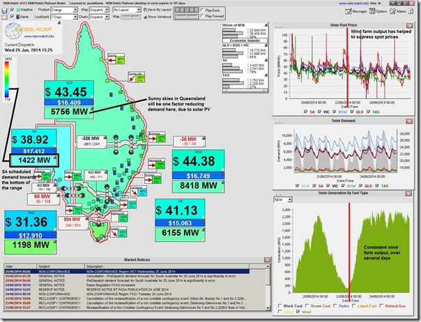
The past couple days have been remarkable for a number of reasons – with strong winds producing an amazingly consistent output from the installed wind farm capacity around the NEM, as shown here in this snapshot from NEM-Watch showing the 15:25 dispatch interval today (in the maps) and 7 days of history in the charts on the right:
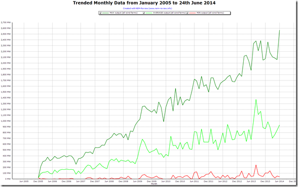
Seeing that the wind farm output seems to be capped around the 2400MW mark during this very windy week posed a question about how this maximum output has grown over time.
Hence, charging up our NEM-Review software, we were able to generate the following aggregate trends utilising Metered Generation from all Wind Farms (i.e. where AEMO has published data) across the NEM:
No surprise, really, that the green and the red lines on the chart seem to sum up much of the debate (perhaps better termed “shouting from opposite sides of the room”?) about the current RET Review process currently underway in the real world, and on social media.
In other news, unfortunately I could not be at the RET Review’s session earlier this week when the results of the modelling were discussed. Would have liked to have used that as an opportunity to update this earlier summary of modelling results, which readers have indicated they have found of value.


On Sunday and Monday night this week there were strong winds overnight at a time of low power demand, and data from AEMO showed a South Australian price of $20/MWh compared with about $30/MWh in Victoria. About 100 MW were being exported from SA. Thermal power was still being generated in SA from Osborne (gas cogeneration, with heat sales to a nearby factory), Pelican Point (gas combined cycle) and Northern (coal). Each of these were generating about 160 MW. Some questions
1. Why is there such a large price differential of about $10/MWh between SA and Vic ? (The same occurs when SA is importing from Vic, except the SA price is $10/MWh higher than Vic). Yet much larger flows of energy occur between Vic, NSW and Qld on much smaller price differentials. Is SA’s Electranet using its market power (and wind power generators who have no-one else to sell to) to extract larger price differentials than in the eastern States ?
2. Is this pricing behaviour what was intended in the NEM ?
3. Why would the gas power station at Pelican Point continue to generate into such a low-priced market ? If it curtailed its production to below 60 MW, so there was net import into SA, then the SA market price would rise to parity with Victoria plus the $10/MWh margin Electranet build in. So by reducing production from 160 to 60 MW the owners could increase the SA price from $20/MWh to $40/MWh, and only pay for one third as much gas.
Hi Malcolm
Thanks for the questions.
Some quick answers at the end of the day:
Q1) You ask “Why is there such a large price differential of about $10/MWh between SA and Vic ?”
Q2) You ask “Is this pricing behaviour what was intended in the NEM ?”
Q3) You ask “Why would the gas power station at Pelican Point continue to generate into such a low-priced market ?”
By the way, ElectraNet is the transmission company operating in SA (see our Power Supply Schematic) so does not have the involvement in the market you’re thinking of.
If this does not fully answer your questions, maybe next week I can come back to this…
Paul