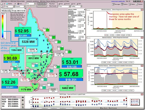
Went for a walk for lunch and the temperature was very pleasant (a great time of year to be in Brisbane). On returning to the office, however, I glanced at NEM-Watch and saw the at the regional demand had not yet budged out of the blue-zone:
[in NEM-Watch each region is colour-coded on a sliding scale between dark blue (being minimum demand experienced in recent years, generally around 04:00) and red (being all-time maximum demand, which for QLD is experienced on hot summer days]
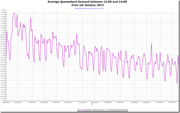
Powering up NEM-Review I produced this intriguing trend of the average demand between 12:00-14:00 each day this year to date:
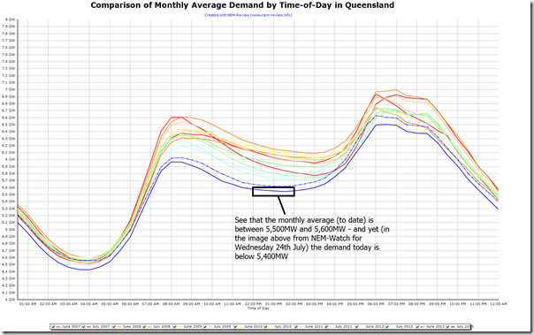
We can see that the lunchtime demand peaked this calendar year late in January, and has been trending downwards ever since. To compare across several years, we run the Chronological Comparison and generate time-of-day demand shapes for June/July months over the past couple years (and colour-code for ease of reference):
The monthly average demand shape for July 2013 (to date) is the lowest of the lot, across all hours.
Undoubtedly, the rush of people (several in our office included) getting their 5kW solar PV systems installed prior to the 30 June 2013 cut-off for eligibility for the 44c/kW net feed-in tariff has had some effect. We wonder how many of these other factors are also at work here (keeping in mind that the demand at 4am is also lower)?


Given that the June-July 2013 profiles are lower for the whole day – not just when PV is generating – your conclusion is badly overstated. PV has no effect on the breakfast and evening meal peaks or overnight values, and they are all lower too, by the same margins.
There is some sign that the minimum is shifting to earlier in the day – which can perhaps be attributed to PV generation peaking at around noon, or just prior to noon for Brisbane (solar noon is at close to 12:00 for Rockhampton, a little earlier for Brisbane). But the effect is pretty marginal, and could also be attributed to the increasing use of air conditioners in the afternoon (it’s most likely a combination of both).
Thanks for the comments, Phil
In the post I linked to a range of factors that would be contributing to various degrees, and noted that the 4am demand was also lowest in July – hence, there’s more than just PV contributing.
Not sure how I have overstated a conclusion?
Paul
Paul, I noted your other factors, which are correct in the context of reducing demand generally, as we see over the family of curves. [Other readers, I can reccomend reading that list].
It just seemed to me that your article was inferring that the demand profile had reduced at midday, and that that was probably due to widespread PV installations (“Undoubtedly, the rush of people … getting their 5kW solar PV systems installed … has had some effect”). I did not feel that the midday reduction was significantly different to the reduction over the rest of the day, so to attribute it mainly to PV was overstatement of the PV effect.
From your response it seems that I had misunderstood your intended emphasis, and that you meant that PV contributed to the reduction, rather than being the primary cause of it.
I certainly agree PV is a factor, but it seems pretty minor from the evidence of these curves.
Hi Phil
Thanks for the added details. Part of the challenge in terms of interpreting PV (for us, and for everyone) is that it is behind the meter, so not as visible at the level of the NEM.
Cheers
Paul