There are only four days left in which we’re accepting entries in our “Best Demand Forecaster in the NEM” challenge – and we’re seeing the late-comers submit their entries now (better late than never).
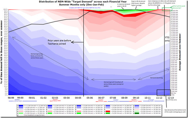
For those not so familiar with what’s been happening with demand in the NEM I have included the following trended distribution, filtered just to include the summer months, of NEM-Wide demand (when measured on a Dispatch Target basis):
(click on the chart to open a larger version)
This chart is an update on the one provided here for full years, and only up until September 2011. I have used the same green colour coding for demand instances in excess of 30,000MW to make the charts more easily comparable (the blue-to-red colour scaling is automated within NEM-Review).
With reference to this trend of SOI from 1994 to 2007 and this trend from 2007 to 2012, I have annotated the chart above with my understanding of the La Nina and El Nino weather patterns [someone, please correct me if this is wrong?!].
When marked on the chart, we can see that the massive demand peak of 2008-09 occurred simultaneous with a weaker La Nina pattern, and that the much lower (peak, and average) demand levels experienced in 2010-11 and 2011-12 coincided with strong La Nina patterns, which washed out any chance of a spike in demand being experienced in those years.
This chart illustrates why demand forecasters are likely to have a tougher time this year, than in immediately prior years, to forecast what the peak demand will be – as they have to assess the extent to which a significant number of variables that have all been contributing to the changes in demand patterns summarised above:
1) Some of these factors are transient (such as with respect to the strong La Nina pattern coinciding with depressed demand); whilst
2) Other factors would be more sustained (price responsiveness, efficiency measures, and increased embedded generation – solar, wind and other).
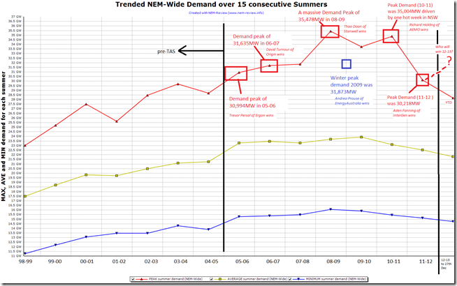
To show the absolute extremities of summer demand more clearly, we have also included the following chart (again generated in NEM-Review):
(click on the chart to open a larger version)
This chart shows how the minimum demand level started falling away earliest (from 2008-09) whilst the average level began dropping a year later and the peak demand level was sustained in 2010-11 by virtue of that one hot week in NSW.
Hence, we can see the uncertainty about where peak demand will eventuate for 2012-13. Whilst it might be seen as reasonably certain that average demand will decline somewhat, peak demand will be almost entirely weather dependent.


Paul
Spot on with the ENSO (el nina etc) summers. Great analysis and very interesting!
Interestingly 2010/11 was a very strong La Niña but a year later it was relatively weak but seemed to have similar effects – just that one peak demand period in NSW. Also noteworthy that ENSO has a much less of an effect on VIC and SA than NSW and QLD which bucks the trend again in 2011/12
Cheers
Thanks, Martin
I note hot weather forecast for VIC later next week, but PASA forecasts are relatively modest (because of the holidays).
We’ll be very curious to see what happens when everyone’s back to work, and schools are in, after Australia Day.
Paul