I was invited to speak at the “Introduction to Power Plant” course at QUT recently.
Given that it’s been on my mind of late, I performed a bit more analysis about how demand patterns have been changing in the NEM in recent times and put these into a presentation. Some of this has been included below, for your interest:
Background
Back in 7th June, I posted this analysis to coincide with the completion of our “Power Trading Schematic” Market Map TM (2011 Issue). From this analysis, it appeared that average physical energy production across all power stations has been declining in the past couple years.
This prompted a few questions from clients and others, which I tried to analyse with this piece on 23rd July. Based on this further analysis it did seem that:
1) An increase in non-scheduled generation (though it has happened – from wind farms and the like) has not been sufficient to explain the reduction in total energy consumed across the market each year;
2) We saw how demand, averaged across the year by time of day, has not been increasing since about 2006 – a situation evident across all hours of the day;
3) We also saw that this was fairly consistent across months of the year, as well.On 2nd September, to coincide with the end of winter, we published this analysis that showed that peak daily demand for each day in winter was not consistently higher than previous years – and instead was lower than extreme demand levels seen in some other years (especially 2007 and 2008). This is surprising, as winter 2011 did have its cold spells.
Further analysis of demand peaks
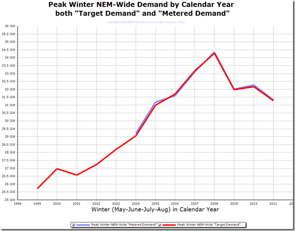
So we looked at peak winter demand by calendar year in NEM-Review 6 and produced this chart:
This chart provided another representation of what was apparent in the comparison of daily peak demand which we posted at the start of this month. What’s striking in this is that the peak demand for 2009, 2010 and 2011 were all significantly lower than that for both 2007 and 2008.
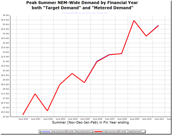
Doing the same thing, but filtering just summers (and hence using financial years) reveals a similar style of chart:
In this case, however, we can see a fairly consistent trend for the increase in summer peak demand. In particular (in looking at summer) we were cognisant of this question we posed previously, following the massive peak of summer 2008-09.
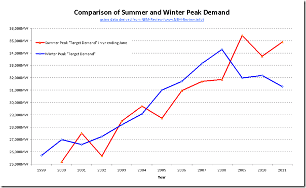
Combining both for clarity reveals the following comparison:
It does appear that there has been a separation in the pattern between winter peak and summer peak in the past couple of years – but is it too early to tell if this is a sustained change?
Analysis of all demand across all years
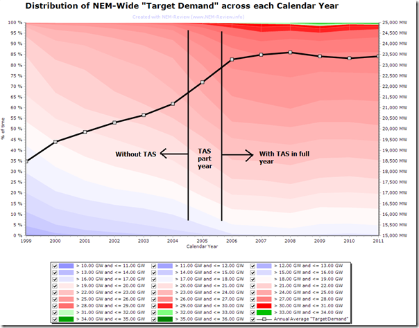
Using the colourful “Distributions” function within NEM-Review 6, we also generated this chart which tells a detailed story in a single chart (which we have annotated date-wise to ensure that the reader is aware of the change in the data set with the entry of TAS into the NEM in mid 2005):
In this chart, we have shown a distribution (for each year) of the percentage of time that the NEM-wide demand has fallen within bands 1000MW apart. We have manually edited the chart to colour demand ranges above 31,000MW in shades of green for clarity.
The line series added to the chart is the annual average “Target Demand”.
What is apparent from this chart is that:
1) All of the 1000MW graduations of demand have been essentially flat from 2006 – i.e. the distribution of demand has been fairly consistent for 98% of the time
2) What has changed (in the green area) is that the demand has risen above 31,000MW for a very small number of times each year since 2007 (though that incidence does not seem to be increasing to a great degree – indeed, when we look closely we see the incidence lower in the past couple years than in 2008 and 2009).
3) There does appear to be two distinctly different trends:
(a) the first (coincidentally pre-TAS) where demand grew consistently, across all hours of the year, and
(b) the second (coincidentally post-TAS) where demand has been flat.
To sum up
As I noted on the day:
1) It appears that demand growth has slowed since 2006, and has been contracting for 3 years
2) This appears to be true across all months, and across all times of the day
3) 2500MW of peak demand has disappeared across winter – with peaks being a further 500MW lower in 2011.
4) However summer peak (though not average, perhaps) demand still seems to be trending up.
5) As a result, the extreme peaks (like a 10% Probability of Excedence, which might not even occur each year) are apparently becoming even more the exception to the rule.
So why does it seem that demand appear to be declining?
Over the past couple of months I have asked the opinions of a wide range of people about this, and have (where possible) jotted down a diverse range of ideas.
When I have some more time, I’ll list some here…
(in the meantime, feel free to contact us – or just comment below – if you have your own suggestions)
What are the implications?
It has been commonly noted by many organisations that peak demand is growing at a faster rate than average demand. This poses its own challenges in terms of system planning and business development.
But what if it is true that the 10% POE peak demand is still growing (so it’s really more of a demand possibility, rather than a peak demand we will see each year), but the “consistently every year” peak demand is more flat, and the average demand is declining.
This would be even more of a challenge – certainly create more incentive for the implementation of demand side response.
Note that all of the above pertains to NEM-wide demand. It’s likely that the situation will vary from region to region, and from zone to zone (within regions).


Hi Paul,
Another interesting article.
Just a couple of ideas you may want to add to your list (if you dont have them). Some are a bit left field but you may find something interesting in the data. The correlation between the demand data and:
– ASX Market Cap
– The AUD
– Severe weather events
– Variances to weather forecasts
– Demand Response products available
– Demand based retail contracts signed
– Co- Tri-Generation systems installed
– Number of Business Consumers
– Inverse Correlation to median business electricity prices.
Thanks Kenji
A few things for me to think about (yes, some a bit left-field!)
Cheers
Paul