
1) Summary
On Monday 19th January, we notified our clients that NEM-Watch version 8.1.2 was ready for installation – complete with a large number of new features.
To celebrate the release of the new version of NEM-Watch, the market celebrated throughout the day, sustaining prices in SA high for several hours, and bringing the Cumulative Price within a whisker of the $150,000 threshold, at which prices would be capped.
Yes, we jest…
However, it was a great opportunity to sit back and watch – to see how the new features in NEM-Watch v8 provide an even clearer view of the market (including the climbing Cumulative Price)! This review is all we had time to put together late on Monday evening…
We also note that it was 6 days ago (on Tuesday 13th January) when prices in SA last spiked – which means that the effects of these spikes will roll off the Cumulative Price through the day tomorrow (Tuesday 20th).
It looks like being a very interesting summer!
2) Contents
1) Summary
2) Contents
3) Sequence of Events
4) Later Analysis
3) Sequence of Events
The following is a loose chronological record of the way we saw the day proceed (featuring 2 copies of the new NEM-Watch v8.1.2).
- Two different Models are featured (Platinum and Gold) – the differences between these models are summarised on the product portal.
- New to version 8, the geographical display utilises colour-coding of regions, and price boxes, to make the relative levels of demand and price more intuitively obvious even at a distance from the display:
- Demand is coloured from blue (recent historical minimum) to red (all-time maximum) demand for the region;
- Price boxes are coloured from blue ($0/MWh) to red ($150/MWh) – with v8.1.2, this is now a sliding scale to provide greater clarity.
- In addition, temperature points are now also set on a sliding scale (0 degrees to 40 degrees Celcius) for greater clarity.
- Additionally, version 8 (Gold and Platinum) illustrates consideration of Economic Islands, and the local reserve plant margin available within each of these. When IRPM for an economic island is low, this is highlighted to make it obvious to the viewer.
- All times shown in the NEM-Watch display are shown in NEM time (i.e. Australian Eastern Standard Time, without daylight savings). One exception is with respect to weather data, which is shown in the respective local time of the measurement point (as provided by the Bureau of Meteorology).
|
Sequence of events on Monday 19th January 2009 |
|
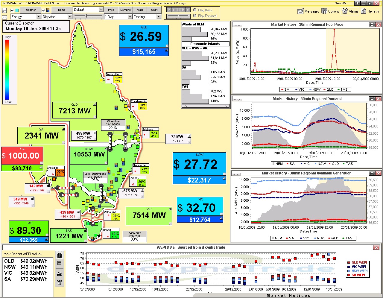
In our article covering the price spikes in SA last week, we noted that the forecast (back then) was for hot weather in SA today (Monday 19th) At 11:35 we see the temperature in Adelaide had already reached 35 degrees. We also see the SA price spike to $1000/MWh for the first time today, and the Cumulative Price start at $93,710/MWh even before the spikes occurred throughout the day. |
|
|
|
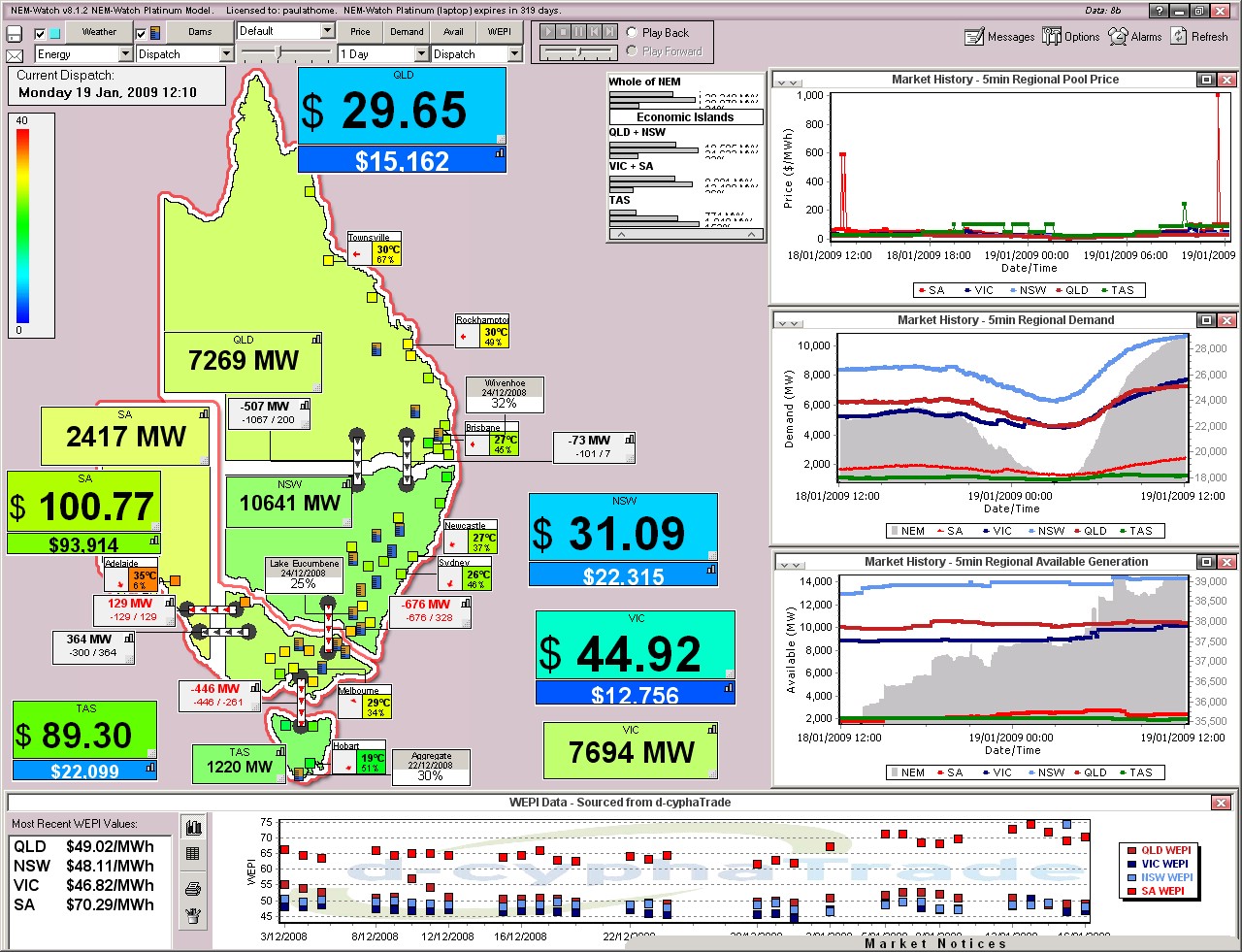
At this time, demand levels across all regions were in their respective mid-ranges (the light green colour) and prices were modest in the QLD+NSW+VIC Economic Island (which enjoyed an Instantaneous Reserve Plant Margin of 33%). As shown in the following snapshot of 12:10, prices dropped again in SA (it was only a single dispatch interval at $1000/MWh to that time). Demand in SA grew by only 76MW over the period. |
|
|
|
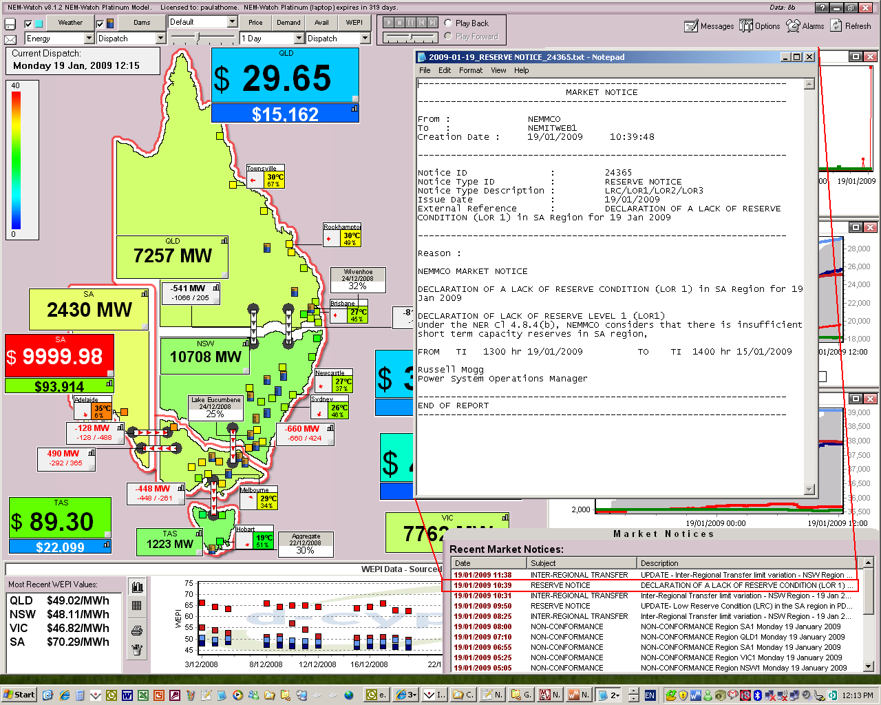
Five minutes later (at 12:15) we see the price spike in SA to VOLL. At this time, we can see that the SA Economic Island (caused by constraints on Heywood) still enjoyed a 15% IRPM – meaning it had about 300MW of spare local generation to meet its local net demand (i.e. that not supplied by imports). In the snapshot we have included, we show the NEMMCO Market Notice that had been released to show that they had forecast an Actual Lack of Reserve Condition (LOR1) for SA from 14:00 on the day. Market Notices are updated through NEM-Watch, and can be used to trigger alarms (for instance, based on a key word such as “LOR1”). |
|
|
|
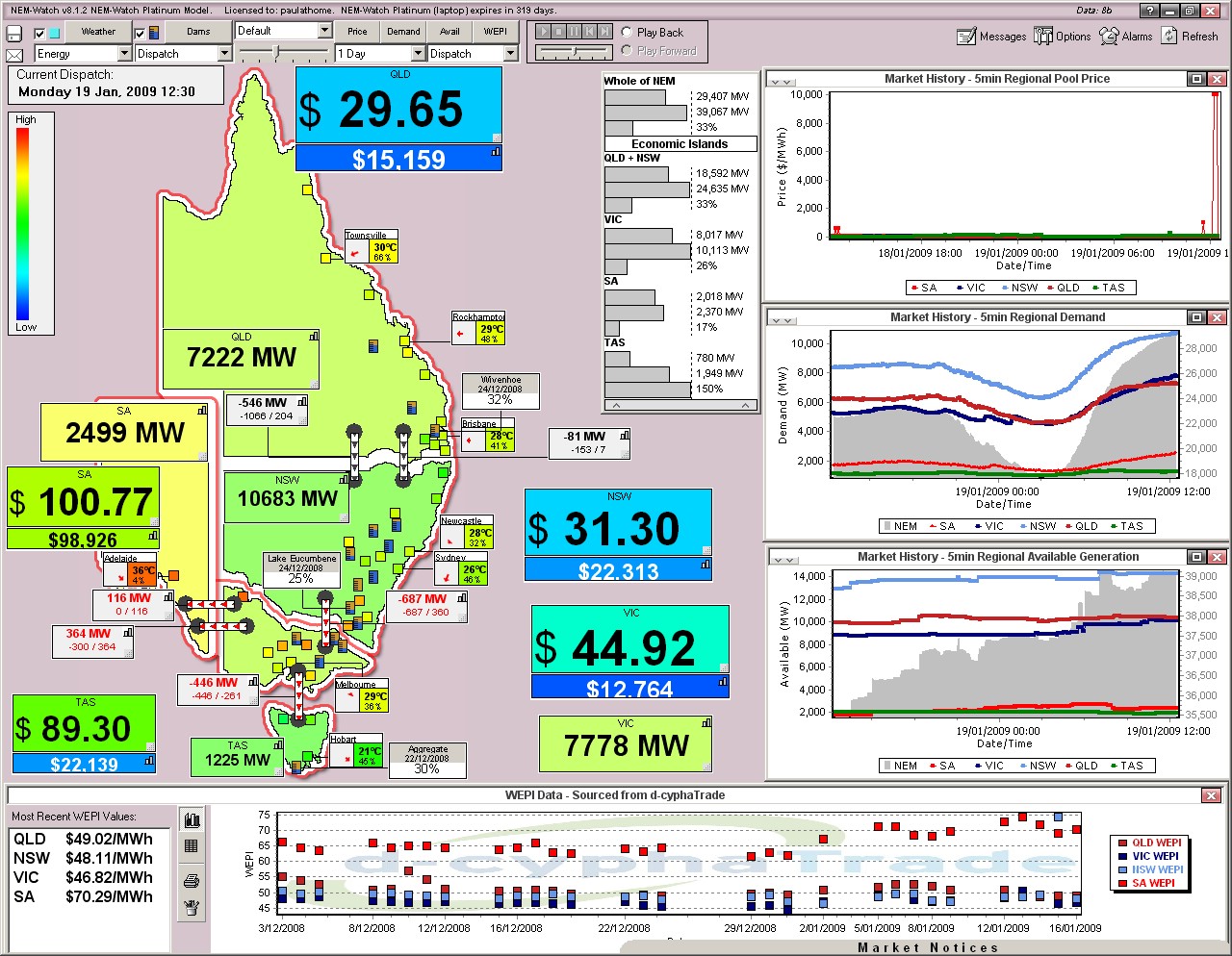
By 12:30 we see demand had grown by another 69MW (or 4.6MW/minute). Prices had subsided, again. |
|
|
|
Sixty-five minutes later (at 13:35) we see that demand in SA had continued to climb (the yellow colour of the SA region shows that its demand was higher, in a relative sense, then demand in QLD and NSW). Prices spiked close to VOLL, again. However, at this stage, the Cumulative Price had only edged upwards (to $99,000). We see in the price chart that NEMMCO’s predispatch forecast was warning of a sustained price spike that would last 2 hours into the future. |
|
|
|
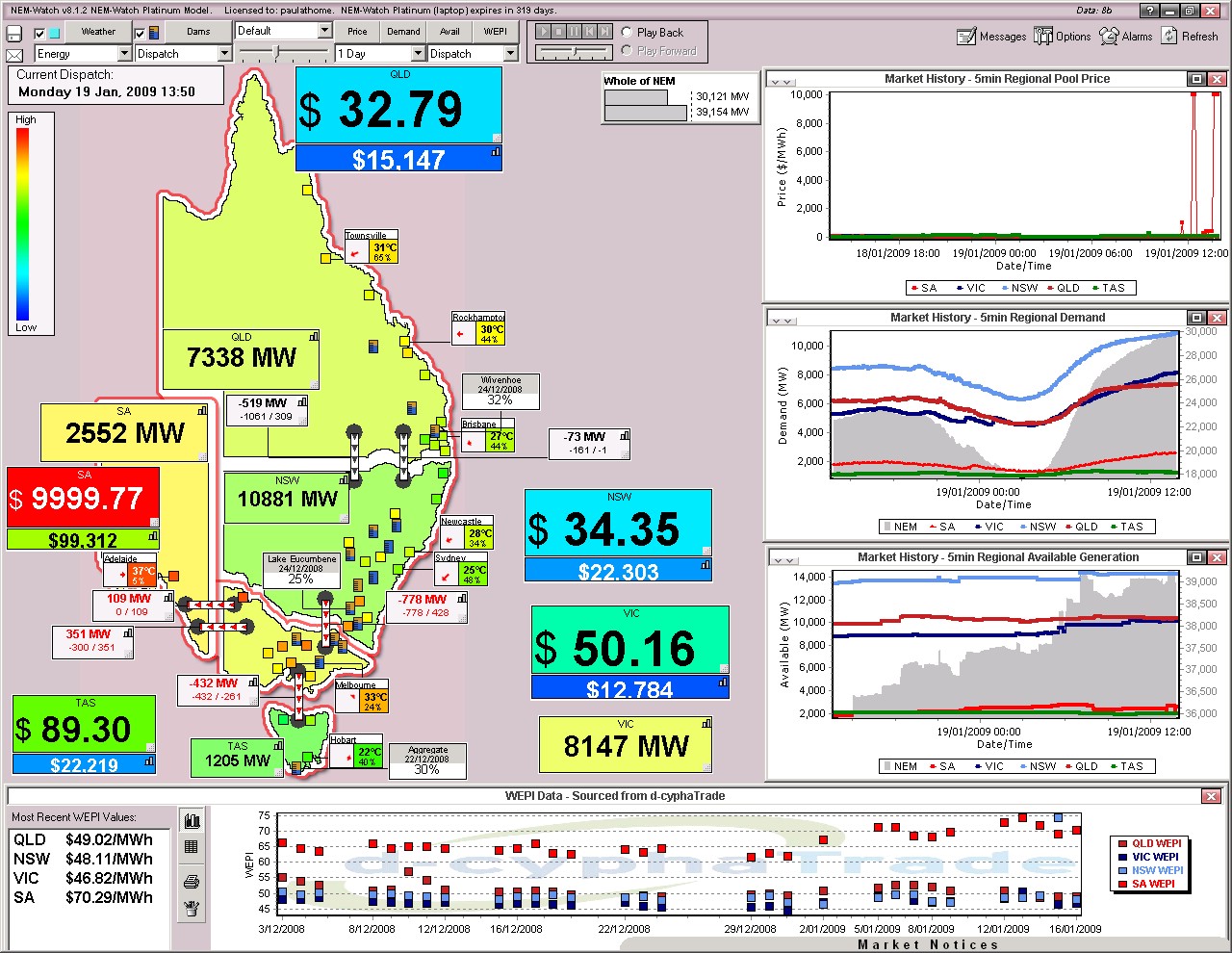
As can be seen (by the reddish dots on the map) the hot weather had progressed further east by this time, raising the level of demand in VIC, as well. By 13:50 (15 minutes later) we see prices had remained high, with demand slightly higher (at 2552MW). |
|
|
|
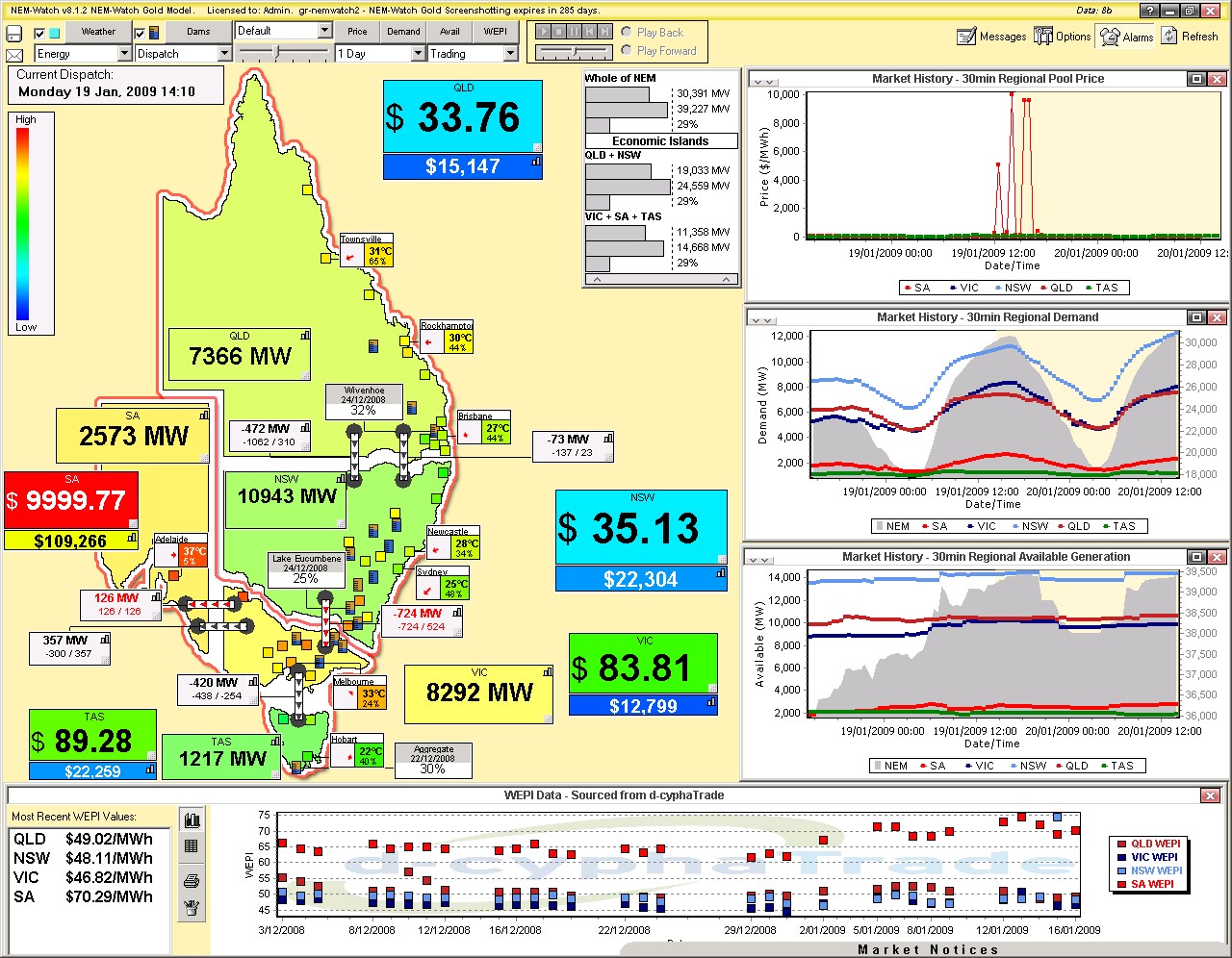
Twenty minutes later (at 14:10) we see that the price was still VOLL in SA – and that the time at VOLL had added about $10,000 to the Cumulative Price. |
|
|
|
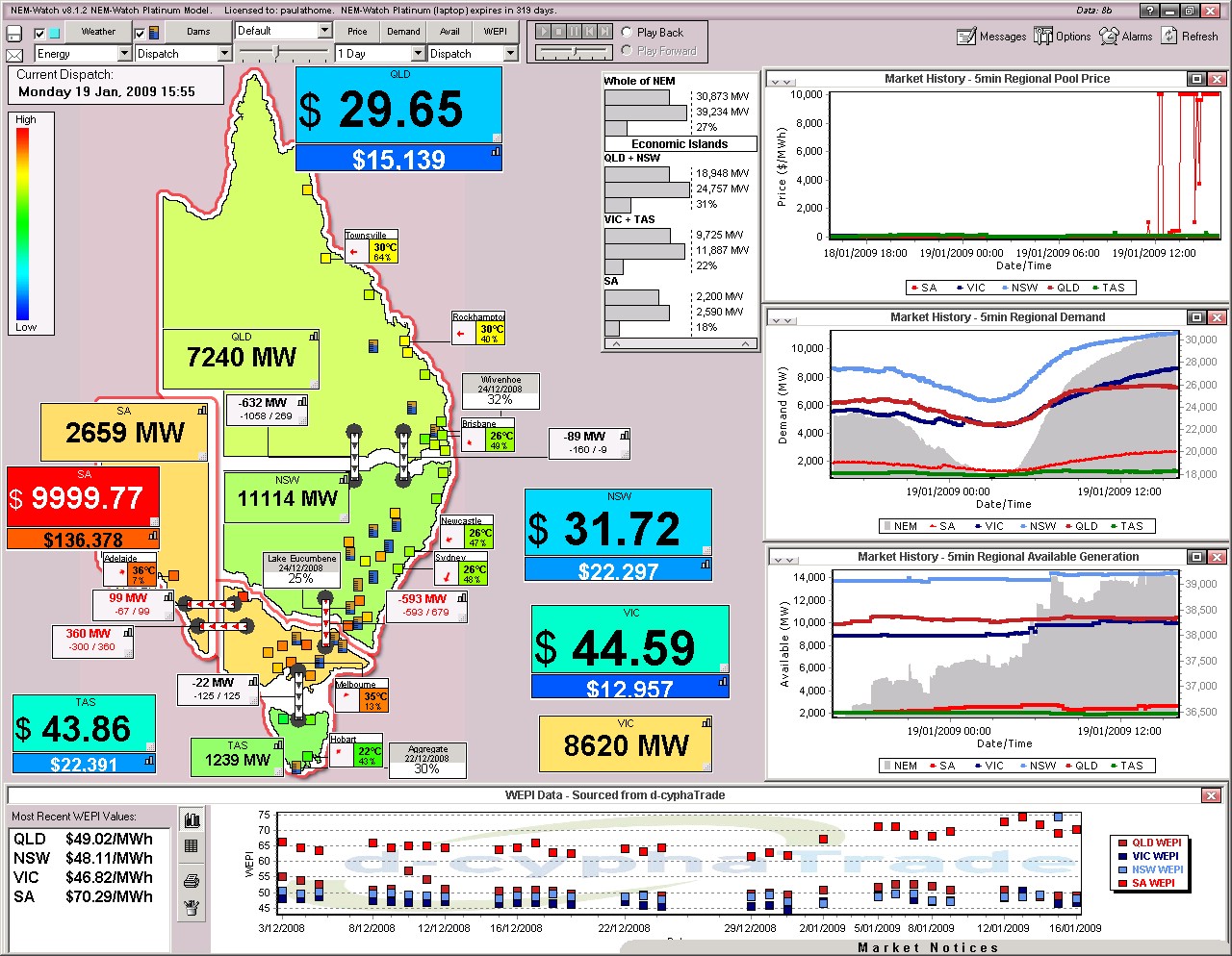
In the illustration above, the Heywood and Basslink interconnectors are NOT shown as constrained (they are NOT red) – this is because the constraint limits were different from the flow by a fraction of a decimal. We note that the prices are significantly different, though. This situation continued for a number of hours (we won’t swamp you with every snapshot we took). At 15:55 (1 3/4 hour later) we see that
|
|
|
|
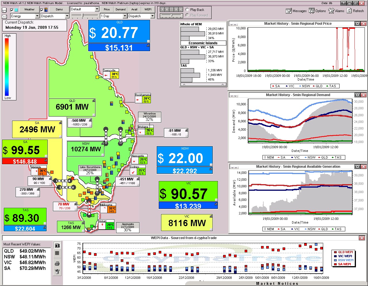
Two hours later, we see that the demand had begun to drop across the NEM, and prices had subsided in SA. The Cumulative Price had reached $146,848/MWh. |
|
|
|
It is interesting to note, from the image above, that there appeared to be three distinctly different weather patters across the country – meaning that:
|
|
|
|
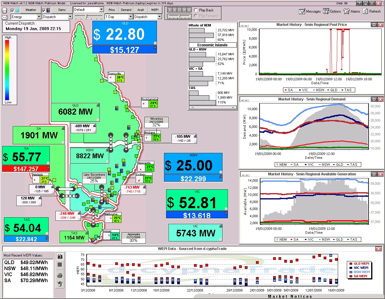
The final image for the day (at 22:15) shows that the demand levels had cooled off through the evening – but the mark of the high prices is still clear in the very red box indicating the Cumulative Price (finishing at $147,257), and in the price chart as well. |

4) Later Analysis
Unlike the review we completed for the 13th January, we put this analysis together in the evening of Monday 19th.
At this time, NEMMCO has not published generation data on a unit basis – hence the summary of generator dispatch (completed for the 13th) has not been included here.
Leave a comment