The level of correlation that exists between the established fleet of wind farms that gives rise to the wind correlation penalty we’ve posted about for a couple of years is not immediately obvious to the eye. Hence why the “it’s always windy somewhere” mantra that’s sometimes used as a magic wand that some see will play a large role in “solving” the intermittency challenge.
1. That’s not to say that all wind farms are perfectly correlated in output – but to note that they (at least the ones that exist currently) are not perfectly anti-correlated, either – which is the assumption that “it’s always windy somewhere” magic wand relies upon.
2. But enough about wind, today…
The strong underlying correlation of solar production across all solar production is much easier to visualise, an intuitively understand. Apart from a time-shift of 1-2 hours from the easternmost part of the NEM to the westernmost part, the sun’s always shining at the same point in time right across the NEM (notwithstanding cloud cover, shading and possibly other local factors).
This high degree of correlation has been a looming challenge that we have been puzzling about increasingly of late.
Our thinking is partly to understand how much change has already happened to date, but it’s moreso with a view to the future:
1) We’re thinking through all the possible implications as the ongoing “solarcoaster” ride ramps up its speed in the coming 12-24 months with the influx of a massive volume of solar PV to hit the Queensland region of the NEM – both in terms of large-scale solar (which will be seen relatively easily by AEMO), and small-scale solar (which has its own challenges of opacity).
2) We’re even thinking about longer-term implications that might come into play under various guises.
Our thinking is driven by the realisation that the needs of our diverse range of clients might change pretty dramatically in the years and decades ahead – and we need to be ahead of the curve in order to ensure we have new products ready for them when they arrive at that point.
The invitation is always open – if you’d like to work with us in some form to help us understand the implications of this energy transition, and what it might mean for (existing and potential new) clients, then contact us one-on-one to discuss.
(A) We’d thought that major effects might be some years away…
To be honest, we’d been working on the assumption that major effects of the influx of solar PV were still a couple of years away in the NEM.
However the advantage of running dashboard-style products (like our trusty NEMwatch v10 entry level dashboard, but including other higher-end ones as well) is that we can progressively get the sense of things subtly changing out of the corner of our eye, even when focused on the here-and-now of our current commitments to clients.
Through 2018 we’ve been tugged by a growing sense that change might be occurring more quickly than we’d previously thought.
(B) A couple comments on social media
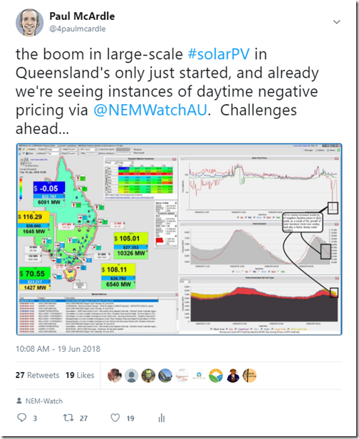
On Tuesday 19th June through one of our display copies of NEMwatch v10, I noted an instance where the 5-minute dispatch price in Queensland was dropping to $0/MWh or below. I tweeted this image from the 10:00 dispatch interval showing the QLD price at –$.05/MWh (which led to some discussion online and offline):
(click on the image to open a full-screen view of the original NEMwatch image).
I note that one of the comments on that thread highlighted the reduction in export capacity reduction from QLD to NSW that was occurring at the time of this (slight) negative price – which is discussed further below.
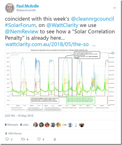
About 5 weeks prior to that (back on Friday 18 May), I also tweeted this annotated image from a NEMreview v7 trend highlighting the way in which (for the 7 days in question) the higher prices had been pushed outside of the daylight hours when solar injections were occurring:
In this case, my tweet then was referenced to this earlier article on WattClarity about the emergence of a “Solar Correlation Penalty”. I note that the same person had also added a comment on the thread in the tweet seemingly misinterpreting the thinking behind that tweet, but explained more clearly (I hope?) in that article.
(C) Expanding on what was observed on and around Tuesday 19th June
One person who asked questions as a result of the tweets above was Giles Parkinson over at RenewEconomy – as a result of which he’s posted this article “Solar pushes mid-day electricity prices below zero in Queensland” on Monday 25th June.
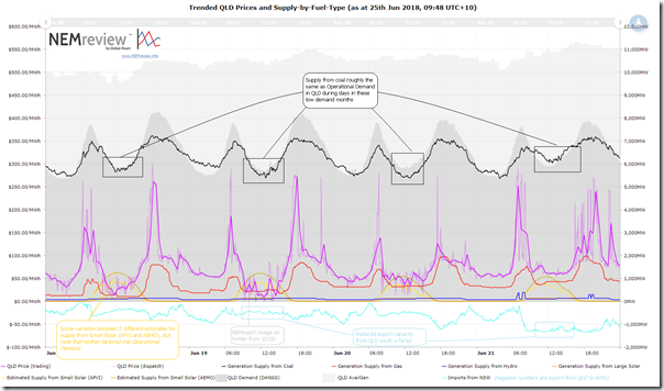
For those who want to understand more of my thinking, I’ve included some here. Using NEMreview v7 and deliberately expanding the date selection out to include 4 days over last week (Monday 18th June to Thursday 21st June) we have the following annotated image (click image for a larger resolution image to read):
Remembering the inherent over-simplification that occurs almost always in the NEM when attributing any outcome to a single action or change, I’ve flagged a number of things that were visible at the time, and summarised in the chart above:
(C1) Demand shape
Since the NEM started, demand during winter months has been typically shaped like a 2-hump camel – lesser morning peak, and then higher evening peak.
1) Across the NEM (but in Queensland in particular), demand for use of air-conditioning (either in heating or cooling) is reduced during the middle of days like that were experienced last week compared with demand for for climate control in the mornings and evenings.
2) This underlying demand shape has historically lent itself to evening price spikes during winter.If we’re thinking about “Operational Demand” (see *) , the shape (which has been with us for 20+ years) is being accentuated in more recent times by the advent of small-scale solar which acts below the visibility of the AEMO to reduce – sometimes called the “duck curve”, or in Australia a localised “emu curve” moniker.
.
(C2) Generation from coal
As seen in the chart, the aggregate generation from coal-fired power stations the demand shape shown on the diagram (the demand shown is AEMO’s “Demand and Non-Scheduled Generation”, which is close to what they refer to as “Operational Demand”).
It’s been noted before the effect that the QLD Government’s “don’t make too much money, we’re copping political heat” directive to the GOCs has had on increasing volume available at lower prices than would have otherwise been the case in prior years. We’ve not had time to check this particular week in June against prior weeks in June from 2016 and before, so wonder about the extent to which this would be a factor in the above.
.
(C3) Export limitations
Last week (including on the 19th) the flow south from QLD into NSW was constrained down from what it will normally be, meaning less capacity to “spill” surplus power into NSW – an eyeball check of the flows on the trend chart above compared with Thursday 21st shows exports were approximately 700MW lower on Tuesday.
This is the point made on Twitter in response to my tweet last week.
My perspective was not so much what was happening last week – but (as noted in the tweet) what it suggested might be the case in future. In other words – if the “market” for generation from QLD reduced by only 700MW in the middle of the day, we see spot prices drop to levels below the short-run marginal cost of generation for the coal fleet in Queensland based on volumes and price bands offered last week. Clearly this would not be sustainable over a long time period.
.
(C4) The looming solar factor
On the chart I have included three lines for solar:
1. Two different estimates are included for illustrative purposes for small-scale solar (from APVI and AEMO – each from different methods, with the difference in the numbers illustrating the challenge in their opacity). Readers should not misconstrue that this supply was having the effect of meeting the “Operational Demand” shown in the chart (as this supply acts to net off the “Operational Demand” visible to the AEMO). It has been included to illustrate scale – both in terms of:
(a) how much the Operational Demand was lower last week by virtue of the solar production last week; and
(b) also to get readers thinking about what increases in this output would also do – given the ongoing rate of installation of rooftop PV in Queensland.2. I’ve also included a trend for existing Large Solar in QLD that is contributing data – which peaks at about 130MW on the 19th.
The point I tried to make via social media was that 130MW is only the start, and there’s a huge influx such that, in a year’s time, there will be magnitude large contribution.
Unfortunately I could have been clearer in my explanation last week (so hopefully this post will help those who follow through). If mid-day prices in QLD dropped below coal gen SRMC with 700MW of export capacity out of service (comparing Tuesday and Thursday), it’s easy to see how (assuming the coal generators bid the same way) the price in winter next year, or even perhaps by September 2018, will be bouncing just around zero much more commonly during non-summer, sunny days.
This will pose challenges to the government-owned operators of the existing coal fleet, for sure – but it will also pose challenges to any wholesale-exposed generators in future, including the number of solar farms that we’re finding (in the compilation of the Generator Catalog) are being constructed and commissioned with a share of merchant exposure.
Welcome to the “Solar Correlation Penalty”.
W.
(D) Analysis using trended volume-weighted prices (referencing the ERM solar shapes)
On Wednesday 13th June, guest author Dave Guiver provided this article about two new hedge options created by ERM Power as one option to help people hedge around a typical shape of solar production.
Dave’s article highlighted an opportunity to use those shapes (which vary month-to-month over the year) and provide for a yin-and-yang comparison of “Solar” and “No Solar” volume-weighted average prices, in order to be a bit more systematic in understanding the degree of influence that this has had to date. Generously ERM has provided me with the details of the shapes, and I have some analysis partially complete.
I’ll post the results of this analysis on WattClarity when it’s ready to go…


Paul, is there experience in other jurisdictions with prices going negative, or is it happening in Oz for the first time round the world?
My crystal ball has a blurry image for about 2020 where the price bounces around at a much lower level than now, especially when the interconnectors are in heavy use and the renewable generation is high. I do hope that the crystal ball the investors pouring into the Oz market have, shows a different and sharper image.
Let’s always entertain that there is a bust around about with every boom and to plan for that too, whether it be Dutch tulips, mining construction or renewables.
Your prognosis is valuable to the industry as well as to your own business. Thanks for sharing.
So does this mean that there will be a inverse effect on the value of dispatchable storage capacity as the opportunity value of zero/sub zero PV energy represents an even greater earning potential for storage projects such as Kidston?