Back on 6th January, I posted this early analysis of prior peaks in NEM-Wide demand to assist those keen competition entrants who were trying to use a little science to place their entry into our “Best Demand Forecaster in the NEM” competition.
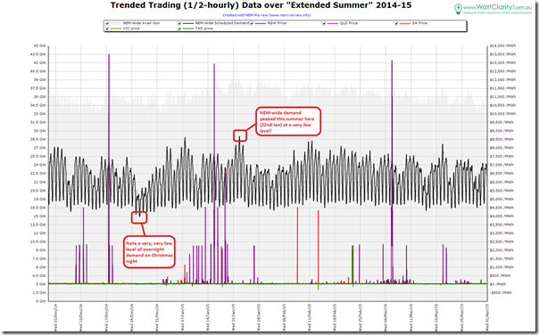
This summer we used an extended definition of summer to include the whole of Q1 – meaning a 4-month long period of “Extended Summer” for the purposes of the competition. Seeing as we’ve just ticked over into April, we powered up NEM-Review to take a quick skim through what happened to NEM-wide demand over this 4-month period.
For keen observers of what’s going on in the NEM, these results are truly staggering…
1) What was the actual peak this summer?
Now, having run NEM-Watch in our office for situational awareness over the course of this summer period, I had already been aware that this was a low-demand summer (the colour-coding makes this easy, especially when coupled with these usage tips). Indeed, I even had the suspicion that the demand had struggled to break even the 30,000MW mark.
However it was not until crunching the numbers that I realised how startling this summer was… this summer the demand could just scrape up to 29,134MW as a peak. There was only the one day where the demand peered above 29,000MW.
A few initial impressions of this amazingly low peak:
(a) The peak this occurred at 15:55 on Thursday 22nd January, a day so unremarkable that (it seems) we did not see anything worthy of a post on that day. We did, however, post these comments the day before, noting higher demand forecast for Victoria.
(b) The low peak is more than 4,000MW lower than the peak achieved just 12 months previously – and more than 6,300MW lower than what might stand as an all-time record for a long, long time – perhaps for all-time? (back from summer 2008-09);
(c) This peak is more than 1,000MW below what was the previous lowest peak on record over the past 10 years – what we thought was a very low level of 30,218MW back in summer 2011-12 (prior to that time Tasmania was not part of the NEM, so NEM-wide comparisons are not apples to apples).
2) What did our entrants think it would be?
As a company, we’re now in our 16th year of operations – and our long-running competition has become a much anticipated chance to test the skills of a cross-section of industry participants, spectators and commentators (though we do deliberately limit the pool of entrants by accepting entries only in the quiet weeks of Christmas and New Year).
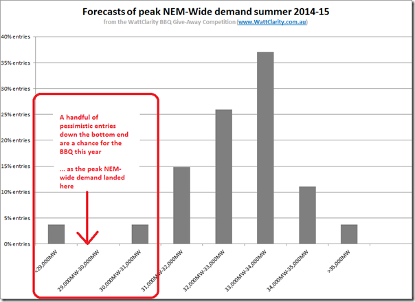
Because of the calibre of the people who enter, we take a keen interest in analysing the distribution of entries for this competition. For the past couple years we have limited entries to one-per-person for this grand prize, so the results presented below (we believe) are a reasonable proxy for where knowledgeable people in the industry do expect demand to peak over a given summer period.
Wow, were most people this summer disappointed!
SO WHO WINS THE GRAND PRIZE THIS SUMMER?
One person who won’t be upset that most of the other entrants were well off the money is the person who’ll be enjoying the new BBQ prize this year. Click through here for more information.
It’s always easier, in hindsight, to rationalise why such a big proportion of our entrants missed the boat on getting anywhere near what the peak demand ended up being.
In our tips published on 6th January, for instance (just before the competition closed), we did show (last chart on the page) that the incidence of demand above 30,000MW had been declining over recent summers.
The first point to keep in mind, however, is that there’s a massive 4,000MW reduction between the peak demand this year and what we saw just 12 months ago. Seen in this light, some might conclude that most of the difference seen over that period come back to weather-related differences.
3) Let’s look into further details…
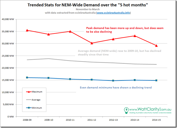
For the following analysis, we’ve added November into the scope of the analysis in order to provide a view of what’s happened over the 5-month period when hot weather has been experienced. Given the extreme demand experienced in summer 2008-09, we’ve started there and looked at 7 successive periods.
Firstly, we include a trend of the basic stats:
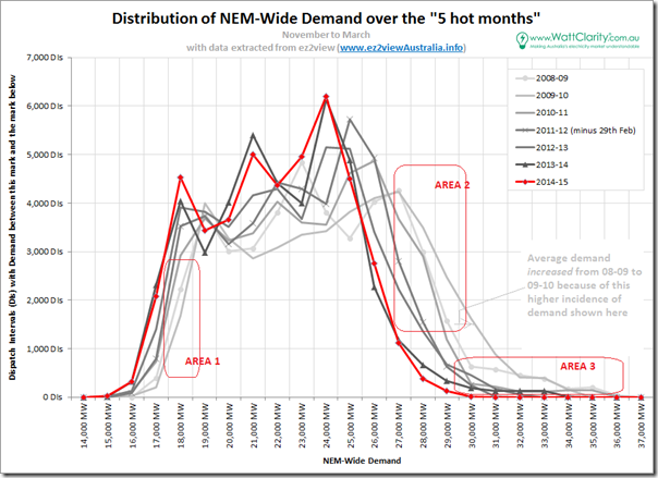
Delving into more detail, we’ve extracted the relevant data and produced the following distribution chart, looking at the 5-minute dispatch intervals:
When results are presented in this way, a number of specific changes are very evident.
3a) Overnight demand is dropping (AREA 1)
Demand instances down this bottom end of the curve are the ones that occur in the depths of the night. We see that demand is dropping off at this level – also shown above in a decline in minimum demand of over 1,000MW over this 7-year period.
Keeping in mind that these are for the hot months, and that the sun is obviously not shining, it’s reasonable to conclude that this this is not due to heating, and that it’s also not to do with solar operating behind the meter.
Instead,the closures of large industrial facilities (Kurri Kurri and Point Henry aluminium smelters being two obvious ones) have played a role in this – as will have greater use of energy efficiency in its multitude of forms:
1. at work (e.g. the now-cancelled EEO scheme);
2. out in the community (e.g. street lighting retrofit to LED) and
3. at home (e.g. perhaps more efficient appliances, with lower power draw on standby?)3b) Instances of demand above 25,000MW are dropping (AREA 2)
There’s certainly a pronounced reduction in demand instances above approximately 25,000MW (which would typically be in the peak time periods). In the first chart, this is also seen in the (>2,000MW) reduction in average demand observed.
Again, these reductions will be due to a number of factors including the following:
1. This is where we see solar PV playing an increasing role – and that’s the reason why we have been so keen to add in a view of solar into NEM-Watch v10 (for both small-scale and large-scale). It’s early days for us with solar data, but our recent analysis showed a peak solar output of approximately 1,700MW across a 7-week period.
2. Layered on top of this, we hypothesise that wider use of insulation has reduced air-conditioning load during these “hot month” afternoons and evenings.
3. More broadly, we wonder about the extent to which this change is due to commercial responses to higher electricity prices, at work and at home?
4. There are undoubtedly other factors, as well.3c) Extreme peaks come and go (AREA 3)
Distinct from AREA 2 is the extreme right of the chart (marked as AREA 3).
Here we see that the instances of demand above 30,000MW has dropped significantly from the high point in 2009-10 (the year after a record maximum was set) to the point where not a single dispatch interval was seen in summer 2014-15 above 30,000MW.
This are of the curve is where peaking generation capacity is required, along with a significant amount of network capacity that is required for only those few days each year (or not at all this summer!) when the demand peaks.
3d) Is the peak demand problem getting worse?
It might seem counterintuitive, for some, to post such a question at the end of a summer when demand barely raised a whimper.
However I would leave you with the following chart that revisits the distribution above, but is cumulative, and looks just at the pointy end of the demand curve.
Keep in mind that 500 Dispatch Intervals equates to just over 40 hours – so less than 2 days of cumulative incidence.
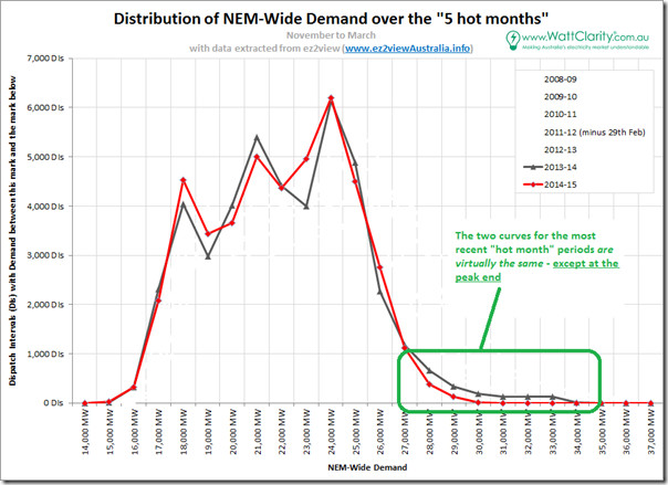
In the first distribution curve (repeated below for just the past 2 years) we see how the 2 distributions are very close to identical, in practical terms – except at this peak end.
Herein lies a big problem – and, it seems, all the initiatives noted above (solar PV, efficiency, closure of industrial facilities, usage reductions in response to higher average costs, etc…) don’t really help with this one.
See how the curves overlay each other. Summer 2013-14 and summer 2014-15 were virtually indistinguishable – with the exception of levels of peak experienced, which saw demand in the prior year peak more than 4,000MW higher than the summer that followed.
This is a very expensive challenge – to have generation and network infrastructure sitting around waiting for those few peak days that might occur one year, but not at all the next!
We’ve posted before about examples of demand response in the National Electricity Market.
There are already existing mechanisms for demand response in the energy market that can assist with respect to spot prices (and, in any case, surplus capacity in the generation sector represents a privatised loss as opposed to a socialised cost).
In the network sector, on the other hand, there does not currently exist any systematic, NEM-wide method whereby demand response can play a role to assist in moderating the cost impact of capacity built to meet these extreme peaks.
More on that one later…
Over the month of April, as time permits, we’ll also publish analysis about the other 6 competitions we ran in parallel this summer – so stay tuned to find out what happened to demand in each region, and to wind production across the NEM (and, as a result, to who the other winners are)….



Leave a comment