Following this analysis last week for EnergyAustralia, we received a number of questions – one of which being the question about what the same analysis would show for the larger AGL Energy (complete with the current acquisition* of Macquarie Generation).
* For a new update on the structure of the generation, transmission and distribution sectors of the industry – in the east and the west see the 2014 Issue “Power Supply Schematic” to be released shortly.
Given the current acquisition, and the political landscape (with much lobbying about the RET Review from all corners), we understand that this is fairly topical. Hence we powered up NEM-Review to generate some more analysis.
Portfolio production and revenue trends
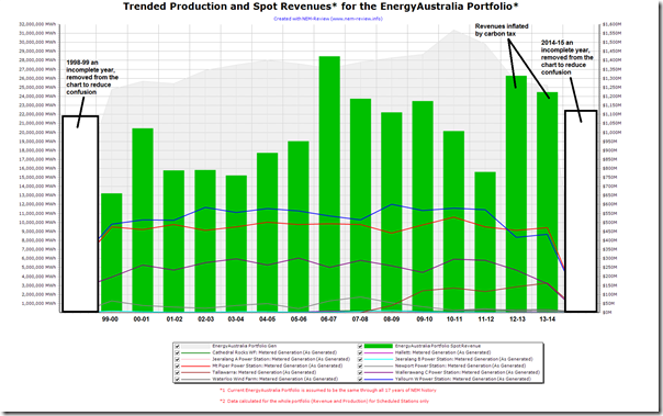
Last week I looked at trended (spot) revenues and production volumes for the current EnergyAustralia portfolio – assuming that the current structure had been the same through the entire history of the NEM. It showed production volumes peaking at just over 31,000GWh in 2010-11 and spot revenues peaking at just over $1.4b in 2006-07 with the drought.
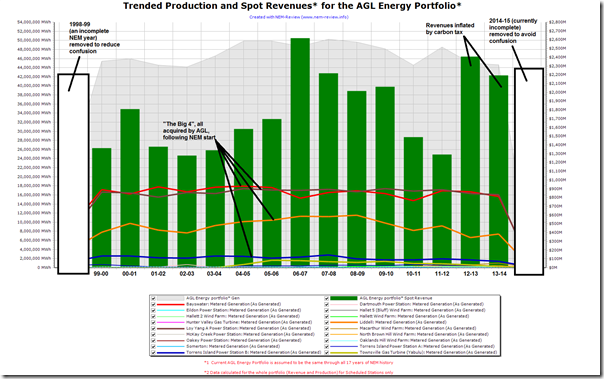
The following is the equivalent chart for AGL:
Note that this new AGL portfolio (in production volume terms) is 170% as large as the EnergyAustralia portfolio when judged on the same hypothetical basis. Spot revenues are also correspondingly larger.
For ease of comparison, here’s the EnergyAustralia one again:
In comparing the two charts, one thing that jumps out is that the production volumes shown are more even for AGL, whereas there is a marked peak in production volumes for EA in the 2010-11 financial year. We’ve not dug into the numbers to assess why this was the case.
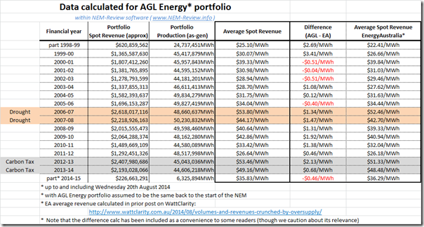
We also prepared the same table of average spot price by financial year below:
Because we know that some of our readers might otherwise do it themselves, we have included a comparison of the average spot revenues looking backwards – however we’d caution that there’s little practical value in doing so (for a number of reasons, including the fact that such comparison takes not account of different cost structures).
What it does show is that the two portfolios are fairly closely matched, with AGL “winning” more years than losing – though there are a whole host of reasons why this might be the case.
Perhaps the main conclusion, however, is that the AGL portfolio faces much the same pressures as EnergyAustralia – with competitive pressures through the history of the NEM restricting revenues for most years.
Many eyes will now be on the future performance of the larger portfolio – including whether the “free” Liddell station is closed in a couple years as mooted in the scenario if Tomago smelter were also to close.
Changing mix of fuel source in portfolio
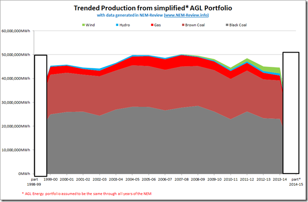
With some commentators proclaiming the “fading to black” of AGL Energy (perhaps to a Jagger and Richards riff) we thought it would be of interest to also include the following chart trending stacked production volumes – again for the hypothetical AGL portfolio backwards in time:
With all of AGL’s four largest plant, in volume terms (shown in the first chart), being coal (3) and gas (1) it reinforces how it’s literally impossible in the NEM (due to the predominance of coal and gas in existing assets) for an energy company to grow to a reasonable size (in percentage terms) without also dabbling in coal and gas.
{note in the above that Wattle Point Wind Farm is excluded, as I sorted by “Bidder” in NEM-Review (excludes Non-Scheduled plant) and not “Trader”}
Food for thought ….


Leave a comment