The never-ending-story that is the ‘Energy Wars’ keeps writing its own new chapters, and this past week we saw the latest updates with the release of the ‘Technology Investment Roadmap Discussion Paper’ by the federal government energy-focused public servants, back in the Department of Industry, Science, Energy and Resources after the latest round of departmental reshuffles.
Interested parties have until 21st June 2020 to make a submission on that one.
So it was in the context of this external stimulus (and the expected responses to it in mainstream media and on social media) that I found what happened yesterday in Queensland to be of some interest.
(A) A blast of southern weather
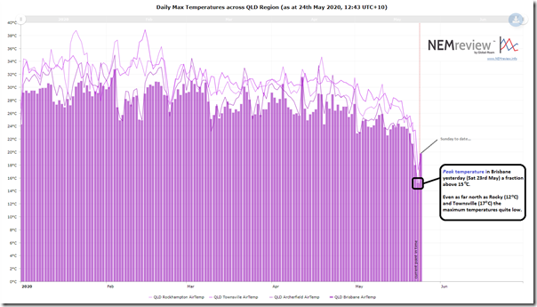
In the ‘work from home’ environment that’s been with us for a couple months now, we’ve been fairly blessed with a gentle decline towards winter in Brisbane:
As noted in the trend above created in NEMreview v7 (clients can access the query here) that ‘gentle decline’ accelerated sharply yesterday with a blast from the south contributing to a drop in temperature meaning Brisbane just managed to nudge above 15°C as the maximum for the day. Even as far north as Townsville the temperature range for the day was not much better, as shown – and Rocky was colder than Brisbane.
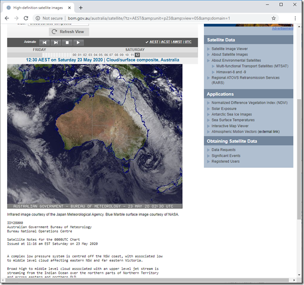
Here’s what the weather pattern looked like in a snapshot I took from the BOM website around the middle of the day on Saturday:
The widespread bank of cloud stretching all the way up the Queensland coast is clearly visible.
(B) Effect this had on electricity supply and demand in the Queensland region
What happened yesterday was just one more reminder of what we explored in Theme 6 within Part 2 of the 180-page analytical component within the Generator Report Card 2018 – namely, that the NEM is becoming increasingly dependent on the weather:
So it was with a bit of interest today that I’ve delved a little deeper to take a look at what happened on the day.
(B1) Effect on the supply side:
We’ll start with the supply side, on this occasion (though as noted in the GRC2018 I’m very cognisant that the demand side of the equation is the underlying reason why the supply side exists in the first place).
(B1a) Supply from Large-Scale Solar
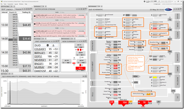
Early Saturday afternoon, I noted here how output at most of the Large Solar stations across Queensland had been hammered by the cloud cover stretching across a large area of the state:
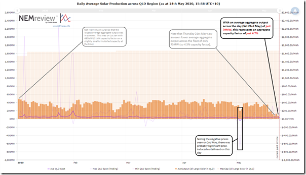
Of the 24 different solar plant highlighted in the snapshot above from the 14:00 dispatch interval using the recently updated ‘QLD Schematic’ widget in ez2view, it’s only really 3 plant (Barcaldine, Longreach, and Darling Downs) that seem largely unaffected by the clouds cover. Curious what that meant across the day I prepared this query in NEMreview v7 to produce this trend:
A few interesting points to note on the chart:
Observation #1) Averaged across the 24 hours in the day yesterday, average aggregate output across all of the Large Solar plant in QLD was a very meagre 79MW only:
1a) Dividing this by an aggregate 1,664MW installed capacity* across the Large Solar plant in QLD this represents a capacity factor the day of just 4.7%
* to be pedantic, readers should note that this capacity number:
i. does not include the contribution of plant like Warwick Solar Farm (a UQ project) which is in pre-production currently, so added to the latest ‘QLD Schematic’ widget shown above, but has no data yet in Production (for output or capacity)
ii. it does, however, include capacity for plant that are currently producing some output but, due to commissioning, not yet at full output levels.
1b) Compared to the day of the highest aggregate output across the year (which just happened to be 1st January) this represents just 16% of the peak daily output YTD.
i. Whilst some of this will be due to the lower yield with winter sun, most of it will have been due to the widespread cloud cover.
ii. Worth noting, as well, that the peak yield on 1st January came on a smaller installed-and-registered capacity base.
Observation #2) Also noted is that two days prior (Thursday 21st May) saw aggregate production from the fleet across Queensland sum to an even lower level. Particularly startling was that there had been 6 days in a row with poor aggregate yield across the Queensland solar fleet.
Observation #3) Compare this to 1st January, which saw a daily aggregate capacity factor peak up at 31.6% for the day. That’s a large difference!
Observation #4) Also notable was the situation on 2nd May, where the negative prices are sure to have triggered some plant being dispatched down on bid price – hence dropping aggregate output for the day compared to days either side.
(B1b) Supply from Small-Scale Solar
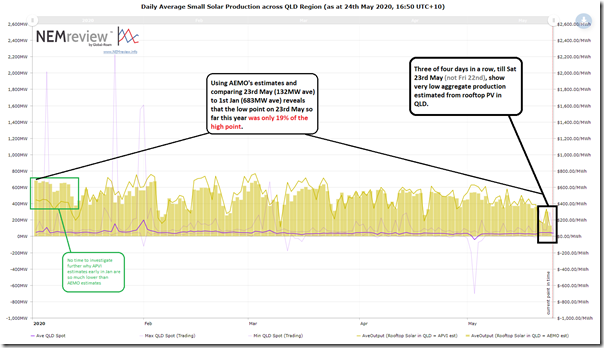
Remembering that they are estimates only (and that there are ongoing challenges with the opacity of small-scale PV) I thought it would be of quick interest to see if aggregate production from rooftop PV systems was similarly smashed yesterday:
The above was produced with this query from NEMreview v7. As noted on the chart:
Observation #5) Based particularly on the AEMO estimates, it was 3 days of the past 4 days (Wed 20th, Thu 21st and Sat 23rd) which saw extremely low levels of rooftop solar production estimated right across Queensland:
5a) That’s not so much of a surprise given how population density – hence people deploying rooftop PV – tends to hug the QLD coastline, hence corresponding to the cloud patterns above;
5b) Notably Fri 22nd was not at such an extreme low, though still perhaps still below average across the year to date.
5c) At another time, I’d like to be understanding why it’s only 4 days consecutively here as distinct from the 6-day run seen for Large Solar above.
Observation #6) A low-to-high ratio of 19% is seen here (compared to 16% for Large Solar noted above).
(B1c) Performance of my own rooftop solar power station
In some prior occasions here on WattClarity we’ve explored a number of personal experiences with distributed energy resources. With reference to my valued data feed from Solar Analytics, I’ve quickly pulled out the following two charts that help to confirm that the level
As noted here, we see output breaking above 1kW (i.e. only one-fifth of the rated capacity) only twice through the day. Almost flatlining!
Here’s the trend of daily production over time, which tends to corroborate the main conclusions about the estimated aggregate production from rooftop PV systems across Queensland (i.e. observation 5).
(B1d) A useful reference case in the designing of sufficient storage, or other dispatchable plant
The low levels of solar production in Queensland did not matter so much over the past 4-6 days given the current early stages of the energy transition.
However it’s clearly a useful reference case to be thinking through in terms of designing sufficient contingency in a variety of forms (such as wind production capacity, dispatchable plant in various forms (incl storage), and interconnection capability). These real world examples are useful in thinking through the constraints and implications of a simplistic ‘diversity will solve it all’ mindset as the scale of solar production capability is further accelerated across the NEM in the coming years and decades.
(B2) Effect on the demand side:
Let’s flip to look at the side of the energy users.
The weather pattern experienced yesterday not only covered much of populated Queensland with cloud (hence taking a big bite out of solar production – small and large) they also plunged temperatures quite low (at least for us Queenslanders!). It was no surprise with the temperatures we were feeling yesterday to hear our neighbours reverse-cycle ducted air-conditioning system cranked to the max even around the middle of the day. I wondered what the overall pattern was for electricity consumption in Queensland – so I took a quick look.
Those newer readers at WattClarity might like to first review this explanation of why measuring electricity consumption is not as easy as it might initially seem – and why there are several different measures of demand are used at different points in time.
(B2a) Aggregate daily Underlying Demand
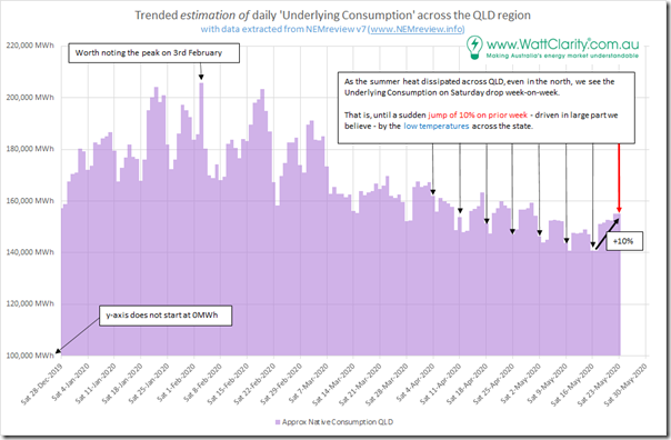
Using the same logic used here to establish an approximation of ‘Underlying Consumption’ (i.e. electricity consumed in the NEM whether supplied by larger power stations seen by the AEMO or from rooftop PV) we see the following trend for aggregate daily consumption in QLD since the start of the year:
Observation #7) We see here that Underlying Consumption on Saturday 23rd May was almost exactly the same as the prior day, a working day.
7a) It was also a significant amount (10%) higher than the level of Underlying Consumption seen in the previous Saturday period.
7b) This jump of 10% had occurred suddenly, after we see a fairly steady progressive decline of underlying consumption.
It’s reasonably to point out that some of the reduction in consumption might have been due to restrictions on activity in response to COVID-19, in the same way that the rise on Saturday was .
i. However my most recent review of the evidence suggests that any actual decline in the NEM is much less significant than it was initially feared to be.
ii. It’s far more likely that the cold snap was the most significant factor leading to the rise in consumption.
Observation #8) Also noteworthy on the chart is the peak in daily aggregate consumption on Monday 3rd February, which was discussed at the end of that day here.
(B2b) Aggregate daily Operational Demand (or ‘Grid Demand’)
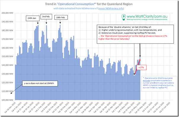
Given that ‘Underlying Consumption’ is met in part by local supplies from rooftop PV, and that the supply from rooftop PV was also affected by recent weather patterns in this ‘double whammy’, it seems reasonable to expect that the pattern for Operational Consumption (or ‘Grid Consumption’) might be even more marked than the above:
Observation #9) As expected we see that the ‘double-whammy’ drives Operational Consumption in the Queensland grid a massive 17% higher on Saturday 23rd May 2020 compared to the prior Saturday:
9a) We know from the above that 10% of this uplift was because of the quite cold weather driving space heating requirements; whilst
9b) The remaining amount was due to low harvest from rooftop PV, meaning more of this consumption needed to be supplied from larger generators on the grid.
9c) Not counted in this percentage is the fact that Large Scale Solar was also seriously affected by the same cloud patterns – which will have meant that supply from other sources will have to have picked up the slack:
i. This will have included a bit of wind (there are only two farms currently in QLD), but it will mainly have been more production from coal and gas generation (moderated by a possible change in export/import from NSW).
ii. I have not had time to drill in further…
———–
That’s all I have time for today…





On the positive side of things, at least wind powered generator output from the two wind farms in QLD was at the higher end of their possible output. This really shows why QLD needs much more in the way of wind farms. Yes there are some big ones under construction, but QLD needs many times what is currently under construction.