… because the evidence currently suggests that this is just not the case.
NOTE = I fully accept that I might be incorrect on this general conclusion. If you believe I am incorrect, I would greatly (and genuinely) appreciate you helping me understand where I have made a mistake in the data discussed below?
This article follows from my first (on 24th March) and my second (on 31st March), and my sense is that it probably won’t be the last. Three weeks ago my first article was prompted by a broader concern about ways in which COVID might impact the energy sector. However I was also interested to see how much electricity consumption might drop due to COVID responses, based on concerning reports from overseas markets.
However I’d already started to tire of that line of questioning, because it just does not seem to be occurring in the NEM….
(A) About (what I have seen of) the Reputex Report
What’s directly prompted this article was a what passes for a flurry of media coverage in the Australian energy sector about a modelling report published by consulting firm Reputex. Yesterday, the company released a promotional article with a suitably provocative title ‘COVID-19 pandemic creates a ‘perfect storm’ for forecast wholesale electricity prices’ yesterday.
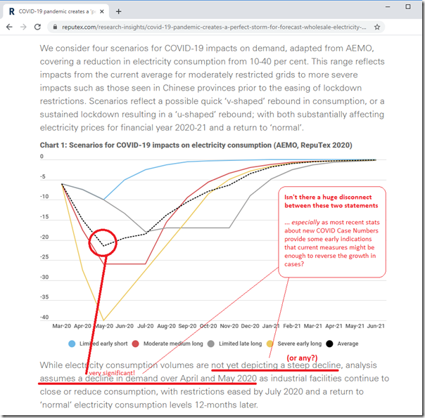
What’s particularly alarming is that the Reputex article contains this startling graphic:
I need to state, up front, that I have not read the Reputex report itself (it’s for sale, and my interest does not extend that far), so can’t comment on anything other than what’s linked here in this article. It’s also worth noting that Reputex make this statement in their article (with my emphasis added):
Based on current data in both Australia and other grids, we anticipate a relatively sharp but temporary reduction in electricity demand across the NEM.
…. because I do wonder what data they have been looking at?
PS1 = 22:20 on Thu 16th April 2020
Thankfully, Reputex have quickly pointed me at the 6th April meeting of AEMO’s Forecasting Reference Group (FRG) focused on ‘Minimum Demand’, and in particular Presentation number 2 in the ZIP, which you can review yourself here.So it seems that it’s AEMO that’s the source of the alarming reduction in demand forecasts.
My first reading of this (it’s late, and I might be wrong) is that there are some key points worth highlighting:
1) AEMO includes a scenario being “base scenario – no reduction” which does not seem to have made its way into the Reputex modelling.
2) AEMO notes, based on international experience “Generally increasing impact (in percentage) on demand week by week (so far).” which seems to be the logic that flows through to higher reductions in future, even if not much is seen now.
3) In terms of reductions today, AEMO numbers (have not cross-checked against mine above) are comparing recent weeks in 2020 against same weeks in 2019 (but not sure what is considered about what seems to be a reduction 2019-2020 across most weeks as noted below?)
On page 16 in AEMO’s slide deck, there is a ‘conceptual scenario’ that shows a reduction of -40% on demand in May, but it’s not clear the extent of the international basis for this (p13 is a bit vague – or I am slow – but perhaps might suggest demand was down in Guandong province for 2 weeks compared to prior year just after the cancelled Chinese New Year). .
Am trying to find out more from AEMO…
(A1) Media coverage
This morning I noted that the Reputex article was then covered elsewhere in the three of the main media sources. There may have been more – I have not checked:
(i) In the Australian today, Perry Williams wrote about ‘Coronavirus lockdown slams electricity prices’ which leads with the alarming statement:
“Power demand in Australia’s national electricity market will fall by the most on record over April and May due to the COVID-19 shutdown, cutting electricity prices and rendering high-cost coal generators uneconomic, consultancy RepuTex said.”
Importantly I note in the Australian’s online article they have reproduced the curve above, but chosen to only show the ‘moderate’ (i.e. 25% drop) and ‘severe’ (i.e. 40% drop) scenarios. Not exactly sure why – though it certainly does make the article read more scarily!
(ii) In the AFR today, Mark Ludlow wrote about ‘’Bill shock’ coming despite lower power prices’ and references ‘lower demand’ as one of the inputs into the main point of the modelling results – that wholesale prices are expected to fall. The Reputex chart is also replicated in the AFR article online (in this case with all 5 scenarios shown – thankfully).
(iii) In RenewEconomy today, Giles Parkinson wrote about ‘Falling electricity prices could favour shift to “mega” wind and solar projects’. Giles quotes Bret Harper as follows:
“While electricity consumption volumes are not yet depicting a steep decline, we anticipate a relatively sharp but temporary reduction in electricity demand over the April and May shoulder, substantially affecting electricity prices for financial year 2020-21,” Harper says.
So with all of this coverage, it would seem entirely understandable that Mr Joe Public or Ms Josephine Businessperson could be walking around believing that there’s been a huge crunch already begun, and accelerating, in aggregate electricity consumption due to various* responses to COVID.
* Some responses mandated by governments, and some responses voluntary by individuals and organisations
…. however the current evidence in the NEM suggests that this is just not the case!
(A2) Why am I so concerned about this?
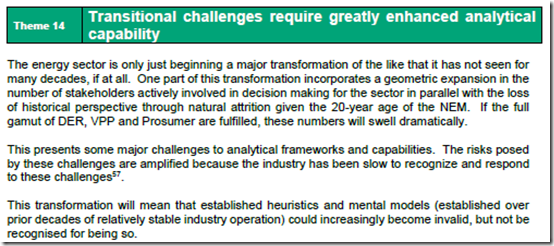
In the preparation of our mammoth Generator Report Card 2018 over many months in early 2019, we thought it was particularly important to highlight that our ‘transitional challenges require greatly enhanced analytical capability’:
For this reason we named it Theme 14 within part 2 of the 180-page analytical component within the GRC2018. This seems, to me, to be a great example of why we need to be better (and I do understand I am very much part of the “we” that needs to be better).
For instance, I have a concern about Mr Joe Public (or particularly Ms Josephine Businessperson) making decisions that they otherwise would not make, pre-emptively, on the basis of a mistaken belief that:
(i) doomsday is arriving with respect to aggregate underlying electricity consumption; and
(ii) that this due to COVID responses (which is scary enough in other ways).
I believe I am pretty safe in assuming that the vast majority of readers of WattClarity are energy sector insiders of one form or another, so you will understand when I write that we all need to be much better (collectively) about the conclusions we draw, and how we talk about these more broadly. Our sector faces huge challenges with the energy transition moving forwards – we really can’t afford to be making it more difficult for ourselves.
(A3) What I am NOT speaking about in this article.
There are many things I am not speaking about in this article – but I would just like to flag these four for now:
(i) Forecasts for electricity prices declining
I am not saying that I agree, or disagree, that electricity prices will decline over the next year or two. I have noted before that ‘forecasting is a mug’s game’ that we are not involved in, as a company.
There are certainly some factors (like a lower gas price) that will put downward pressure on electricity prices – though there are also the possibility of counteracting forces that might act to raise the price (e.g. possible closure of old thermal plant, and/or a slow-down in the development of renewables projects as discussed by Matthew Warren and many others).
(ii) Aggregate Consumption (however you measure it) growing or declining
As discussed below, by some measures electricity consumption has declined in recent times.
My point here is that it takes a load of mental gymnastics to look past the more ‘obvious’ causes of this and attribute it – mistakenly – to COVID response.
(iii) Instantaneous Demand (however you measure it) patterns changing
The data below all relates to aggregate consumption on a daily basis, NEM-wide. This should be the starting point to understanding any macro changes due to COVID (for which there does not appear to be anything significant at present).
This, however, does not speak to the fact that:
1. Patterns of demand might be differing in certain locations (e.g. CBD demand might be down, whilst demand in residential suburbs might be up);
2. Patterns of demand might be changing during the day (especially during the day whilst we might ordinarily be out enjoying the autumn weather).
3. and so on…
(iv) Significant other risks COVID poses to the electricity sector
In my first article I mentioned some of the different risks that the electricity sector is facing.
Whilst my reading of the data for the NEM has moderated my concern that it might crunch electricity demand, there are plenty of other things to be concerned about:
As just one example – electricity retailers are being encouraged to not disconnect customers who don’t pay, and yet incomes for many residential customers have declined at the same time as their (confined to home) electricity consumption looks set to rise.
Seems obvious to me that something does not add up here, and it’s going to mean that something ‘unexpected’ (but which we really should have foreseen) happens in the months ahead. Whilst there may be a number of stakeholders who won’t shed a tear for the pain this causes those Big Bad Retailing Three, we also need to think about the impact this will have on the numerous fledgling retailers that are in tier 3 and tier 4, for whom cash-flow will really be king?
Since 24th March I have not tried to list the growing number of concerns that occurs to me – but the list is growing. Seems to me that we should be focusing on real problems and not adding to the list by misinterpretation of some core market data…
(B) A refresher on measurement of electricity demand
Back in April 2018 I published this lengthy explainer about electricity demand, which (based on feedback) has helped many readers understand some of the gory details of how what seems to be such a simple concept is actually (under the hood) a whole load more complex than would initially seem. I won’t burden you by re-writing all of it, but would just highlight that there’s essentially three core measures of demand that we need to be aware of:
Note that the following descriptions are not 100% accurate – but near enough for the purposes of this article.
(i) Scheduled Demand
This was the original measure, and might be thought of as ‘pure market demand’ (in terms of it being the amount of consumption that the NEMDE dispatch process actually schedules generators to deliver). It’s fallen out of favour at AEMO more recently (for some understandable reasons) but is still quite useful.
(ii) Operational Demand
This is the measure that AEMO speaks about increasingly (e.g. when it reports about ‘record demand for the day’ etc…). It’s essentially a measure of all of the consumption that AEMO can easily actually see in real time (i.e. in simple terms it’s Scheduled Demand plus demand supplied by other Non-Scheduled generators that are outside of the market dispatch process but which the AEMO can ‘see’ in real time by virtue of having access to real time SCADA readings).
I understand why AEMO increasingly uses this measure, but it also has a number of drawbacks as well:
1. Relevant to this particular question, there is not a long-range history published by AEMO of their Operational Demand metric (instead I sometimes use ‘Demand and Non-Scheduled Generation’ as a reasonably accurate proxy for the longer-term trend of Operational Demand).
2. Additionally, it’s difficult to be sure it’s actually longitudinally consistent:
2a. Let’s say (for instance) that AEMO decided it needed a real time feed of SCADA data from Racecourse Sugar Mill – or the mills in northern NSW. It’s a sizeable plant and there is some precedence (data for Invicta, Pioneer and Rocky Point Mills are all ‘seen’ by AEMO in real time).
2b. Let’s say that AEMO adds in this data set to Operational Demand measure from 1st May 2020.
2c. I’m not aware of a process by which AEMO would proceed back through data previously published for Operational Consumption (i.e. to re-create what it would have been had Racecourse always been visible in the data). This discontinuity applies not just in terms of the data series, but also in terms of documentation written using the data feed (including important documents like the ESOO and the ISP etc…).
(iii) Layperson’s Demand (Native Demand, or Underlying Demand)
If there is some opacity in Operational Demand, the situation is much worse with what a layperson might think of as demand when trying to understand how much electricity is being used in total – no matter where it is being produced. For this includes sources of production that the AEMO can’t see in real time – with two big ones being:
1. Production from rooftop PV; and
2. Production from embedded generation onsite (e.g. cogeneration projects on industrial sites).
We know (from estimates that show that production from rooftop PV) that there is a growing gap between Underlying Demand and Operational Demand. That’s the source of much confusion – including perhaps in this case as well.
(C) What’s actually apparent in the data
So with the above in mind, let’s delve directly into the data:
(C1) Daily Aggregate Operational Electricity Consumption
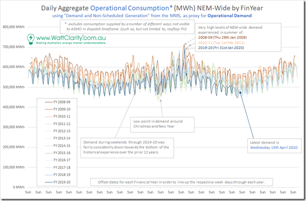
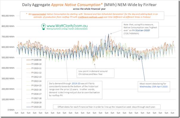
In my first article I utilised ‘Demand and Non-Scheduled Generation’ as a proxy for ‘Operational Demand’ in order to produce a volumetric measure of daily Consumption and compared patterns across 12 most recent financial years NEM-wide on an ‘equivalent day’ basis (i.e. matching up Sundays by slightly offsetting dates). This was produced using this query in NEMreview v7.
Here’s the updated trend showing the full year results, with data including consumption for yesterday (Wednesday 15th April):
Repeating the key observations:
Observation #1) There’s a significant seasonal variation (higher in summer/winter – and lower in spring/autumn, which includes now)
Observation #2) There’s also a significant and pronounced variation across the week
Observation #3) There’s some significant dips for Christmas, and Easter
Observation #4) Across the the twelve years there is a fairly consistent pattern of declining Operational Demand (which is due to a number of factors – but more recently particularly due to rooftop PV).
Observation #5) Across the entire year the past few weeks are not all that visible – so we zoom into a more granular view below:
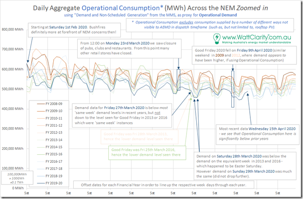
In this focused view, we can make some follow-on observations:
Observation #6) Around 5 weeks ago we see the blue trend (i.e. for FY 2019-20) separate more below the other years. However we also note that this started to happen before the Morrison Government announced the measures that saw pubs , clubs and restaurants close – and which heralded the start of (voluntary) retail closures as well.
Observation #7) We also see more clearly the ‘noise’ created in this period by the fact that the Easter weekend lands at a slightly different point of the calendar each year.
Observation #8) There is also a fair variability on a week-to-week basis for any particular colour of line. Readers will understand that some of this short-term variability will be due to weather patterns (particularly space heating and/or cooling requirements).
Observation #9) Perhaps someone taking this data out of context might see either (or both) of the following:
(a) the blue line does generally trend down through the period (i.e. out of summer and into autumn); and/or
(b) the colours do generally progress (for a given day) from higher consumption in 2008-09 to lower consumption in 2019-20.
… which might then be taken to (wrongly) conclude that COVID response was a major factor….
(C2) Daily Aggregate Underlying Electricity Consumption
… so I wondered how much clearer the data would be if I cobbled together a long-range data series reflecting underlying electricity consumption on a NEM-wide daily basis. This is more difficult than it might initially seem, because:
1) There are only estimates of rooftop PV production;
2) Which come from different sources that don’t always agree (as discussed before);
3) Which don’t span the entire 12-year time range; and
4) Which have a few holes in them.
Working with what data we have (i.e. AEMO estimates on a 30-minute basis in the past couple years, APVI estimates on a 5-minute basis before that for a few more years, and AEMO estimates for annual production in the earlier years we had to disassemble into rough daily figures) we have done that, and so re-present the top annual chart below:
Some follow-on observations:
Observation #10) Adding back the Operational Consumption ‘lost’ due to cannibalisation of Rooftop PV (or at least our estimates of it) moves the trends for the more recent years upwards relative to the earlier ones.
(a) However on most days Native Consumption for 2019-20 is towards the bottom of the range over the 12 years shown
(b) This reinforces the fact that it is more than rooftop PV that’s been contributing to declines in Operational Consumption.
Observation #11) As an interesting aside, we can see that Native Consumption earlier this year on Friday 31st January 2020 could be recognised as ‘highest ever’ by this measure. I’d surmised that at the end of that eventful day.
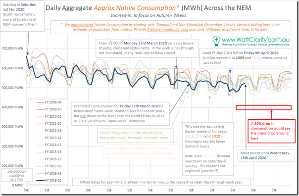
So we then zoom into the same date range and see the following:
Observation #12) My reading of the data here is that there is nothing emerging in the pattern to suggest that the aggregate underlying consumption might drop by:
(a) 10% (the ‘Limited early short’ scenario) or by
(b) 20% (highlighted on the chart, and the ‘Average’ scenario promoted by Reputex) or by
(c) an unbelievably massive 40% (the Reputex ‘Severe Early Long’ scenario – which they may well have named ‘Cataclysmic’).
(C3) Other interesting references
There’s been a plenitude of articles and comments written by a variety of people about what they are seeing in various parts of the world in relation to electricity demand. At some point (as noted previously) I might focus some attention to collate these references together as a general service to interested stakeholders – however my interest is waning in that as well as other priorities come along.
Today I thought it would be noting two particular references I have seen that are worth considering:
(i) Energy Networks Australia
Also earlier today I noticed that Hannah Farrow had provided a useful addition to the discussion in this article ‘Commercial down v residential up: COVID-19’s electricity impact’. This article was useful in breaking apart changing consumption patterns by different sectors of the economy, and by time of day as well.
That article also unfortunately contained the following sentence straight under the heading ‘National Impacts’:
“In March, there were clear reductions in operational demand in the National Electricity Market (NEM).”
… and whilst this is factually correct (it’s shown in the 2nd chart above) it is also, unfortunately, quite likely to be misconstrued by readers – being in an article titled ‘COVID-19’s electricity impact’ and without a clear disclaimer straight afterwards that the reductions in consumption through March happen every year as a result of seasonal variations.
(ii) Australian Energy Council
A week ago today Carol Tran at the Australian Energy Council published this article titled ‘NEM demand in the time of COVID-19’. This incidentally referenced my second article as one of the sources for stating that (with respect to perceptions of COVID effects):
‘These have tended to be rather equivocal: fairly small effects lost in the normal day to day fluctuations’
I might have been equivocal in that article about ‘well, maybe if you squint hard, you might see a COVID related change’, but I hope I have been more unequivocal here today that there is no compelling sign that it is changing!
The AEC article was useful in presenting their view of ‘Underlying Demand’ (which may not be 100% the same as mine, but should be fairly close) on a time-of-day basis by region.
Readers need to keep in mind that the AEC analysis only compares figures for March months (and over the past 4 years – though that’s not the main point). The main consideration is that, by just showing March, readers might conclude that the change in NSW underlying demand from March 2019 to March 2020 might be a result of a COVID-19 effect, whereas a full year comparison above shows that most months through 2019-20 exhibit lower consumption patterns than prior years (i.e. can’t be due to COVID-19).
I will be interested to see where the AEC takes this analysis in the coming weeks.
(iii) AEMO
Worth also noting that I have not seen anything in particular published by AEMO on their interpretation about what is happening to underlying electricity consumption as a result of responses to COVID. I did see this article ‘The global energy industry responds to COVID-19’ from 2 weeks ago that is useful in other ways.
If I have missed something, please let me know?
(C4) Estimated Daily Aggregate Production from Rooftop PV
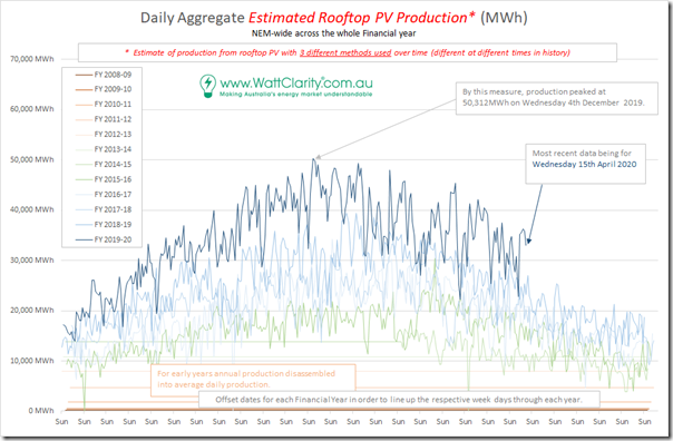
Just because I could easily do it, with the data so assembled for the above, I thought some readers would be interested in the following year-on-year and day-by-day comparison:
Three other observations
Observation #13) The early years (to early 2015, when our record of APVI data starts) the ‘trends’ are flat as we have just apportioned AEMO’s annual estimates across the days. The APVI data then swaps out for AEMO estimated time-series when that became available (May 2018). A bit of a mess, and another example of how our ‘transitional challenges require greatly enhanced analytical capability’.
Observation #14) Because these are rooftop systems they have no tracking (unlike the “Large Solar” systems registered with AEMO), so it can be understood that the seasonal variation is much more marked. However I suspect that this is compounded by the fact that their positioning has been dictated by the ‘however the roof faces’ factor. As such we see aggregate winter-day harvest being under half of summer-day harvest – which seems a pretty poor outcome.
Observation #15) Using this data it seems that the peak production day so far was Wednesday 4th December 2019 when the daily production was just over 50,000MWh (i.e. 50GWh) – which averages out at a consistent production of 2,080MW. One of our readers with an understanding of the latest CER data for capacity installed might translate that to a capacity factor for the day, please?
———————
That’s all I have time for today – I hope this has been useful.
… and (reiterating my note at the start) if you can see any mistakes in the above, don’t be shy in letting me know as we all need to keep improving!


Paul, the media need stories and “nothing much has changed really” is not a story. Reputex know this and know that if they can give the media a story they will get some free advertising of their wares. Like you I’m not going to pay for the analysis, so I’ll take it with a huge pinch of salt because I can’t sense check it myself they way I do with publicly available analysis. Before you get too frustrated with this state of affairs, please bear in mind that today’s news is tomorrow’s chip wrapper (if only metaphorically these days with most of us reading online).
Your note in passing that 31 January was probably an underlying demand record for the NEM is worthy of more analysis if you ever have the time and inclination. In any case thanks for another interesting piece.
Presumably the report prompted the same flurry to get some newsworthy comment from any sundry experts about islanded WA here-
https://www.msn.com/en-au/news/australia/falling-power-use-due-to-coronavirus-risks-system-overload-and-blackouts-experts-warn/ar-BB12NV6b
Dooming sells it seems but I note the negative correlation between MSM articles on global warming and coastal/esplanade RE prices so there does seem to be some considerable immunity among our movers and shakers. But with Covid19 and relevance deprivation syndrome for all other messages I guess you have to try a lot harder to rise above the milieu of bad news just at present.