There’s been plenty of news and commentary in the mainstream press on the tight supply-demand balance in the mainland NEM states this summer. With the South Australia system black in 2016, last summer’s load shedding in both SA and NSW, the retirement of Hazelwood, the SA Government’s Energy Plan (including the Neoen / Tesla battery and acquisition of 276 MW of “emergency” generation currently being commissioned on diesel fuel), AEMO’s recent ESOO outlook publication, actions to procure “demand-side response” or voluntary load reduction capability, and warnings of “Low Reserve” conditions in weekly market notices, it’s not surprising that there is a degree of anxiety about the potential for difficulties over the coming summer months.
This note looks briefly at what some of the NEM data are showing as we approach summer and temperatures are already starting to rise.
Prices
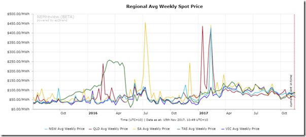
Starting with spot prices, a weekly trend chart since July 2015 produced from NEM-Review v7 shows that while spot prices remain well above historic levels for this time of year, there has actually been a modest downward trend since the end of last summer, and no marked volatility over that period.
But spot price averages are backward looking, so what about forward-looking price indicators? The most obvious to use are ASX-traded cap futures, since the price of these products embody the market’s expectations for price volatility – particularly for the extremely high spot prices that might accompany very tight supply-demand balance and certainly in the case of actual load shedding. Cap futures only accumulate value when half-hourly spot prices exceed $300/MWh.
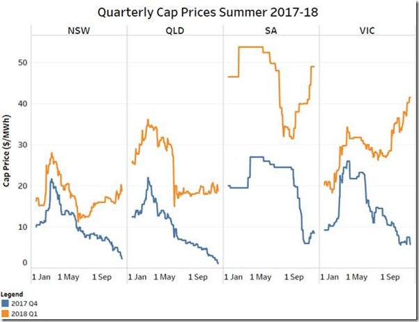
This price data is also sourced via NEM-Review from the underlying ASX feed, but I’ve charted the regions and summer quarters in a different format to more clearly differentiate the trends.
The first observation is that cap prices for the current quarter are now way below those for Q1 2018 – this is partly because we are already halfway through Q4 2017 and with no volatility to speak of, the realised value of Q4 caps is so far minimal, and there is less time remaining for any future volatility this year to feed into Q4 cap payouts. However even before Q4 started the price relativities showed substantially higher expectations of volatility in Q1 2018 than Q4 2017. This reflects the significantly higher proportion of Q1 during which peak system demands could be expected (from early January to early March in most regions), relative to Q4 when the period of highest potential demand does not generally start until late in November or early December.
Focusing on Q1 2018 cap prices, there is a clear pattern in all mainland regions of prices peaking early in the year – as events of Q1 2017 unfolded – then falling away until about August / September at which point a sharp return to upwards trend appears in SA and Vic and to a lesser extent in NSW. Notably the Q1 2018 Vic cap price is now double its level at the start of this year.
It’s also clear that the market is judging the risks of price volatility in Q1 next year to be significantly higher in SA and Victoria than in NSW or Queensland. This is consistent with supply-demand balance assessments such the AEMO ESOO pointing to higher risks in the southern mainland states. In fact it was probably the release of the ESOO in early September, with its focus on potential unserved energy, that also prompted the reversal in Q1 2018 cap price trends.
Finally, close observers of the charts may pick out a kick up in prices within the last few weeks – this might reflect increased focus on AEMO’s “Low Reserve” notices for the next few months, published in conjunction with its weekly “MT PASA” data.
System Reserve Levels and PASA
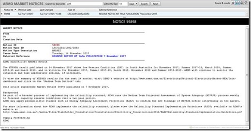
On any given Tuesday, AEMO publishes a market notice like this:
This notice highlights any periods and regions where AEMO’s Medium Term “PASA” process has identified shortfalls in system reserve levels (various measures of headroom between available supply and potential maximum demand) in any region over the period of the next two years.
Unlike the ESOO modelling and publication which comprise a detailed analysis of supply adequacy generally undertaken annually or semi-annually, “PASA” (Projected Assessment of System Adequacy) refers to a suite of capacity adequacy assessments run regularly at much higher frequency – every few hours for the Short Term (ST) PASA covering the next seven days, weekly for the Medium Term (MT) PASA covering the next two years. These assessments attempt to reflect changes in generation and network availability due to outages, real time demand and wind / solar generation forecasts in the case of ST PASA, and their outputs highlight periods where system reserves may not meet a range of reliability criteria (which vary depending on the time horizon of the assessment).
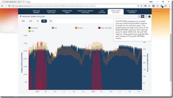
The market data portal on AEMO’s website provides a graphical viewer for some of the MT PASA data – shown here for South Australia:
However it isn’t explained on the AEMO portal exactly what this data represents, especially what a “Reserves Shortfall” means in practical terms, the basis of the demand “forecast” (often this is a “P10” demand maximum expected to occur only once in ten years and therefore well above a median expectation), and why the chart above shows some periods where demand appears to exceed supply but there is no matching reserve shortfall. (The answer may be to do with the complexities of “reserve sharing” between NEM regions.)
More generally, the details of AEMO’s PASA processes and accompanying data are very obscure and not at all well documented for casual observers. A bit of hunting through the AEMO website turns up a detailed process description with references to data models and some highly involved example calculations, but it’s still far from easy to understand.
Products like ez2view provide a much more granular and configurable set of tools for accessing and visualising PASA data than the AEMO data portal, but again the key issue is one of first understanding what that data mean. Absent this, it’s not surprising to see press reports of “impending blackouts” when the data may really mean that their likelihood is still relatively low.
Nevertheless I think we can broadly conclude that under extreme conditions the risk of supply shortfalls persists in the southern NEM states, reflected in these MT PASA reserve shortfalls, and from here what is probably most important to monitor are changes in the outlook being presented. As more elements of AEMO’s summer readiness program and Reserve and Emergency Response Trader (RERT) tender are finalised and revealed in coming weeks, we would expect to see further changes in the PASA outlook.
Plant Availability
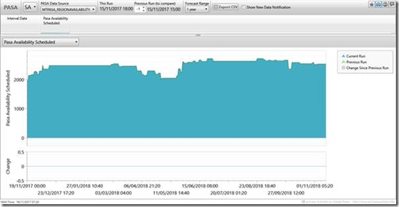
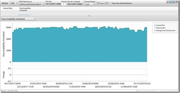
A key summer reliability driver and input to the PASA processes is the level of generation plant availability in each region. Registered NEM generators are required to maintain an updated view of their forecast availability for future periods extending out several years. Using ez2view’s PASA widget provides a view of the aggregate availability in each region. The views below for the next 12 months in South Australia and Victoria show that total available generation is not yet at the maximum level expected over summer, which partly explains why there are potential reserve shortfalls forecast later in November in the MT PASA results shown above – however remember that reserve shortfalls would only translate into risks to supply under extreme demand (weather) conditions.
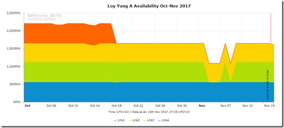
In Victoria particularly the market will be watching closely for the return to service of Loy Yang A Unit 1, which went offline with an equipment failure in mid-October and has not yet returned to service:
About our Guest Author
 |
Allan O’Neil has worked in Australia’s wholesale energy markets since their creation in the mid-1990’s, in trading, risk management, forecasting and analytical roles with major NEM electricity and gas retail and generation companies.
He is now an independent energy markets consultant, working with clients on projects across a spectrum of wholesale, retail, electricity and gas issues. You can view Allan’s LinkedIn profile here. Allan will be sporadically reviewing market events here on WattClarity Allan has also begun providing an on-site educational service covering how spot prices are set in the NEM, and other important aspects of the physical electricity market – further details here. |


Last summer was quite eventful in SA, but Oz lived up to its name as the lucky country when a very hot spell, culminating in a total wind power around only 50 MW at peak demand, fell on Christmas day rather than on a full working day:
https://climanrecon.wordpress.com/2016/12/30/christmas-2016-in-south-australia/