It’s been a busy week this week. Amongst other developments, I noticed this article on Wednesday in EcoGeneration titled “The Rise and Rise of Demand Response”. Being a keen supporter of (and facilitator of) Demand Response in the NEM since around 2002, with a growing number of energy users we support in this manner, I read the article with interest.
However I was surprised (and saddened) to see the unnamed author seeming to claim that there was only 1% of peak demand in the NEM in this comment:
“Demand response is on the radar. The Australia Institute says demand management will be worth $36 billion by 2025 and increase from 39GW to 144GW, and the International Energy Agency reckons a good benchmark for demand response is about 15% of peak demand. In Australia it is less than 1%.”
(A) Sloppy journalism
The way the article was written, it did not seem to do much for the credibility of the Australia Institute – with the article seeming to imply that the Australia Institute both:
1) Confused the broader sphere of “demand management” with the narrower sphere of “demand response” (a subset of demand management, as explained here); and
2) Seemed to claim that Demand Response (or Demand Management?) would rise from 39GW to 144GW in Australia (which floored me, given that the highest the demand has ever been in the NEM was only 35.5GW on Thursday 29th January 2009 – just before the “Black Saturday” disaster).
However with the benefit of a bit of time later, and digging, I tracked down this article here from Dan Cass at the Australia Institute of July 2017 that seems to show (on page 6) where the author/editor at EcoGeneration had (very sloppily) gained their perspective:
Hence it did seem that the major errors in the article came down to sloppiness on the part of the Editor/Author, rather than errors at the Australia Institute. Unfortunately it may well be their brand is tainted by association – I know I had a pretty poor first reaction, and suspect others will have as well….
(B) Tracing back the claim that Demand Response in the NEM is “less than 1% of peak demand”
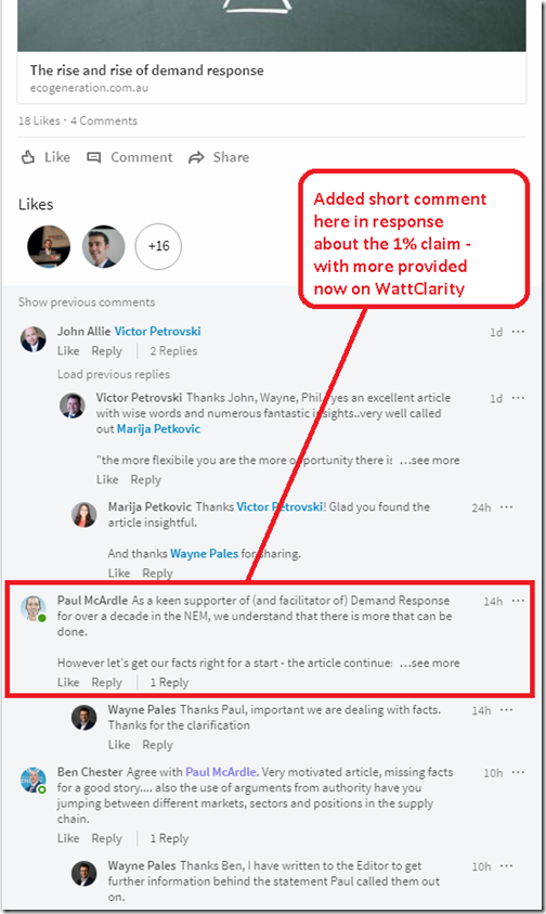
The 1% claim in the article as posted in EcoGeneration on Wednesday (paragraph copied verbatim above just with the 1% claim highlighted in red) stuck out like a sore thumb, because we know that it is just plainly wrong (and significantly so). So on Wednesday I added my comment to the LinkedIn feed (read the full text of the comments here, as they are worth the read):
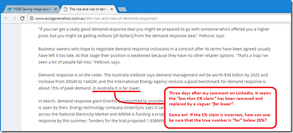
I notice that now (i.e. Saturday evening, when I finish this post) the 1% claim has been removed with the much vaguer “far lower” as copied here for posterity:
As I noted on the image, if the author/editor has retreated from a claim that the level of demand response is “less than 1%” of peak demand, how can they be so sure that the level of demand response in the NEM is “far lower” than the 15% the IEA suggests is a good benchmark? So I returned to the Australia Institute report from July 2017 that they appear to reference.
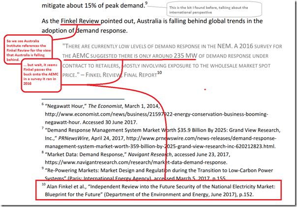
Below the quote referenced above is the following:
So it seems that EcoGeneration repeated comments that Australia Institute made, based on claims made in the Finkel Review referencing a “2016 Survey” run by the AEMC. Something seem a little strange in all of this to you?
At least we understand where a “less than 1%” metric comes from, then – if the AEMC apparently said that there was only 235MW reported in an (optional?) survey of (a sample of?) energy retailers, at least mathematically that represents less than 1% of peak demand in the NEM. However is it anywhere near an objective truth in the answer to the main question – how much demand response is there in the NEM?
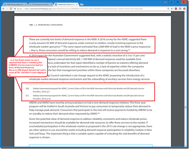
Given that I’d come this far, I pressed forward (thankful at least that the Australia Institute had references a particular page (i.e. p152) in the Finkel Review). Here it is, with the corresponding reference highlighted:
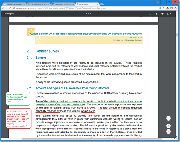
Again, thankfully, the Finkel Review references specific pages in the Oakley Greenwood report (which is belatedly copied here), so I dig further in this noddy game of “pass the parcel”. And, lo and behold, what do we find:
Well, it seems the “less than 1%” claim is based on very shaky ground indeed…
For only 5 retailers (of 30 or so) provided data on the users they had who had some incentive to provide demand reduction (i.e. one particular method of Demand Response) and reported a total of 235MW – i.e. this was a small sample set, and was only one form of demand response (a sample of a sample). We don’t know who these 5 were, and whether it included retailers we know of who are keenly pursuing Demand Response as one point of differentiation. However it seems to have made its way up the chain above to be represented as a gospel claim of “in Australia it is less than 1%”. Talk about sloppy!
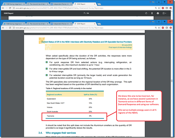
In the interests of clarity for the patient reader who’s made it this far, I should note that Lance Hoch of Oakley Greenwood posted this article on the dedicated Demand Response site we host to explain more about their method, and the report. The full Oakley Greenwood report is worth reading, though I did notice a number of errors in a review just now – for instance:
This makes us think that Oakey Greenwood probably ended up understating the amount of Demand Response in the NEM – but that’s a moot point anyway, as the references of their report tended to misconstrue what they had actually reported in any case…
(C) So, how much Demand Response is there (actually!) in the NEM
The truth is, I don’t know.
What I do know is that the “less than 1%” is complete baloney – but it’s been a stubborn misconception that I’ve seen all too often. I’ve noted here on the focused demand response site how we help facilitate demand response with a range of energy users. I know the aggregate load of our client base adds up to way more than that 1% amount, and spans all 5 regions.
(D) Why is it so frequently understated?
I have puzzled about this over the years, as this is not the first time a claim of “there’s no Demand Response in the NEM” has been raised. In my puzzlement, I’ve identified at least four possible causes:
D1) Because comparison with international markets are sometimes (often?) apples-to-oranges comparisons
Most electricity markets internationally have some form of Capacity Market in place – but the NEM does not, at least for now (though we’ve noted calls for the inclusion of some form of physical capacity market since before 2015 (not without warts) – with both the Generator Reliability Obligation in the Finkel Review and the Reliability Guarantee under the NEG being forms of capacity market).
In the absence of a capacity market, a number of the comparisons of the “how much demand response is there?” questions have been apples-vs-oranges comparisons comparing:
(a) Internationally, how much demand response capacity receives a capacity payment (incidentally I think this is where the IEA’s 15% mark comes from); with
(b) In the NEM, how much demand response people try to deduce has been actually dispatched.
D2) Because in the NEM it is opaque – sometimes deliberately so
In the NEM, the large energy users we work with pay costs of energy that are a significant share of operating expenses – hence anything they can do to reduce their cost of energy can be something they are (in our experience) be reticent to share with their competitors. Hence if there is some energy-intensive industry in Australia with a couple companies sharing most of the market (there are a few of them!), most or all of them might be operating in some form of similar arrangement, but with each of them not talking too much about it to protect what they see as their own competitive advantage.
To operate as a spot-exposed energy user with physical curtailment, the energy user assumes responsibility for managing the risk (and our software can help them with this), but no-one else really needs visibility of what they are doing onsite.
D3) Because it’s a subset of different methods of Demand Response
A couple years ago, we put together this site with this definition, to help readers understand that there are different methods of demand response. On occasions, however, it seems that others choose to deliberately ignore (or are ignorant of) different methods for energy users reducing consumption in response to some incentive – commercial or otherwise.
D4) Because it fits “the NEM is broken” argument that some way to leverage
Unfortunately, from time-to-time I’ve come across people (and organisations) who have tried to import business models and perspectives that might work in another electricity market somewhere else and find they don’t work so well here. It seems that, in least some cases, the tendency might be to think “the NEM is broken” when an alternate view might just be that “my imported business model does not work so well here, because the market is different”.
(E) We’re not “pro Anything” – besides “pro Objectivity”
I’ve noted a number of times that we’re not pro-coal, or pro-renewables. We strive to remain technology agnostic in understanding the complexities and challenges in making this energy transition actually work.
One thing we are strongly “pro”, however, is Data, Facts, and Objectivity. That’s the number one reason why the sloppiness of the above train of thinking exposed above. That, and the fact that we feel directly for the many energy users who we know personally are providing different methods of demand response – but whom are dismissed so summarily by certain groups (including some in “the NEM is broken” camp) because the efforts of these energy users don’t fit some preconceived mental model of (remembering that “models are just models, they are not reality”).
(F) Please do point out any errors in the above (online or offline)
As such, please do point out any factual errors I have made in the above – but please do leave any axe you have to grind at the door…


Leave a comment