What a truly remarkable quarter we’ve just finished!
I’ve not had time to post much about it here on WattClarity due to other business development commitments, but we’ve been keenly watching what’s been unfolding with our various dashboard-style displays.
(a) As Q2 (i.e. April, May, June) progressed, I wondered if we had seen anything of its like beforehand – across all of the 17 x Q2’s that had come before.
(b) Hence, before we launch into the next round of business development initiatives, I thought it worthwhile to invest a couple hours to put this review together.
As with most times that I have done this, peeling the onion just reveals further layers to peel, more questions to answer. Hence I am left with a number of questions at the end – including perhaps the biggest one:
Was Q2 2016 a short-lived excursion, or a more systemic change in pricing patterns?
… for that is, literally, the billion-dollar-question, and one that I would imagine many energy sector stakeholders are puzzling about (or at least should be).
Whilst the quarter was progressing, I’ve also been trying to keep on top of (or even just briefly skim!) the volume of commentary that’s been posted in the old media, in social media, and by industry organisations. That’s a tall ask, growing taller each quarter with a proliferation of people showing an interest in machinations within what (was formerly / is?) a very arcane industry.
The following might be useful a useful starting point to those who are interested.
1) Average prices up across all regions
Last week I posted briefly about these exceptional prices, but waited for the end of the quarter to pass before being able to extract full price data from NEM-Review and perform some more detailed number crunching.
For a start, we looked at a trend of the 3 core pricing metrics for each quarter – trended over the 18 of these quarters we’ve experienced since NEM start (hence beware of both the discontinuities between the quarters, but the underlying similarities between them in terms of demand shapes and the like).
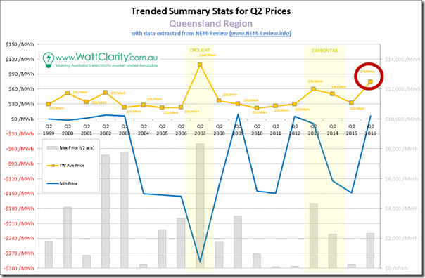
1a) Queensland trended stats
We’ll start at the top of the NEM and work our way around:
In these charts, we’ve placed the maximum prices (as bars) on the y2-axis in order to provide for visibility, without compressing the readability of averages (the most important metric) and minimum (included in response to some specific questions we’ve received about whether prices ever do go negative).
We’ve also deliberately set the scale to show a line at $30/MWh to highlight how in all years except for 4 particular periods, time-weighted average prices have hovered around the $30/MWh mark – i.e. at, or below what most people would see as Long-Run Marginal Cost (perhaps for pre-existing plant, and certainly for new entrants):
1. In the early years, we see blips in 2000 and 2002 resulting primarily from an undersupplied QLD region prior to QNI (arrived 2001) and new generation (arrived 2001, 2002, 2003)
2. In the drought year of 2007, we see average prices substantially higher due to a NEM-wide shortage of useable capacity
3. In the carbon tax years of 2013 and 2014, we see price elevated by the fixed cost imposed on electricity supplies across the NEM
4. Which brings us to Q2 2016, in what was clearly the second-highest outcome across all 18 years (i.e. more severe than the much maligned carbon tax, and “bettered” only in a year where the supply/demand balance NEM wide was sorely tested).
To reduce the risk that some readers might take the above out of context and lay the blame for this outcome singularly at the feet of the “greedy” GOC duopoly (Stanwell and CS) or those (also “greedy”) LNG exporters we’ll move quickly onto NSW…
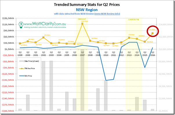
1b) NSW trended stats
At a distance, the chart for NSW looks disturbingly similar…
Once again, Q2 2016 in NSW is clearly the standout, with the exception of the drought-ravaged 2007.
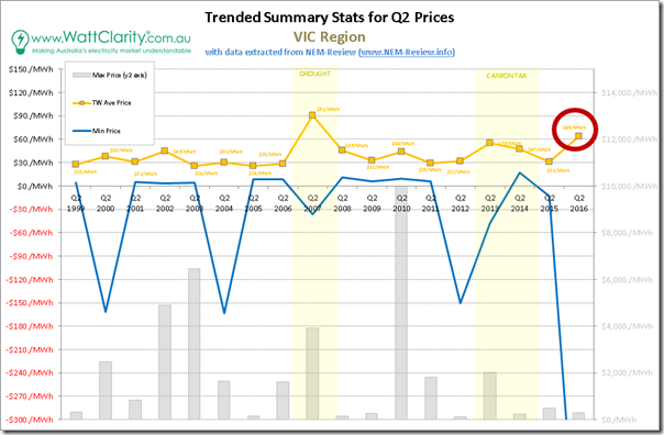
1c) Victoria trended stats
Down in Victoria, we see a similar picture:
The pattern in the trended quarterly average price is so uncannily similar to the ones above for QLD and NSW that I had to check, and re-check, the numbers and spreadsheet references to ensure they were correct. Plus I have added the numbers to the chart that you can see for yourself.
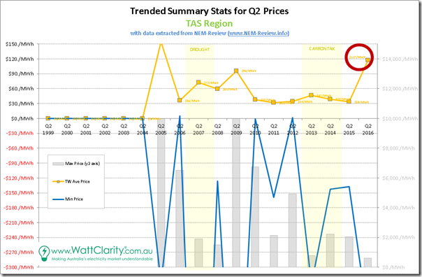
1d) Tasmania trended stats
In Tasmania, of course, they’ve been experiencing a whole other world of pain:
Tasmania did not join the NEM until part-way through Q2 2005, and that quarter TAS operated literally as an islanded region, as Basslink was not yet connected – this is the reason that average prices for 2005 are off the chart (we kept the same axis for comparability). Unfortunately for Tasmanians, Q2 2016 operated much the same way (i.e. disconnected from the mainland for much of the quarter), as discussed back in March, resulting in much the same high-level outcome as in 2005.
As an aside, we see 2013 & 2014 prices in renewable-rich TAS marginally elevated by the fixed price on carbon, though not to the same degree as other regions (and certainly dwarfed by events in other years).
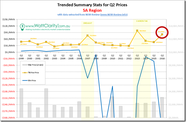
1e) South Australia trended stats
Finally we move into South Australia, which has been the focal point for much of the discussion I’ve seen, with the closure of Northern one of the points that’s garnered a share of interest:
As with the Queensland region, we see a few notable periods where average prices deviated off that notional $30/MWh benchmark level for what is traditionally a softer quarter:
1. As with Queensland, South Australia was undersupplied in the early years of the NEM
2. As with the other regions, SA was affected by the drought in 2007 – though not to as large a degree
3. As with other regions, the carbon tax affected prices in 2013 and (to a lesser extent) in 2014.
4. Plus we have the aberration (off “old” normal) that is Q2 2016.
However what’s particularly noteworthy in the chart for SA is that, unlike the 4 other regions, prices for Q2 2015 did not re-seat back down at $30/MWh but instead remained stubbornly above. At $45.44/MWh in that quarter, that’s a significant uplift on top of where the other regions were sitting.
1f) Summing up for all regions
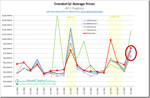
Taking the trends for Q2 average prices for each region and plotting them all on the same chart, the following is what we see:
For our readers, the most important 2 take-aways from this analysis should be:
1. That the outcome for Q2 2016 was truly remarkable; and
2. That it affects everyone, right across the NEM – and hence readers could surmise that overly simplistic “it was due to … [this one factor]” statements are unlikely to be correct, and could be dangerously misleading.
——————
2) Many, many more prices in the $100’s
Q2 2016 pricing was unusual – though I hear the more seasoned reader note that it’s not been unprecedented.
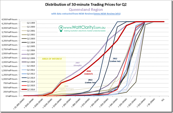
To illustrate for everyone, I’ve taken all 4,368 half-hour periods through the quarter (through each of the 18 quarters) and apportioned prices into buckets, depending on the level at which they fell. 18 discrete curves have then been overlaid on a chart for each region, with particular years of interest highlighted.
2a) Distribution of prices in QLD
Starting again at the top of the NEM, here’s the chart for Queensland:
As was the case for the trended stats (above) we have highlighted the outlier years:
1. The supply-constrained early years in QLD;
2. The drought year of 2007;
3. The two years of carbon tax; and
4. The massive result for Q2 2016 just passed.
In this series of charts we can clearly see how astoundingly different the outcome was this year – the only similar quarter was the one in drought-plagued 2007 (a year where there was a clear, systemic, NEM-wide causal factor).
Of key interest, here, is a much higher incidence of prices above $100/MWh.
1. If we exclude 2007 (898 half-hours) and 2016, the incidence for all (16) other years ranged from a low of 1 half-hour (2011) to a high of 305 half-hours (in 2000, as can be seen), with the next highest being 124 half-hours (in 2002).
2. Clearly the result in 2016 is staggering – with 775 half-hours (cumulatively, more than 16 days) seeing prices above $100/MWh, well above what historically we’ve been accustomed to seeing as “normal” levels of pricing.
Unlike 2007 however, in the case of 2016 it’s not factually correct to point to a single, NEM-wide, “smoking gun” – though that has not stopped a diverse range of different people trying to simplify, but ending up being overly simplistic.
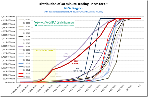
2b) Distribution of prices in NSW
Progressing further south, it should probably not surprise readers (by now) that we see a similar pattern:
Again we see 2007 and 2016 standing out like sore thumbs.
The carbon tax years of 2012 and 2013 receive mentions – and I’ve left the note for 2000 on there, with respect to supply shortage in neighbouring (though not really connected at the time) QLD to prompt the comparison with the chart above.
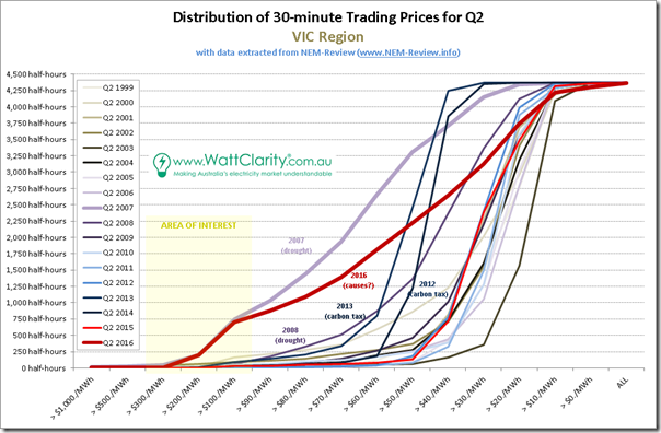
2c) Distribution of prices in VIC
Moving into Victoria, we see the same picture:
Likewise we see 2007 and 2016 as the standouts – with 2012 and 2013 receiving mentions because of the curves clearly shifted to the left by virtue of the $20-something/MWh cost imposed by the fixed price on carbon. I’ve also noted slightly elevated levels in 2008, partially as a result of hang-over from the drought of 2007.
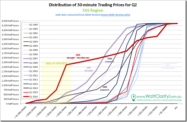
2d) Distribution of prices in TAS
Down in Tasmania, we see a somewhat different picture – though still with similarities:
The local issues of 2016 push the incidence of prices above $100/MWh to almost 50% of all trading periods over the entire quarter.
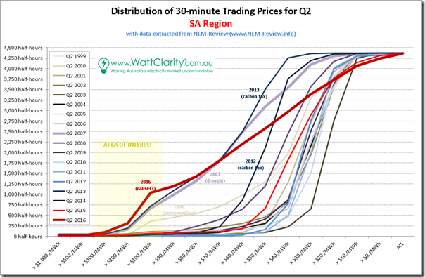
2e) Distribution of prices in SA
Finally, we land at South Australia:
As noted above, the effect of the drought in 2007 was not felt as severely in SA (hence not as large an uplift in average price for the quarter).
In contrast, however, the variety of factors affecting Q2 2016 prices were felt more severely in South Australia than in the other mainland regions – with more than 1,000 trading periods seeing prices above $100/MWh.
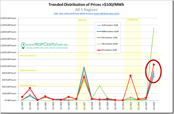
2f) Summing up, for all regions
Selecting just the incidence of prices above $100/MWh for each region and trending over time, we see the following summary:
This chart also highlights how staggering the results of Q2 2016 are, compared with historical norms. Only the 2007 drought year was anything like it – and that was for a transient cause (though perhaps one that will occur more frequently in a climate-changed world).
Once again it does beg the question – was Q2 2016 a short-lived excursion, or a more systemic change in pricing patterns?
——————
In a complex system (such as the NEM) it’s highly likely that, with most events, there are a number of contributing factors. It’s also possible, given the NEM is a market, that the actions of multiple actors (each with their own discrete commercial/other drivers) play a role in influencing outcomes.
This energy transition upon which we have embarked in Australia (and elsewhere around the world) is multi-faceted. Though an interested observer might not deduce this from the volume of electronic ink produced, perhaps, it is far broader (in my view) than just being about achieving any particular percentage deployment of renewables. It’s far broader, as well, than pursuing a zero-emissions trajectory. There are many moving parts involving customer awareness and empowerment, technology change, new business models, asset renewal, changing ideology and other facets.
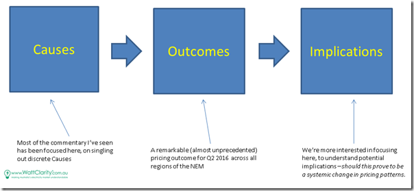
However we don’t have time to get ourselves sucked into that rabbit hole, so instead of taking the route backwards from “Outcomes” to “Causes”, instead I’ve been puzzling about the bridge forwards between “Outcomes” and “Implications”.
In particular, given our keen interest in demand response, I have been puzzling about the implications of these changing pricing patterns for the energy users who provide a valuable service to the market through demand response services. These are some of the same major energy users (a number of whom are our clients) who have historically used Australia’s low cost and abundant energy supplies as a source of competitive advantage in their own global markets.
As time allows, I will post more thoughts specifically on these implications over at www.DemandResponse.com.au …
PS – on 22nd July, I posted this article here about “Possible implications for Demand Response, flowing from Q2 pricing patterns changes?”


A few key main suspects for me Paul:
– Liddell issues early April had quite an signicant, extended impact on supply, combined with some other unreliable baseloaders (Eraring in particular) and a heavy outage season (majors at Kogan, Darling Downs and Vales). Note the PDC for VIC reflecting separation overnight from northern states, overnight was particularly affected by low baseload availability (particularly with some participants bringing down plant at their lowest position eg Eraring clinkering overnight, similarly of late Loy Yangs with coal issues conserving during the day/overnight such that they can run morning/evening peak)
– Repricing of TIPS/SA gas. The Brooklyn compressor issue earlier in the year limited participant ability to fill storage and the impact is most notable in the gas market. Whereas LNG has capped the market in the past we’ve seen a number of prices into the $20 and even $30 range. The TIPS pricing in the $400 range is more than the spark spread but suspect they might be attempting to conserve gas to last out winter and a combination of transport considerations
– And as everyone has been talking of, the impact of LNG trains in QLD. There has been an increase in load from upstream compression, combined with intermediate gas generation largely limited to running only morning/evening peaks
Hi Paul
The information in these graphs is really interesting particularly the Distribution of Prices for each State. Have you put together similar graphs for the Q1 prices or Annual prices. I looked through the Archives but could not spot anything.
TB
Interesting comparison would be WA, which has a portion of its gas allocated to domestic users (as have all other LNG exporters in the world except on the Australian east coast). The WA spot power prices on the AEMO website are reminiscent of a year ago on the east coast.
There’s something interesting I’ve noticed – someone will pick a few large-sounding SA price intervals, then present the penetration of wind in that state, and then conclude that the high prices are caused by wind.
Considering this strange phenomenon is occurring to a similar degree in all NEM regions, is it fair to assign the penetration of wind as a necessary factor in this phenomenon?
IE: if the penetration of this specific fuel type was lower or zero, would this phenomenon cease to exist? A hypothetical worth thinking about, considering how this has now taken the form of an unquestioned assumption, in some media outlets.
Cheers,
Ketan
Great post. Thanks Paul.
Of all the forecast flops, the biggest howler has to be the Frontier Economics wholesale forecast that made its way into the AEMC’s retail price trends report last year.