
Here at WattClarity, it’s become an annual tradition for us to publish a review of Q2 prices shortly after the close of the quarter each year.
Back in 2016, we began to observe an emerging shift in Q2 dynamics, which turned out to be an early sign that the energy transition was beginning to have a seasonal impact on pricing. A year later, our observations were reflected in this ABC article, where we labelled the shift as “off the charts”, based on price outcomes across two consecutive second quarters.
This post continues this long-running analysis series by examining how Q2 2025 compares to the broader long-term trend of Q2 prices in the NEM.
Underlying drivers
With the onset of the energy transition, Q2 has become a volatile and unpredictable time in the NEM, driven by the combination of (1) cold weather boosting demand, particularly in southern regions, and (2) relatively poor seasonal conditions for VRE.
Below is a quick summary of some of the high-level drivers and dynamics that we noted during Q2 as it played out this year:
- Several powerful cold fronts pushed electricity demand higher than historic norms. The last week of June was an example of these weather impacts — where on July 1st (just one day after the official close of the quarter), NSW recorded its highest winter demand in fifteen years.
- Several planned transmission outages that limited generation and interconnector flows, such as the market outcomes in NSW on the 13th of May.
- Continued—and accelerating—growth in the battery storage fleet, with several large projects entering, progressing through, or completing commissioning during Q2, including the Koorangie BESS, Eraring BESS, Greenbank BESS, and Waratah Super Battery.
- Outages amongst the thermal fleet — including an unexpected 58-day outage of the 466MW Callide C3 unit due to a clinker incident starting from April 4th.
- The characteristically variable nature of wind generation — which hit an all-time record on June 23rd before dropping to extreme lows just three days later.
- A north-south solar irradiance divide across the mainland in autumn, with unusually cloudy and wet conditions in the north, and drier weather in the south. This reduced solar availability in QLD and northern NSW, and increased solar availability in VIC, SA, and southern NSW, compared to seasonal norms.
That list is neither exhaustive nor ranked by significance. Rather than exploring these drivers and their contribution in detail, the analysis below primarily focuses on how Q2 2025 price outcomes compare in a historical context.
Region-by-Region
Longtime readers will be familiar with the rotated duration curves we’ve been publishing as part of our analysis, along with our one-phrase summaries for each successive Q2. Below, we continue this series by incorporating data from the quarter just passed.
Queensland
QLD saw a similar duration curve shape in Q2 2025 compared to 2024 and 2023. As we’ll see in the final chart within this article, there was a slight decrease in negatively priced intervals in QLD throughout Q2 2025 — bucking the trend of the other three mainland regions. The slight decrease in negatively priced intervals in the ‘sunshine’ state is likely partly attributable to lower-than-usual solar irradiance patterns throughout Autumn.
Time-weighted average prices in QLD however increased by $20/MWh compared to 2024, up to $121/MWh over the quarter.
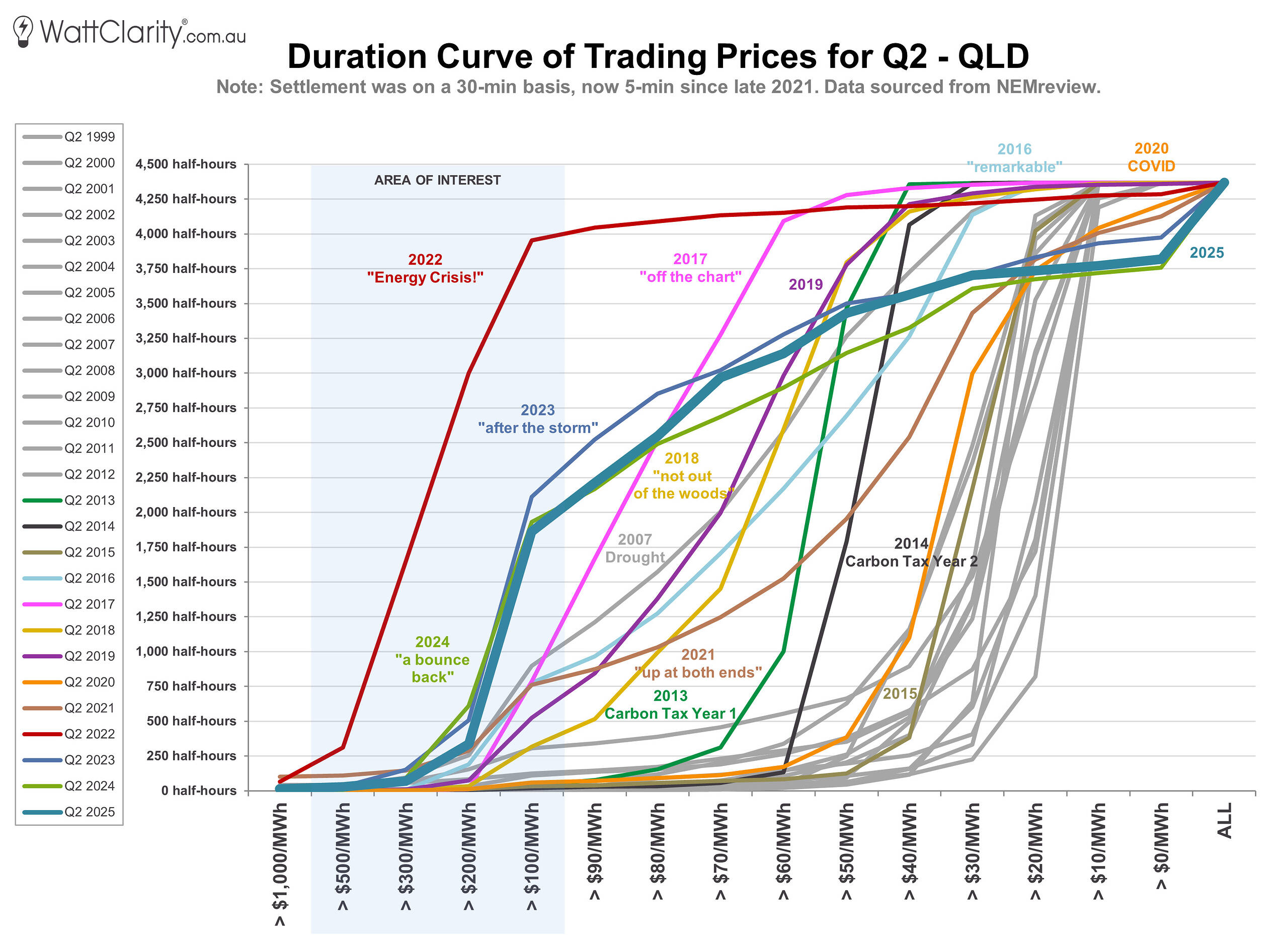
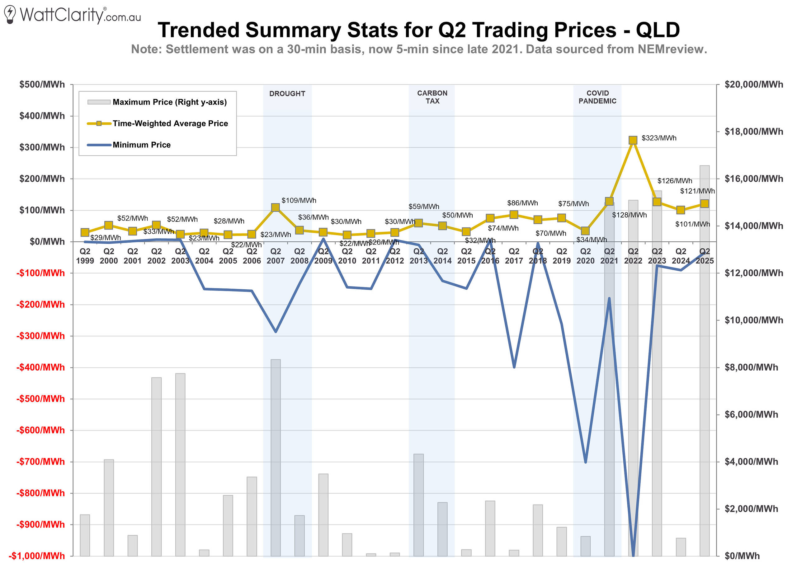
Time-weighted average prices in QLD increased by $20/MWh, to $121/MWh compared to Q2 2024.
Source: NEMreview
New South Wales
Our duration curve in NSW also follows a similar shape to 2024 and 2023. While there were several extended runs of high prices throughout the quarter — such as on June 13th — there were no sustained extreme pricing events similar to May last year, where the Cumulative Price Threshold for the region was exceeded.
As a result, time-weighted average prices decreased by $12/MWh compared to 2024 — making NSW the only region to record a year-on-year decline. This was also in spite of the region recording the most incidences of >$1,000/MWh prices across the five NEM regions this quarter.
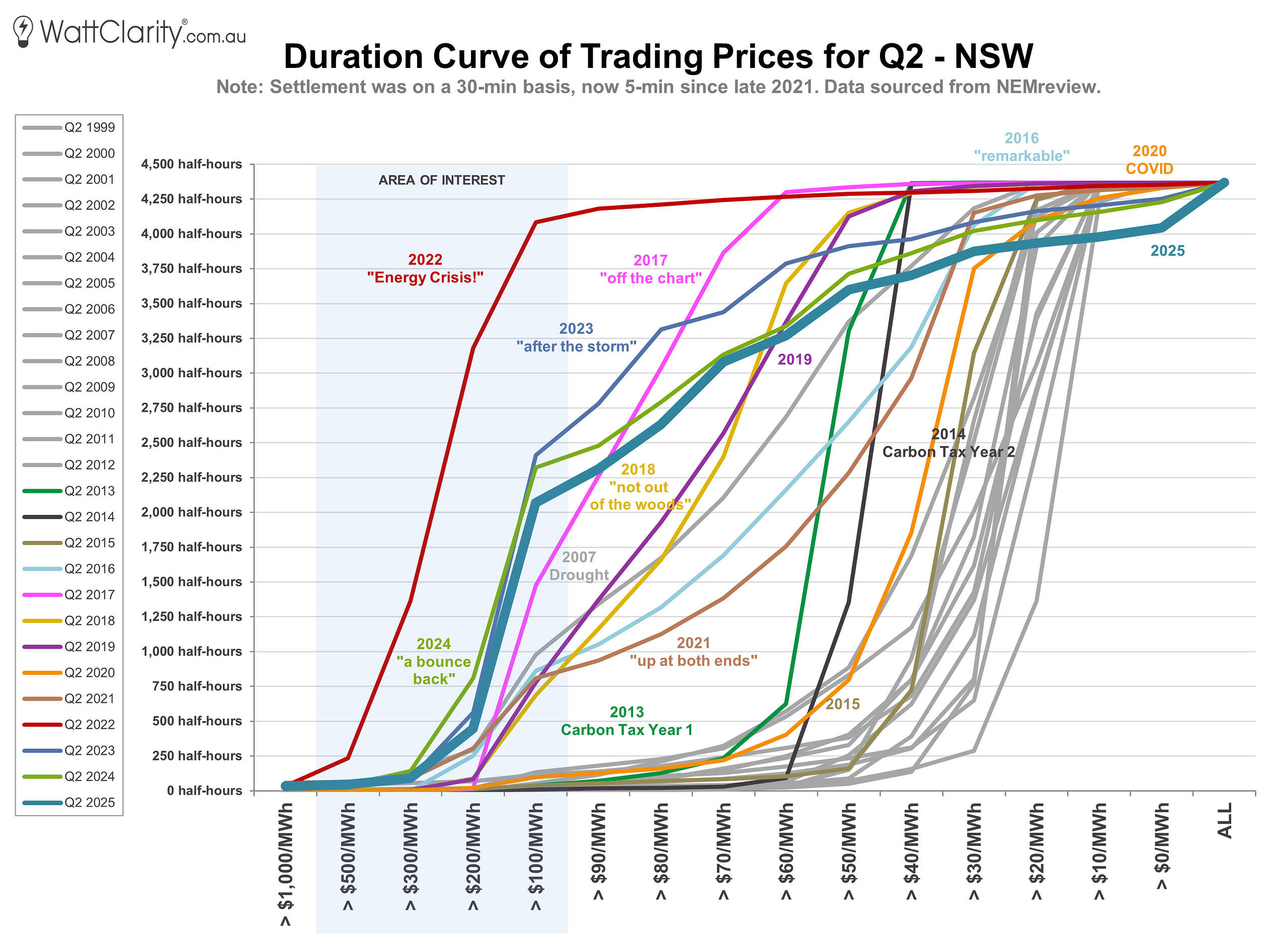
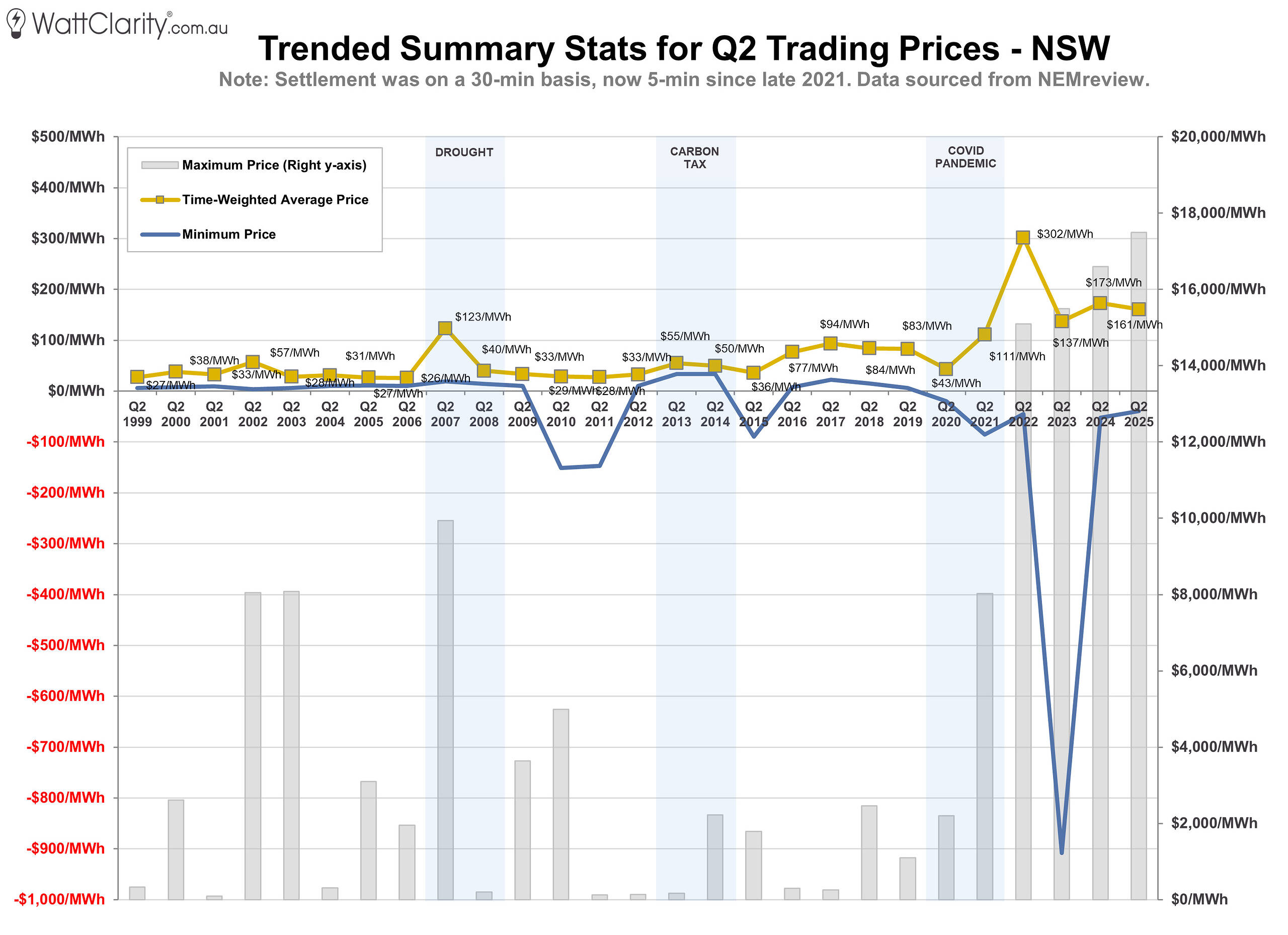
Time-weighted average prices in NSW decreased by $12/MWh, to $161/MWh compared to Q2 2024.
Source: NEMreview
Victoria
With increasing limitations on VNI, price outcomes in SA and VIC have become more closely aligned in recent years. In last year’s analysis, I noted that an extended wind drought, combined with outages on the Heywood interconnector, likely contributed to elevated prices in both regions. In 2025, both regions returned to a duration curve shape similar to that seen in 2023.
Time-weighted average prices in VIC rose by $11/MWh, to $138/MWh for Q2 2025 — the second highest on record since the start of the NEM, surpassed only during the 2022 energy crisis. A notable rise in the number of prices above $1,000/MWh (as shown in the second-to-last chart of this article) was a key contributor to this outcome.
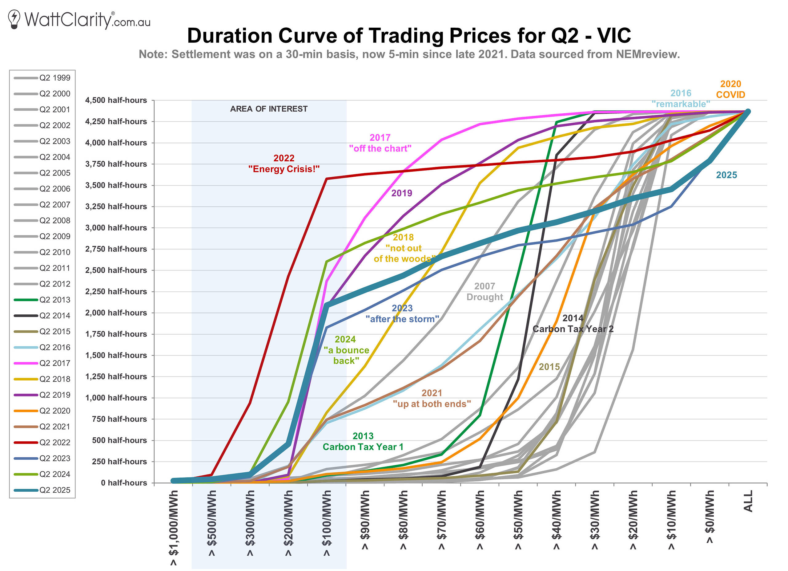
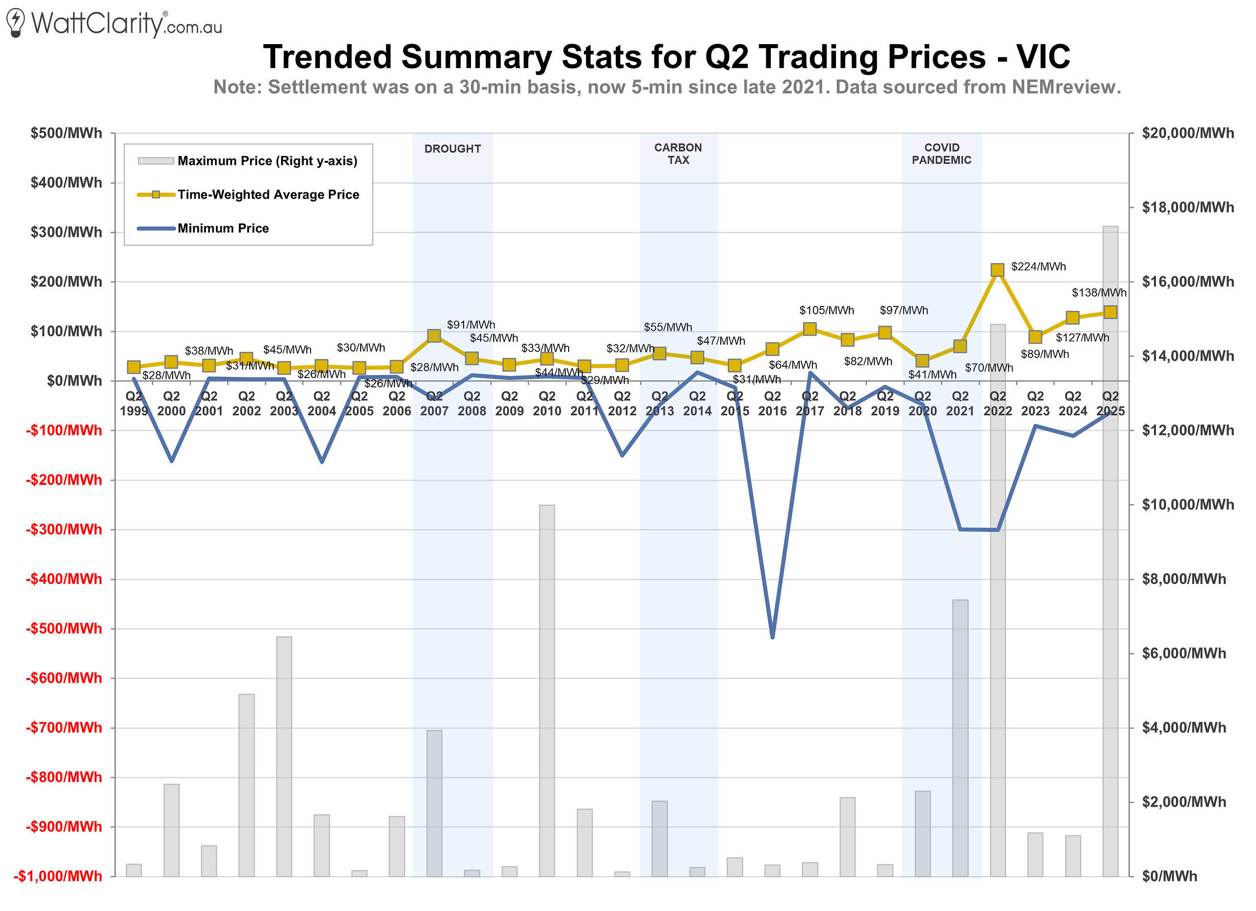
Time-weighted average prices in VIC increased by $11/MWh, to $138/MWh compared to Q2 2024.
Source: NEMreview
South Australia
Like VIC, the duration curve in SA again displayed the steep slope between $100 and $200/MWh that has become characteristic over the past decade.
Time-weighted average prices in the region rose slightly to $140/MWh for the quarter, with several extended runs of high prices — like on June 26th — contributing to the slight uplift.
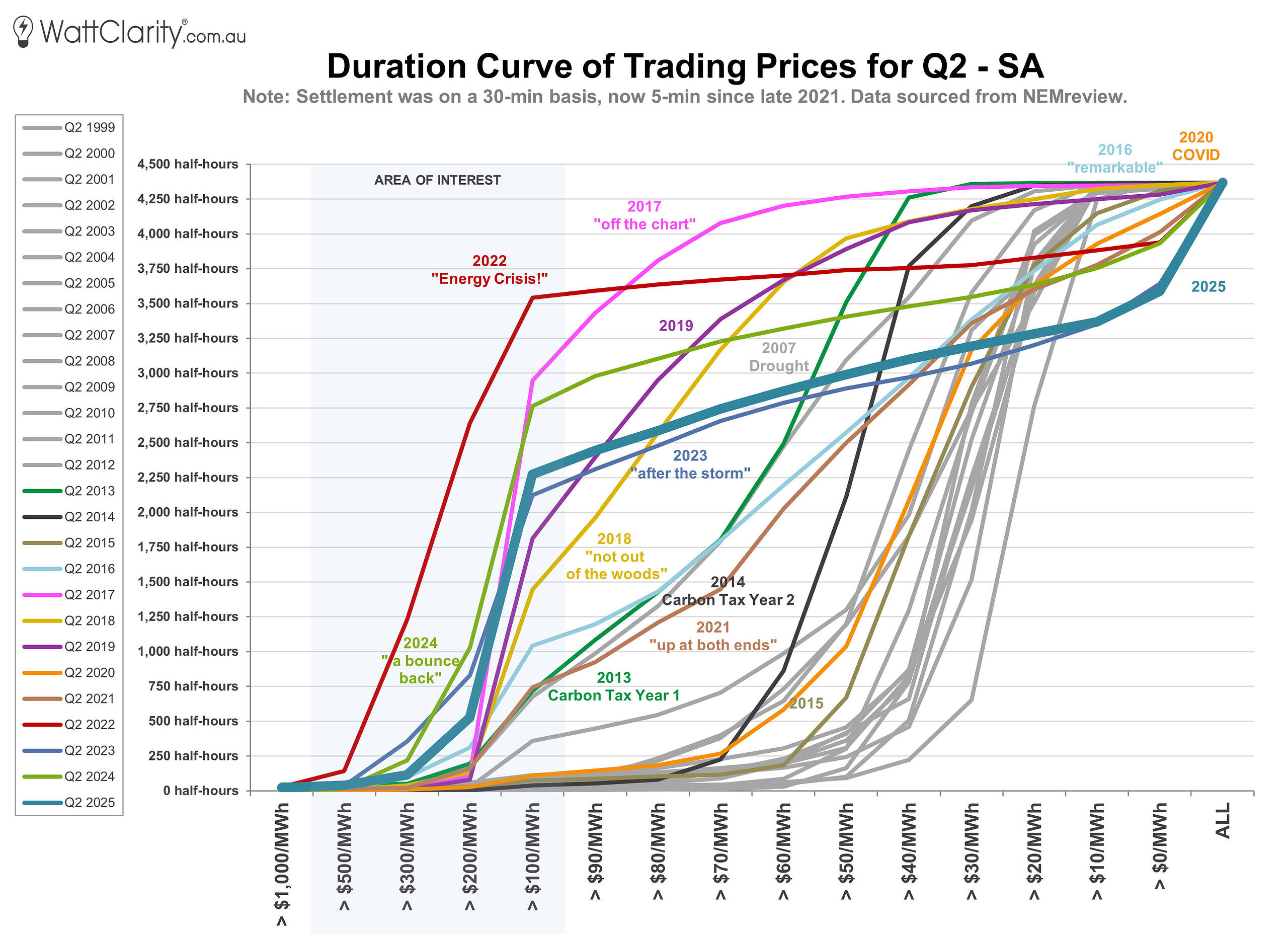
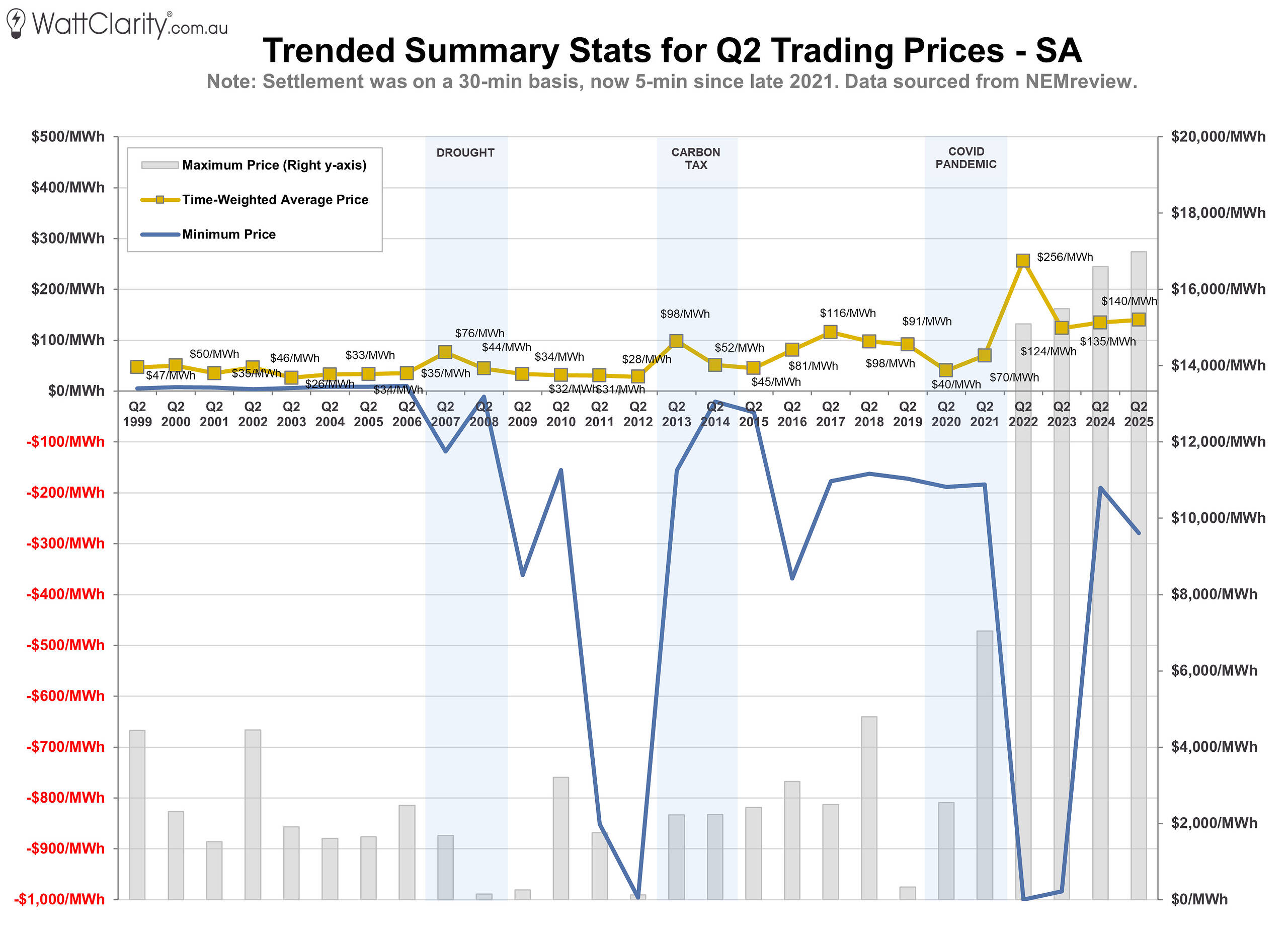
Time-weighted average prices in SA increased by $5/MWh, to $140/MWh compared to Q2 2024.
Source: NEMreview
Tasmania
Notably, the duration curve in TAS shows a sharper slope between $100 and $200/MWh — steeper than any year except 2022.
For the second consecutive year, TAS recorded the fewest negatively priced intervals across the five NEM regions. The region also experienced an increase in the number of prices exceeding $1,000/MWh.
Overall, TAS saw a $10/MWh year-on-year rise in the time-weighted average price, reaching $141/MWh for the quarter.
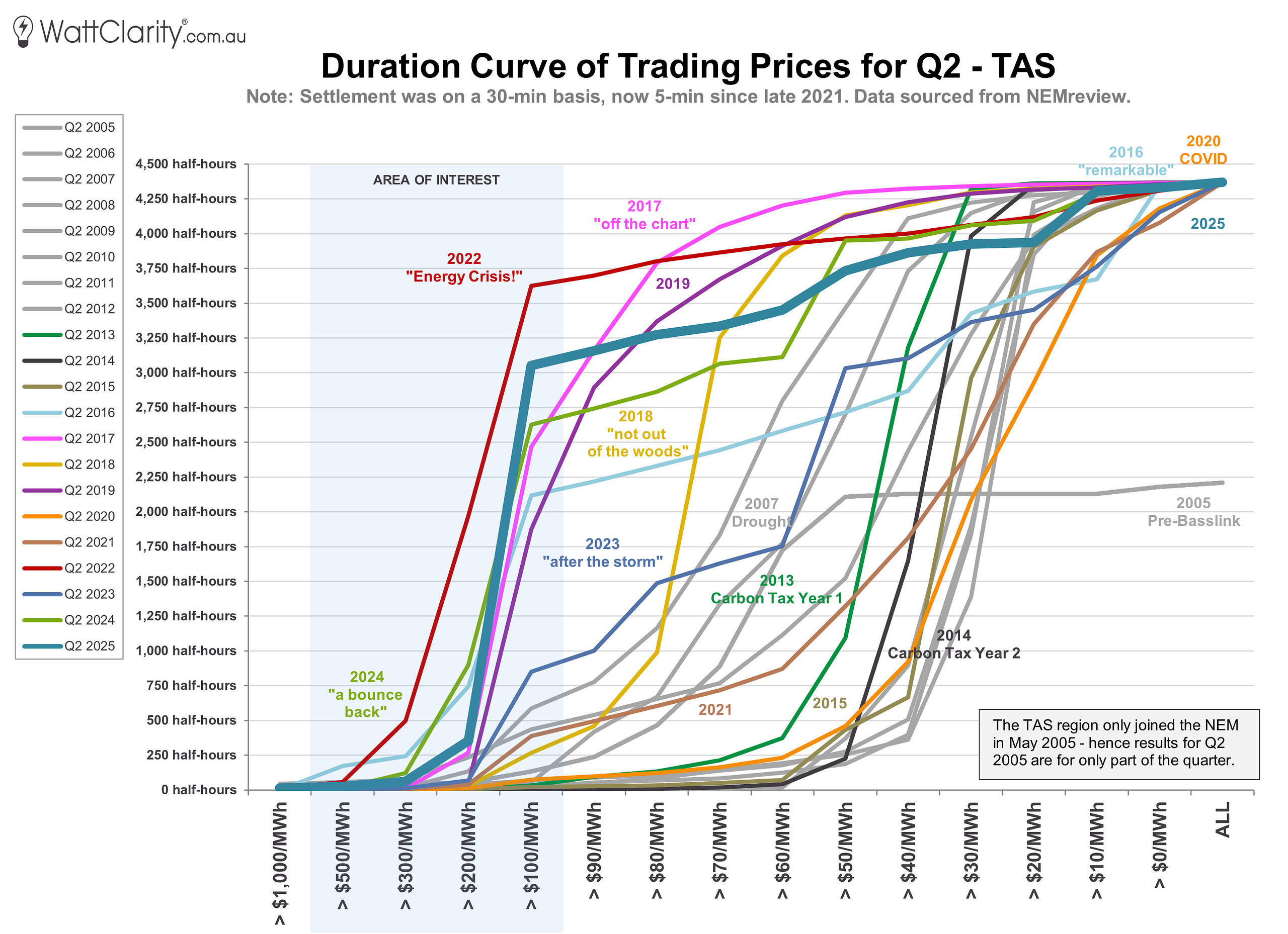
Time-weighted average prices in TAS increased by $10/MWh, to $141/MWh compared to Q2 2024.
Source: NEMreview
Western Australia
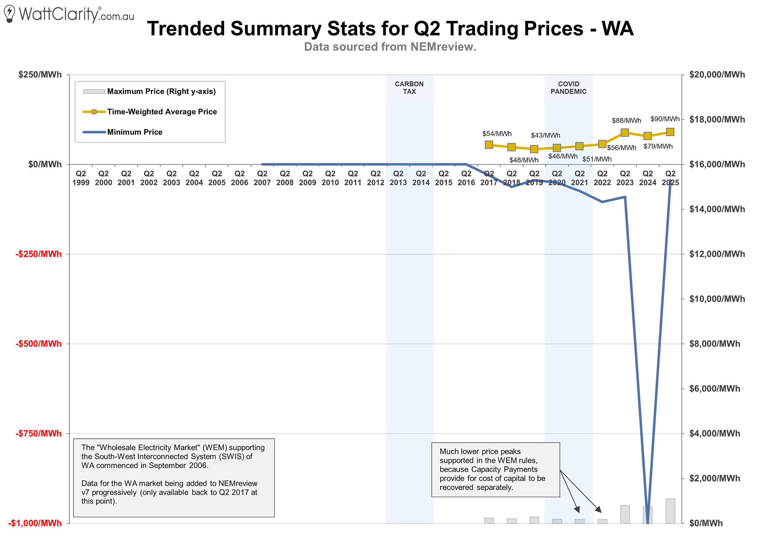
To round things out, we’ve also looked at Q2 price trends and duration curves for Western Australia. This data, pulled from our NEMreview software (which includes WEM data from 2017 onward), highlights the clear contrast in pricing patterns—reflecting the WEM’s unique structure and market rules compared to the NEM’s five regions.
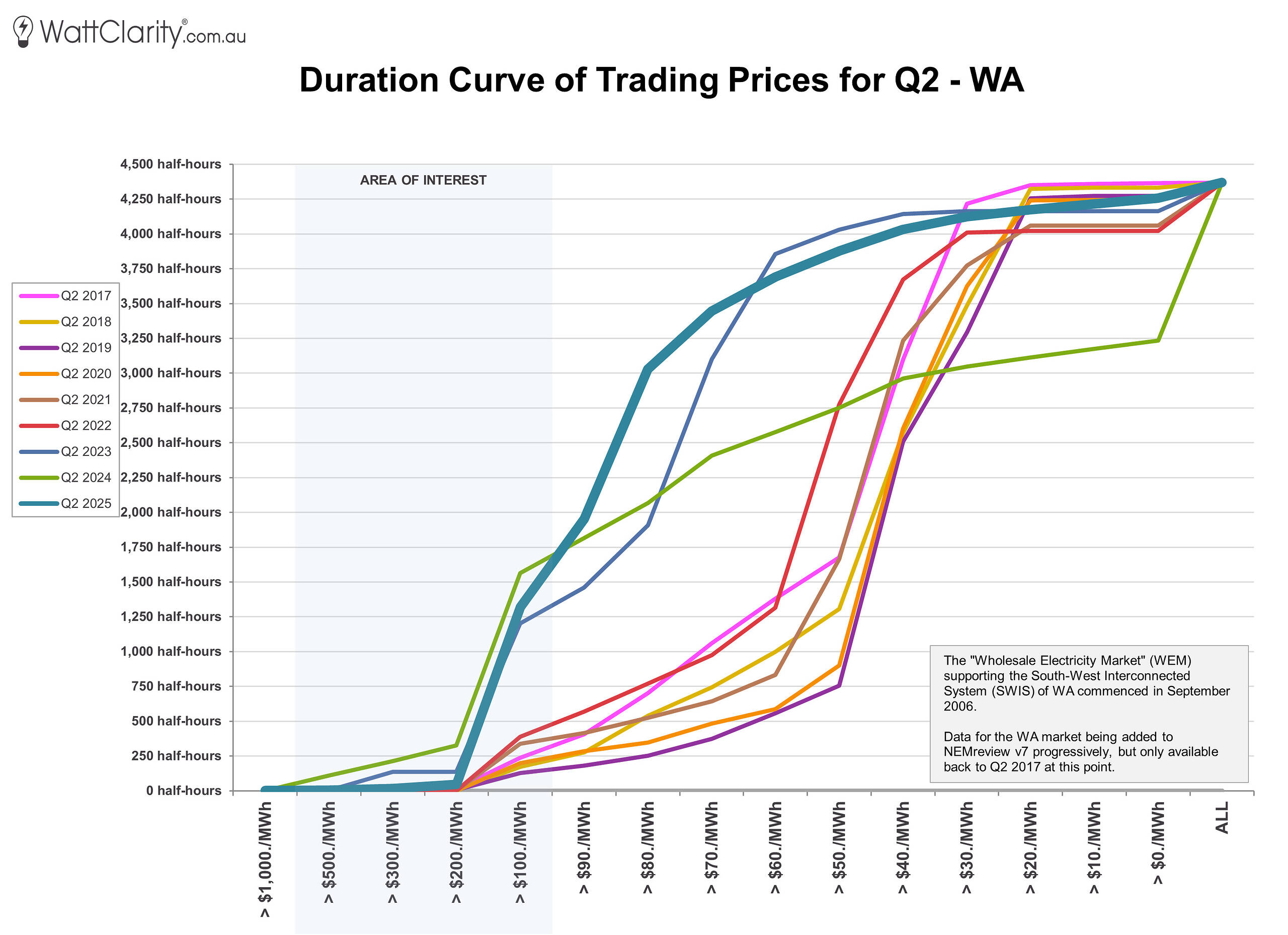
Time-weighted average prices in WA increased by $11/MWh, to $90/MWh compared to Q2 2024.
Source: NEMreview
Summary of long-term trends
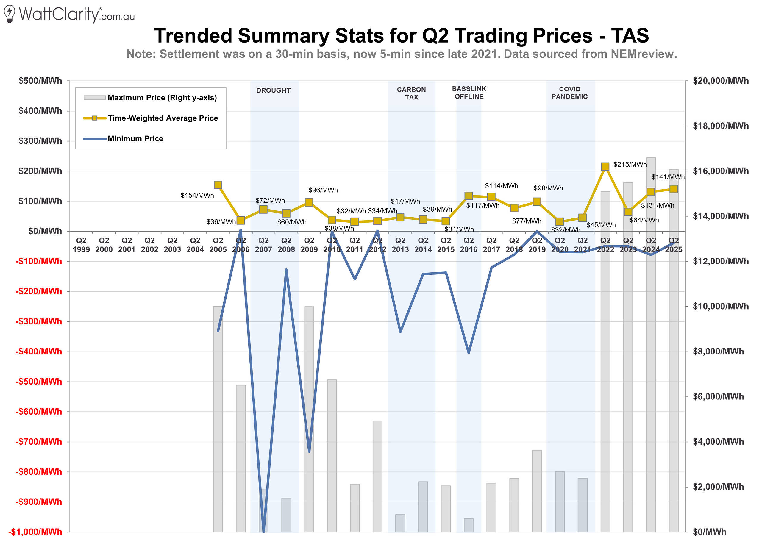
To maintain consistency with our past reviews, the next three charts present prices in half-hour intervals (averaging the six 5-minute dispatch prices), as this approach predates the introduction of 5-minute settlement and has been used in our analysis for several years.
The first chart below is the summarised view of each of the time-weighted average prices across the five NEM regions, and WA.
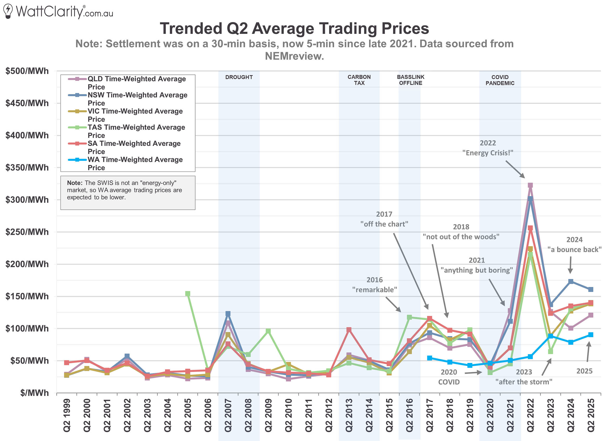
Time-weighted average prices saw modest increases in four of the five NEM regions compared to Q2 2024.
Source: NEMreview
The next two charts illustrate long-term trends in the frequency of high-price events (above $1,000/MWh) and at-or below $0/MWh.
In 2025, all six regions recorded an increase in high-price events compared to 2024. At the same time, NSW, VIC, and SA experienced a notable rise in the number of negatively priced intervals year-on-year.
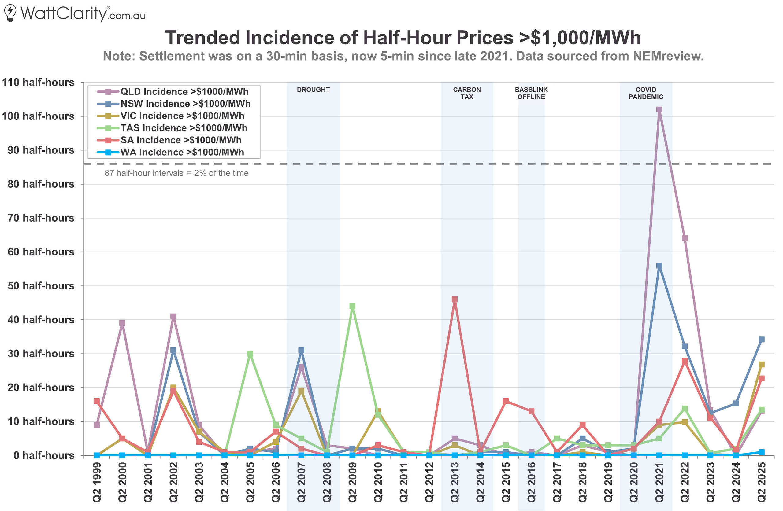
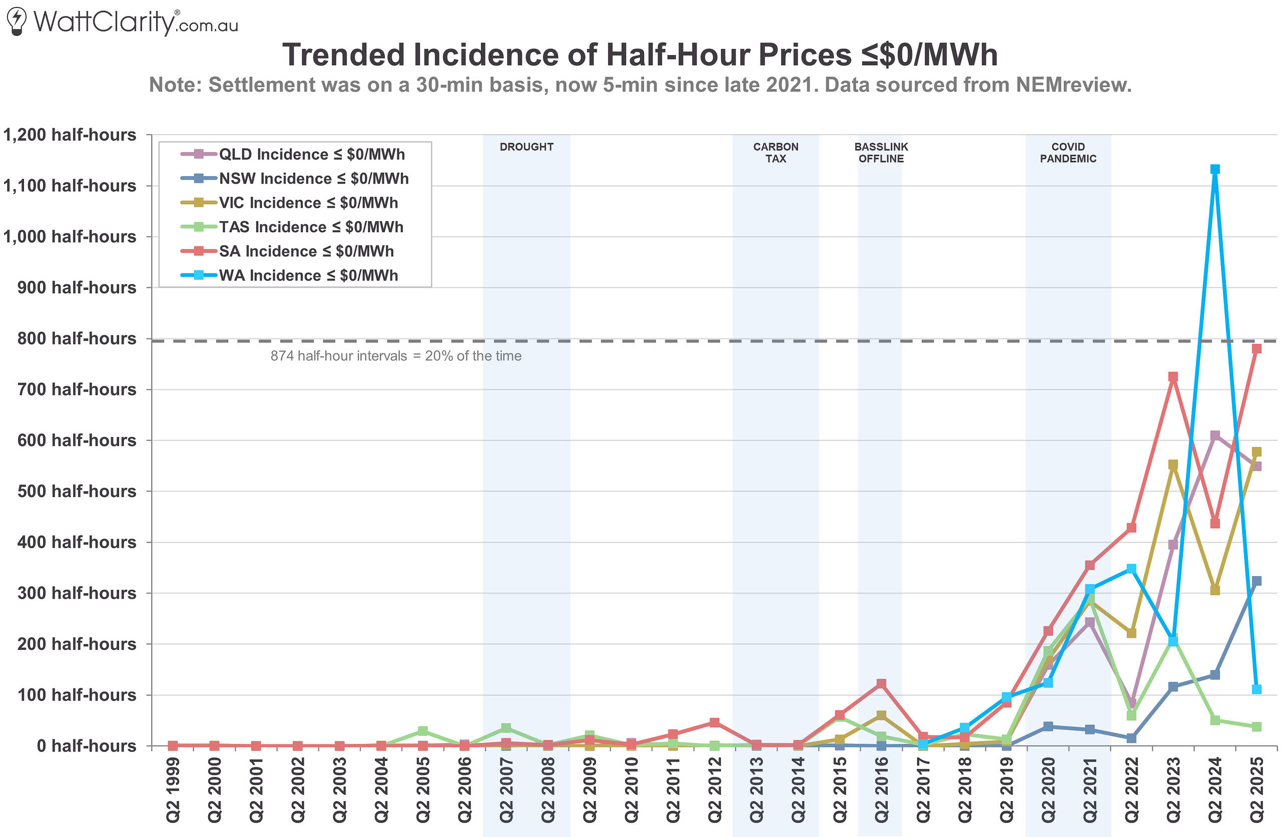
Incidences of >$1,000/MWh prices (top) and ≤$0/MWh prices (bottom).
Source: NEMreview
Key Takeaways
Time-weighted average prices rose in four of the five NEM regions compared to Q2 2024, with only New South Wales recording a year-on-year decline. Despite the absence of a single, market-wide crunch, the quarter was again marked by heightened volatility and some divergence in regional outcomes.
More significantly, the broader trend of pricing extremes continued to intensify. Q2 2025 saw a clear increase in both high-price events (above $1,000/MWh) and negative-price intervals (at or below $0/MWh) across most NEM regions. This reinforces a pattern observed over recent years — one where prices are increasingly influenced by the edges of the distribution.
Each region’s outcome reflected a mix of local conditions and shared systemic pressures. While the underlying factors varied — from weather and outages to interconnector constraints — the net result was a continuation of the long-term shift in Q2 dynamics. What was once a relatively uneventful quarter has firmly cemented itself as a focal point for observing how the energy transition is reshaping price outcomes.
The fact that the wholesale price in Victoria was significantly higher in 2025 than 2024 means there is a management problem. 2024 was one of the worst years for wind conditions on record, so to have higher prices is really saying something went wrong.
“Several planned transmission outages”
I think it is time that the exact timing of these outages needs to be made more flexible. The cost of delaying these works by one or two days until wind conditions were better, might have been small compared to the additional electricity costs to consumers. Some one needs to run the numbers.
Is the limitation with VNI, or with transmission around Wagga Wagga? I was under the impression that it was the later. It is simply the reporting system that makes it appear as though it is VNI.
Really good article series this one, thankyou.