
In late February, it was confirmed that the Market Price Cap (MPC) in the NEM would increase to $20,300/MWh for the upcoming financial year—a rise of 16%. This change is the first of three significant increases in line with an AEMC rule determination made back in December 2023.
Alongside the MPC increase, the related Cumulative Price Threshold (CPT) will also rise progressively, from the equivalent of 7.5 hours at the MPC to 8.5 hours. The previously temporary increase to the Administered Price Cap (APC), set at $600/MWh, was also made permanent as part of the determination.
Rule makers and academics have long argued that raising the MPC is necessary to adequately signal new investment. However, it comes with a clear trade-off—as this cap exists to protect consumers from extreme prices. Therefore, if this signal fails to translate into any change in investment decisions, raising the cap simply shifts more cost and risk onto consumers.
To explore this trade-off, below I’ll summarise the economic theory and walk through some basic exploratory analysis that will look into how ‘high-high’ prices contribute to average prices, the cost of hedging for retailers, and impact other investment signals.
The Market Price Cap
The MPC is effectively the ceiling for how high the wholesale price of electricity (or an FCAS service) in a region can reach in any given dispatch interval. Although spot prices are nowhere near this cap more than 99% of the time, extreme prices have a disproportionate influence on market outcomes.
The MPC is part of a broader set of market mechanisms that limit the impact of extreme supply scarcity events for consumers. The image below is a simple infographic explaining how the MPC fits in with the CPT and APC.

The relationship between the MPC, CPT and APC. All of which are essential parts of the NEM’s market settings.
Note: This information applies to the main ‘energy’ market. The CPT and APC also apply for FCAS markets, but note that the price floor is $0 for FCAS.
This article won’t examine the CPT in detail, as it has historically been of lesser significance in the NEM. This is primarily because our generation mix has traditionally been capacity-constrained and energy-abundant. However it’s important to note that as a growing number of coal plants eventually retire and relatively shallow batteries connect, the NEM is likely to transition to being capacity-abundant and energy-constrained. In such a future, the CPT—being the primary mechanism that determines the value of “deep” capacity— may become even more consequential than the MPC itself.
A primer on the history of the MPC
When the NEM commenced operations in December 1998, the price cap was set at $5,000/MWh, and was then known as VoLL (Value of Lost Load), to signify that it was intended to represent the cost of a disruption to supply for consumers.
In the graph below, I’ve charted the MPC in dark blue to show how it has changed over the years.
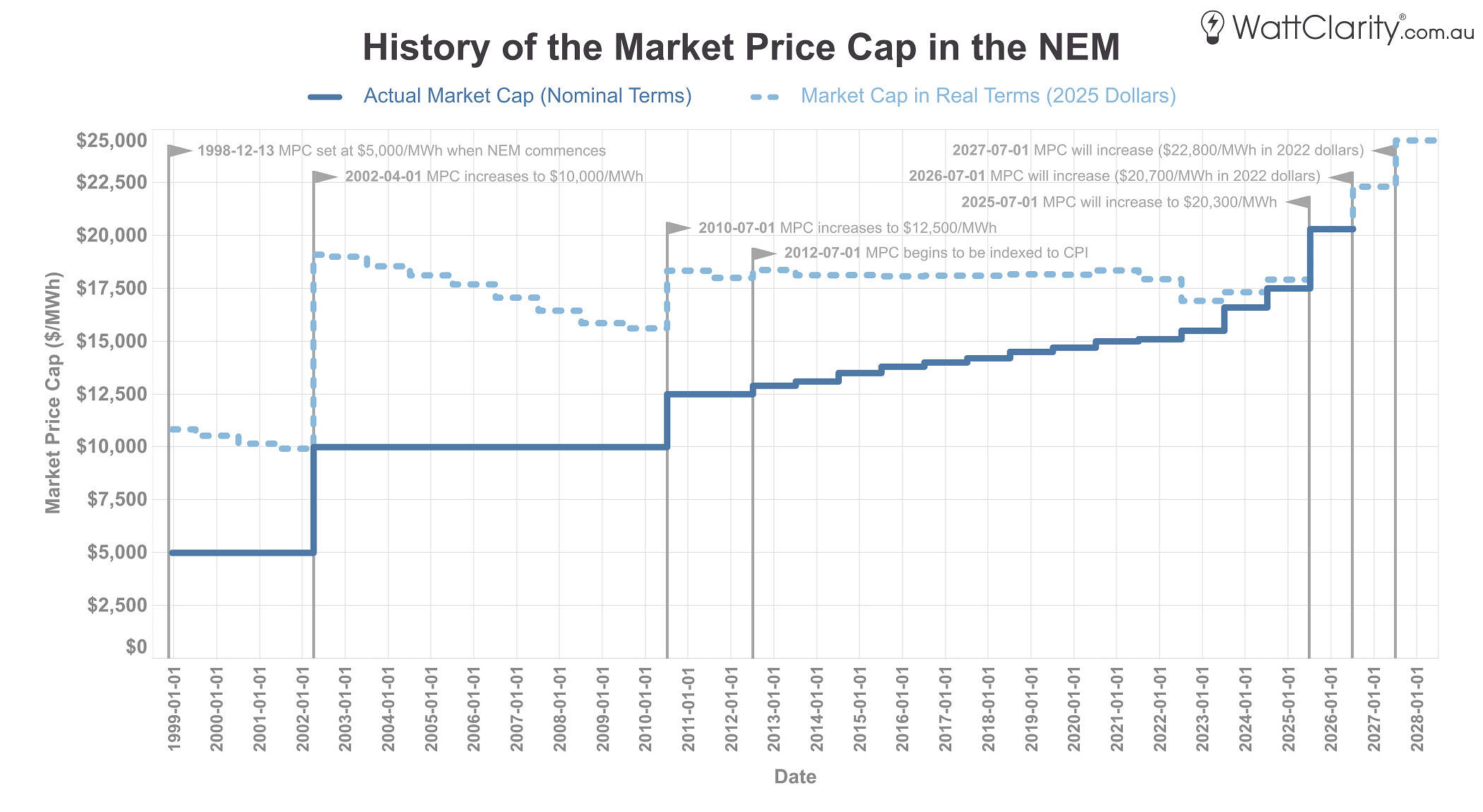
From July 1st 2025, the MPC will begin the first of three scheduled increases, representing a significant rise in both real and nominal terms compared to previous years.
Source: AEMO MMS, RBA
The light blue dotted line shows that, since the price cap doubled in 2002, most increases have been relatively modest once adjusted to CPI. In contrast, the upcoming three step changes mark a material rise in both nominal and real terms.
A primer on the economic theory
The NEM is designed to incentivise generators to bid their capacity at their Short-Run Marginal Cost (SRMC)—which typically reflects fuel costs, short-term opportunity costs and other incremental operating costs. However, in the 2000s, American economists Peter Cramton and Steven Stoft articulated what became known as the “Missing Money Problem“—the recognition that a market clearing at SRMC, even for the most expensive generator, fails to provide sufficient revenue to cover long-run capital costs. In short, the market systematically under-recovers the investment needed to maintain reliability over time.
It is important to note that Cramton and Stoft’s papers contemplated international electricity markets that had explicit (or implicit) price caps that were well below the NEM’s MPC at the time. Interestingly, on page 67 of their 2006 white paper, they made special mention of the NEM’s energy-only model, and unique influence of government-owned generation (particularly in QLD): “I’d suggest that before anyone placed too much faith on the Australian model, they at least check into the possibility that non-market forces may be playing a significant role”.
Unlike most other commodity markets, which typically operate without formal price caps, electricity is fundamentally different in nature, as supply and demand must be balanced in real time — yet demand is highly inelastic because many consumers: (1) have few substitutes, (2) are largely unaware of real-time prices, and (3) live in a modern society built around the assumption that electricity is an essential service.
If a very significant and widespread amount of demand-side participation existed, a price cap would be unnecessary. Some argue that a higher price cap could encourage more demand response, but whether there is sufficient flexibility in existing loads, or accurate short-term price forecasting to make this feasible, remains an open question for further analysis.
In summary, where to set the price cap involves a fundamental trade-off: a higher cap strengthens the investment signal by increasing potential returns, but it also exposes consumers to greater costs during scarcity events. Crucially, a higher cap also raises operational risks for participants, such as when a contracted generator is constrained by transmission outages during high-price periods. These risks, in turn, tend to flow through to consumers as higher costs as well.
A primer about the modelling
Rule makers and academics have maintained that increases to the MPC and CPT reduce costs to consumers over the long term. In its final determination for the December 2023 rule change, the AEMC stated:
“The changes in the market price settings are modelled to increase retail electricity prices by 2.7% on average across all regions of the NEM… we consider the long-term benefits of the final rule for consumers in terms of improved reliability and lower long-term costs outweigh this relatively small short-term cost increase.”
This implies that the equivalent amount of investment would not have otherwise occurred in an alternate reality where the cap was not raised.
The modelling conducted for the rule change took half-hourly outputs of prices, generation, and unserved energy distributions from an earlier 2022 reliability review, ran them through an optimisation model to assess MPC/CPT combinations, then re-profiled price traces and simulated hedging outcomes. It also included sensitivities such as WACC changes and FCAS revenues.
A decade earlier, researchers from UNSW published several academic studies about VRE and scarcity pricing—including this conference paper. Those studies concluded that a higher MPC was likely to be required in a market with high shares of VRE, as their high-CAPEX low-OPEX nature—and the need for flexible dispatchable firming resources—meant a higher reliance on low frequency, high priced intervals.
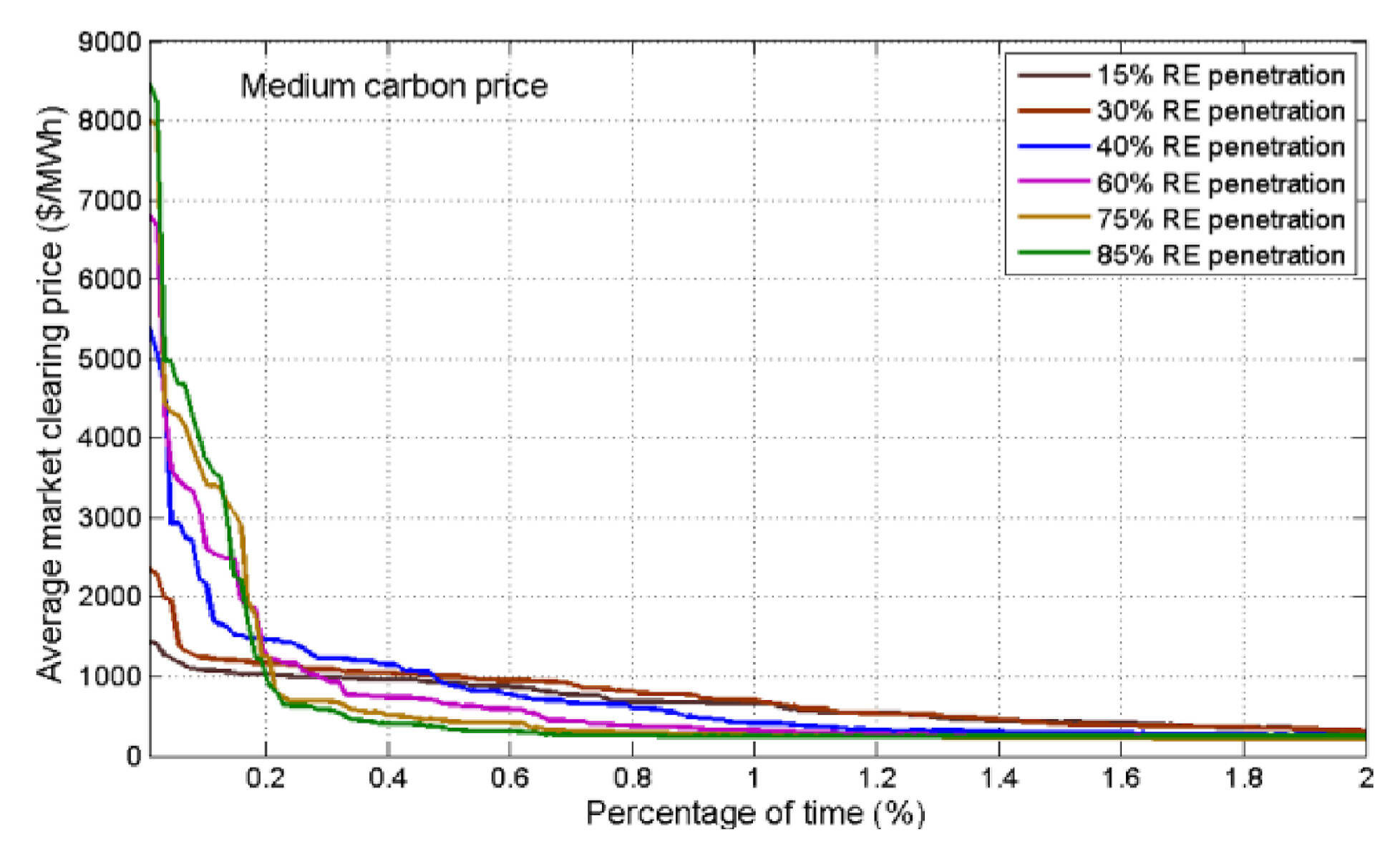
The top 2% of the duration curve from a 2015 academic study that modelled the average spot price under all simulations for a least cost generation portfolio through several scenarios.
Source: Vithayasrichareon, Riesz and MacGill, 2015
That study did not forecast future market behaviour, it instead ran a portfolio-based Monte Carlo simulation to determine the average price of all simulated revenue outcomes under six renewable energy scenarios. In short, it found that as VRE penetration increased, the magnitude of price spikes was greater, but average prices reduced as the duration curve flattened faster from left-to-right.
Almost all of these models have assumed an ‘atomistically competitive’ generation sector (i.e. all generators always bid at their SRMC). The lived experience of supply/demand scarcity in the NEM is quite different— in practice it’s been more typical to see some larger generation companies park quantities of their volume at the MPC (i.e. favouring price in the price-volume trade off), in the hope of positioning their portfolio to opportunistically earn superior profits when/if high prices eventuate. When generators bid above their SRMC, this has the effect of raising investment returns in the real market above the academic theory. It could be argued that some of those companies have responded with additional investment in peaking generation, but more on that later.
Prices in practice
With the above theory in mind, below I’ll take a closer look at extreme prices near the market cap, and how they have historically influenced volume-weighted average prices, spot market settlements, the cost of hedging instruments, and other capacity incentives.
Frequency of price spikes at or near the cap
I’ll begin by showing two price duration curves that will help us see the changing shape of prices at-or-near the MPC over the long term. I’ve highlighted more recent years to understand whether price curves are changing as renewable penetration has increased.
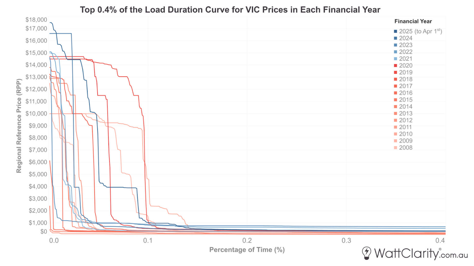
The extreme end of the duration curve in Victoria, with recent years highlighted in blue.
Note: Based on 5-minute dispatch prices, not settlement prices (which were determined on a 30-minute basis up until October 2021). Prices are in nominal terms.
As we see in the chart above, there are some signs that the duration curve in VIC has begun to decline steeper, and sooner, from left to right. For reference to the conclusion in the aforementioned UNSW study, renewable energy penetration in Victoria was ~ 15% over FY2017, ~30% over FY2021 and ~40% over FY2024.
As the NEM often exhibits a north vs south divide, I’ll next show the same curve but for the Queensland region.
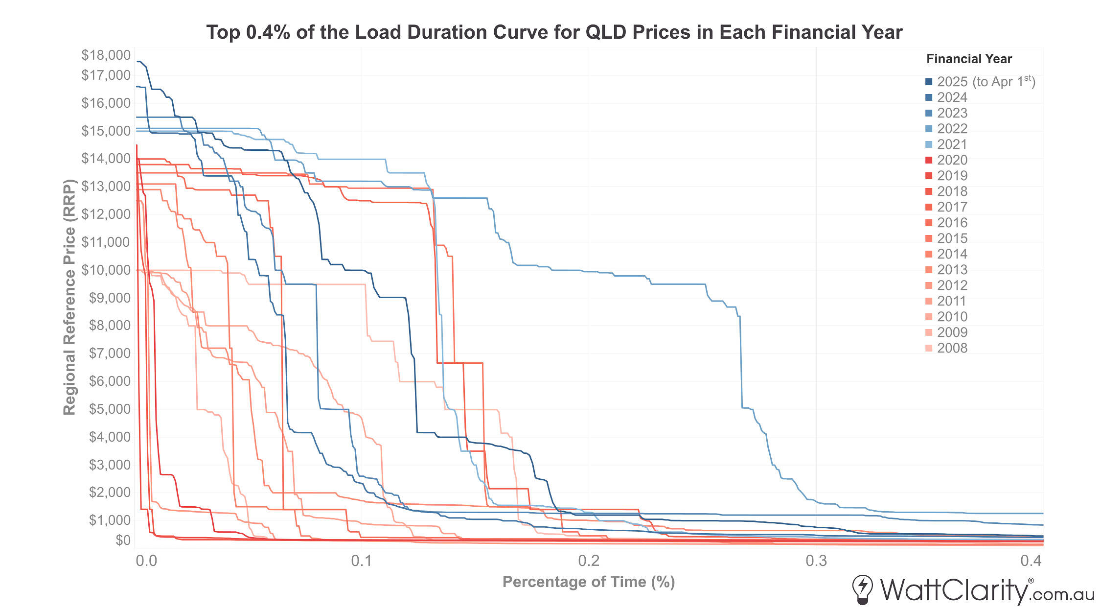
This end of the duration curve tells a very different story in Queensland.
Note: Based on 5-minute dispatch prices, not settlement prices (which were determined on a 30-minute basis up until October 2021). Prices are in nominal terms.
Source: NEMreview
Over the past five financial years, the resulting curves in Queensland exhibit a markedly different pattern compared to Victoria. Renewable energy penetration has also increased significantly in Queensland in recent years, albeit at a slower rate than in Victoria—reaching around 31% by FY2025 (to April 1st).
As I’ll touch upon later, there are many factors at play to explain the difference in extreme price outcomes in these two regions, including: interconnector dynamics, differing levels of market concentration, minimum stable loading requirements of each region’s thermal fleet, differences in demand patterns, etc.
Contribution of ‘high-high’ prices to wholesale averages and hedging costs
Below is a simplified retrospective analysis to explore the impact of prices at-or-near the MPC. I’ve calculated the amount to which dispatch intervals with prices above $10,000/MWh have contributed to total settlement and $300 cap payouts since the MPC was raised above this level in July 2010.
This should help us get a glimpse into the macro impact of prices near-or-at the MPC—as opposed to evaluating whether new entrant generator costs are justified, which was the focus of the modelling commissioned by the AEMC.
Since the NEM is ‘gross pool’ by design, all purchasing and selling of physical electricity must be settled through the spot market first. This means that we have a reasonable level of transparency over the total sum of money flowing through the spot market. Importantly, though, this is not the final figure to show what consumers pay, as this settled amount of money then has circular flows and on-flows via hedging instruments and other long-term contracts in the financial market.
To show an example of how this calculation has been done, the image below shows the contribution of >$10,000/MWh dispatch prices on VWAPs in Queensland.
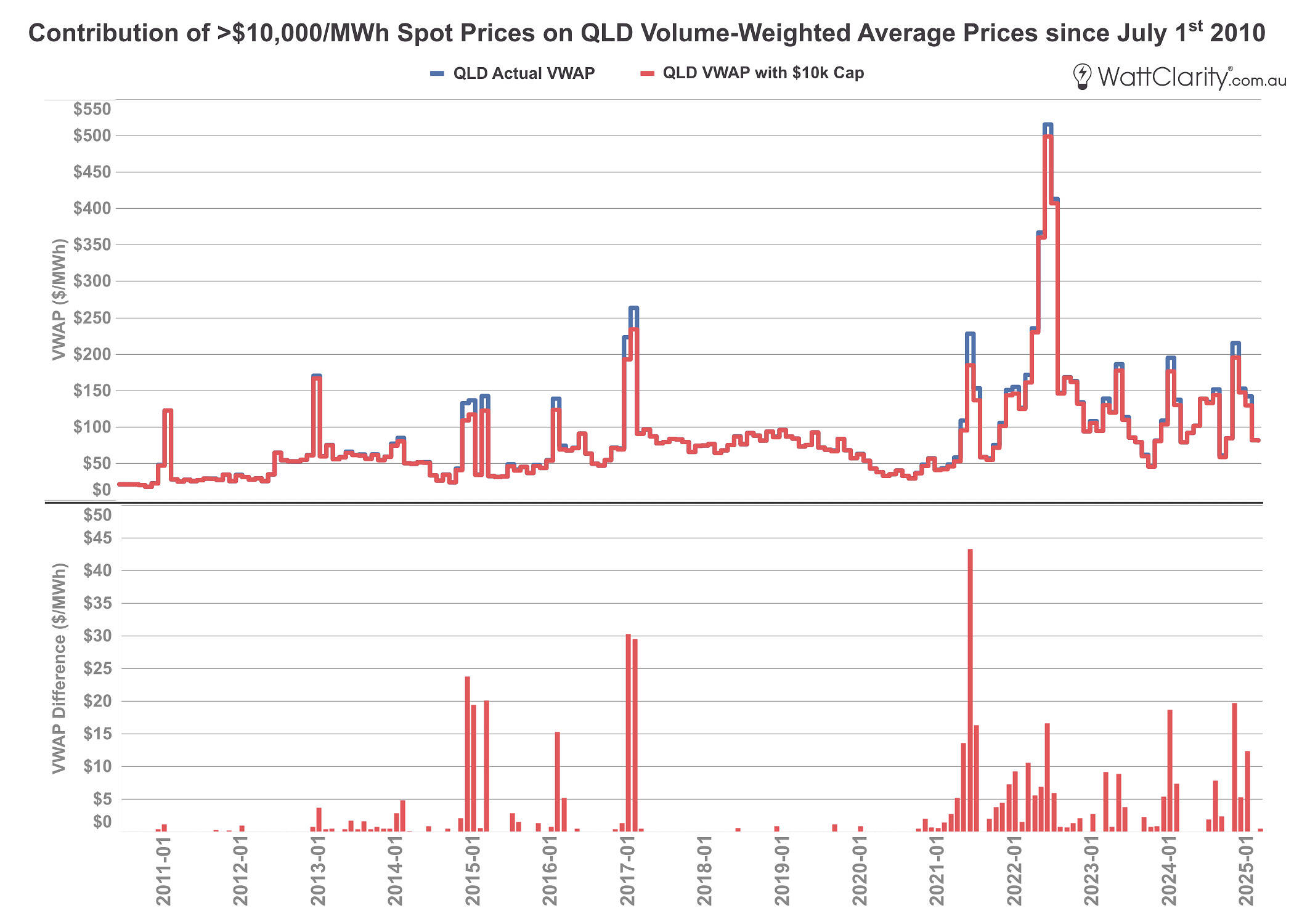
Example: the contribution of >$10,000/MWh prices on volume-weighted average prices in QLD since July 2010.
Note: Based on 5-minute dispatch prices, not settlement prices. Prices are in nominal terms.
Source: NEMreview
To understand how this has changed over time, and between regions, the next chart below shows the cumulative contribution of >$10,000/MWh prices on the total amount settled in the physical market for energy, since July 2010.
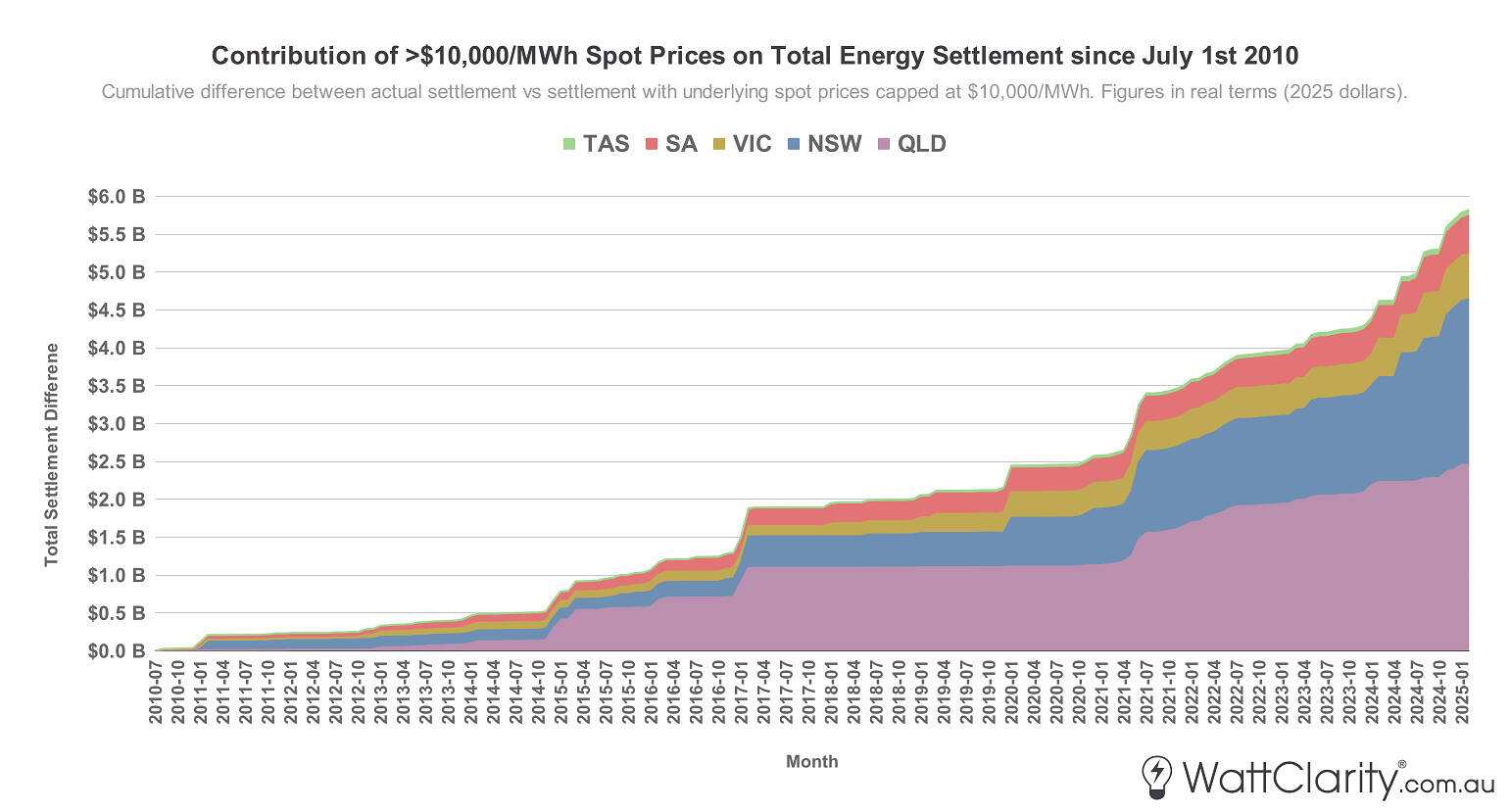
The contribution of >$10,000/MWh prices on total spot revenue settlement since July 2010.
Source: NEMreview
We can see that the total contribution has been $5.82B in that time, with the largest share of contributions coming from the QLD and NSW regions.
The image below shows the same view, but for aggregated FCAS revenue from all ten FCAS markets.
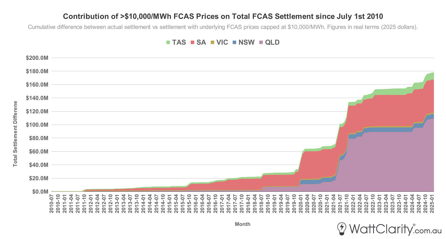
The contribution of >$10,000/MWh prices on aggregated FCAS settlement since July 2010.
Source: NEMreview
Here, the total contribution on total FCAS settlement since July 2010 has been $178m. We can see clearly that the largest contributions have come from two of the least interconnected regions (QLD and SA). The spikes in the cumulative trend coincide with unexpected events that impacted supply for frequency services—such as the January 2020 SA islanding and the May 2021 Callide C4 explosion in QLD. Tasmania, the only other NEM region with only one adjacent connected region, has not historically experienced such FCAS supply crunches.
If we combine the figures from the last two charts, we can see that prices above $10,000/MWh have contributed approximately $6B to total settlement costs across both energy and FCAS since July 2010.
However, these total settlement costs are not a direct indicator of the impact on consumers—but, they are a revenue signal that can help us understand what the physical market design is incentivising.
Consumers are largely shielded from extreme spot price volatility through the financial market and other long-term contracts. Retailers can manage their exposure by selling or purchasing various forms of exchange-traded or OTC hedging products, by signing longer-term offtake agreements, or by receiving a government-initiated underwriting of their revenue. One common form of financial insurance to hedge against high prices are $300 cap contracts. These exchange-traded products are triggered when the spot price in a region goes above $300—returning the buyer of the contract the difference between this $300 amount and the eventuating high spot price.
The chart below shows how >$10,000/MWh prices have impacted $300 cap payouts for each region, so that we can similarly see the impact per region, over time.
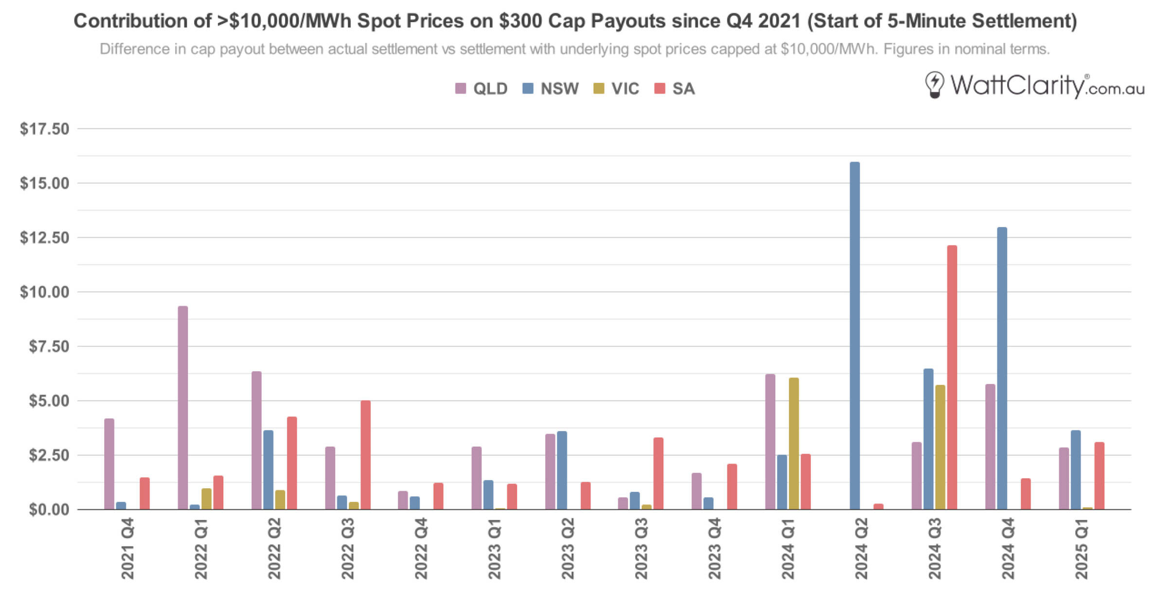
The contribution of >$10,000/MWh prices on $300 cap payouts since the start of 5MS in October 2021.
Source: NEMreview
This data only goes as far back as the start of 5-minute settlement in October 2021. In that time, the contribution of >$10,000/MWh spot prices on these cap payouts has been most significant in NSW and QLD. As an example of this impact, prices above this threshold would have contributed $41.6m towards hedging a hypothetical 500 MW load in NSW over the 2024 calendar year.
Other signals for investment
Many other jurisdictions around the world have introduced a formal capacity market to address the so-called missing money problem. As this analysis by CEPA argues, well-designed capacity markets can work alongside real-time markets with high price caps (like the NEM’s current energy-only model), without creating perverse incentives or so-called “double-dipping”.
Instead of a formal capacity market, the NEM relies on a patchwork of de facto capacity mechanisms to signal investment:
- Capacity Investment Scheme (CIS) and other government underwriting – government-led mechanisms that guarantee a fixed revenue stream by compensating the project when spot and contract market revenues fall below a pre-agreed floor, and in some cases, claw back revenue above a cap. A competitive tender process dictates which projects are chosen to be underwritten, as opposed to a pure ‘let the market decide’ approach.
- Contract Market – as discussed, these exchange-traded or OTC instruments (in addition to long-term offtake contracts) largely act as a decentralised capacity market.
- Retailer Reliability Obligation (RRO) – a mechanism that obligates retailers to acquire set levels of financial contracts when triggered, benefiting capacity suppliers through the contract market.
- Reliability and Emergency Reserve Trader (RERT) – an out-of-market strategic reserve only triggered under certain projected supply scarcity circumstances—and should be noted is also paid for by consumers, at a cost above the MPC.
Unlike a formal capacity market, these various mechanisms have an imperfect—and in some cases, disconnected—relationship with the signals from the physical market, and by extension, the signal of a rising MPC.
To be clear, the NEM should be celebrated for greatly improving the efficiency of dispatch since its inception—a story well documented by Paul Simshauser, Ben Skinner, and this retrospective from KPMG and the AEMC— but its track record of driving timely, market-led investment in generation is more mixed.
As Thomas MacDonald recently highlighted on LinkedIn, truly merchant generation investment has been scarce since the NEM commenced in 1998. Projects that proceeded without state or Commonwealth support—whether via LGCs, the CIS, or PPA procurement by government-owned corporations—are the exception, not the rule.
Historically, one of the few examples of generation successfully entering the market with little-to-no subsidy was gas peakers—typically developed by those large generation companies who were capable of taking a price approach in the price-volume trade off, discussed earlier. While this behaviour is often characterised as an exercise of market power, such investment may not have occurred otherwise, particularly given the lack of political appetite for more explicit support mechanisms. Economists and academics often argue that any exercise of market power is bad—and almost invariably exclude it from their modelling—nonetheless, it has evidently played a role in capacity investment.
Key Takeaways
It is difficult to conclude whether a rise to the MPC strengthens and clarifies the in-market signal enough to outweigh the additional cost that it inevitably passes on to consumers. It is similarly unclear how this signal then interacts with an expanding suite of out-of-market mechanisms, many of which are more targeted in design.
This analysis shows that while high-end prices—those above $10,000/MWh—have made a measurable contribution to wholesale averages and cap contract payouts, their impact has been highly variable across regions—reflective of differences in market concentration, interconnector dynamics, network constraints, and a range of other factors. This may imply that applying a uniform, market-wide increase to the MPC is too blunt a mechanism in a system where structural conditions differ markedly across regions—especially when there have been (1) repeated episodes of market power being exercised and (2) persistent government intervention.
In this context, cranking up existing signals whilst layering more mechanisms to incentivise new investment, may make things increasingly incohesive. Ultimately, we must not lose sight of the fact that it is consumers who bear the risks of inefficient investment signals.
great article
thank you Dan
Great article, thanks Dan. My feeling is that the balance is a little bit off here. I think the MPC should be lower, but the APC should be higher.
Main reason is that I would like to see policies encourage more consumers to participate in the spot market. I view the high MPC as a deterrent for consumers exposing themselves to the wholesale price.
There have been several instances over the past few years where the MPC has been hit due to local transmission constraints rather than genuine supply scarcity. Whereas the triggering of the APC would be more linked to genuine supply scarcity or energy resource issues.
Hi Dan – I think you’ve covered a lot of ground here and that is to be commended. However, doing so can tend to trigger some conclusions and convictions in people that are shaky when you consider them in more detail.
Here is just one example. We need to understand how economists differ on the matter of market power to better understand the problem. US economists tend to use SRMC and variable cost interchangeably and any differences are considered an abuse of market power (they tend to ignore the presence and operation of hydro generation for some reason). Efficient pricing should account for opportunity cost but this is often misunderstood.
Market power in the US is considered such a scourge that even relatively recent attempts to allow generators to offer according to opportunity cost of fuel in ISO-NE have failed. Similar attempts to allow small generators to vary from variable (fuel) cost (“small fish swim free”) in Ercot also failed, which is why they adopted an Operating Reserve Demand Curve to ramp up prices when generation becomes scarce. This takes places despite the fact that consumers and society is better off if scarce fuel stores are priced according to opportunity cost.
Also, the incidence of very high spot prices (ie above $10K/MWh) needs to be considered in the context of the event that caused scarcity to occur. They are often due to sudden and unexpected events and this is where rebidding rules and trading behaviour needs to be well understood. I’ve published articles on Watt Clarity about this issue and which rules need to be reviewed.
Thanks Greg — very useful points, especially the context around how different markets handle market power. Appreciate you sharing the examples; it’s given me a bit more to think about for future analysis.