
On 1 July 2025 the allocation of payments and costs of regulating grid frequency will change.
The changes stem from the implementation of the Incentivising primary frequency response rule.
As identified in Incentivising primary frequency response, the indicator of the need for raise and lower responses to a frequency deviation is changing.
The FI is the indicator prior to the reform implementation, up to June 8, 2025.
The FM is the new indicator introduced with the implementation.
These measures are core to how each unit’s MW performance is assessed and therefore how each attracts costs and, post June 8, payments.
Deviations in unit performance (how the unit’s MW output deviates from its reference trajectory) can cause a supply-demand imbalance which drives frequency away from the preferred position of 50Hz.
Complimentary ‘helpful’ deviations are needed to return system frequency to the preferred position.
In this article we aim to understand the indicators of frequency because these underpin the link between unit performance and cost of regulating system frequency.
Frequency itself
For a background on frequency readers may find About System Frequency of interest.
The frequency deviation drives the requirement for corrective responses
At the core of the pre-reform and post reform arrangements for controlling system frequency, a measure derived from system frequency indicates a need for corrective responses. After all, frequency is the thing being controlled.
Both approaches (pre and post) aim to associate costs of controlling system frequency to the unhelpful contributions of market participants (power deviations).
However, FPP (and with it the replacement of Causer Pays) takes a different approach to linking frequency and corrective responses.
We explore this further starting with a series of frequency deviations borrowed from About System Frequency.
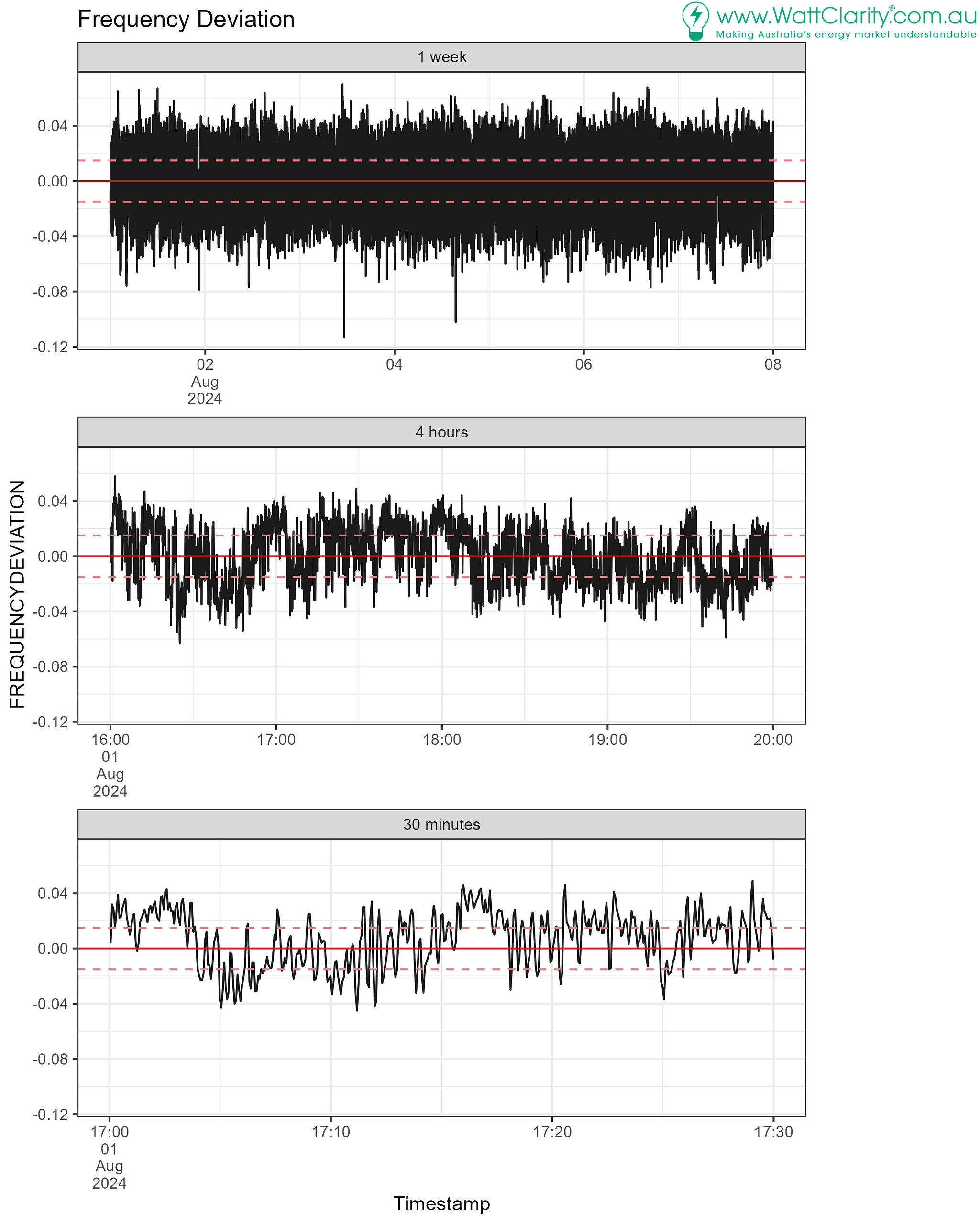
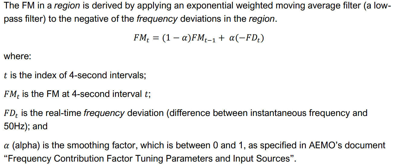
The above chart is the actual frequency deviation at 4-second measurements. How do the FI and FM compare?
The FI is the indicator of corrective responses needed from regulation FCAS
The FI is the indicator of the requirement for corrective responses for regulation FCAS, recovered via Causer Pays. It isn’t system frequency itself. Rather, the FI represents a heavily processed signal of system frequency in the form of megawatts.
We refer to it as the indicator because it is used to indicate whether a unit’s MW deviation is helpful or unhelpful (an unhelpful MW deviation is registered when opposite to the FI).
To allocate costs, the first step is to multiply the FI by a unit’s MW deviation from target trajectory. This results in its 4-second performance. A host of subsequent calculations apply before costs are allocated, which we acknowledge but won’t get into here.
Effectively, unit performances are weighted by the FI such that the performance is positive (deemed helpful) when the two values have the same sign.
The FI for the mainland over the same period as we’ve charted earlier is visibly more stable than frequency itself:
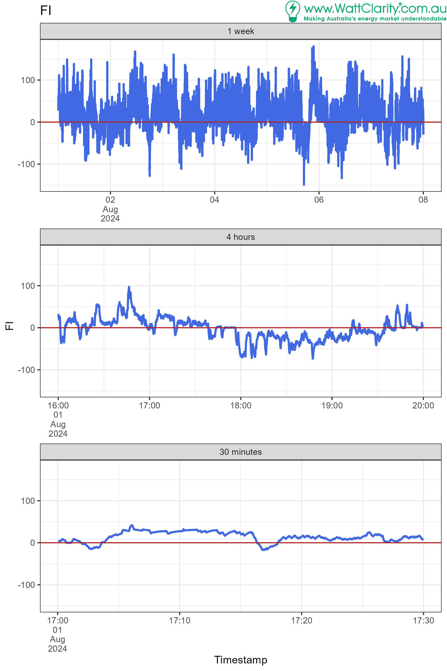
The FI is quite slow-moving, relative to frequency itself.
Over a year (2024) we see that the FI crosses roughly 90% less than frequency itself. It tends to stick to one side (the positive side) for longer periods.
On average FI changes sign once every 8 minutes
For the mainland, the crossings indicate frequency deviation changes sign roughly once every 10 measurements on average, once every 40 seconds.
The FI, in contrast; 0.85% indicates it crosses slightly more than once every 120 measurements on average, roughly once every 8 minutes.
The number of crossings of zero indicates how much less variable the FI is, relative to frequency itself
| Area | FI crosses zero, % of all readings | Frequency deviation crosses zero, % of all readings |
| MAINLAND | 0.85% | 9.73% |
| TASMANIA | 0.90% | 17.57% |
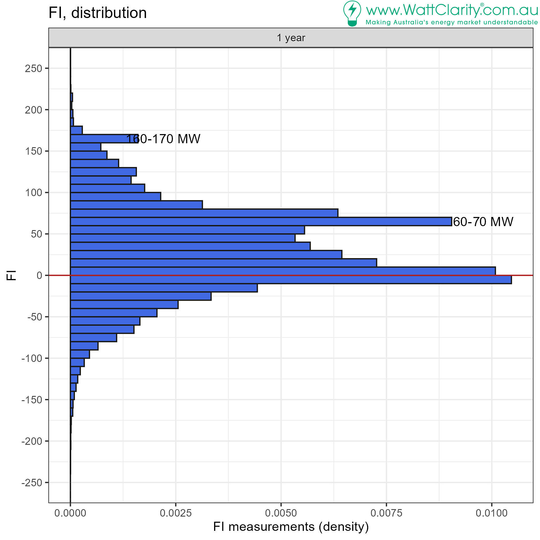
The chart below shows FI tends to stick to the positive side. We see this in the positive bias of the distribution of mainland deviations:

Over a year (2024) we can see the bias towards positive mainland FI values in the chart below.
There are some interesting modes in the distribution at 60-70 MW and 160 – 170 MW.
For the mainland:
So what really is the FI?
The frequency indicator (FI) indicates whether more or less generation is required to return system frequency to 50 Hz, during normal operation. It is measured in MW.
It is the estimate from the market operator’s automatic generator control (AGC) system.
The Causer Pays procedure describes how the FI is calculated. As part of the Incentivising primary frequency response rule change process additional analysis on FPP from IES in 2022 was published which helps to clarify some aspects about the FI. I’ve aimed to grasp it faithfully as follows (yet welcome any clarification from readers):
- The components of the FI metric are generated in real time within the AGC and can therefore only be known after the event.
- Even after the event, the FI metric is difficult to reproduce in a way that makes it useful for local estimation.
- An ACE (area control error) is calculated to be the amount in MW that represents the frequency deviation (that potentially includes an offset to account for ‘time error’).
- The time error requirement was dropped from the operating standard FOS effective 9 October 2023 but the procedure is not clear whether it is still accounted-for in the AGC calculations.
- A MW-per-0.1Hz value is applied to calculate the ACE from the frequency deviation.
- An ACEI (area control error integral) is calculated to represent any buildup of ACE over time.
- The ACE and the ACEI are added, after weighting by variable ‘gain’ values, to produce a Regulation Requirement (RR).
- The gain values are taken from lookup tables and ‘tuned’ from time to time.
- The gains are sometimes adjusted, by the AGC’s logic, which effectively creates ‘deadbands'(static and dynamic) under specific conditions.
- The deadbands are said to be relatively wide.
- This RR is further processed in the AGC, it is:
- Split out to each enabled FCAS provider,
- Processed by low pass filters to avoid large output swings at individual units (smoothed),
- The relatively wide dead band is somewhat disguised by the signal being passed through a low-pass filter after the variable gain has been applied.
- Values are recombined to represent the quantity of Regulation FCAS that AGC has identified in the 4-second period (but may be different from actual enabled amounts).
- These operations make the metric highly non-linear.
The FM is the new measure, post-reform, for FPP and regulation cost recovery
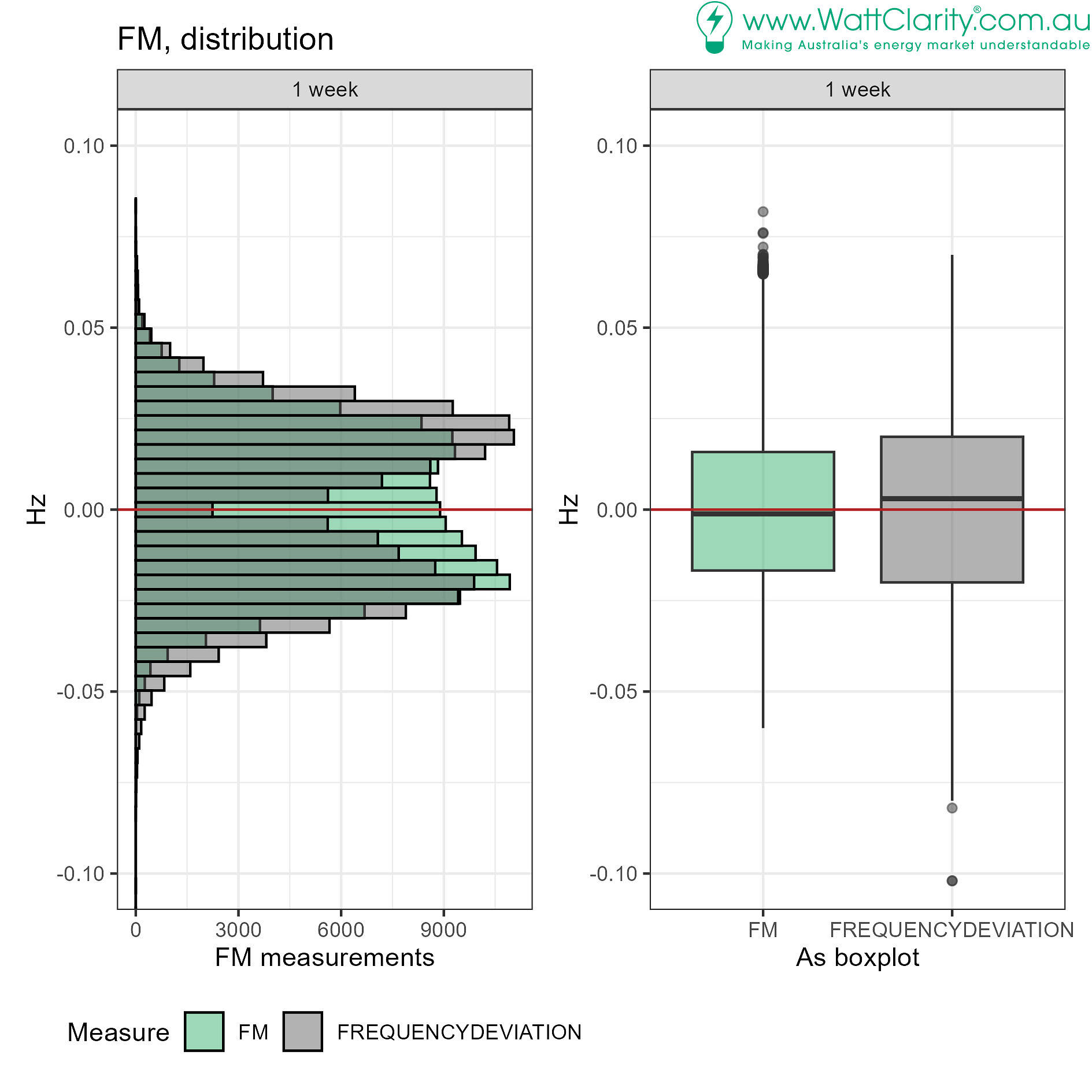
The FM (Frequency Measure) is a smoothed measure of the system frequency’s deviation from 50Hz. It is therefore closely related to grid frequency.
It is a moving average (exponentially weighted). This helps it ‘fill in’ the distribution around deviations of 0 Hz (histogram below) and gives it a tighter range relative to frequency deviation (boxplot).
For the mainland, (the same week as applied to FI and frequency deviation analysis above):
Over a year (2024) we can see that the FM crosses zero much more often than the FI
| Area | Crossings of FI, % of all readings | Crossings of FM, % of all readings | Crossings of frequency deviation, % of all readings |
| MAINLAND | 0.85% | 4.27% | 9.73% |
| TASMANIA | 0.90% | 7.80% | 17.57% |
For the Mainland, 4.27% equates to an average of one crossing of the FM every 90 seconds.
So what really is the FM?
It’s an ‘exponentially-weighted moving average’. The FPP procedure provides the full explanation:
This approach to deriving the measure means it is easy to calculate and understand, relative to the FI.
Alignment with Frequency
In Causer Pays, and in FPP (and changed regulation cost recovery), performance against the measure is usually included for assessment when the measure aligns with the frequency. Alignment is when the measure and the frequency deviation have opposite sign.
For indicative purposes, in our 30-minute analysis window used above, deviations of a unit would contribute to performance assessment at instances charted in blue below (barring outcomes of any alignment tests or data quality tests that procedures may impose):
- An example of misalignment is when the FI is positive and frequency deviation is already positive. The chart below identifies misalignment in red colour. There is a lot of red fill in the FI chart indicating frequent misalignment.
- Conversely, we see that the FM is filled with a lot more blue, – it aligns with the frequency deviation much more often.
On misalignment of the FI
It isn’t immediately a fault of the FI that it is misaligned so often.
It is designed to provide units with the signal to raise or lower output within the regulation FCAS AGC cycle. This means instructions every 4 seconds allowing sustained responses in the form of secondary frequency control.
With the market now seeking to incentivise primary frequency response, which acts much faster, the FI is not suitable as an indicator of faster beneficial unit deviations. Primary responses to fast-changing frequency would often not register, because of the misalignment, if the FI was used as the indicator.
The slow-moving nature of the FI imparts predictability
We’ve seen how the FI can remain positive for long periods (over 10 minutes, in the 30-minute chart above). We’ve also seen how the FI is biased positively.
These aspects afford some degree of predictability in the FI, certainly over horizons of 5-minutes – the dispatch interval.
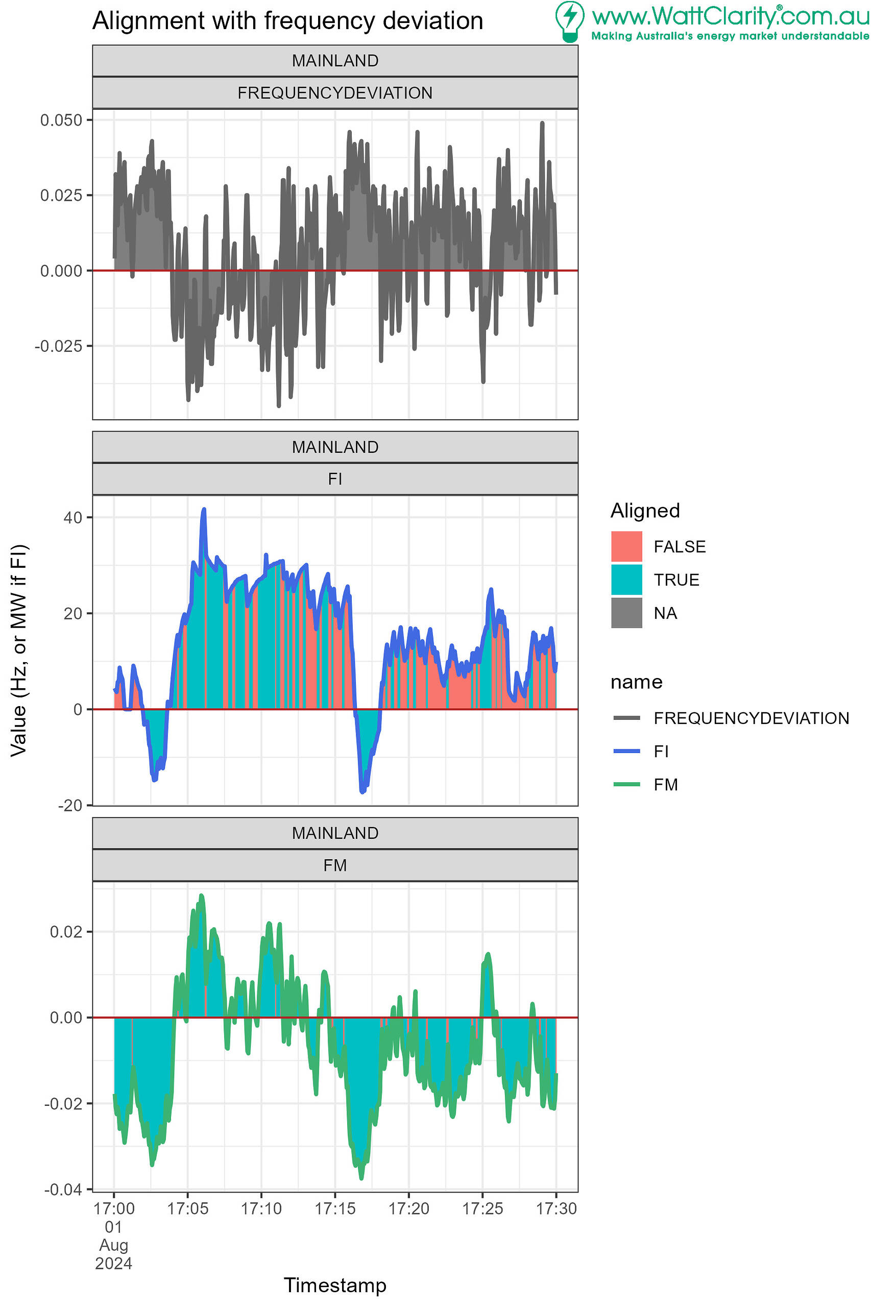
The next chart provides an indication of, when on a particular side, how long the FI stays on that side.
- Mainland data used.
- Approximately a year’s worth of FI measurements from Jan 15, 2024, to Feb 6, 2025 is used (388 days).
- Each measurement is allocated a duration, being how long the run of same-sided FIs was.
- A ‘run’ is a sequence of consecutive FI that have the same sign.
- Runs have durations
- Runs have a side (positive or negative) being the sign of the FI.
On the blue (positive FI) side:
- There’s a tendency for the 4-second FI measurements to stay positive for 40 -120 seconds represented by the first blue peak in the distribution.
- There is a second, wider peak, for runs of positive FI of around 600 seconds – that is 10 minutes.
- The distribution is skewed to the positive side so that we do see many more events of positive FI lasting longer than even 3,600 seconds – 60 minutes.
Examples of the slow-moving nature of the FI
Focusing on a single bar near from the above chart, near 3600 seconds in duration, and approximating:
- At duration of 3,620 – 3,640 seconds, with 4-second measurements, each run (sequence of consecutive 4-second values) consists of ~900 measurements.
- If we are counting ~10,000 measurements (plus/minus, as per y-axis for those durations)
- that equates to ~11 runs lasting a bit more than 1 hour in a year.
- And then there are all the other bars representing similar numbers for runs lasting longer and shorter.
- Including many runs of duration between 3,000 to 3,300 seconds (50-55 minutes).
- If we are counting ~10,000 measurements (plus/minus, as per y-axis for those durations)
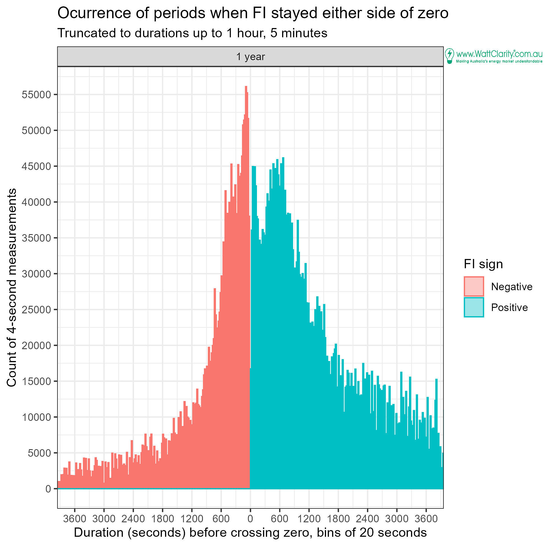
Transforming the above, the next chart counts the number of runs when the duration was greater than a particular length.
- There were more than 8,600 runs lasting longer than 10 minutes when the FI was positive.
- Of those, more than 1,000 runs were of duration greater than 1 hour.
- In contrast there were than 3,500 runs lasting longer than 10 minutes when the FI was negative.
- Of those, 60 runs were of duration greater than 1 hour.
Conclusion
The slow-moving FI frequently spends long durations on the positive side of zero.
Its no stretch to see how a predictable FI lends itself to confidence in guessing whether sustained positive or negative unit deviations would align with the indicator. And that this potential could be exploited to obtain improved performance factors that minimise Causer Pays costs, via deliberate unit deviations (outside of central dispatch, mandatory PFR and and ACG) in one direction or another.
The faster-moving nature of the FM, with the introduction of FPP, removes predictability in the indicator for frequency performance.
Great Post Lindon, really informative of the facts.
I know it is difficult, but perhaps some times Global-Roam could stretch itself into the implications???
Thanks Boyd. Appreciate your encouragement in that direction. There’s more to come from Watt Clarity in this space.