
A couple of recent posts by Paul on high demand outcomes in Victoria – together with some forecast hot weather this week – piqued my interest to take a closer look. Paul’s posts provided a full history of peak demands for every day back to January 2008, and a second post including a focus on where outcomes last Monday (February 3rd) sat in the all-time rankings.
Top of the charts
To kick off this post, here’s a chart of the top 20 maximum Victorian demand days for summer (November-March), split into weekdays and weekends and ranked. Also plotted are Melbourne’s maximum and minimum temperatures on those days.
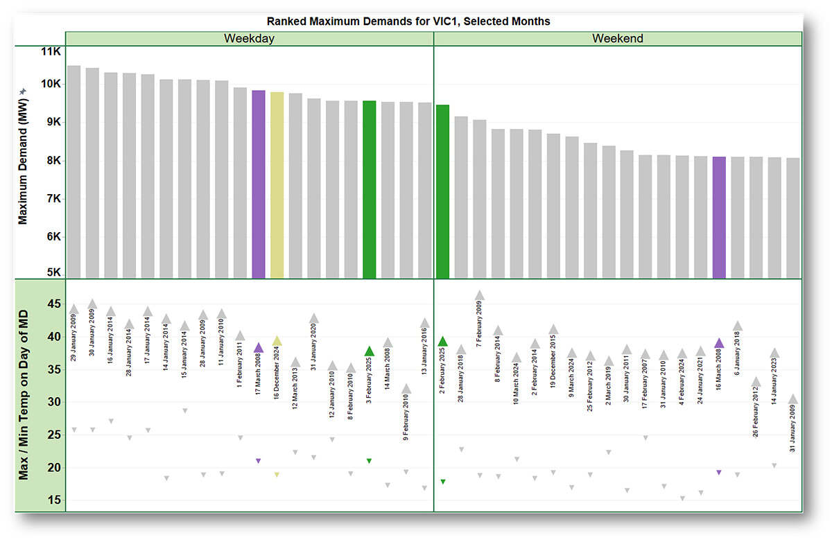
The underlying dataset for this chart is derived from regional market dispatch data published by AEMO and corresponds closely – but not exactly – to AEMO’s “official” half-hourly Operational Demand series, whereas the series that Paul analysed was for 5-minute ‘Market Demand’. Numerically the precise values for these series differ slightly, even though they all relate to demand drawn from the main grid. Despite their differences, relativities in maximum levels remain very similar, and since there are dozens of different ways to define demand in the NEM I’m not going to confuse things any further by quoting precise numbers in megawatts in this post.
The weekday / weekend split is useful because, for a given temperature level, we normally see significantly lower maximum demands on weekends, due to lower commercial and industrial load. On the chart I’ve highlighted a few specific days:
- December 16th last year, the highest Victorian demand day recorded this summer;
- February 2nd and 3rd this year, a pair of successive hot days over a Sunday and Monday, including the day Paul’s post focussed on; and
- A similar Sunday-Monday pair back in 2008, March 16th-17th: these days recorded very similar temperature levels to February 2nd & 3rd this year, so the relativities and changes in maximum demands make an interesting point of comparison.
Some observations from this chart:
- The all-time top 10 weekdays are dominated by outcomes in just two years – 2009 and 2014, on days where Melbourne’s maximum temperature climbed well over 40 degrees. Fortunately for those of us who live there, Melbourne has seen very few such extreme days since summer 2019/20 (in that season only load shedding following a major transmission event prevented January 31st 2020 from registering as a top 10 demand day)
- This summer’s two highest demand days (so far) come in at 12th and 17th on the weekday rankings, noting that Melbourne maximum temperatures were only around 38 degrees on both days
- Considering the period spanned by this data – nearly 17 years – the variation in weekday maximum demand outcomes seems surprisingly small – only about 1 GW, or ~10 per cent of the maximum level. If overall demand levels had been steadily growing or shrinking, we’d probably expect to see the top 20 days concentrated in a narrower time range.
- Weekend maximum demands do show a greater range of variation – partly for purely statistical reasons, since there are fewer weekend days in the dataset so the distribution of temperatures and demand outcomes will be inherently wider.
- Sunday February 2nd this year is the real outlier, recording Victoria’s highest ever weekend peak demand by a large margin, and nearly 1.5 GW or 20 per cent above its distant cousin, Sunday March 16th 2008. On the other hand, their adjoining pair of Mondays, February 3rd 2025 and March 17th 2008, show quite similar maximum demands, with the 2008 day recording the higher demand level.
What about loadshape?
Let’s look more closely at demand profiles by time of day on these two Sundays and Mondays:
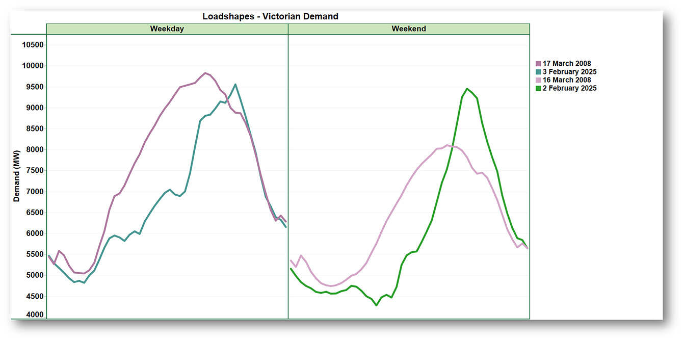
The differences in shape are stark, with much narrower and peakier demands this year than back in 2008. Especially on February 2nd where demand climbs from 5.5 GW around midday to nearly 9.5 GW over the next 5 hours before retreating almost as abruptly. Back in 2008, demand shapes were much broader with extended periods spent within a GW or so of the maximum level. (Of lesser note, we can see that the electric water heating demand peak that used to appear at around 01:00 (NEM time) has vanished sometime between 2008 and 2025, indicating one small change in demand drivers – not that this one affects peak demands).
What about rooftop PV?
At this point canny readers will probably be thinking “but, rooftop PV?” – which isn’t included in this demand series, nor in AEMO’s Operational Demand, nor the Market Demand figures Paul analysed. These datasets all deal with load drawn from the main grid supplied by large-scale generators, and therefore exclude the contribution of small-scale rooftop PV generation (both self-consumed and fed back into the distribution networks).
Obviously this is a major reason behind the very different demand shapes, so let’s add a data series that includes AEMO’s estimated half-hourly gross PV production to show total consumption. We don’t have estimates for 2008 but it’s safe to assume PV production back then was negligible.
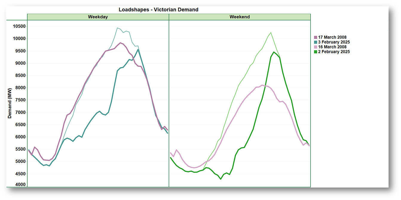
The lighter narrow lines on the chart are the PV-inclusive consumption values for 2025, and clearly more closely aligned – in shape terms – with those in 2008. That said, they do highlight some additional differences in this year’s outcomes:
- Underlying consumption peaked about 0.7-0.9 GW higher than demand from the grid, at times of day when rooftop PV was still providing significant supply. We can think of this difference between consumption and grid demand peaks as roughly the contribution to lowering this summer’s maximum grid demand made by Victoria’s 4.8 GW of installed rooftop PV capacity.
- The peak consumption value reached on February 3rd is comparable to Victoria’s all-time demand record of 10.5 GW set back in 2009 – on a much hotter day – when rooftop PV wasn’t even in nappies.
- For a weekend day with a maximum temperature below 40 degrees, the peak consumption on February 2nd really does seem remarkable, as does the shape of that profile compared to a day of similar temperature in 2008. It would be interesting, but going beyond the scope of this short post, to speculate on the specific drivers behind this change in weekend consumption shape.
What about people?
Standing back though, perhaps we really shouldn’t be too surprised at these results. Victoria’s population has increased by well over 30 per cent since 2008:
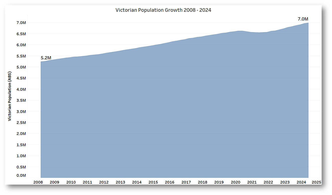
Maybe what’s most remarkable is that, so far at least, peak demand – however measured – hasn’t really grown at all!
Except on weekends.
Postscript: But, Alcoa
One almost hidden feature of the demand outcomes on February 2nd and 3rd this year was that Alcoa’s Portland aluminium smelter reduced its load by about 300 MW in the 20-30 minutes either side of 18:00 (NEM time) on both days:
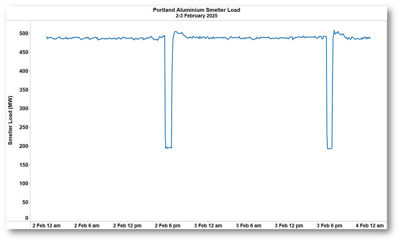
It’s not clear exactly what’s behind these reductions: Victorian spot prices were not excessively high (around the $300/MWh mark), but it’s possible the smelter has contractual arrangements with its energy supplier enabling that supplier to call for load reduction at times of high demand.
Looking back at the day of highest demand this summer there was also a reduction in smelter load, but deeper and longer:
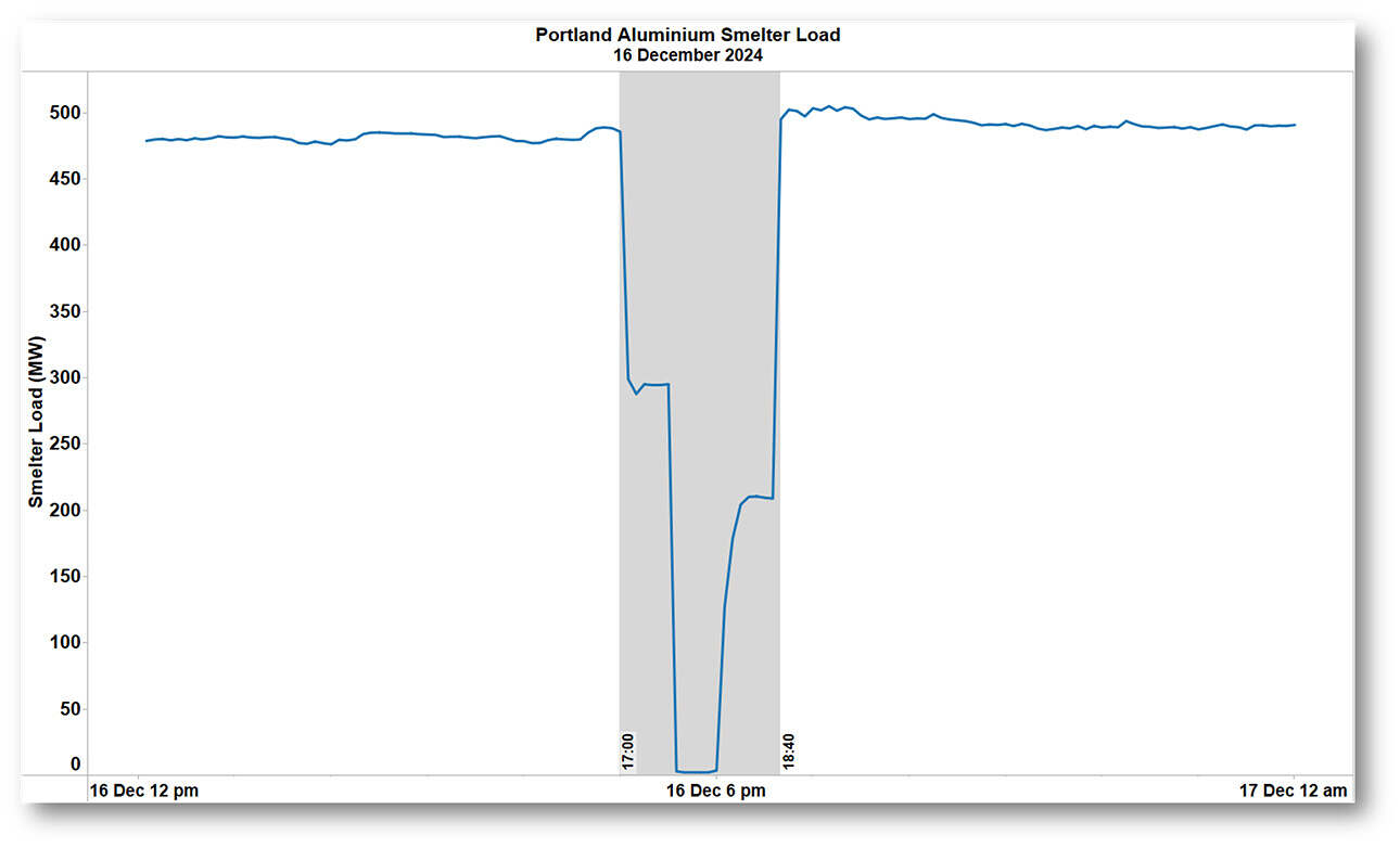
The specific timing and size of these reductions meant that on the two working days (December 16th 2024 and February 3rd 2025), they barely affected the maximum levels of grid demand and total consumption. But on Sunday February 2nd 2025 the reduction was fully active at the time of the grid demand peak, which otherwise would have reached nearly 9.7 GW – a higher level than on the succeeding, equally hot, working day – that would have been an even more remarkable outcome!
=================================================================================================
About our Guest Author
 |
Allan O’Neil has worked in Australia’s wholesale energy markets since their creation in the mid-1990’s, in trading, risk management, forecasting and analytical roles with major NEM electricity and gas retail and generation companies.
He is now an independent energy markets consultant, working with clients on projects across a spectrum of wholesale, retail, electricity and gas issues. You can view Allan’s LinkedIn profile here. Allan will be occasionally reviewing market events here on WattClarity Allan has also begun providing an on-site educational service covering how spot prices are set in the NEM, and other important aspects of the physical electricity market – further details here. |
Guys, I realise you do not cover Western Australia to any extent however your assumption re rooftop PV are spot on. I suggest you start using the BOM satellite cloud maps and the answer will become obvious. We see enormous rates of change in operational demand on hot cloudless days as the sun sets (gets worse as we move past the summer equinox – remember we do not have daylight saving in WA) and the evening peak arrives. If you get a hot overcast (hence humid) day in Perth then the operational demand comes up in the middle of the day and keeps growing. These become big energy days for conventional generation and as we back out of coal, we end up in more gas than can be delivered so hence into liquids. Batteries are there but if there was no spare solar / wind around to charge them it simply implies more fossil primary energy. Train wreck arriving soon!
Portland smelter has two potlines so when this happens you’ll see roughly half then no load (like you see in the charts). You can change power usage a little but there’s a bit of a window to operate in to be make aluminium and not just heat. The Dec 16 outage looks pretty long for an aluminium smelter, probably close to the max they would allow. Based on the load dropped then returned it was one potline for a bit, then the next pot line for a bit with some overlap – so roughly 1 hour per pot line.
Alcoa Portland Aluminium does do RERT – not sure if AEMO activated it then though?
Thanks Michaela, that looks right. Seems one of the potlines draws about 300 MW and the other a shade under 200 MW. The load profile on the 16th fits with the smaller one being tripped for one hour, then the second larger one going off roughly half an hour later, also for a one hour period. As you point out, they probably wouldn’t want a line off supply for more than an hour as they get more temperamental to restart the cooler they get. Allan
PS RERT definitely wasn’t called on any of these dates.
The first point to consider is that making comparisons with 2008 is fraught with difficulties. For starters, this article overlooks the massive reduction in Victoria’s energy intensive manufacturing base. Brand names like Holeproof, Dunlop, Hard Yakka, Fletcher Jones were all Victorian manufacturers in 2008. Ditto intensive energy users like Ford, Holden, and Toyota have subsequently packed up shop. Another big load that has disappeared is the Port Henry smelter at 360 MW. A additional chunky +40MW load is the Altona oil refinery that has closed since 2008. Further, there are all of the upstream suppliers, component makers, and contractors that have subsequently disappeared. The list of loss of manufacturing business goes on and on. Green activists look at the reduction in energy usage and jump with joy. I look at the reduction in energy usage caused by loss of manufacturing and see an economic calamity unfolding in slow motion.
The second point to consider is how the network is having to do double duty boomerang parenting for solar PV owners when a bit of cloud comes across on a hot summer’s day. Customers are quite happy to install a solar PV system, hold up the middle finger to networks by completely undermining revenue when the sun is shining. But then, like wayward children, expect to be able to return to the network in force on a hot summer’s afternoon, when clouds come across or the sun goes down, and demand there is network capacity spare for them. It is the equivalent of an _infrequent_ customer expecting Qantas keeps seat 9C free on every 737 in their fleet for them, on the off chance that they want to book a flight sometime in the next few months. In the real business world, this practice just doesn’t happen. Yet politicians and regulators are encouraging this behaviour. Having idle network for just a few hours every few years is inefficient CAPEX in the extreme. Perhaps it is time for a new rule that specifies a domestic battery of a certain size is installed with every solar PV system.
Making comparisons with 2008, 2023 or any other year since NEM start isn’t “fraught” at all. It’s just data. If you want to get into reasons for changes, let alone your own personal views on their merits, that’s your prerogative but it wasn’t the point of the post.
But on your last point, why wouldn’t we also make a rule to require purchasers of (say) air conditioners or electric vehicles buy a generator of a certain size?
Then I have missed the point. There was a “remarkable” conclusion made that population had grown by 30% but peak demand hadn’t. Yet, the analysis overlooked “the why”. Surely a big part of the “why” is the large base load and large industrial consumers that had closed in Victoria.
By contrast, the population in Queensland has also grown by about 30% over the same period. Yet its system peak demand has grown by about 4GW. Obviously, a big factor is the increase in base load due to LNG and coal mining, the upstream suppliers in machinery and manufacturing, and the population growth who assume comforts like AC are a mandatory in the home.
As for the point about air conditioning and electric vehicles, on households without solar PV systems, they are generally paying their fair share. Particularly AC units that have long daily run times. (AC that only come on for a few hours per year are a burden.)
From a grid perspective, EV on TOU or load control are one of the best customers have around as they suck up electrons in the middle of the night to improve network utilisation when it would be otherwise idle.
While the wholesale electricity market is an important part, 45% of the electricity bill comes from TUOS and DUOS expenses. Declining network utilisation (which is a function of short and spikey peak demand) drives additional network CAPEX that everyone must pay for.