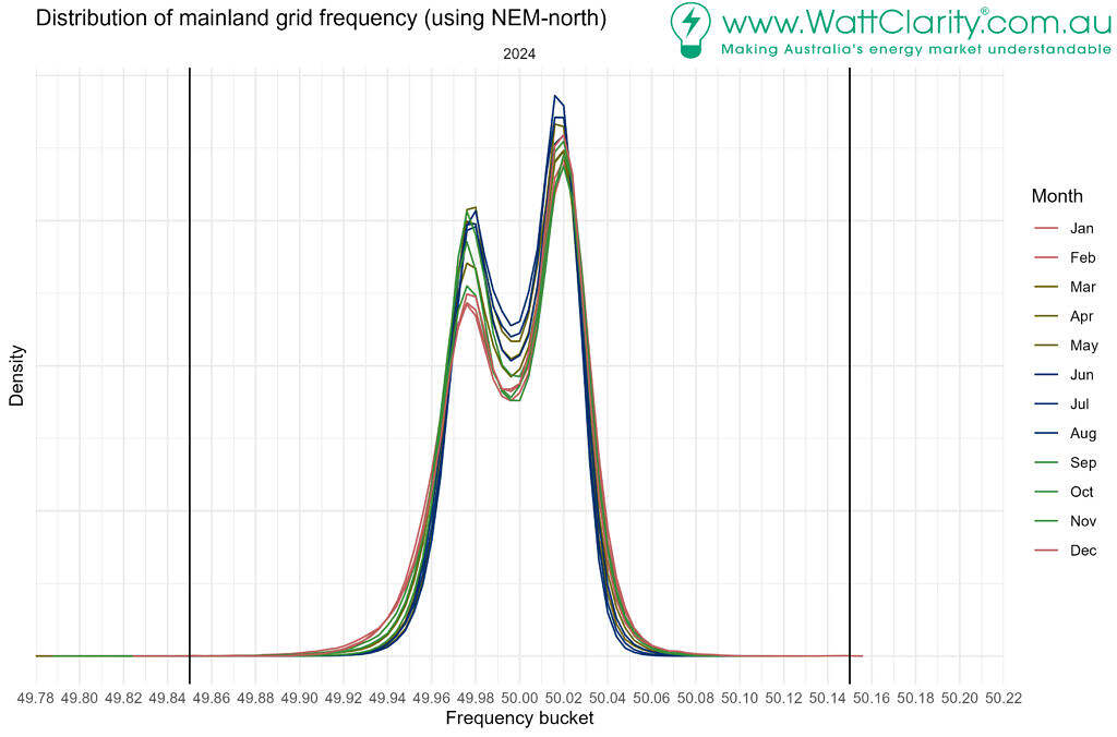
It was captured by a keen eyed reader, that the distribution of mainland grid frequency in recent times now exhibits cat ears.
We can see the pointy cat ears in the high resolution chart of 2024, which was initially presented in NEM Mainland frequency patterns – historical overview from 2024:
Commentators have attributed this to the primary frequency response (PFR) deadband (0.015 Hz either side of 50 Hz). PFR will begin to act once frequency is outside the deadband.
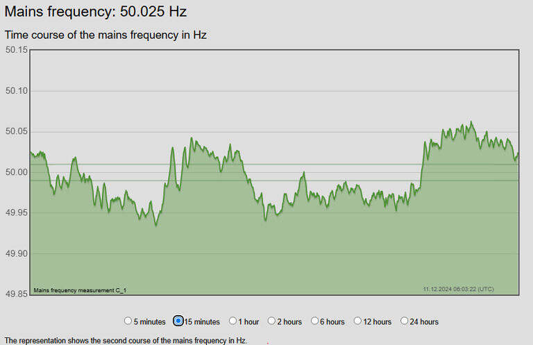
It is resulting in swings above and below 50, and less time spent at 50 Hz, and fewer crossings of 50 Hz.
We can see this in a recent snapshot of frequency from Global-Roam’s logger. Note that the logger’s chart includes two gray lines either side of 50 Hz.These are at 50.01 Hz and 49.99 Hz so they approximate (off by 5 mHz) the deadband for PFR in the NEM.

It reminded me of my golf game, not enough time playing in the middle of the fairway, too much time stuck in the rough. And when I do get out of the rough, I readily end up on the other side of the fairway back in the rough!


Suggest this data by time of day (instead of month) might be interesting too.