
This article was originally published on LinkedIn. Reproduced here with permission.
As the NEM transitions away from its traditional fossil fuelled generation base towards generation more reliant on Wind, Solar and Energy Storage (either BESS or hydro), it is important to understand how the behaviour of the system is changing so we can ensure that its reliability is maintained.
The power system that was designed, built, and connected together in the post war years was made up of large coal fired generation which exhibited large amounts of inertia, which meant there was a built-in natural opposition to changes in system frequency. This generation is being retired and its replacement wind and solar has little or no physical inertia. Instead, as the system transitions, we will have to rely more and more on the responses of automated control systems to maintain system frequency.
How is this working out in practice so far ?
We have some tools at our disposal to provide a picture of what is happening – albeit perhaps not as good as one would like. So before launching into an analysis of the NEM’s frequency behaviour – it is worth first spilling some ink describing the limitations we have with the available data.
Resolution of the data
AEMO measures and records generator MW dispatch and system frequency at 4 second intervals. This is totally inadequate for tracking power system transients that occur during system events. However, for monitoring the slower generation ramping and gradual frequency changes that occur in normal operation – it is usually sufficient.
The four second data provides a reasonable overview of what is happening on the system, but it must be borne in mind that if there are any transients that are occurring on shorter time scales – they will be missed.
Synchronisation of signals
When Australians travel interstate for business or personal reasons – the mode of travel is more often than not by air. Accordingly, I think we often forget how big the country actually is. If we drove between Sydney and Melbourne which takes perhaps 10-12 hours , instead of flying ( about 1 ½ hours) – our perceptions might be a bit better aligned with reality.
The various signals that come from the 400 or so power stations connected to the NEM have to travel to a central control centre so they can be compared. To do so they have to travel through thousands of km of communication links and various network routers. The speed at which the signals are propagated is very fast ( approaching the speed of light) so surely this shouldn’t matter too much, but there are also processing delays to consider. During “busy” times – several seconds of delay will often be experienced and the order in which changes appear to occur may be different to what really happened.
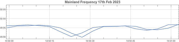
An example of measurement mismatch is given below, the mainland frequency is logged using two channels, designated “FREQ NEM SOUTH” and “FREQ NEM NORTH”. The figure below shows that while they track each other quite closely, there is often a several second delay between each trace.
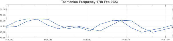
Similar delays can be noted for frequency measurements in Tasmania.
Filtering in the power system
However, even if we had high resolution data and perfectly synchronised signals there would still be inherent delays which would make analysis difficult – the delays inherent in the power system itself.
The power system can be modelled quite accurately by considering the transmission lines to be like springs, and the generation and loads to be like weights. System transients run up and down the power system much like the wave impulses up a “slinky”.
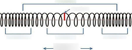
Figure 3 “Slinky” representation of wave travel
The time required for the transient to travel from one end of the system to the other is quite significant, and there will be reflections at any discontinuities in the power system (i.e. substations, power stations and loads) . This creates “noise” in the frequency signal which makes it difficult to clearly assign causation between changes in power and the measured system frequency. Like trying to follow several conversations at a party in an echoing room, the sounds all get jumbled up together making it difficult to hear.
A large disturbance in one location on the system may have only a minor effect on system frequency measured at another point, and vice versa. Therefore, you can’t assume that large power steps will necessarily create a bigger impact than a smaller step change in power. The system is a large low pass filter, and like a filter, effects can be attenuated or amplified at various locations.
In summary – analysis of power system frequency changes is not trivial – we have incomplete, low-resolution information, and the system itself exhibits complex behaviour. Despite this – as demonstrated below – we can connect some of the dots and provide an out of focus picture of how the system frequency behaves.
Disclaimer
All of the information herein is based on my analysis and any opinions, omissions or errors are mine alone. I also want to make it clear that any descriptions of generator dispatch behaviour below do not in any way imply that the observed behaviour was incorrect or contrary to good engineering practice in any way. This is only a description of what I think happened to the system frequency over a few hours of a typical day in the NEM, and what the main causes appear to have been for the observed frequency behaviour. In most respects the chosen time to analyse was uneventful, there was no loss of supply, the frequency remained reasonably well behaved, albeit with some unusual swings, it was in fact a boring day to be a system operator – which is what all experienced operators wish for.
Analysis Tools
The analysis toolkit includes plotting the data and comparing the graphs which is a traditional method used to workout causation of transients. However, there is another tool in the toolkit which will be described below, which is known as “independent component analysis” (ICA). I like to think of this as a type of “information spectrum” of a collection of signals.
A traditional Fourier analysis approach splits up a signal into individual frequency components, whereas ICA splits up a collection of signals into a new collection of components which are “statistically different” from each other. In information theory terms, the “mutual information” between the signals is minimised.
Analysis of Frequency signals
An example may make this clearer. Below is a chart of the four frequency channels that AEMO publish on their website the mainland frequency traces being the subject of recent discussions and articles on LinkedIn and WattClarity.
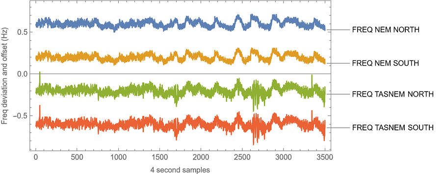
Figure 4 Offset Frequency measurements on the NEM for Feb 3 2023 over a 3 hour period
Using ICA, we can rearrange the four measured signals into four plus a constant signal which look like the following (I have purposely suppressed the graph axes, it’s the shape of the signals that is important, not the scale which is normalised):
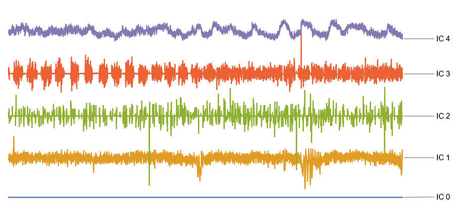
IC 0 is always flat (by design) and is used to model the dc-offset in the analysed traces.
By eye you can see that IC 4 is the component closest in shape to the system frequency measurements, the other traces much less so.
It is straightforward to calculate the individual contributions that each IC has to each frequency signal. This is shown below as a series of bar charts. This is what I like to think of as the “information spectrum” of the four frequency traces.
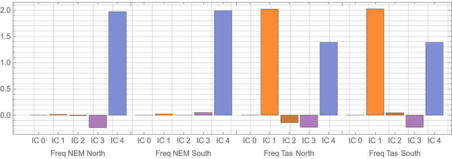
From the bar chart it is easy to apply the following interpretations:
IC 0 is zero – this is because I subtracted the mean from the signals which means they all have zero DC-offset.
IC 4 – represents the underlying “system frequency”, which is an amalgamation of both the mainland and Tasmanian frequencies, north and south.
IC 1 – represents most of the difference between the frequency in Tasmania and the “underlying system frequency signal”. Tasmania is connected to the mainland via a HVDC link, so there is no reason why it should operate at the same frequency. However, the frequency of Tasmania follows the mainland frequency via its control systems, albeit the two are not locked together. The frequency in Tasmania is less stable than the mainland, in part because it is a smaller system – flows across Basslink have a bigger impact on Tasmania then they do the mainland system.
IC 2 and IC 3 are relatively small and between them appear to represent the processing time delays between the north and south frequency measurements.
Independent component analysis can thus be used like a microscope ( maybe more like a poorly smudged magnifying glass) to pick out differences between signals that would otherwise be too small to notice.
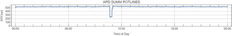
APD load changes
The analysis above only considered the frequency traces, but there is no reason why generation and load traces cannot also be included.
In this section we will look at the effect of load changes at APD which on the day being analysed showed a step down and then up in load.
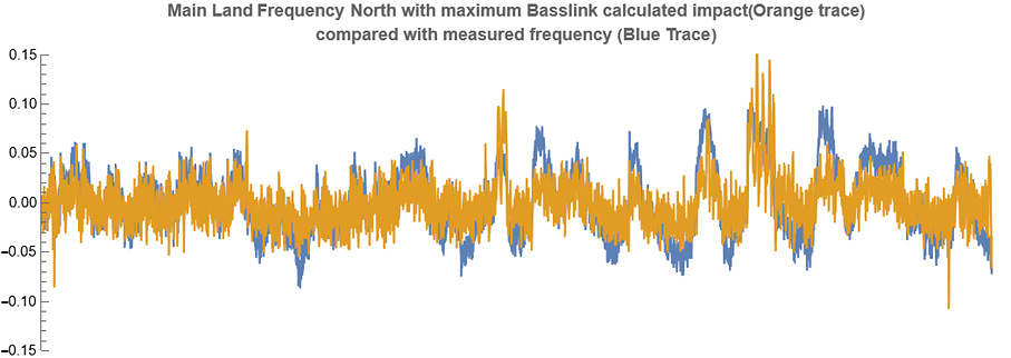
Splitting the frequency plus APD load traces into independent components, it is possible to assess the maximum impact the load step can have had on the system frequency. The next graph shows the outworking of this calculation:
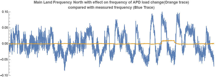
Looking at the magnitude of the actual change in frequency compared to the calculated impact of the change in load, it looks like the calculated impact is too small (also let me emphasize – the calculated effect is a maximum, in theory, the real impact might actually be less). However, this belies the complexity of the situation. In addition to the step change at APD, there is a lot more going on in the system. Only by adding in all of the generation and load changes (some of which is not even directly measured) can we hope to match the measured system frequency.
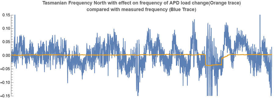
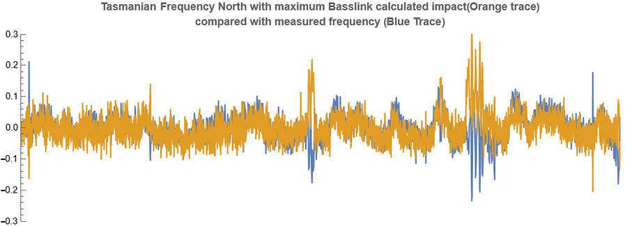
The maximum effect that the APD load change had on the Tasmanian frequency is shown below:
A few points to note:
- Why would Tasmanian frequency be affected by a load change on the mainland? – This is likely because the control systems of Basslink would have responded to the frequency change on the mainland. Note that the large oscillatory transients in Tasmanian frequency coincided with the load step, indicating the interaction with Tasmania is quite complex.
- The analysis indicates that the frequency in Tasmania went down in response to the initial step change down in load. This is counterintuitive, but I have checked the maths and the analysis appears to be sound. I believe this result may be due to some aspect of the control systems setup in Basslink, coupled with the governor control systems of the predominantly hydro fleet of generation in Tasmania. Similar load steps at Wivenhoe (described below) do not exhibit this reversed impact behaviour. This could be because Wivenhoe is geographically and electrically located quite far from Basslink and thus did not trigger a negative response.
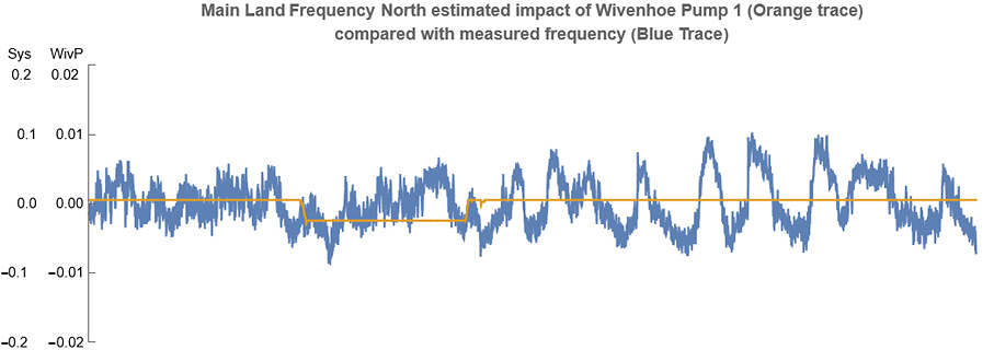
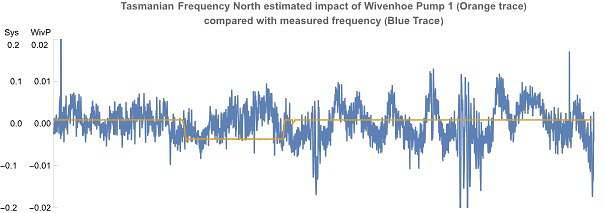
Wivenhoe Pump Switching power flows
We can repeat the method used above to gauge the impact of APD on system frequency, to Wivenhoe, (which at the time was flowing from the mainland towards Tasmania).
Wivenhoe Pump 1 was switched on and then switched off again in the time region of interest. The analysis indicates this had a barely discernible effect on the system frequency. To see the effect, it is plotted on a different scale to the system frequency.
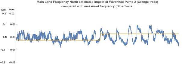
Wivenhoe Pump 2 was switched off in the time region of interest. It appears to have had a slightly larger effect on the system frequency than pump 1, but the measured effect is still very small.
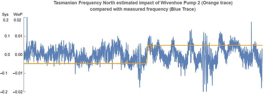
Reiterating, the magnitude of the measurements depends not only on the magnitude of the disturbance but also on where the disturbance is in relation to the measuring point of system frequency. The power system acts like a low pass filter, which means that the change in voltage phase angle (i.e., frequency) can temporarily be different across different locations during power swings. The equations used to model power swings, relative phase angle and frequency at different points on a power system are identical in form to those used in AC circuit theory to calculate voltages and currents. Resonance effects can cause disturbances in one location to look quite different to very similar disturbances in another location. Local governor control action by generators near the disturbance can also act to mitigate or amplify its effects. This appears to me to likely be the reasons for the substantially different magnitudes of estimated disturbances for load changes at Portland compared to Wivenhoe.
Selected Wind Farms and Solar farms
The intermittent nature of Wind and Solar has raised concerns that they could be a problematic source of frequency disturbances as the transition proceeds. So far this does not appear to me to be the case. It is certainly the case that, both Wind and solar generation sometimes experience rapid ramping due to loss of sun or wind, however it is also the case that the market re-dispatches generation in order to optimise supply and demand.
Below are charts of selected solar and one wind farms that appear to have caused the largest frequency disturbances at in the period being analysed.
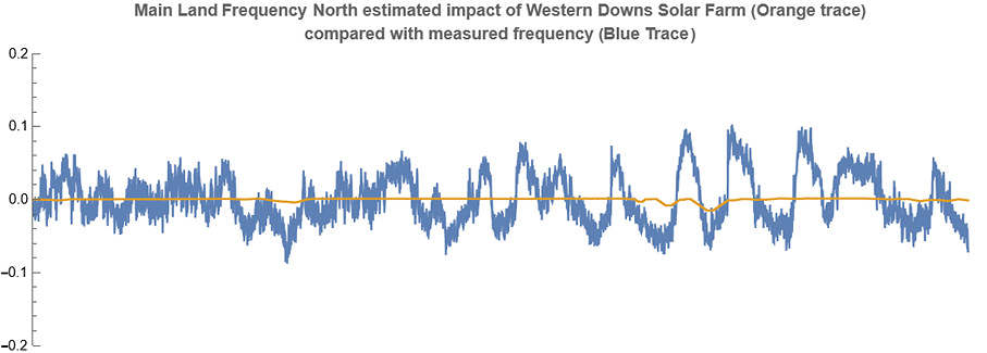
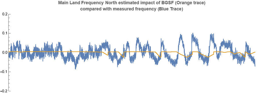
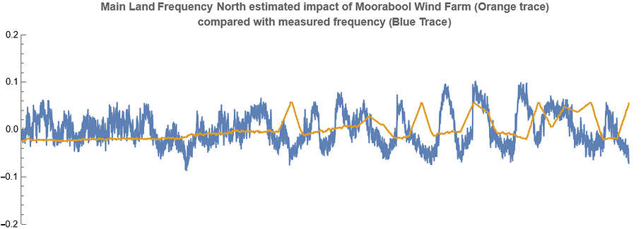
Although it is not possible to say for certain, the above responses appear in most cases to be due to following market dispatch instructions rather than say cloud cover over solar farms, or rapid loss of wind resource for the wind farm. This has been discussed in some detail in Allan O’Neils Watt Clarity article which can be found at https://wattclarity.com.au/articles/2023/02/investigating-last-fridays-frequent-frequency-swings/
In general, this seems to be the case. The intermittency of Solar and Wind is undoubtedly contributing to the frequency changes on the system, but so far its effects appears to have been swamped by market dispatch behaviour causing generation plant to ramp to new setpoints.
Yallourn W1
Reviewing the behaviour of some of the coal fired units indicated that Yallourn W1 in particular seemed to be participating in the measured frequency swings as shown below.
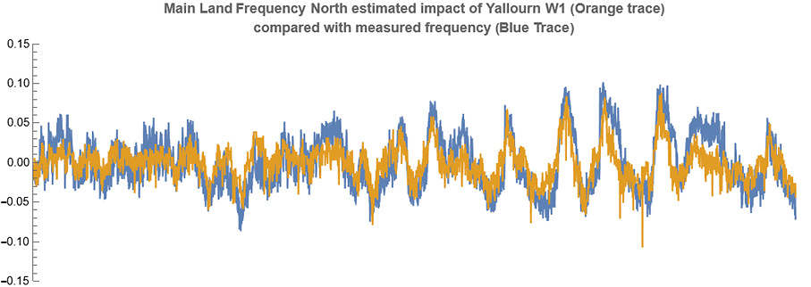
The correlation between the output of Yallourn W1 and the system frequency is quite compelling, and initially I thought I might have got the power trace upside down, because contrary operation is what would be expected from the governor control system. On closer inspection, the ICA revealed that two out of three components are opposite phase between the output power and the system frequency, but there is one component which is in phase which causes the high degree of correlation shown above.
Correlation does not necessarily imply causation, but it seems likely to me that there was an interaction occurring between the system and Yallourn W1 which contributed to the observed frequency swings. The power flows across Basslink at the time also appear to have played a part and are shown below. They also appear to show reasonable levels of correlation although not as good.
Summary and future directions
The frequency behaviour of the NEM is complex and will change as the system mechanically based inertia is replaced with fast frequency control supplied by grid forming inverters. Accordingly, we have to keep a close eye on the system frequency control to ensure it remains robust. The tools we have to monitor this are quite crude but even so they are probably underutilised.
At the moment it appears to me that most of the disturbances we see in system frequency appear to be due to generators changing their dispatch outputs in response to market directions, and occasionally (along with large load steps) that may trigger complex interactions with the various control systems that individual generation plant has in place. Obviously, we want to keep these interactions well bounded, so they don’t cause any system issues – in the worst case resulting in blackouts.
So far that seems to have been the case – but we shouldn’t be leaving this to chance.
In devising the best way forward, the first step is defining the problem by gathering the data and analysing it to reveal the patterns in behaviour. This is not a trivial task which I hope this contribution to the discussion provides some appreciation of.
About our Guest Author

|
Bruce Miller is an Electrical Engineer from a High Voltage Power systems background. He has experience in design, commissioning and project management and the development of mathematical and software tools.
You can find Bruce on LinkedIn here. |
Be the first to comment on "The NEMs frequency behaviour – how is it going?"