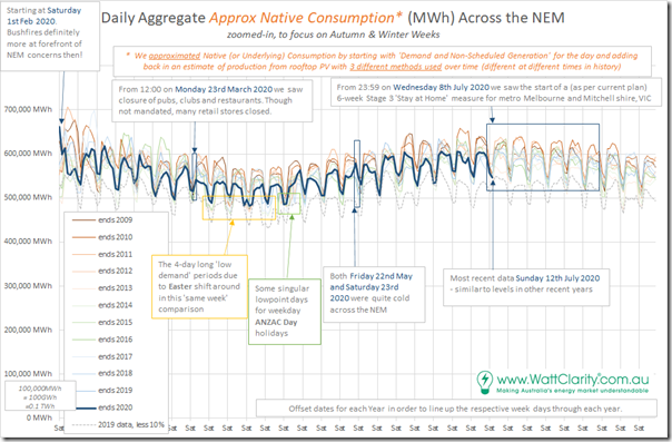
It’s Monday 13th July 2020, so we’re into the first week of what we hope is only 6 weeks of ‘Stay at Home’ (Stage 3) restrictions for metropolitan Melbourne and Mitchell shire in Victoria, as a result of the spike in cases seen there – and there is also the worrying spurt in cases now being detected in NSW.
This Wednesday I’m speaking to a virtual audience organised by Vestas about ‘NEM merchant pricing – is this the new normal?’ and have been asked about the effect that COVID has had on electricity consumption (hence flowing through to prices) so I thought I would have a quick look at what’s changed since I last had a look at the data…
(A) Prior analysis posted on WattClarity®
Firstly, a quick review of what we’ve published before on this topic:
| Tuesday 24th March 2020 (First Article) |
There’s been a lot of water under the bridge since I posted these ‘1st thoughts on possible impacts of COVID-19 on Australia’s National Electricity Market (NEM)’ . In that article, I mentioned three different ‘levels’ of concern: Level 1 = about electricity infrastructure. There are still concerns here: 1a) With some maintenance having been deferred from the traditional outage period prior to winter, there will be challenges in the lead up to summer to ensure we’re all ready to go for the summer peak periods. Watch this space… 1b) There’s also talk about possible construction/commissioning delays with new plant due to additional difficulties in arranging the relevant international experts to come onsite at various points. Challenges to work through. Level 2 = about demand. That’s what this article is about. Level 3 = broader impacts. Given that the services sector of the economy has been significantly hit and that there are currently planned sunset periods for different aspects of support provided by the Government, I have concerns about what it means for energy users – and hence flow-through effects on energy retailers and others in the supply chain, when the music stops and we find out how many chairs are missing. Watch this space… |
| Tuesday 31st March 2020 (Second Article) |
This was then followed up the following week with ‘Electricity demand as a Performance Metric, in the age of coronavirus’. Thankfully it seems that the broader information economy has been providing metrics that are better than electricity consumption to map the impact of COVID. |
| Thursday 16th April 2020 (Third Article) |
Spurred on by some conversations I had seen elsewhere, I cautioned that we should be ‘Careful with the ‘doomsday claims’ that COVID responses have (or will) massively reduced aggregate underlying electricity consumption in the NEM…’ and blah blah. In the analysis behind that article, I was able to extend the number crunching to also look more directly at ‘Underlying Consumption’ in order to avoid the confusion that some might be suffering when equating the reduction in ‘Operational Consumption’ (or ‘Grid Consumption’) that’s happened because of an uptick in rooftop solar PV with COVID effects. |
| Sunday 24th May 2020 |
Somewhat related to this topic, I was able to utilise the same data structure to look at ‘Underlying Consumption’ just for the QLD region in posting about how ‘Sunshine State forgets its own branding on Saturday 23rd May 2020’ and hence how underlying consumption rose. |
| Monday 13th July 2020 (Fourth Article) |
Which brings us to this fourth article here in the series looking at NEM-wide daily aggregate consumption levels. |
So let’s have a quick look…
(B) Short update on 13th July 2020
Cutting to the chase, this trend of ‘Underlying Consumption’ or ‘Native Consumption’ which has been extended from the third article above:
for those who need a refresher on the different ways in which demand and consumption are measured in the NEM, here’s the explanation from 2018.
To make it easier to understand (in comparison to the more severe lockdown effects in other locations) I’ve also drawn a dotted trend to help all readers understand where 2019 daily underlying consumption would have been if it were 10% lower (some other locations have seen reductions greater than this).
1) Comparing the trends for the days shown in 2020 (i.e. February to July) we see that the daily consumption is clearly higher than the ‘2019 less 10%’ trend.
2) Remembering that individual days in each year will also be affected by weather patterns and other effects on a ‘like day for like day’ basis, we can see the trend for 2020 is much the same as prior years, perhaps a little lower (but that reduction was also seen prior to COVID lockdown).
3) So it seems clear that the aggregate consumption might have dropped by a percent or two, but no more than that.
Hence it seems clear that (at least in terms of aggregate Underlying Consumption), the NEM has escaped more severe effects …. at least for now?
Remember that this analysis:
1) Does not look at the effect on individual regions;
2) Does not look at the effect at different times of day (where other analysis, like from the ENA, suggests there has been a shift – which seems logical); and
3) Does not look at the effect on different types of customers (e.g. ‘at home’ consumption will have risen, whilst CBD consumption will have fallen … and so on).
That’s all I have time for today…


Leave a comment