As frequent readers would be aware, we’ve been investing considerable resources (both hours internally, and dollars externally) in the development of our Generator Report Card 2018 (page updated with a bit more detail) in conjunction with collaborative partners in that venture, Greenview Strategic Consulting. A rough guess is that we’ve easily invested easily many thousands of hours – and are seeing a number of interesting things in the data (with the task transitioning to reporting on them).
… which is why it is nice for a change to think about something a little different.
——————–
I received a call recently from an Energy User who is a client of ours. This energy user is one of the growing number we work with that (as described here) have some form of spot exposure in their retail procurement arrangements, and so watch spot prices with the option of curtailing when prices exceed their trigger levels as part of a physical hedge – a form of Demand Response.
The dispatch price spiked at 16:15 on Thursday 31st January and it was not previously forecast in predispatch (and my inference is that it hurt) so they were conducting a bit of an investigation to why this happened – and what they could do about it.
I walked through through a couple of things at the time, but promised to have more of a look and put something together for them. Given the time it’s taken to do this (and because we know this will be more generally useful) I’ve posted it here and will let them know.
(A) Why it matters, for Energy Users like these
As noted before, there’s a sizeable – though notably opaque – volume (in MW demand terms) of energy consumption in the NEM that delivers a form of “demand response” that’s triggered as a result of some form of exposure to spot prices. We’ve been involved with a fair number of these customers as noted here – some for more than a decade.
Because they respond to spot prices as they are published, this offers an advantage that they can secure a lower average cost of energy by incorporating physical curtailment as a hedge, as guest author Mike Williams noted here.
However the facts that forecasts are not firm (and necessarily do change as market conditions change) also means some residual exposure. That’s why we have listed this (i.e. lack of firmness in forward pricing) as one of the real barriers we have experienced to more widespread adoption of demand response. We’ll note more (when time permits) about what we can do to help energy users with this one).
(B) Why did the 16:15 price spike surprise us?
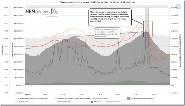
For some context, I have included a trend here from our online Trends Engine that could be created by both our NEMreview clients, and those using ez2view online. For clarity I have highlighted the particular period of elevated pricing late in the afternoon on Thursday 31st January:
I’ve also highlighted how:
- The demand on that Thursday was up around 14,000MW, which is quite a high level for NSW.
- Also, the NSW demand was more than 1,000MW higher than the level experienced the day before, and yet available generation capacity was much the same
- … both indicators of increased risk of price volatility.
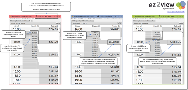
Using Time Travel in the installed version of ez2view and showing three copies of the same widget side-by-side (just at different points in time) we see how the price spike of particular interest evolved (click on the image for a large-screen view):
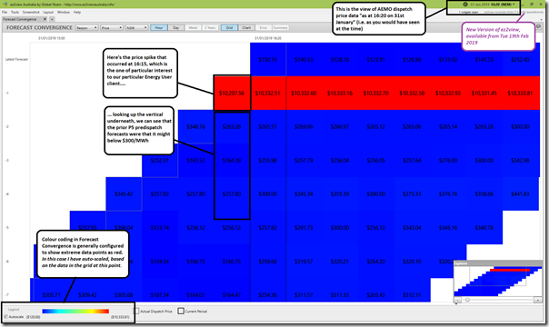
We can see clearly the challenge that faced the particular energy user in question – the price spike was not telegraphed, in advance, in P5 predispatch forecasts.
In prior articles (like those which Google finds for you here) I’ve used the “Forecast Convergence” widget in ez2view to provide a picture of how certain aspects of AEMO’s forecasts change over time, sometimes unexpectedly – as in the case of the price outcomes above. To start with, I have used Forecast Convergence to re-assemble the same three price snapshots above into one widget as follows:
We first added this widget to ez2view some years ago, but more recently have been adding in some enhancements (additional data sets and functionality), some of which is highlighted below.
(B1) AEMO’s expectations of “market demand” increased
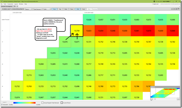
Flipping the widget to now look at AEMO’s forecasts for demand on the same basis, we identify one of the factors that led to the price outcome being higher than forecast:
As noted on the image, we see that the Scheduled Demand outcome (in terms of the TOTALDEMAND target number used in NEMDE to produce the dispatch price outcome) was 88MW higher than that forecast just 5 minutes before that, and higher still than the forecast 5 minutes before that. Let’s call that “Contributing Factor #1”.
Incidentally, we also see (presumably at least in part as a result of the price spike) that the Scheduled Demand dropped by about 200MW to 16:50 (i.e. 13,823MW to 13,626MW), as another indicator of the presence of (spot exposed, and presumably automated) Demand Response in the NEM.
(B2) Aggregate supply from Intermittent plant dropped
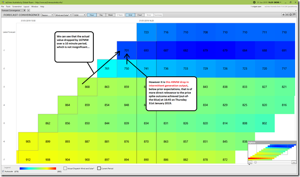
Flipping again to another option in Forecast Convergence, we look at how the AEMO’s forecasts for the aggregate output of intermittent generation in NSW changed leading into the price spike:
As noted on this image, we see that the contribution of intermittent generation was lower (by 49MW) than that forecast immediately prior to the event.
Let’s call that “Contributing Factor #2” – however note that there is some overlap between this and the increased expectation of Scheduled Demand, which needed to be met by dispatching more scheduled generation.
Some of the gory details of how demand is measured in real time was explained here.
(B3) Imports from Victoria dropped
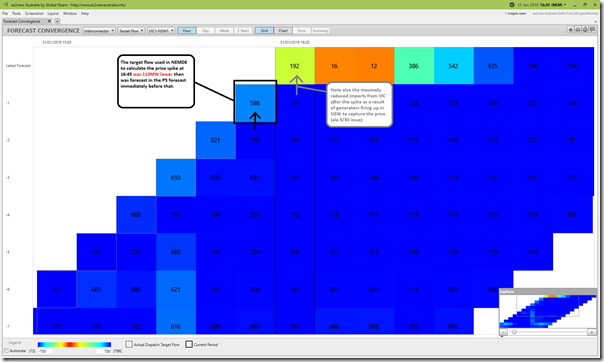
Flipping again to select the Interconnectors option and look at flow on the VIC-NSW interconnector, we see the actual target flow north from VIC in the 16:45 dispatch interval (i.e. 598MW) was 110MW lower than had been forecast in the P5 forecast immediately before that:
The colour-coding in this case focuses on the greater change in flow north from 16:45 to 16:50 in response to the price spike, but it is the smaller magnitude change (from 16:40 to 16:45) that was the next contributing factor to the price spike in the first place.
Let’s call that “Contributing Factor #3” – however it’s a simplification to call a change in target flow a contributing factor, as the target flow is an outcome from the NEMDE run, and not an input. Target flows are what NEMDE calculates that they need to be to solve the Objective Function* for a dispatch interval.
* In simple terms, the Objective Function is to minimise the aggregate cost of Energy and the 8 x FCAS commodities across all regions of the NEM collectively, where participant bids for Energy and FCAS are treated as costs and the solve is typically subject to between 500-800 discrete constraint equations. For those who want to understand more, we’re increasingly called on to arrange training, utilising the services of external consultants who are more knowledgeable than us.
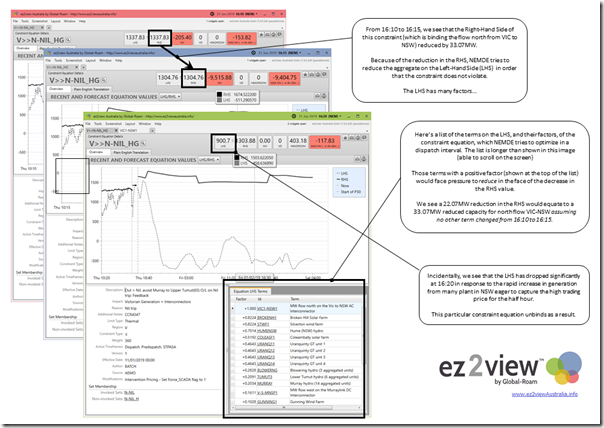
In simple terms, to understand the real contributing factors that lie behind the reduced target import from Victoria, we would need to look behind that to understand what was lying behind that reduction. No time to do that in detail now, but I will flag that the constraint equation “V>>N-NIL_HG” was bound at 16:10 and 16:15, having the effect on limiting imports from Victoria – and also acting to limit output of some scheduled (e.g. Uranquinty, Blowering, Tumut 3 and Murray) and semi-scheduled plant (e.g. Silverton Wind Farm, Broken Hill Solar) as well:
(B4) Small increase in imports from QLD
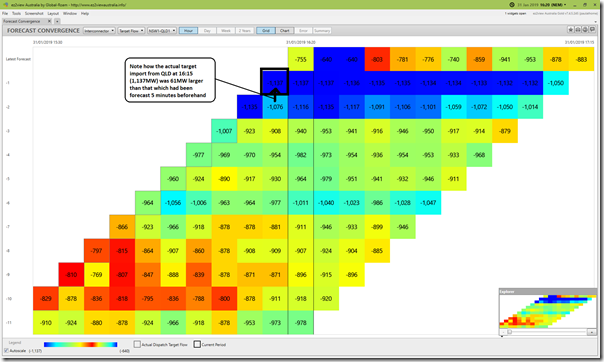
Flipping to look at target flow on the QNI interconnector (remembering that negative numbers are flows south from QLD into NSW) we see that the target flow barely changed from 16:10 to 16:15:
However we do note that the import at 16:15 is 61MW larger than that forecast 5 minutes before , hence this would have partially offset the (110MW) reduction in imports from Victoria compared to what was forecast.
(B5) Generation supply within NSW
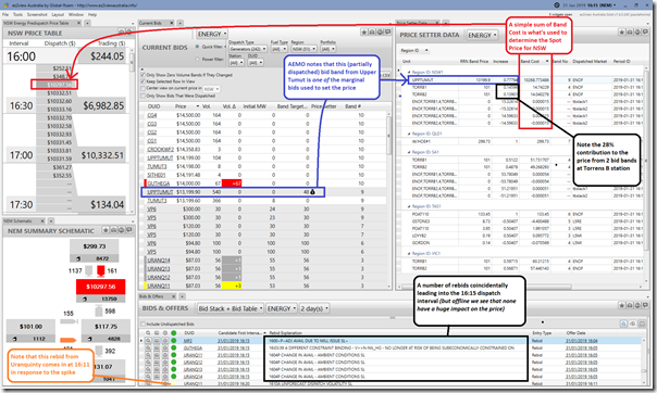
As with constraints (above), so it is that there are levels of complexity in how generator bids are taken into account in the dispatch process. I don’t have much time to drill into this today, but would add in this snapshot from 16:15 on which I have annotated a couple things.
In quick order:
(B5a) Multiple units, some in SA, involved in setting the NSW spot price
We see that it’s a partially dispatched bid from Upper Tumut (i.e. 48MW target of 540MW offered at $13,199.90 at the RRN) that is making a large contribution to where the price actually lands.
However it’s also important to note that the remaining contribution to the price comes from outside the NSW region.
- It’s a 28% share of the uplift from the offers at Torrens B1 and B2 (which are both at $101.00 at the SA Region RRN).
- The Bids from Torrens set the price in South Australia, and also VIC (adjusted for dynamic inter-regional loss factor), and also in NSW as well;
- The “Increase” column does not sum to Unity, because of the complexity of the co-optimisation process (incl inter-regional losses).
(B5b) No capacity offered, by anyone, in between $300/MWh and $13,199.60/MWh
The second thing that jumps out is that there is lots of empty space between the volume offered by Vales Point at the cap price of $300/MWh and the volume that was required to be dispatched on this occasion at Upper Tumut. This kind of “tipping point” is a natural function of market outcome considering that demand on the day in NSW was up close to 14,000MW (i.e. not too far away from its all-time maximum levels). The fact that the price had jumped from $252.51/MWh (at 16:05) to $348.76/MWh (at 16:10) just beforehand was a good clue that we were on a knife edge (see 2nd image above).
(B5c) Some rebids flagged
We’ve highlighted the rebids (see note 1) made just in time for incorporation in the 16:15 dispatch run (i.e. submitted just prior to the cut-off before the 16:10 commencement of the dispatch interval).
Box Note 1
As part of our Generator Report Card 2018, we’re taking a detailed look at rebids. In this earlier article, I noted how we were classifying the bids according to the most recent AER Rebidding Guidelines. Readers will note that none of the rebids highlighted are “Well Formed”, if applying a strict interpretation of the AER’s guidelines, because of a number of factors:
(1) EnergyAustralia’s rebid for Mt Piper included the “~” character instead of spaces.
(2) Snowy’s rebids for Guthega include colons (and seconds!) in the portion that AER asks to be just HHMM.
(3) Origin Energy’s rebids for Uranquinty did not include a space between HHMM and the Category.
These differences seem a bit like splitting hairs (especially as the 3 patterns noted above seem fairly consistent for the portfolios – and, we presume, just probably an outcome of the pre-existing bidding software the portfolios use), hence we have loosened the filtering to incorporate these sorts of patterns. However that still does leave a fair number (in numerical terms) of rebids “Not Well Formed” across the entire set of rebids over the past 2 years – with examples further below.
These rebids are from three different entities:
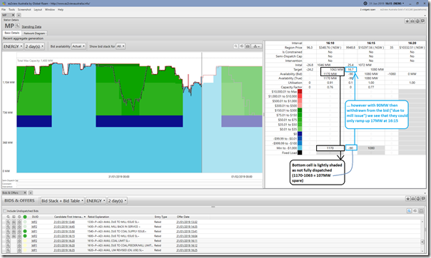
1) Reduced capacity at Mt Piper Unit 2
From rebid reasons through the day, it appears that EnergyAustralia had been having problems with coal supplies (and flow-on effects in its coal mills). Coincident with the price spike, we see that capacity offered at Mt Piper Unit 2 was reduced by 90MW.
Now this 90MW of capacity had not been dispatched in the 16:10 dispatch interval (that same 90MW had only just been added back at 16:05 in what seems like a premature recovery), but it looks like it would have been called on to dispatch in response to the other factors above (increase in demand, drop in intermittent generation and reduction in imports from Victoria). Let’s call this “Contributing Factor #4”.
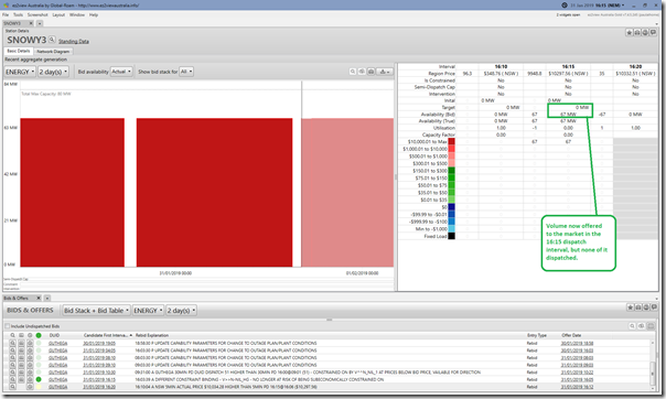
2) Capacity added back in at Guthega
We also see that (prior to the start of the 16:15 dispatch interval) Snowy Hydro had returned the 67MW capacity offered for Guthega to the market:
However this returned capacity was offered in at $14,000/MWh at the RRN (we see in the “Current Bids” widget above), so too high to even be dispatched during the price spike.
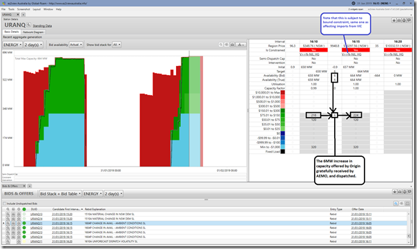
3) Increase in volume available at Uranquinty
Finally, we see that there was a small increase in capacity at each of the 4 x Uranquinty units with the rebid reason referencing Ambient Conditions (see note 2), so presumably the temperature had dropped a little:
Given that this increase in capacity was slotted into Origin’s $87.03/MWh bid band for Uranquinty (at the RRN) we can see it has been gratefully dispatched by AEMO.
Box Note 2
As part of our Generator Report Card 2018, we’re endeavoring to take a detailed look at how ambient conditions seem to affect the capability of all generators across the NEM. That’s one of the tasks that has not been done, yet.
However there will also have been a slight catch as a result of this – remembering that Uranquinty is also on the LHS of the same bound constraint that is affecting imports from VIC (discussed above). All else being equal, this 6MW increase in supply from Uranquinty would have had the effect of reducing imports from Victoria by about 2.8MW (ratio of the LHS factors). Because of the bid price offered by Uranquinty (relative to spare capacity in VIC and SA – remembering Torrens is at the margin), NEMDE calculates that this is worthwhile.
(B5d) Capacity disappears further down the bid stack
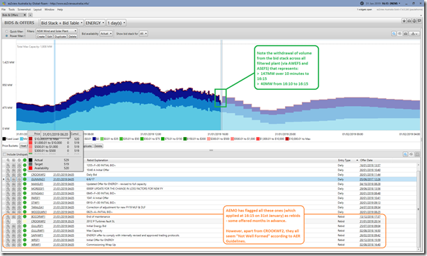
Whilst talking about bids, however, it’s important to caution about the need to look at more than just what happens at the margin. Looking further down the bid stack, we see one representation of aggregate bids from all Wind and Large Solar plant in NSW:
We’ve highlighted the drop in output that resulted from the withdrawal of capacity from the dispatch process (energy constraint induced, and facilitated via AWEFS and ASEFS by AEMO acting on behalf of the participant). As noted above, this was Contributing Factor #2 in delivering the price spike. Note that the volume lost to the market noted here (40MW from 16:10 to 16:15) is different than what’s noted above for a couple reasons:
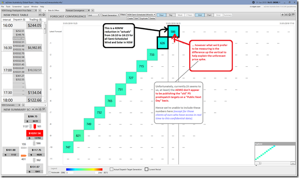
(a) This calculation is effectively walking up the diagonal in Forecast Convergence (not the vertical, which would be the better measure. Here’s a view of the same in Forecast Convergence, but note that the AEMO does not appear to publish the “old” P5 predispatch targets for DUIDs (though they do for P30) despite the fact that the MMS Data Model suggests (we think) that they should be “Public Next Day”:
(b) There’s also a difference in the make-up of the data sets aggregating DUID-level data for Wind and Solar when compared to what comes out of the UIGF + INTERMITTENT GENERATION.
Box Note 3
Also, we’ve added a comment about most of the rebids in use at 16:15 here being “Not Well Formed” – refer Note 1 above (and this prior article) for more context
(B6) Summing up…
Summing up what’s above (and noting that I don’t have time to dig further at this point) I’d reiterate that there were at least 4 factors contributing to the price spike:
Factor #1 = Demand increased more than forecast
Factor #2 = Aggregate supply from intermittent supply dropped unexpectedly
Factor #3 = Imports from Victoria dropped more than forecast; and
Factor #4 = Capacity was withdrawn from Mt Piper because of coal issues.
It’s highly likely there are other factors as well – we know this, given the levels of complexity we’ve seen in drilling into other dispatch intervals of interest.
(C) What are the implications of this?
Don’t have much time today, just want to flag:
(C1) Implications for us, and our particular client
First and foremost, we know we have a customer which has been unpleasantly surprised by a price spike. Even this single dispatch interval will have been painful (hence their call to us as part of their investigation of what happened).
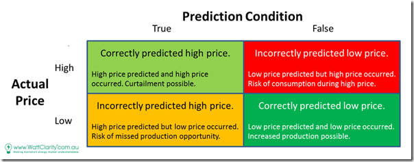
We mentally model each dispatch interval of the Curtailment Challenge (i.e. the actual price, and the prediction/forecast some time before that) falling into one of these quadrants of a matrix:
From prior conversations with a range of energy users practicing demand response, it’s very clear to us that:
- the relative value weightings for trading off the Red and the Orange quadrants will be very different from client-to-client; AND
- is also likely to vary considerably from time-to-time (e.g. in response to changes in their Order Book, or what Hedge they have in place, or their Appetite for Risk, or for other reasons…).
It’s quite a complex space, but we have made steps more recently with a couple pre-existing clients to step beyond just our deSide® energy-user product to look further into leading indicators of volatility to deliver a “Defcon Rating” specifically tailored to their own particular market perspective. That’s something noted briefly here.
Hence an action for us is to follow up directly with that particular client to explore, with them, ways we can serve them better.
(C2) Implications for the broader market, as the transition gathers pace
The NEM is becoming more complex – and it’s happening at the same time as we see an influx of a greater number of stakeholders looking to be active in (or at least involved with) the wholesale market in some way – including:
- Energy users, such as the one flagged in this post (and we expect more to come, as these real barriers continue to be surmounted); and
- New entrant generators, such as those who appear to need some assistance in complying with the AER Rebidding Guidelines.
That confluence of two significant trends (and the ongoing attrition of institutional/reform memory) is the reason why I’ve talked about Villain no 4 before.
——————–
As a company that strives to continually be improving in “making complexity understandable, so people can make better decisions”, we understand that it’s an opportunity for us.
Part of the reason for us to invest heavily in the collaborative Generator Report Card 2018, for instance. Now back to that…


So long story short, renewables weren’t able to supply the demand and exports from Vic were lower than expected and couldn’t make up the difference.
That meant the domestic dispatchable power with a bid at $13,000 was required, sending the prices skyrocketing.
The answer is no more intermittent power connected to the grid.
Hmmm… seems like you overlooked Contributing Factor #4?
If you’re holding a hammer then every problem looks like a nail …
Snowy loaded up Upper Tumut (gatekeeper), then swapped volume to Lower Tumut (contributor) – they made V>>N-NIL_HG bind and imports reduce.
I’d agree with HR about the fundamental reason for this spike being Snowy moving generation from Upper Tumut to Lower Tumut. Essentially when V>>N-NIL_HG is binding, shifting 220 MW of generation from UT (coeff -0.3) to LT (coeff +0.2) forces a reduction in Vic exports to NSW of 110 MW. Snowy rebid this way effective from 16:00.
Part of the reason for the export forecasts & price forecasts being out is that the representation of the constraint for predispatch is only approximate, and was overstating the export limit from Vic by about 100-120 MW. My guess is that this systematic gap was as much a factor in the “surprise” element of the spike (and in plenty of others like this one) as the other possible causes identified by Paul.
Just to clarify, the fundamental reason for price volatility on the day was the level of demand and overall set of supply offers for NSW; Snowy’s impact on exports from Victoria was then the proximate cause for the spike occurring at 16:15.