I’ve been on holidays the past couple weeks – this year keen to escape the NEM (and fortuitously most of the summer heat). Apart from some initial analysis in preparation for our collaboratively developed Generator Report Card 2018, which I knew I had to get underway, I’ve been largely successful at that.
However I could not escape the ongoing stream of SMS alert messages and phone calls that inundated me all through this past afternoon (Thursday 24th January) as Victoria and South Australia boiled for hours. A small sacrifice to pay compared to those stressed out with keeping the lights on, exposed to high spot prices but perhaps unable to curtail – or just baking in the heat. Hence with my day largely finished now (and the buzzing phone finally abated) I thought it might be useful to some readers if I took a first* look at a number of events that occurred through the day:
* Readers should note that this first look may well contain errors, misinterpretations and omissions. I’d ask that you keep this in mind in your reading.
Upon my return (next week) I hope to have a bit more time to dig deeper. If you have comments on what follows, please feel free to leave a comment or send an email – but leave the phone calls till next week please.
(A) First look at Thursday 24th January 2019
During the afternoon as the result of a team effort, we were able to post this initial article highlighting some of the aspects of what was going on through the day.
(A1) Prices
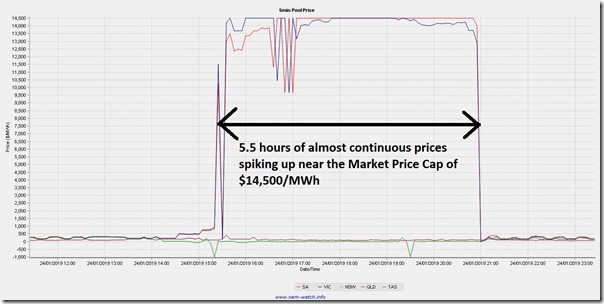
The SMS alerts had been trickling in beforehand, but these were more about forecast shortages. However from 15:25 (first major spike for VIC and SA) it became a torrent over 66 dispatch intervals up near the Market Price Cap in both Victoria and South Australia (5-and-a-half-hours) until 21:00, when the price finally dropped. Here’s a snapshot taken from my copy of NEMwatch later in the evening:
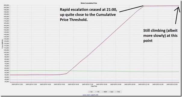
A less well known aspect of the NEM is the working of the Cumulative Price, which is also shown in NEMwatch (and was the subject of one of the questions received today). This is the rolling total of 7 days of trading prices, and operates as a safety valve on the market in terms of liquidity risk for wholesale market customers because of their prudential requirements.
Here’s a view of how this trended upwards through the day:
We see that the Cumulative Price climbed up close to $205,000 to the current point in time, and is continuing to climb slowly as the lower prices periods from a week ago roll out of the rolling total. It’s when the Cumulative Price Reaches the Cumulative Price Threshold that the AEMO steps in to cap prices.
This document from the AEMO notes that the Cumulative Price Threshold for 2018-19 financial year is $216,900. It’s a number I find hard to remember – so the shorthand I use is that it’s roughly the Market Price Cap x 15. What’s important to note is that the Cumulative Price currently is only $10,000 below that – hence it would not take even one half hour at MPC tomorrow to set it over its limit.
My recollection is that there have only been 5 instances where the Cumulative Price Threshold has been reached in the entire history of the NEM:
(a) Once in Victoria (January 2009);
(b) Three times in South Australia (March 2008, January 2009 and November 2009); and
(c) Once in Tasmania (at June 2009)
During some of these periods, we’ve observed a number of strange behaviours in the past (like spot-exposed, and curtailed, demand response actually coming back online with the price drop, despite the ongoing tight supply/demand balance at the time this happened). It will be important to watch this tomorrow, as it may play a role in delivering less demand response than would otherwise be the case, if spot prices are artificially constrained down at $300/MWh because the Cumulative Price Threshold has been reached.
(A2) Temperatures and demand
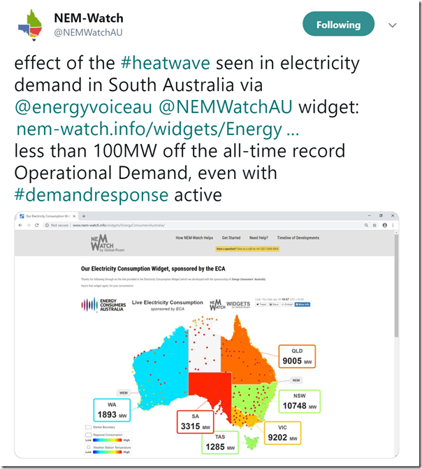
Even where I am, it’s hit the mainstream media that the temperature experienced in Adelaide today (46.6 degrees Celsius) was the highest ever experienced for an Australian capital city. I daresay there are not many major cities around the world that would have ever been that well baked. Earlier today on Twitter, the team posted this snapshot from the Energy Consumer’s Australia NEMwatch widget:
We were pleased to work with our sponsors (the ECA) to provide this widget as a freely available point of information on the way temperature drives electricity consumption, with no better example of it than what we saw today in this snapshot. The red colour of the South Australian region highlights how high its demand was based on its historical range (only 100MW below the all-time record, when measured on the same basis – as noted in the tweet).
Logging into the online component of ez2view and accessing a number of previously configured trends, I have included the following trended views of how temperatures drove demand during the day:
(i) Trended demand NEM-wide
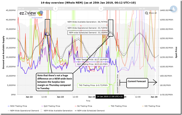
Firstly, given that Ilan had posted about how Scheduled Demand rose above 33,000MW NEM-wide on Tuesday, I have zoomed into our 14-day NEM-wide view (7-days backwards and 7-days forwards, which clients can access here) to compare between Tuesday and Thursday on a NEM-wide basis:
On Thursday we see how the Scheduled Demand* peaked up at 33,150MW at 17:00 in the afternoon – and note that this will have occurred with demand curtailed:
- after Reserve Trader had operated,
- which will itself have come after a number of spot-exposed, demand response enabled energy users we serve in both VIC and SA had reduced their consumption when prices first started going ballistic.
Given how demand has been declining from about 2009 (when the all-time maximum was experienced) for a variety of reasons, that’s a pretty remarkable demand level in its own right (albeit still more than 1,000MW below the all-time max).
* Some might be interested in this explainer of some of the gory details of measurement of demand, and what is meant by Scheduled Demand, Operational Demand and so on…
(ii) Trended temperature and demand for South Australia
Turning our attention to South Australia, I have zoomed into our 14-day NEM-wide view (7-days backwards and 7-days forwards, which clients can access here) to take a look over recent days:
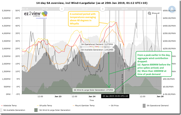
The temperatures plotted on this trend are hourly average temperatures for Mt Gambier, Adelaide and Whyalla. We see some high temperatures in Adelaide, and positively horrid temperatures for Whyalla. Still reaching about 35, Mt Gambier seems positively mild in comparison.
We see demand peaking at 3,273 at the “Demand and Non-Sched Gen” approximation for Operational Demand (slightly lower than shown above for the ECA widget, due to different data set used).
Unfortunately we also see a significant loss of supply from aggregate wind generation that comes before both the sustained price spikes (800MW lost before spikes) and the peak in demand (>1,000MW lost prior to peak demand).
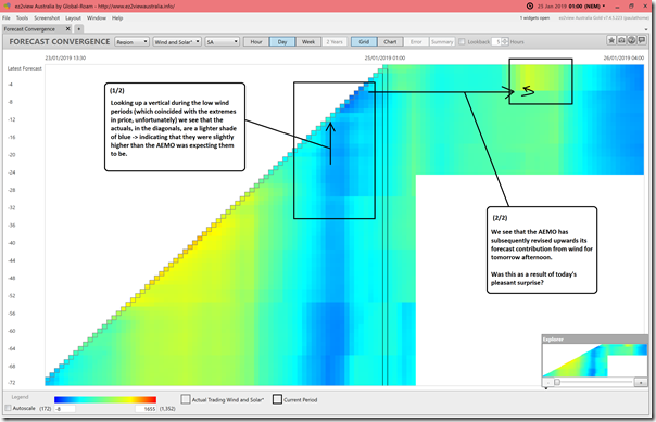
Using Forecast Convergence widget in the ez2view installed application to look back over successive AEMO forecasts for this Wind and Solar contribution, we see that the wind production levels, though considerably lower than earlier that day, were slightly better than what the AEMO had expected them to be.
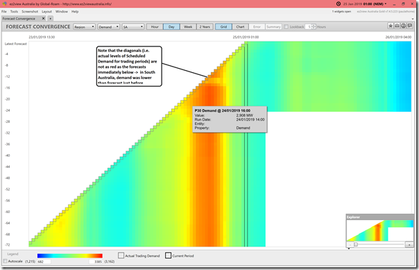
Using the same function and flipping to Scheduled Demand in South Australia, we see that the actual levels of Scheduled Demand experienced were slightly lower than forecast:
This will have been partly to do with the slightly higher contribution from wind than forecast immediately beforehand.
(iii) Trended temperature and demand for Victoria
Completing this picture by looking at Victoria (here’s similar client access) we see the following trimmed view:
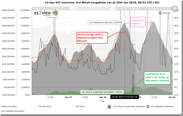
As noted on the image, we see that the “Demand and Non-Sched Gen” approximation for Operational Demand peaked up at 9,387MW at 17:55.
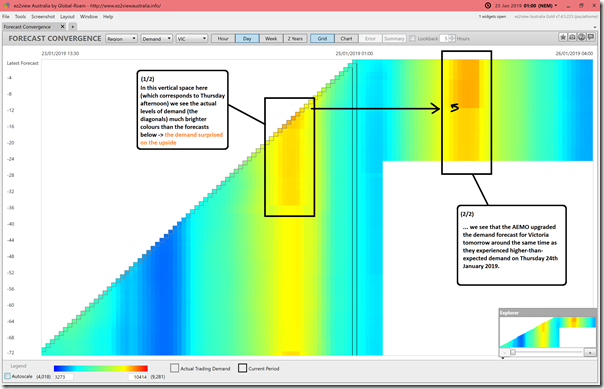
Using Forecast Convergence widget in the ez2view installed application to look back over successive AEMO forecasts for Scheduled Demand, we see that in this case the AEMO had considerable difficulty in forecasting the level of demand, which surprised on the upside (from people on the ground in Victoria the suggestion is that this was in part due to the higher level of humidity than normally experienced).
As noted in the image, the forecast for Friday afternoon was upgraded on Thursday evening (coincident with AEMO experiencing higher-than-expected demand for Thursday afternoon).
(A3) Constraints
Every dispatch interval there are typically 600-800 constraint equations “invoked”, or used by AEMO via NEMDE to keep the system operating within physical limits. With ez2view, you can see all of them.
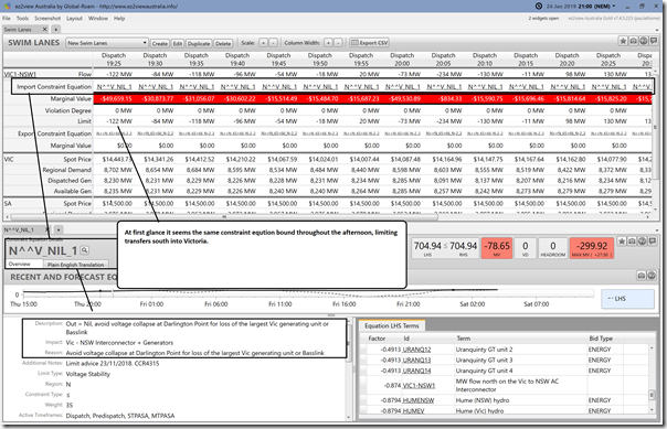
In this article I want to just highlight one constraint equation – N^^V_NIL_1 – which had the effect of limiting the capability of the NSW-VIC interconnector to supply surplus power from QLD+NSW into a very tight VIC+SA Economic Island:
As a result, VIC+SA (and a bit of Tassie exports) was all on its own –> hence talk about an outage at Liddell seems a bit of a red herring on this occasion.
If I had more time, I would look further – but not at the present time…
(A4) Dispatch
When there is more time, I will be very interested to investigate further, but just wanted to flag a few interesting points of dispatch in AEMO’s job today of keeping the lights on.
(i) Dispatch of LOR3 Load Shedding
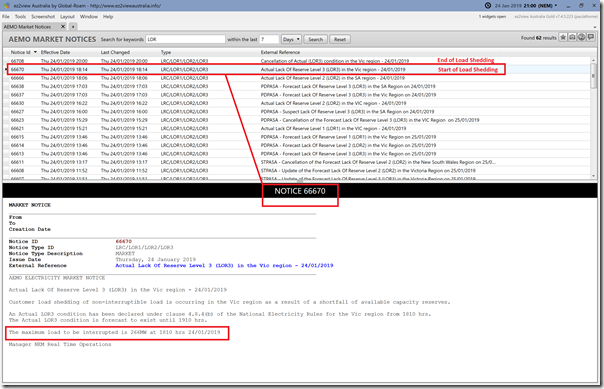
A market notice (#66670) issued at 16:14 signalled that load shedding had begun at 16:10 for an estimated maximum amount of 266MW in the Victorian region. I read somewhere that this was just Alcoa’s Portland smelter that was instructed to shed load but have not had time to look into that (coincidentally I know of residential customers that did lose supply in Melbourne – though this might just be coincidence).
A market notice (#666708) issued at 20:00 indicated the end of Load Shedding.
(ii) Dispatch of Reserve Trader
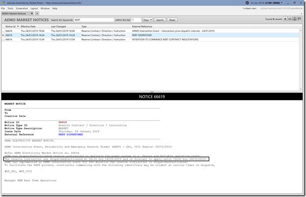
Separate from the load shedding, other loads were actually asked to turn off as one form of demand response under the “Reserve Trader” arrangement as noted in the earlier article during the afternoon.
This notice was published at 14:24 and related to dispatch from 16:30. I have not seen further information in a quick scan about this.
(iii) Other demand response
Worth a quick note about other demand response (including clients of ours in both VIC and SA) who would have almost certainly triggered curtailment earlier that afternoon in response to the high prices when they started to roll through – though (as noted before) it’s impossible to know exactly how much, because of the nature of their arrangements.
(iv) Drop in aggregate wind output across VIC and SA
In images above, I’ve noted the unfortunate drop in wind output in South Australia prior to the price spikes, and also how the later ramp-up of wind output in Victoria unfortunately also missed the timing of peak demand and price.
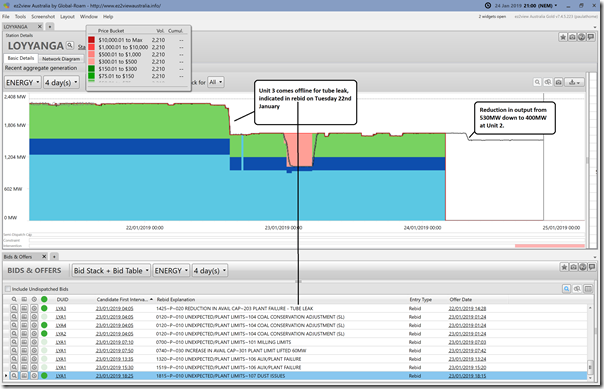
(v) Loy Yang A unit out down by 600MW+ compared to earlier in the week
Using a standard widget within ez2view (that is copied below for different stations for expediency) we see that not only does Loy Yang A have Unit 3 out this week for tube leak, but we also see output at Unit 2 reduced from 530MW to 400MW earlier in the day for reasons I have not explored:
If time permits, I would explore further.
(vi) Yallourn has a unit out on maintenance
Noted elsewhere there is a unit out on maintenance – however no image provided here as output for the other 3 units pretty consistent over the past couple days.
In delving a bit further for this article here, I noticed that Yallourn Unit 3 came offline from 23:05 on Thursday 24th January. This was later than the Time-Traveled window used for these station-level charts included here (set at 21:00 to keep focus on Thursday), which is why I missed it last week.
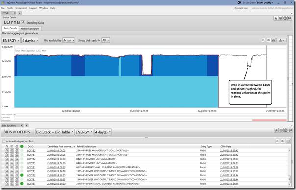
(vii) Loy Yang B reduction between 14:00 and 16:00
In this chart here, we see output reduced between 14:00-16:00 (roughly), for unknown reasons:
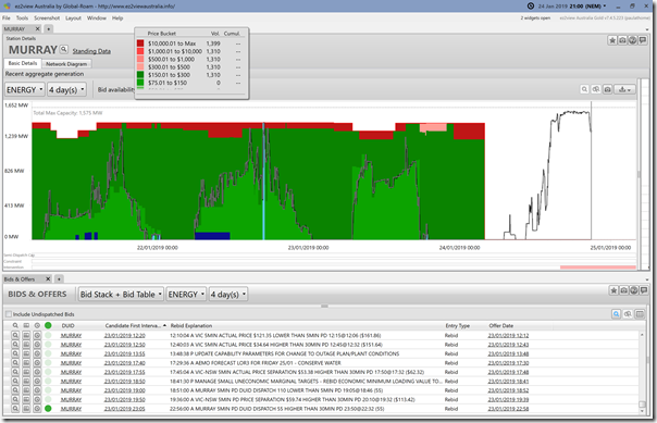
(viii) Murray cranks up
We see Murray output during the day much higher than was the case in prior days:
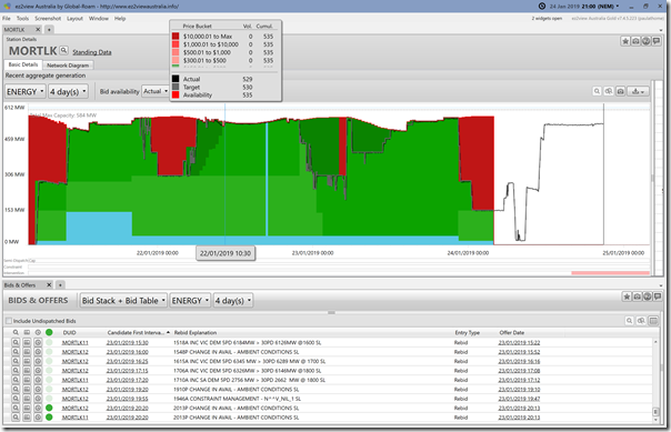
(ix) Mortlake running hard
I’ve not got time to add in all the gas peakers (there were many running) but have added in Mortlake here:
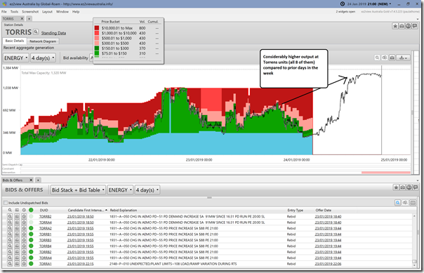
(x) Torrens Island Station (both A & B)
Here’s a view of all 8 units at Torrens Island, cranked up to the maximum capability:
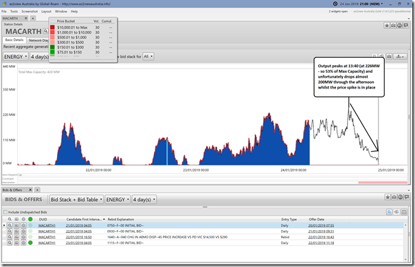
(x) Macarthur Wind Farm:
Being (I think still?) the biggest wind farm operational by installed capacity, I have added in Macarthur for a particular look:
Over the four days shown, we see its output peaks at 13:40 during the afternoon – but then declines 200MW during the same period when the price spike is in place.
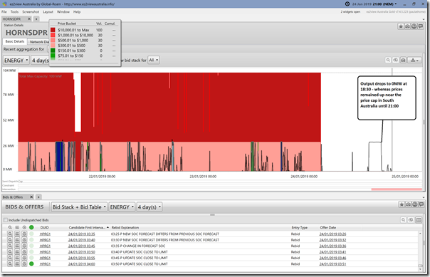
(xi) Hornsdale Battery Exporting
Here’s a quick look at exports from Hornsdale battery:
Worth noting that the output from the battery ceased at 18:25 (i.e. with the price spike still having a couple hours to run) – which I presume was as a result of low state of charge. Also worth noting that output did not increase over the 30MW “market” component.
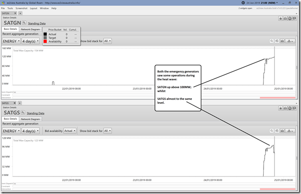
(xii) SA Emergency Generators
Both the emergency generators saw some run time:
(B) Brief look at current expectations for Friday 25th January 2019
That’s all I have time for right now. Looking into the day to come, we see more LOR notices:
- Currently forecast LOR3 for Victoria from 12:00 to 15:00 with maximum load shedding 186MW (Market Notice #66714)
- A LOR2 forecast for Tasmania between 13:30 and 15:00 (Market Notice #66727)
I’m getting back to my holiday, and will pick this up further next week…


“Unfortunately we also see a significant loss of supply from aggregate wind generation that comes before both the sustained price spikes (800MW lost before spikes) and the peak in demand (>1,000MW lost prior to peak demand)”
That is the nature of renewables and why we are in this mess to begin with.
I rarely if ever see the mention of capacity factors for renewables with wind averaging 20-25% of nameplate capacity. so regardless of the fact we have over 5600MW of wind installed, we on average get 1000ish MW and sometimes much less.
Thank you for including the Hornsdale battery information.
It is important for people to see that even large scale battery storage cannot fix these problems.
Is that correct? During peak demand we had 2000+ MW of wind and solar and AEMO can always constrain wind or solar if there is going to be a forecast shortfall…
http://anero.id/energy/wind-energy/2019/january/24
https://anero.id/energy/solar-energy/2019/january/24
Australia wide wind power oputput had been declining all day, hitting the low at 3:35pm (16% output or 939MW) just when solar was coming off its peak.
SA wind power began its decline from 7am. It dropped from almost 70% (1300MW)in the early morinng to 50%+ (100ishMW) output at 9am and then plumeted to around 15% (300MW) from 2pm, falling as low as 4% (80MW)later in the evening.
Victorian wind power output was relatively stable at between 30% (500MW) and 40% (700MW) for the morning but then suddenly declined after 3pm and stablised at the low point of 20% (360MW) between 4:30pm and 9pm which was when demand was rising and solar output was declining.
The fact is that you cannot rely on solar and wind to provide reliable supply on hot days with warm nights as these usually occur when there is low wind.
Wind capacity factor in SA is typically 28-32%, long term average. Go to the AEMO website and download the SA Electricity Reports, that tells the story very well.
Yesterday there was more diesel generation (400 MW) in SA than wind generation (270 MW) around 7pm after the solar generation went to 0 MW.
https://anero.id/energy/wind-energy/2019/january/24
https://anero.id/energy/solar-energy/2019/january/24
2000MW of output compared to a nameplate capacity of 5661MW for wind and 2241MW for solar is 25%. It only got worse as the afternoon progressed.
South Australia was woeful with just 5% of wind output between 7:30 and 9pm, victoria was at sub 20% for most of the peak demand period.
Wind power generation plumeted during the afternoon to a
Does anyone know why the Vic – NSW interconnector has been at zero at various times over the last couple of days?
Bushfires in New South Wales were allegedly the cause.
Constraints during peak demand today were for net flows toward NSW, even while load was being shed in Victoria. That one might take some explanation from AEMO.
Rereading the post, it is likely the same constraint was in operation as yesterday N^^V_NIL_1, preventing voltage collapse on the NSW end should basslink or a Victorian generating plant trip off. Perhaps investment can be made to improve this situation (for example STATCOM equipment at Darlington Point).
The Battery is being used like a water tank, with a hole in it. Why on earth could it be cycling on a day like yesterday. WHERE was the power coming from to charge it. WHY was there power allowed to change it??????.
That has to be looked at in detail, because which ever way you look at it, on a day like yesterday, the battery is only making the situation worse. It takes more power to charge it than it can put into the grid, ITS SHEER MADNESS, to allow it to run yesterday!!!!!!!!!
Agreed, just like Snowy Hydro 2.0 which will require huge amounts of energy to pump water uphill and then only be able to provide 70-80% of that energy back when it is needed.
These storage solutions aren’t fixing the problem of renewables and prices
It’s true that Snowy 2.0 is a net load, with no additional generation. What they are hoping is that wind power can be used to replenish the pumped storage, instead of curtailing the wind at nights. Not much being said about the additional transmission line CAPEX and OPEX necessary to ensure wind farms can send their power to the grid without being curtailed, and what happens when the wind disappears for days…
I did not see it “cycling” during the high prices. It discharged at 30MW until it was spent. No surprise there. There is simply a shortage of dispatchable generation. Wind and solar is somewhat predictable although not necessarily dispatchable when required. Fossil fuel generators are generally dispatchable but their reliability is unpredictable. We see coal generation having issues and other generators severely limited in output due to heat. If there was a more storage available in pumped hydro (for example) the system would have been much more stable. High output – but only needed for a couple of hours. Blaming wind,solar, coal or any other form of generation is a bit like blaming who lost the football game. Was it in the last 2 minutes when the team missed that goal and hit the post, or was it the 1st quarter when the losing side didn’t kick any goals??
@ Ian: regarding your post your words are largely correct but the context matters, in this case the context is blackout occurred because of a lack of power generation. Power shortages are a logical result of weather dependent power generation.
Lack of maintenance and zero investment in dispatchable generation are a logical result of subsidised renewables.
The whole scenario is entirely predictable.
But we have commentators like Nicky Ison from The Guardian, with zero technical knowledge in the subject, touting an old AEMO report discussing what it would take to achieve 100% renewables. The report says the idea is rubbish, but the article goes on to say it’s a great idea and perfectly achievable.
What is wrong with this lot?
https://www.theguardian.com/commentisfree/2019/jan/28/what-would-australia-look-like-powered-by-100-renewable-energy
Hi Ben, yes I agree with you pretty much. Paul regularly talks about people at each end of the “Emotion-o-meter”. Some people blame wind and solar (whose output was low which unfortunately does happen at these peak times). Others blame coal/FF generation, eg X units were out of action due to failure, or were limited to X amount of output due to heat (all true and correct). What will it take to change the situation, while the small amount of storage introduced recently in terms of batteries I think has worked well for it’s intended purpose, the amount of stored energy is very small when this type of event occurs. Do you think we will see a change of market rules in the future introducing capacity payments perhaps? We certainly need something to incentivise storage, although if we have many more days like this I think the monetary incentive might be already here!
The 600 transmission constraint equations seem like a black box that are probably only understood by a handful of people within the industry. When a constraint equation is imposed how much analysis is there of risk vs consequence? For example on Friday 25 January Victoria had to shed 200 MW of load, but there was spare generation in South Australia that could have been used if there were a temporary lifting of the 500 MW constraint on South Australian exports to Victoria via Heywood. The physical works on this link were completed over 2 years ago to allow 650 MW capacity in both directions, and an export of 600 MW from Vic to SA is now allowed. But are the risks that the 500 MW constraint is trying to avoid sufficiently great to start load shedding in Victoria? Or would it have been better to try increasing the constraint to 600 MW and monitor its effects. If there is problem, the worst that can happen is it is reimposed to 500 MW and load is shed.
THe low output of wind during Victoria’s price peak needs to be contrasted with the high output from solar farms, which until 5:30pm were producing 200-250 MW. By this time next year this should increase by 500 MW through new solar farms under construction, and completion of the current solar farms. If there is an equivalent amount of roof-top solar, we would have quite a different situation of perhaps another 1000 MW of solar into the Vic market, and a much shorter period of price peaks.
Inefficient infrastructure attracts capital
There is astonishment in the industry about the timing of EnergyAustralia’s maintenance program for one of its Yallourn units, and concern about the ability of both Yallourn and Loy Yang A to provide “firm” power when needed, particularly given their owners intend to keep them operating for another 15 and 30 years respectively.
But there is also anger at the bidding practices of some of the big generators in the lead-up to the heat-wave and over much of summer, something that has been building up for the last six months following AEMO’s warnings, the spike in futures prices and the scarcity of contracts available on the market.
https://reneweconomy.com.au/fury-over-generator-bidding-this-time-they-have-gone-too-far-39712/
The coal generators had been running at 100% output for the last 2 months due to the closure of Hazelwood.
Blaming coal plants for not being able to run at 100% when wind and solar are only able to produce on average 20-25% output and aren’t dispachable is disingenuous.
reneweconomy is a garbage fire of a website and should be ignored.
According to an article in the Herald Sun, AGL had just spent $136m on preventative maintenance on the generator unit at Loy Yang A that had just failed. There must surely be some questions within the company about the returns on such life extension investments in coal-fired stations, when similar investments in solar or pumped-hydro would be much more reliable. The Loy Yang maintenance is $0.25m per MW, compared to about $1m per MW for a pumped hydro that would probably last 30 years.
Hi I read yesterday on http://joannenova.com.au/ that the cost for electricity in Vic and SA was nearly a billion dollars FOR ONE DAY! Amazing and one poster there claimed ““Three days and you could buy a HELE plant with the money wasted.” That’s a power plant that could last 70 years, and provide electricity at under $50/MW”.
Renewable Wind and Solar was developed around the time of the first coal-fired electricity generator circa 1895. It was very limited engineering then and it’s the same now!