On Tuesday 28th last week, I posted these comments about a few of the machinations occurring through South Australia during the week. As noted in that article, and by Ben Potter on Thursday in the FinReview, we received a number of calls from large industrial energy users in South Australia who were wanting to know what was going on.
(A) Why are they concerned?
A1. Some are spot exposed …
For many years we have been serving a number of large industrial energy users who have had some form of spot price exposure in their electricity retail contracts – or, in some rarer cases, directly with AEMO. These energy users provide a form of Demand Response to the market by curtailing consumption when spot prices are high:
(a) This delivers a benefit to the market as a whole, by helping to moderate spot market volatility; and
(b) It delivers a benefit to the energy-user themselves, by delivering them lower average cost of energy than would be otherwise possible.Some energy users who operate this way like to talk about their experiences – whilst others prefer to keep the nature of these arrangements confidential (as being part of their competitive advantage).
These energy users are keenly interested in what’s happening in the spot market in the region in which they reside.
Some of these energy users have sites in South Australia – and some of these people asked questions last week about what was happening.
A2. … whilst most are not
Whilst the method noted above works for some energy users, it does not work for everyone.
However a broader (and growing) number of energy users are watching the spot market, though perhaps not as intently as those above, because of how spot behaviour flows through to wholesale contract prices – and hence through to retail contracts (especially for the growing number of energy users seeking to time the market in terms of when they procure blocks of load).
Some of these people called as well…
My understanding of the concerns above can be thought of in three ways:
Concern #1 – absolute prices in the week that just happened,
Concern #2 – a need to understand what’s behind this (including questions about “gaming the system”) and
Concern #3 – concerns about what this might bode for the future, with increase in renewables and a (perhaps “disorderly”) closure of thermal plant anticipated.
(B) Some observations about what’s happened?
I don’t have as much time as I would like to ponder these types of things, given a few other initiatives we have on the go at present – but the following is provided in case it’s of value to some of our readers.
B1. South Australia is awash with (coincident) wind
Given that, historically, South Australia has has higher spot prices than prices in other regions, it’s been no real surprise to see that South Australia has seen a significant amount of wind farm development enter this region in particular – a combination of
(a) good wind resource (best in the NEM?);
(b) higher historical prices
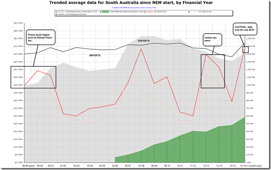
(c) lack of hiccups in planning requirements (in contrast to VIC).The following trend of average data for financial years in South Australia from NEM-Review illustrates the result:
As can be seen, wind production in South Australia has continued to grow, year-on-year. Combined with the fact that total generation has been declining since 2010-11 (i.e. non-wind sources declining significantly) this means that the share of energy generated from wind in South Australia has grown to reach 37% of total metered generation* in 2014-15.
* i.e. metered generation = what AEMO publishes data for, so it excludes smaller generation (and particularly residential solar PV).
Coincidentally back in August 2013, I did some rough numbers to work out the NEM might support 37% wind production, though not without its own challenges. Is what we’re seeing in South Australia currently an indication of what would be the case for the NEM as a whole if this happened (or would the outcome be more extreme, given the NEM’s not connected to any larger market elsewhere).
Whilst a casual observer might look at a summary chart like the above and conclude that there’s plenty of market opportunity for more wind in South Australia (i.e. because the South Australian price is still averaging above the average price in Victoria), the devil lies in the detail – with last week a good case in point….
B2. Last week, SA spot prices operated in 2 different paradigms
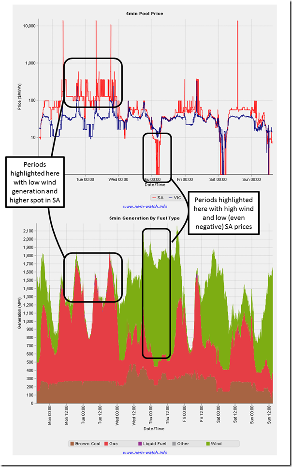
It should not be a surprise to anyone, really, that prices dropped when large volumes of wind generation flooded the market, and then rose back up when the wind stilled. This is shown in the 2 charts below taken from NEM-Watch showing the trend in both over the week:
There were, last week, clearly two separate paradigms operating in South Australia in terms of spot pricing – when the winds was blowing, and when it was not.
Quite clearly there are “windy day” prices, and “calm day” prices – and it appears that the gap between the two is widening. That’s something that’s not captured at all in the summary analysis (such as in the first chart above) and poses a real problem for all generators in the region (wind, thermal and other).
Given that the thermal fleet has a “fixed” (i.e. sunk) cost of capital, it’s not really a surprise that prices in the low-wind period are higher than they might otherwise be as generators seek to cover the same fixed cost base over a lower number of hours when the wind’s not blowing. I think I noted about some limitations of simplistic modelling earlier in this post in relation to the RET Review.
My sense is that energy users are concerned about what this means for the future – and whether they will have to get used to an operating paradigm containing both sides of the boom/bust coin:
(a) Low or negative prices when the wind’s blowing (which impact on the viability of all plant – including wind farms); but also
(b) Higher prices (as a result of fixed cost plant chasing fewer hours to run) when the wind’s not blowing.From their perspective, especially if spot-price exposed and providing demand response (as above), it would be exceptionally difficult to operate a (capital intensive) plant with a capacity factor significantly lower than 95% (if trying to curtail when prices are high meant much of the time when the wind’s not blowing). Sounds like the same problem “base load” coal generators are having.
B3. Gas prices were high, but not wholesale changes in bids
What’s more unusual in the second chart above are the number of hours shown where prices hovered around the $300/MWh mark, or above (keep in mind that it’s a log scale that’s been used for clarity).
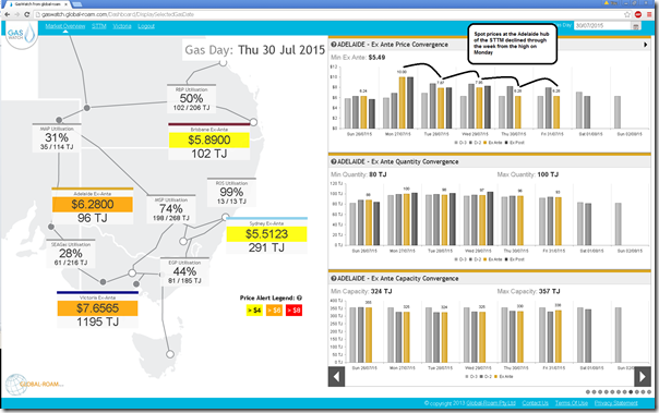
In my post last week I highlighted how spot gas prices at the Adelaide hub of the STTM were high on Monday 27th July. GasWatch has a useful Time Travel™ feature that can be used to step back in time and show the market conditions for a given historical day – the following shows last Thursday (30th) as it shows prices wound back from the peak of $10/GJ on Monday 27th (coincidentally the day with low wind and high electricity spot prices) as the week progressed:
Some might assume that with gas prices high, all gas-fired generation would raise their price to reflect the higher cost of gas. However that was not the case.
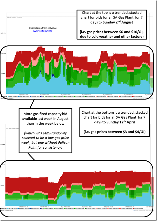
Using ez2view (our tool for detailed analysis of particular nuances of the NEM) we see the following comparison of a trended bid-stack over 2 weeks for SA gas-fired generation:
We selected the week in early April on the basis that it was a week with lower gas prices, but also after Pelican Point came offline (at the start of April). What this also means is that it’s also a week of lower electricity (and gas) demand, not being the winter season.
The most obvious finding in the comparison above is that the July week saw significantly more gas plant bid into the South Australian region of the NEM (which makes sense given the higher underlying demand). It’s also clear to see that the vertical space covered by blue and green bids (i.e. bids up to $300/MWh) was higher in the week just passed than in the week during April – i.e. gas-fired generation was not all bidding capacity at much higher prices due to higher spot gas.
We do see, however, the effect of more rebidding of capacity during last week, with a more dynamic colour profile in the top chart.
B4. Individual Behaviours
Whilst I’d like to have more time to delve into individual participant behaviours (second only to sitting on a beach this week and enjoying the warm Queensland summer), this is not unfortunately not possible.
(C) Implications for the future
C1. Decline of Thermal Generation
Those in the industry (and outside) who support carbon reduction targets for Australia will understand the inevitability that the existing fleet of thermal plant is undergoing a terminal decline. Whilst this much is (mostly) not questioned, key questions remain, such as:
C1.1 Over what time period?
AGL’s much mooted “closure by 2050” announcement must win credits for gaining mileage from just stating what’s pretty obvious to the broader industry. On the left of field, there are others who wish to see far more radical change achieved by 2030, or even sooner.
There’s a world of difference in between these positions – and what looks like no hope of sound, long-term, bipartisan policy in the foreseeable future (especially with ongoing concerns about the lack of leadership still shown at ministerial level).
C1.2 The degree of disorder in, and level of support provided during, the closure process?
Starting from the position that the NEM, over its 17 year life (to date) has proven to be a market quite resilient to past challenges – like the drought of 2007 – I have been pondering this question (amongst others).
Ben Potter, in his article last Thursday quotes others raising the prospect of some form of capacity payment to assist during – and possibly past – the transition period. Capacity payments were one of the options canvassed previously by AGL (and I think updated in this paper from June 2015) .
Capacity markets are not without their own warts, however – as I noted before on WattClarity.
C2. When will spot market implications of coincident wind output change locational decisions?
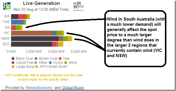
One of the things that’s been puzzling me for some time has been the apparent willingness of wind farm developers to use development sites that deliver a wind farm with an output profile that appears very aligned to the output of other wind farms in the region.
Demand in the South Australian region is much smaller than the size of demand in Victoria, NSW and Queensland, as is clear in our “Live Generation Widget” on RenewEconomy – for example in this snapshot from early afternoon today:
To be clear – as more and more wind is layered into South Australia, this will continue to drive spot prices lower and lower (to the extent to which wind production patterns are aligned), with more prices being close to, or below, zero.
It seems logical that this would prove problematic to any new project developer trying to bank a project based in South Australia where its output is going to significantly contribute to “windy day” prices dropping even further. Yet the most recent ACT power auction awarded a contract to the Hornsdale project – another one in South Australia (one of many listed on the 2014 update to our “Power Supply Schematic” market map).
Back in August 2013, I pondered much the same thing in this post. We’ve separately had discussions with several developers who claim that their wind production profiles would be very different from that currently exhibited. However I also note that those projects remain on the drawing board.
What am I missing here?
C3. What would incentivise other types of generation capacity?
There are various stakeholders in, and around, the market that have assumed a number of other technology choices might be made to get to a 100% renewables scenario (or at least some high degree of penetration).
These might be concentrated solar thermal with storage, geothermal, hydro (though not many sites – not counting clever use of disused mining pits), pumped storage hydro (even with sea water pumped up to the Flinders Ranges?!), and even the “dreaded” nuclear projects.
The current state of low-emission technology deployment in the NEM suggests that, left to its own devices however the invisible hand plonking down generation capacity across the NEM will continue to select centralised wind and distributed solar.
What would make this change?
C4. With, and Without, Storage Cases
As I think I have noted elsewhere, any crystal-balling into the future (as imprecise as such an art-form is) must now consider two very distinct scenarios – being with, and without, meaningful deployment of storage.
How much storage would need to be meaningful, you might ask?
If the NEM now has more than 1,000,000 households with rooftop PV solar systems installed – and is starting to see significant impacts at a regional level as a result, it seems reasonable to infer that it would be around the same numbers of residential storage systems would need to be deployed for a meaningful (macro) impact on the market.
Gut feeling says that this number deployed will be significantly more than the “technology enthusiasts” (geeks) and the “visionaries” (I hate my energy company) people – hence requiring a decent number of “pragmatist” buyers in the early mainstream (who buy on the basis of real commercial value and proven performance). Geoffrey Moore’s “Crossing the Chasm” provides a good description of the type of challenge this represents.
The solar PV rollercoaster (which Nigel Morris described here before recently switching seats) was supercharged by some very generous incentives for residential customers (myself included) but, unless I have missed something, I have not seen much clamouring for similar style incentives for storage.
C5. Other Impacts on Market Design
Running out of time here, so just some dot-point lists of other implications we’re puzzling through….
C5.1 Are we becoming a net pool by stealth?
When the NEM was established, a deliberate choice was made that the NEM would be a “gross pool” market – i.e. all generation capacity would be scheduled and dispatched by the AEMO, with contracts between counterparties being financial instruments of one sort or another.
With the rise of semi-scheduled wind production (at times when it’s not being scheduled) and the rise of rooftop PV, is the NEM moving towards a “net pool” market by stealth – and what are the implications of this?
C5.2 Would the Market Price Cap have to rise as high as $80,000/MWh?
It was with interest that I noted this (May 2015) presentation by Dr Jenny Riesz of the Centre for Energy and Environmental Markets at UNSW pondering the same sorts of questions as what I had been wondering about – as the market moves towards one with much higher levels of intermittency (and hence potentially severe boom/bust pricing) what would need to happen to the Market Price Cap to keep the lights on in an ordered way – in the absence of capacity payments?
Jenny’s note about spot prices as high as $80,000/MWh is certainly food for thought (or indigestion?)
C5.3 Implications for Demand Response
Returning to the question posed through questions received from energy users during last week, this is something we’ll have a number of reasons to puzzle through.
Amongst other initiatives during 2015, we’ve been putting together this general-access resource on the different methods of demand response that currently operate in the NEM (www.DemandResponse.com.au) – and so have been pondering how these forms of demand response might change as the market evolves….
(D) Thinking about Demand Response, in time for “All Energy” Conference on 8th October
Given our background as a long-time supporter of Demand Response within the NEM, I’m happy to agree to speak at All Energy in October on the topic of the role that Demand Response could play as the market continues to evolve (from centralised to decentralised energy supply). That’s only 2 months away now, so I’ve not too much time to start thinking about this in more detail.
Any readers particularly interested in this topic, I would like to hear from you ahead of time – either leave a comment below or contact me offline (tel +61 (0)7 3368 4064)
That’s all I have time for today…


Thanks Paul, very interesting.
On wind farm location: unfortunately SA price is still very attractive. Weathering the occasional bout of low price is still worth it.
Last month dispatch weighted price for some SA farms; Snowtown $40, Lake Bonney2 $49, North Brown Hill $43. Average SA price was $73. “A rising tide floats all boats” etc.
In NSW Boco Rocks got $38 and NSW avg. was $39. Portland got $32 and VIC was $34. Musselroe got $31 and TAS avg. was $35.
One of our readers has let us know the following:
Hi Paul, great article.
Just a guess – but perhaps it is due to how the projects are hedged. For example, if hedging using the exchange, the price at contract expiry is what matters (which is both unrelated to when you produce, and is sort of ‘balanced’ by the non-windy prices). Having said that, I understand that the liquidity in the South Australian futures market is pretty low – and wind farms are pretty unlikely to hedge with the exchange (for other reasons).
Related to this – a poorly designed / implemented CfD (and/or PPA) might have a similar effect. Simply going for the lowest price CfD (rather than lowest cost) would likely encourage wind farms in regions with good wind resource / high capacity factor and favorable planning laws (i.e. South Australia). The price might be the lowest here – but that says nothing about the difference between this price and the value in the market (and hence cost). For example, a higher priced CfD in NSW that was perhaps anti-correlated with wind in SA might end up costing less much, due to a price premium in the wholesale market.
This is all speculation of course – and presumably the people who design such things have already thought of this!