Over the past two weeks, we have walked through 4 of 7 metrics to ascertain what the extremes have been in terms of demand, and wind production. That leaves 3 still to go.
Turning to one of our favourite destinations, we look at what happened in Tasmania over the “extended summer” period 2014-15.
1) What actually eventuated?
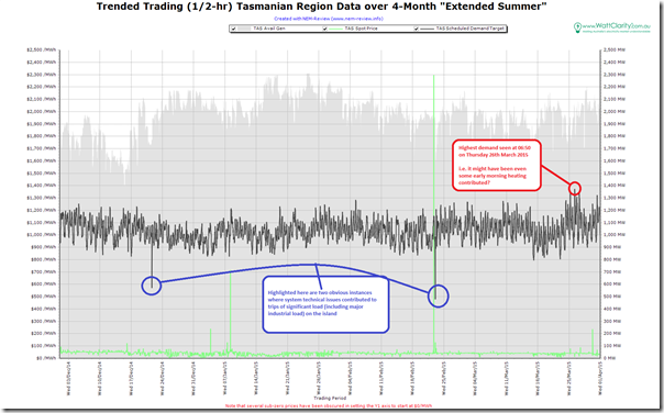
Returning to NEM-Review, we produce this trend of Tasmanian region scheduled demand over the 4-month period:
Of interest to us is the fact that the demand peak occurred towards the end of what we defined as “extended summer” (on 26th March) and at 6:50 in the morning – so we’re inferring that early-morning heating might have been a contributing factor on that day (see how neighbouring days were also higher demand).
If this is true, we have an “extended summer” peak demand of 1,389MW occurring at a time when it was cold enough for heating to push demand higher.
I’ve also highlighted on the chart two obvious instances where system technical issues resulted in the trip of significant amounts of Tassie demand (including some major industrial loads). We did find at least one other, in a quick inspection of the data (this was in the middle of the day, so is not as obvious in the above). There may have been other occasions.
Keep this in mind when looking at the minimum demands below!
2) How well was this expected?
This summer, in conjunction with our traditional “main prize”, we also offered to give away a “consolation prize” for the closest to the market at guesstimating what the peak demand would be for the TAS region (this was Competition #6 of a total of 7 competitions this summer).
2a) Was it expected, by our competition entrants?
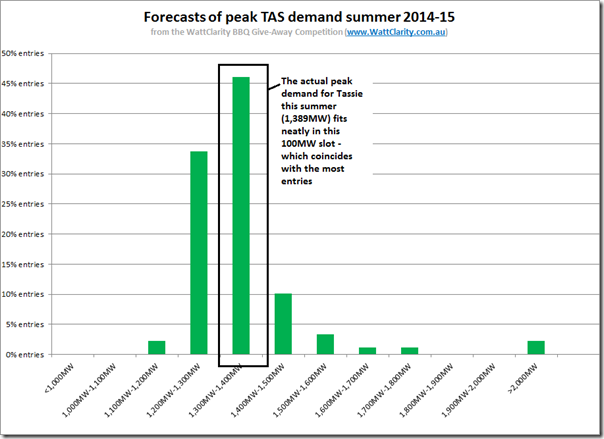
Collating all the entries and plotting a distribution, we see this pattern:
With reference to the above, keep in mind that I have used small (100MW) steps in the distribution curve and, even with these small steps, we find the actual peak demand coincided with the high point in the distribution curve.
Hence we could conclude from this that the peak demand in Tasmania is much more predictable than in any of the other competitions we’ve seen to date.
A glance at the chart above, which shows much less variation in demand from week-to-week than the other regions, illustrates why.
Hence, in terms of entries, this one came much more down to the wire.
SO WHO WINS THE “CONSOLATION” PRIZE FOR COMPETITION #6 (TAS PEAK) THIS SUMMER?
One person who proved adept at taking heating into account in forecasting peak demand in Tasmania over this early-morning period (and so can enjoy their new portable BBQ prize, from Barbeques Galore), is revealed here…
We see a small percentage of entries trailing off to the right in the distribution, including some above 2,000MW. However in general terms the entries were clustered tightly around what actually happened.
2b) Was it expected, by AEMO?
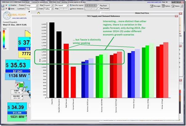
On New Year’s Eve, I posted these tips about summer peak demand in Tasmania – to help entrants sharpen their pencils and put in their best entries.
Included in these tips was this image highlighting AEMO’s forecasts for peak Tassie demand – shown in conjunction with current demand data:
As noted in the image, Tasmania is (unlike the other 4 northern regions now) distinctly winter-peaking.
One of our entrants pointed out when making his entry that, because we extended our definition of summer to include March, we left open the possibility of a cooler period late in March delivering higher demand than had been experienced in the three regular months or summer. That’s what’s seemed to happen.
3) Looking in more detail?
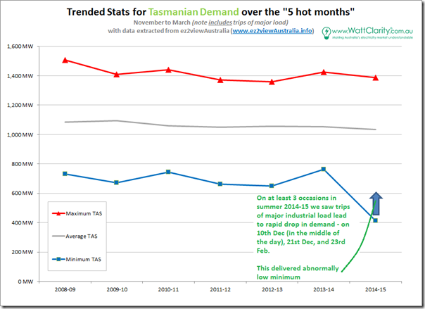
As we did for other regions last week, we include this trend of the headline stats for TAS for the “5 less cold(?) months” of 2014-15 and the 6 preceding financial years:
As noted in this chart, the effect of the tripping of a significant proportion of load (500MW or so, on occasions) can be clearly seen in the suppression of minimum demand for 2014-15. It should be noted, as well, that I did not check the prior years to see if the same thing had happened.
Compared to the same chart for South Australia or Victoria, we can see that the average demand in Tasmania is much more evenly spaced between maximum and minimum (i.e. Tasmania is much less peaky – again contributing to the ease of forecast).
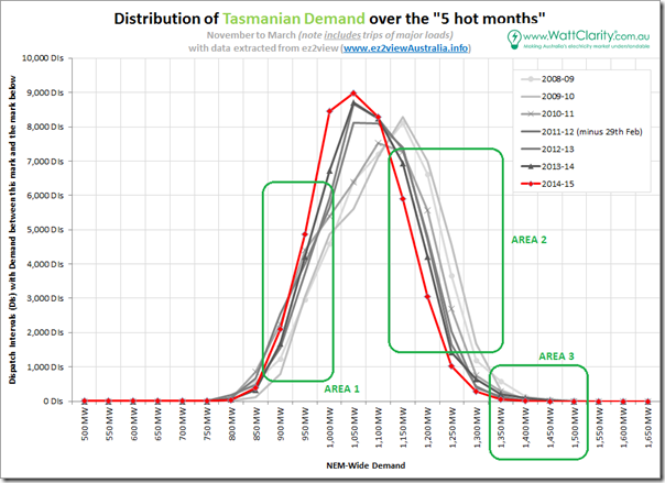
To provide more detail, we generated the following distribution curve for TAS:
With respect to this curve, we can see that it is almost a natural bell curve (at least, much more the case than is the case for the other regions we have looked at).
The three areas highlighted still apply:
3a) Minimum demand
Down at the bottom end of the curve (marked “Area 1”) we see a shift in the demand pattern occurring between 2009-10 and 2010-11 – and, further up the curve, between 2010-11 and 2011-12.
I am not familiar enough with the Tasmanian region to hazard a guess as to what this might be – it might have resulted from a combination of a number of initiatives, such as:
1. More efficient street lighting; and
2. Better insulationRight down the bottom end of the curve, it does not seem that there has been much change at all in the demand pattern (for minimum demand) over 7 years.
3b) Afternoon demand
Up in the area of afternoon demand (marked “Area 2”) we see a more distinctive pattern of change, beginning 2009-10.
Whilst solar PV will have been one of the factors, the installed capacity in Tasmania is relatively small (and harvesting not so great, at the southern end of the country) – so I can only think that there will have been other factors at work.
Perhaps some of our readers can suggest?
3c) Peak demand
As noted above, Tasmania is much less peaky than the other regions we’ve looked at to date.
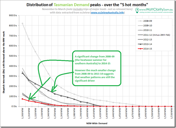
For completeness, however, we include the same chart, focused on the higher end of the demand curve:
As noted on the graphic, we can see a significant drop in the curve from 2008-09 to 2014-15 which (if seen on its own) might give cause for some to believe that the peak demand challenge had been tamed.
However the much more similar load shape between 2008-09 and 2013-14 (5 years apart) implies that the challenge still remains, ready for weather extremes to unleash it again.
More on Tasmania in future WattClarity posts, as time permits….


There’s quite a few unique things electrically in Tas.
First is that at the far off-peak times, heavy industry accounts for 80% of the total load and just one factory is one third of the entire load in the whole state in the middle of the night.
Second is the dominance of peak rate water heating, with a market share around 88% of residential hot water. Typically these are 160 or 250 litre storage systems (no such thing as instant electric hot water in Tas) with 2.4 or 3.6kW element. Hence the big jump in demand in the morning as people take showers. Off-peak has only 8% or so of the market, and virtually all of those are on the off-peak rate with afternoon boost – there’s only about 1000 or so customers using the off-peak night only tariff in total so it’s very minor. That said, gas, heat pumps and solar are slowly gaining increasing market share at the expense of the traditional electric storage HWS.
Third is that electric heating dominates (67% market share) with most of the rest being wood. Gas is sufficiently rare that if you have a house with gas and are selling it, the real estate agent really will mention the gas as a definite feature of the house.
Then there’s the means of heating itself. About 40 – 45% of homes use what are universally known as “heat pumps” in Tas – that’s a single split system air-conditioner in the terminology used in other states. They’re always installed for heating, with a heating calculation (but no cooling calculation) to determine the size and spend 99% of their operating time in heating mode. Typically, a 7kW or so output system in the main living area only and electric resistive heating in bedrooms etc is very common.
Then there’s those with resistive heating systems, and typically that’s a 6 – 10kW fixed heater in the living room. Yes, a 10kW single phase 240V electric heater – and they literally do glow red hot in operation (as they’re supposed to). Others have just a fixed fan heater, but still 3.5 – 7kW generally.
So there’s a lot of heating equipment installed versus relatively little cooling equipment. Hence cold weather can drive demand far higher than hot weather ever will. But heating is becoming more efficient as such, with heat pumps going from basically nothing 20 years ago to their current usage and a move away from resistive heating.
Also notable is that the traditional use of off-peak electricity in Tas is space, not water, heating via storage heaters. These are decidedly out of fashion these days and in terminal decline. Common a generation ago, before too long they won’t really exist at all.
Comparing past years, also of significance is the closure of the once-massive paper factory at Burnie. APPM (Associated Pulp and Paper Mills), or better known locally as simply “the pulp”, that place dominated the town for decades but it’s completely gone now and so too is its’ power consumption. At its’ peak it had 10 production lines producing paper, a pulp mill to supply the paper machines and another production line producing boards, slowly declining over 30 years before final closure in 2010. The separate Wesley Vale paper mill, with one machine, also closed at that time.
The remaining paper mill, Norske Skog at Boyer (near Hobart) has also reduced electricity consumption due to process and feedstock changes. Many still call that place ANM – Australian Newsprint Mills – and that’s what it used to make. These days one of the two machines has been converted to produce higher grade paper and the feedstock changed to rely solely on softwood which requires less energy (electricity) to process via the mill’s mechanical (not chemical) pulping process.
Then there’s a few small industrial co-generation plants, there’s a significant one at a vegetable processing plant and another one at a public hospital, installed in recent years which have also reduced grid demand a bit.
So overall, quite a few things have individually reduced load by small amounts but collectively it becomes a bit more significant. Also a lot of LED traffic lights are around now and street lighting is starting to change to LED’s too. And of course the move away from incandescent lighting in homes is another one.
All that said, so long as the “big 4” factories continue operating then overall demand can’t possibly change too much. The big 4 use roughly half the state’s power on average and two thirds at the far off-peak times.
Hi Shaun
Thanks for adding some excellent local context – very useful for me, and for our readers as well.
Paul