It’s past Australia Day, so Australia’s long, lazy, summer holiday season is at an end. As people drift back into work this week, having been trapped in the inevitable “back to school” (peak demand) traffic snarls, we turn our minds to wondering just what summer will bring, with respect to peak electricity demand.
Particularly today, given all the press about the clash between the NSW Government’s network privatisation plans, the draft rulings from the Regulator and the understandable response from industry, I’m thinking about NSW.
As a related question, I am wondering what the peak demand will turn out to be in NSW this summer. Demand (particularly peak demand) plays such a key role in these sorts of consideration – how hard can it be to forecast?
1) What does recent evidence suggest?
Frequent readers of WattClarity will have noted that we’re giving away seven BBQs this summer to those entrants who show that they are good at forecasting some of the key metrics important to both infrastructure development, and to market operations.
It’s a bit of fun over Christmas – but it does have a serious side, as we are keenly interested in analysing the results of this (highly unscientific) survey to see where there is greatest alignment (and, conversely, greatest divergence of views) about what might happen to these metrics. With some attractive personal inducement (at least to the entrants) in the form of the prizes, we secure entries from a diverse bunch of people – including people who, in their “day jobs”, have a keen interest in being able to forecast such metrics for their own businesses.
We understand that these metrics do play a key role in the core business of many of the companies operating in, or looking to enter, Australia’s National Electricity Market.
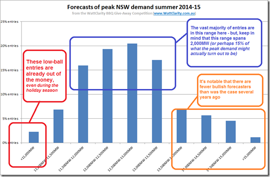
In the case of NSW peak demand (our competition #3), the following distribution indicates that there is a significant spread of entries from “industry insiders, commentators & spectators” that (we think) typifies the challenge of correctly forecasting metrics such as peak electricity demand:
Figure 1 = spread of forecasts from NEM participants, spectators & commentators
Let’s say that the peak demand lands somewhere between 12,500MW and 13,000MW (which is what the consensus view is this summer). For a peak demand at that level, we see a spread of over ± 2000MW (or ± 16% of that hypothetical level) in the forecasts received …. and these are forecasts made even as summer is already underway!
One reader might take this to mean that our self-selecting group of demand forecasters is not altogether that competent…. whilst another reader might infer from the above that they have been tasked with forecasting something that is, by it’s very nature, very difficult to forecast accurately.
2) So far this summer?
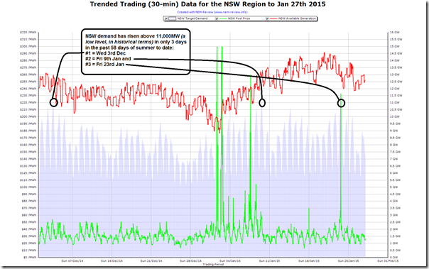
To track how demand has fared in NSW so far this summer, we power up NEM-Review and produce the following trend of 30-minute (trading) data for the region:
Figure 2 = trend of NSW demand in summer to date
As can be seen here, the NSW has been depressed for summer-to-date, only scraping above 11,000MW on three separate occasions.
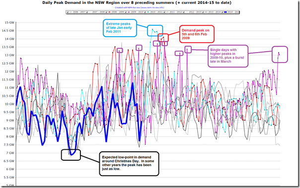
The second chart here (also from NEM-Review) compares 9 summers in a row for NSW to illustrate how low these peaks for summer 2014-15 to date have actually been.
Figure 3 = comparison of this NSW summer with prior summers
That this is the case is not surprising, given that the Kurri Kurri smelter closed in the 2012 year – adding a step-change decrease in demand to the pre-existing trend of declining demand (that has continued since then).
However the question remains – where will the NSW demand peak this summer?
It’s an important question (and not just for those who stand to win a BBQ on the answer). It’s also a challenge that’s central to future investment decisions in the generation, transmission and distribution sectors (plus the growing sector “behind the meter”) – as well as being central to the ongoing operations (and retirements) of existing assets.
But the three charts above start to explain the story of why it’s such a difficult (and thankless) task.
3) What’s the “official” forecast for the remains of summer?
Judging by Figure 3 above we can see that, whatever the peak demand will be for summer 2014-15, it’s highly likely to occur in the next week or two. We see that demand has always seemed to fall into a lull late in February and through March (except for that one spike shown for late March 2010).
3a) AEMO’s NEFR / ESOO forecast
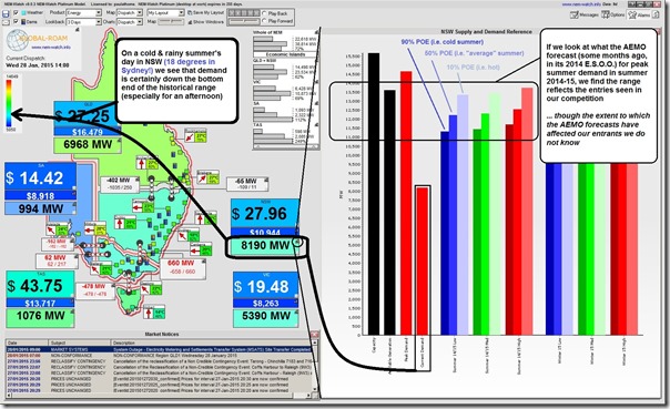
Back in August 2014, the AEMO published its Statement of Opportunities which included the demand forecast for summer 2014-15 (sourced from the NEFR from 2 months earlier, in June). We can use NEM-Watch to drill-in to see how those forecasts (under 9 different scenarios) compare with how summer is actually unfolding, as shown here:
Figure 4 = demand in NSW today (being cold and wet) is way below what’s forecast for summer peak
Using the higher-end dashboard, ez2view, we can look into two other demand forecasts produced over shorter-term time horizons – as follows:
3b) AEMO’s MT PASA forecast
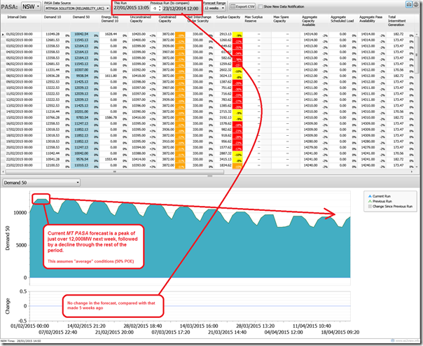
The AEMO’s MT PASA demand forecasts are updated once each week, and provide a view of peak daily demand under extreme (10%POE) and average (50%) weather conditions.
The following is the view of the NSW demand forecast under the average weather scenario :
Figure 5 = demand is expected to peak next week in NSW, according to AEMO’s MT PASA forecast
As noted here, AEMO is forecasting a peak next week of around 12,000MW under the “average” weather scenario.
3c) AEMO’s ST PASA forecast
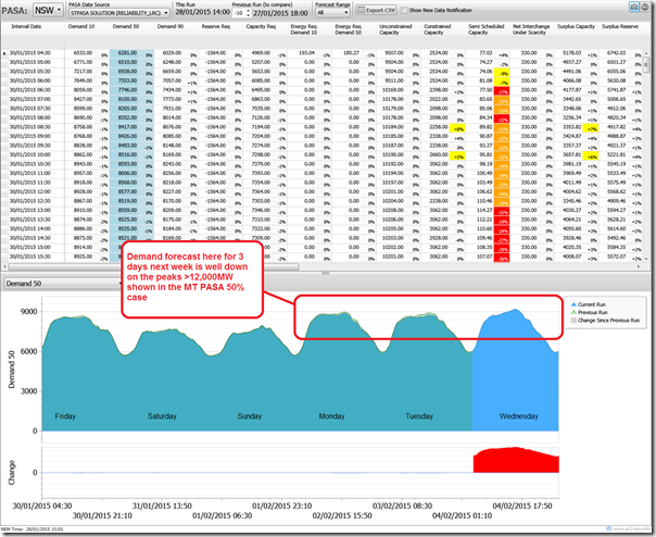
Given that the MT PASA forecast (Figure 5) shows a demand peak expected next week, it’s particularly interesting to narrow the time-range of the inquiry and look into the ST PASA forecast (again within ez2view).
What we see is a very different story:
Figure 6 = ST PASA forecast is 3,000MW lower…
Because ST PASA is updated every 2 hours (compared to once per week for MT PASA) it can take account of changes to weather forecasts that are updated on a much more regular basis.
Is this the only reason why the demand peak forecast now for next Monday/Tuesday/Wednesday is 3,000MW lower than was the case in the MT PASA forecast published yesterday afternoon (Tuesday 27th Jan)? Does this mean that next Thursday and Friday might be significantly hotter?
If you know of other reasons, please help me (and our readers) out by adding your comments below…
4) Is forecasting becoming even more difficult?
Back in 2008, we posted this analysis of the demand forecasts that had been made by TransGrid to that point in time. As could be seen then, the demand forecasting process was fraught with difficulty (no better than sticking a finger in the air too far out?).
However since that time, it seems to me that the demand forecasting process has become even more difficult. With price elasticity of demand now clearly seen (at home, and at work), the rise of solar and other embedded generation behind the meter, and the potential rise of distributed storage, it’s becoming a “perfect storm” to make the future very cloudy.
It’s also become much more politicised than was the case in 2008 when we posted that analysis following the conference I spoke at.
(a) Since that time, the link between demand forecast rates and infrastructure development – and hence end prices (for the transport component, at least) to consumers has become much more apparent, and widely understood.
(b) Coupled with this is the fact that we have privatisation (oops, leasing ☺ ) of network assets in Queensland and NSW, linked with billions of dollars of other investment promises, subject to two very contentious & imminent elections. Coincident with these elections are the AER’s decision process relating to revenue.
Technology change is only part of the puzzle. Also playing a significant role in driving behaviour is pricing of energy delivery – and yet there does not seem to be anyone in particular in the driver’s seat on that front….
Because the horse has bolted with respect to cost-reflective network tariffs in the roll-out of distributed air-conditioning systems (*1) it has been seen by some as self-serving on the part of the network companies when “the sluggish battleship” finally starts to turn its direction and adjust its pricing methodology – coincident with the second technology change (*2). This is quite understandable (I’m not getting into the extent, or not, that it might be true – as, apart from anything else, I don’t really know).
*1 = others have written of that aspect of “Socialising cost whilst privatising profit”
*2 = The first technology change (air-conditioning) added to average demand in a big way (and peaks even more-so). The second technology change (solar PV) is having the opposite effect – reducing average demand and also reducing peak demand, hence shifting the time when scheduled peak demand occurs.
Close on the horizon is the third big change (distributed storage), replete with its own challenges, as well. Given that the industry has not even dealt effectively with the first and the second, what hope is there that we can deal with the third?
Many others have written about different aspects of storage (and solar, and air-conditioning). What puzzles me, today, is how anyone can be expected to have a reasonable stab on where demand will be in 6, 7 or 8 years time with all of these moving parts (and more). As shown in Figure 1 above, we can’t even accurately forecast what the peak demand will be in the summer that’s right upon us…
5) Surely there must be a better way?
I don’t have any answers, but I am pondering this question…
For those who don’t know, in a former life (see here) I did play a role in developing a probabilistic scenario planning methodology to assist network companies dealing with the mismatch between an uncertain market environment and the need for firm revenue plans.
If we assume, for a moment, that all parties are altruistic, the cards still do seem to be stacked against the chances of achieving a reasonable and cost-effective outcome for energy users who are, at the end of the day, the people (and companies) that foot the bill for all players operating in the market (including new technology providers).
My experience is similar to what Luke has noted in that, from the broad cross-section of people who I have the privilege of speaking with and serving, I find most genuinely interested in helping to meet the principles espoused in the National Electricity Objective. On the flip side, there have been those rare few who have been out looking after number 1, and they’ve not been uniquely located in any particular segment of the industry.
I wonder, for instance, if asking network companies to submit firm revenue requirements out up to 7 years into the future (i.e. from the time the numbers are first crunched) is just asking for trouble – with the inevitable boom/bust cycle that seems to have threatened the industry for as long as I can remember.


Paul
Just on the question of why AEMO’s MTPASA and STPASA forecasts seemed so different for the week you examined, the reason is that the MTPASA takes no account of the actual weather forecast – it is simply based on long term climatic statistics. The STPASA forecast does take into account the actual weather outlook.
The MTPASA demand forecast will almost always be significantly higher than the STPASA forecast unless the near-term weather forecast is predicting conditions (broadly) corresponding to a maximum demand day for an entire season, which is the the demand metric that the MTPASA forecast is attempting to represent (at 90%/50%/10% probability of exceedence levels).
Cheers
Allan
Thanks Allan
That helps me – and probably some of our readers as well.
Paul