We connected with our clients directly last week about the release of our detailed review into what happened in Queensland over the 120-day period (1st December 2012 to 31st March 2013) and, in doing so, posed the following questions – which generated considerable interest.
For this reason, we thought that they would also be of interest to our wider WattClarity readership:
Q1) About the temperature/demand correlation
According to the Bureau of Meteorology , summer 2013 in Queensland was particularly warm:
“4th highest maximum temperature on record, warmest since 2005/2006
4th highest mean temperature on record, warmest since 2005/2006”Given this, we asked how much did Queensland’s demand increase as a result of these temperatures?
Answer = Demand actually continued to decline, despite the temperatures.
Q2) About the changes to spot prices experienced over the 4-month period
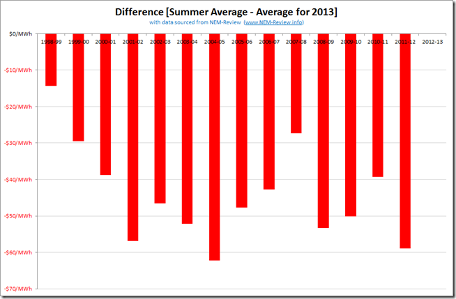
In the following chart, we highlight how the time-weighted average price for Queensland over the December-March period compared to every single year in Queensland since the start of the NEM. A pretty telling chart.
We asked – what were the four key changes to the shape of spot prices in the Queensland region that drove prices so high compared with all 14 previous summers since the NEM began?
Answer = Obviously carbon is one of the four changes, having increased the input cost of most of the generation fleet in Queensland (and elsewhere). However, do you know what the other 3 changes are?
Q3) About transmission constraints
Transmission constraints were one of the factors that led to prices being higher in Queensland over summer 2013 than they had been in any of the 15 summers since the start of the NEM. This was even mentioned in the mainstream media as summer progressed.
We asked – what transmission constraint was most prominent in driving prices higher?
Answer = If you answered “855/871” then you’d actually be wrong, which was actually a surprise when we looked at the numbers. This is discussed further (with a layman’s explanation of what these constraints mean) in our 3-part report.
Q4) About Available Capacity
Mention had also been made, in plenty of places, of the decision to withdraw 2 units at Tarong Power Station (totalling 700MW or approx. 12% of average regional demand) from the market. Some had seen this as the most telling reason that prices were higher.
We asked – in addition to the withdrawal of two units at Tarong prior to summer, there was almost 600MW of other Queensland baseload capacity missing from the market over summer. What was this?
Answer = we suggested that, if you don’t know what contributed to this other missing capacity (but recognise that this played a key role in the prices experienced) then you probably need to read a copy of this review.
Q5) About Generator bidding behaviour
In addition to the above, there was also plenty of discussion about generator bidding behaviour over summer, with some singled out in particular.
We asked – which generators engaged in bidding behaviour designed to lift prices to the heights achieved over summer? What was this behaviour?
Answer = we suggested that, for a more complete picture of what happened in terms of Initial Bids, and Rebids (both of which contributed, in different ways) you could reference our review as a way of learning more
Q6) Looking towards the future
Summer 2013 is in the past – for some its a distant memory, whilst for others it is still a painful period that’s still being autopsied.
We asked – what are the potential future implications washing out of what happened in Queensland over summer?
Answer = this is one of a number of things we considered in our review.
.
What happened, why – and what are the future implications?
This report is ready to be provided in three parts:
PART 1 = Executive Insights has been written, and substantially refined, to be about 40 pages summarising the different factors that contributed to the key outcomes that emerged over summer (those above, plus others). We summarise how these have come about, and comment on what the potential future implications might be.
PART 2 = Analytical Details has been compiled for the detail oriented and is centered around individual review of each of the 121 days over the period we have termed Summer 2013 for this review (December 2012 to March 2013). In several cases we have included focused Case Studies of specific events that occurred over summer – such as this review of 2nd January.
PART 3 = An Explanation of some key concepts in the NEM has been prepared to augment AEMO’s excellent “An Introduction to the NEM” brochure, and provide some more details necessary for understanding the nature of volatility in the Queensland Region over summer. It’s designed to be read in conjunction with the illustrated Case Studies to help those not intimately aware of the workings of the NEM to understand what’s occurred, and why.
To order your copy of this report, please fax back this order form today.


Leave a comment