I was grateful to be asked to participate in another discussion, this week, about where demand is headed in the NEM – following on from the comments I have made previously on WattClarity®.
Most recently, I posted this analysis of the pattern of demand on a regional basis, and observed that (at least for the three largest regions) a common pattern could be observed in terms of flattening growth rates (at all but the peakiest of peaks) since 2006 – and perhaps a slight decline recently.
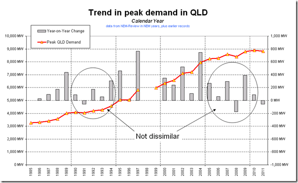
Coincident to the discussions this week, I came across some historical records of peak demand in Queensland that pre-dates the NEM by a number of years. I have presented these here for your reference:
Note that I am reasonably confident (though not 100% sure) that the numbers shown in these charts are an “apples to apples” comparison of peak demand on an as-generated basis. Please bear this in mind.
1) QLD – calendar year basis
As seen in the chart below, with almost 15 additional years of history added, we can find a similar pattern of lower load growth from the early 1990s (a period of softening demand growth that led to the deferral, for a couple of years, of the construction of the Stanwell power station).
In this light, it is understandable that a number of generation project developers are talking, now, about projects moving slowly, or being on hold.
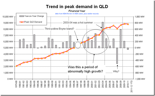
2) QLD – financial year basis
I separately found some records that went back even further, on a financial year basis – these are represented in the second chart.
As is indicated in this chart, it does appear that the growth seen from around 1999 to 2005 was higher (on average), than the growth experienced over any other 5 year block of time.
Perhaps we should be considering what factors (such as the introduction of major industrial loads in mining, minerals processing or other industries) occurred in that period at a higher rate or concentration than in any other?
If someone can point me at a similar history for each of the other regions, I would be most appreciative.


Hi Paul,
i don’t have numbers for you but have a book called “Brown Power – A jubilee history of the State Electricity Commission of Victoria” It is a self published work from 1969 and gets back into the halcyon days of brown coal expansion that lead to Loy Yang etc. There are many interesting aspects to this, not least the intent and associated policy and practice of promoting load growth. Linking this with the nature of large thermal plant there was a natural desire and deliberate process of growing what we currently call ‘base load’. Of course you know what baseload is, but it is an artifact of both technology and socio-politcal intent. Baseload is an outcome of historical priorities and triumph of one story (coal) over all competing others. Hence the title of the book.
Long story short, I’m contemplating revisiting this book over the next few weeks. If so, what would your review questions be in light of your current historical investigations?
Jim Castles
Hi Jim
Thanks for the question.
Unfortunately I can’t really comment in detail, not having read the original edition to understand its context.
Obviously there has been no new brown coal development since the VicPool market started – though my understanding is that utilisation rates increased, and have remained high. I’m not sure how this fits into the context of the older book.
Regards
Paul