Following from the analysis we’ve been doing of the way NEM-wide demand growth has slowed, and may have started to decline (and the identification of possible reasons for this reversal) one of the first questions we’ve asked ourselves was the extent to which this change has varied geographically.
Using NEM-Review, we looked a bit further (on a regional basis, this time) and the results were surprising.
The five charts below have been configured with respect to each region in turn. They show a colourful trend in the distribution of demand across each year – enabling several dimensions to be read and understood in a single chart. For comparison, the similar chart for demand NEM-wide is at the bottom of this analysis.
We have coloured the upper 20% of demand (i.e. down to approximately 20% below the peak) in greenish colours in order to provide another point for understanding the patterns shown.
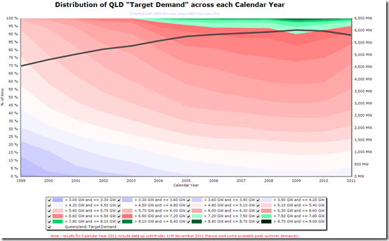
1) Queensland
In comparison to the analogous charts for the other regions below, we can clearly see how QLD has the flattest load shape of all the regions of the NEM (seen in the largest area of green colour banding on the chart).
It can be clearly seen** in the chart that the trend of increased demand seen earlier in the period softens and even can be seen to reverse since 2009 – though it should be noted that results for 2011:
(a) Incorporate the effects of the flood in January and February 2011; and
(b) Are incomplete, and potential omit some peak summer demands for November and December of this year.
Hence, the decline shown in 2011 should be considered excessive and unusual.** it can be seen through the gradient of each colour banding in the chart, which initially slopes downwards to the right (indicative of growing demand for that category) but then levels off, and shows a reversal in 2010 and 2011.
In addition, the solid line on this chart shows the average demand for the year – this grew solidly up until 2005, but then started tapering off and then declined in 2010 and 2011 (with the caveats above applied).
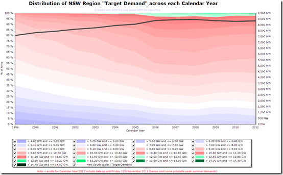
2) New South Wales
The following chart for NSW is very similar (with the notable exception of a smaller banding of green – indicating a peakier demand shape).
We can see that, in the early years, the rate of growth in demand in NSW was not as great as seen in QLD (i.e. the the gradient of the coloured bands shown for QLD is greater).
From about 2006 in NSW we can see that the trend of increasing demand changes as the gradient reduces, with even an reversal seen in later years from 2008 (i.e. a year earlier than in the QLD).
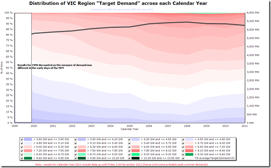
3) Victoria
The chart for Victoria has been modified to obscure the results for 1999 – as the measurement of demand was different (with the smelters reported separately) for the initial period of the NEM.
In general terms, we see that the demand pattern has bumped around more in VIC than in NSW and QLD (where the coloured bands are generally smoother).
It’s also very notable that the patch of green colour in the top-right of the chart is very small, in comparison with QLD, highlighting the very pronounced nature of peak demand in Victoria.
The headline conclusion is the same as for NSW and QLD – that demand growth appears to have slowed from about 2006, and has been reversing in the past couple of years.
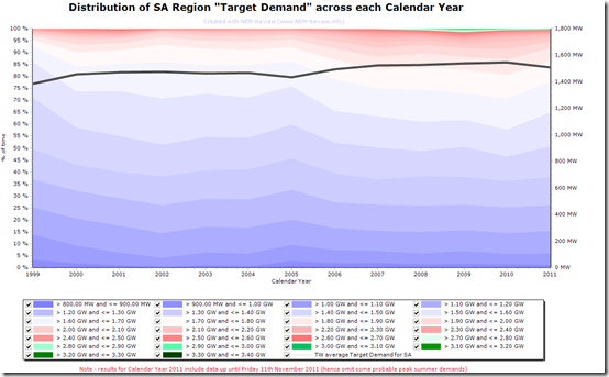
4) South Australia
The following chart (for SA) shows more blue space than in the charts above – however this is primarily a result of the automated selection of the colour coding from blue to red, so should not be taken to imply anything in particular.
What can be seen (by virtue of the extremely low area of green banding, which is manually configured to represent the last 20% of peak demand), however is the extremely peaky nature of the demand shape, particularly compared to QLD.
In contrast to the regions above, we can see that demand declined in the period 2003 to 2005 (which seems to have been a particularly low demand year) and then increased again in the years subsequent to this.
It appears to have only reduced again in 2011 – though this might be because of the partial year of data.
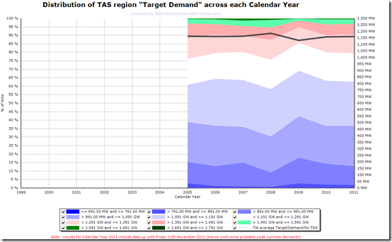
5) Tasmania
As this region only entered the NEM in May 2005, less can be seen in the way of a historical trend.
Hence it is not clear whether demand was increasing prior to 2005 (in peak and/or in average terms), as can be seen to be the case for the other regions – however it is apparent that demand has been fairly flat in TAS since 2005 (which is similar to what we see to be the case in the mainland regions).
It’s notable that 2009 appears to have been a lower demand year. However apart from this, there does not appear to have been the decline in demand seen in QLD NSW and VIC in recent years.
We can also see (from the green area) that the demand shape in Tasmania is not as peaky as is the case in VIC and SA.
In summary, we see that the pattern seen NEM-wide (of reduced growth rates in demand from around 2006, with even a decline in demand in the most recent years) appears to have been repeated at a regional level for most regions, particularly the larger ones.


Leave a comment