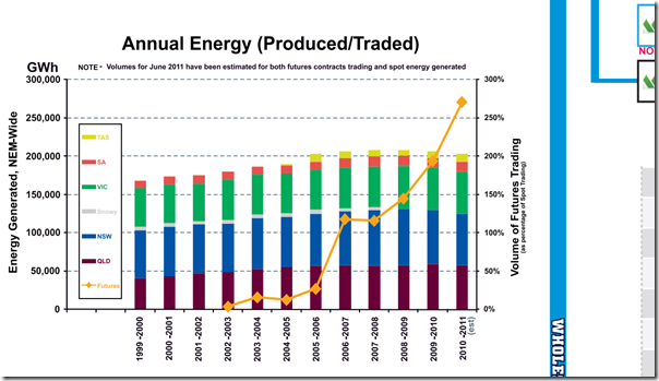
In the compilation of our newly updated (2011 Issue) “Power Trading Schematic” Market Map, we took a look at the way in which traded volumes of electricity had changed .
This produced an interesting trend:
With respect to this diagram, perhaps we could draw a few conclusions:
1) Futures trading is booming – as frequently noted by d-cypha, traded volumes of electricity futures contract is now well in excess of the underlying physical market.
Perhaps it’s a self-perpetuating cycle, but we’ve seen an increasing number of financial traders enter the market on the back of these increased liquidities.
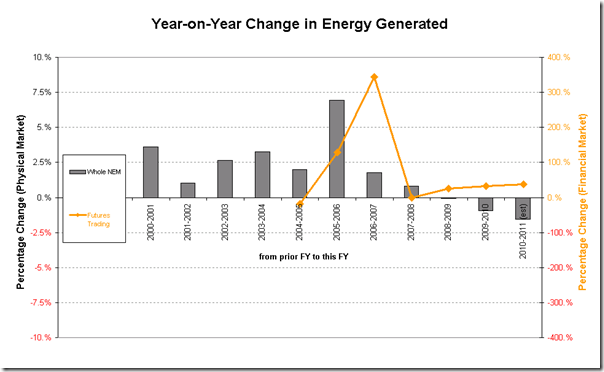
2) Average physical energy demand has been declining – as distinct from the separate issue of peak demand (which continues to climb), we see that the level of total electricity generation in the NEM has actually declined in recent years. This is undoubtedly due to a number of different factors, including perhaps:
(a) A hang-over from the GFC, as discussed at the time;
(b) The beneficial effects of increased focus on energy efficiency, at work and at home – which could be due to the proliferation of state and federal energy efficiency schemes, plus a general heightened awareness of increased electricity prices, which began with the drought and which have continued since then.
This is highlighted in the second chart, which is not included on the “Power Trading Schematic”, but which has been derived from the same data:
Note that in producing this chart, we have estimated traded volumes for June 2011 in order to round out the spot and contract market traded volumes in the 2010-11 financial year.


Have you included non-scheduled generation, a classification which grew substantially during those years when the energy growth appears to have slowed?
Great catch, Ben
You are correct in that the numbers shown include only Scheduled and Semi-Scheduled generation, at this stage.
When I get a moment, I’ll update the post with another chart including the Non-Scheduled generation.
Cheers
Paul
PS Ben – had a chance to have another look and so put these additional thoughts together here.
The more I look, the more fascinating it is.
There are a number of reasons quoted for a flattening in demand growth – which has had the most impact, and will it continue into the future?