I’m completing a summary, and analysis (post coming when complete, will link it here) about energy user’s concerns about rising wholesale spot prices for electricity in the coming years in Australia’s National Electricity Market (NEM).
As is the case with many aspects of the NEM, different groups of people have different perspectives of whether prices are destined to rise or fall. To some extent, a person’s views are dependent on their own assumptions about the way in which the market will develop in future (in terms of policy, in terms of technology, and in terms of other external factors).
In addition, however, it’s important to note that a person’s perspective of the future trend in prices will also be dependent on the timeframe over which they are looking. This is something that is not stated as often, or clearly, as it should be – and hence leads (in my view) to miscommunication between people sharing perspectives that might actually be fairly compatible.
Hence, to provide some context to my analysis I’ve separately posted below the historical trends in prices over the 17 years since the VicPool market was started in Victoria in 1994.
A. Long-Range Trend in Average Prices
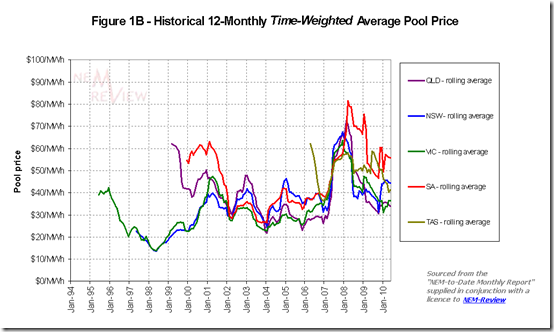
The following chart highlights how the spot prices for electricity in each region have trended over the 16 years since competition was first introduced in 1994 in Victoria (with the VicPool market, a precursor to the NEM).
The chart above provides a rolling 12-month average price (hence prices achieved in mid-1994 only show in mid-1995 for the first time). It has been taken from the “NEM to Date Monthly Report”, which is supplied with a subscription to NEM-Review Silver Model.
Within the chart, we can see how average prices have fluctuated over a period of 11.5 years (in the NEM) with additional years (prior to 1999) being in markets that were precursors to the NEM.
It will be apparent, with reference to the chart above, that either of the following perspectives would be correct, depending on the perspective of the reader:
1) If the reader compares current levels of spot pricing to those experienced in some previous years (2007 is the most obvious case, but there are others) the conclusion will be that prices have fallen – particularly in QLD and VIC, where they are substantially lower.
2) However if the reader compares current levels of spot pricing to other years in the past (e.g. 2003), it could also be said that current prices have risen from the low levelsHence, a truer explanation might be that spot prices clearly cycle (just like most other commodity markets), with a variable period between peaks (or troughs). Current prices are neither at their highest levels ever, nor at their lowest levels ever. Hence, at a very coarse level, it can be seen that current prices are fairly “normal”, with reference to the historical data available.
B. Simplified Chronological Evolution
In the following table, I have tried to provide some very general context around what happened over this period of 16 years or so (please note that it is a simplified explanation, but one which – I hope – covers the main points):
Year Context 1994 The VicPool market opened, with prices set at Long-Run Marginal Costs – there were a number of factors determining these prices. For instance:
1) In the early period, it’s my understanding that plant availabilities were lower than was the case in the following years under new owners.
2) It’s my understanding that (initially) most of the load was hedged via vesting contracts, hence the spot price only mattered at the margins.
3) With only a relatively small amount of experience in competitive electricity markets internationally, there was an expectation was that prices would be set at LRMC.
1995
1996
1997In the subsequent years, generators bid for market share, driving prices in VIC & NSW down. This situation was exacerbated by the higher availabilities achieved by these stations in the competitive market environment.
1998 Queensland Interim Market opens, with large amounts of volatility. 1999
20001999 was the first year of the NEM. The market opens with QLD undersupplied with capacity, and not connected to NSW and with SA undersupplied with capacity, and with transfers in from VIC consistently constrained. Hence prices were high. In contrast, VIC and NSW were still working through a considerable oversupply, resulting in very low prices.
2000 Directlink starts operating, linking QLD to NSW. We start to see some convergence in prices. 2001 QNI is commissioned, along with 2 units at Callide C. The convergence between QLD, NSW and VIC continues. 2002 Millmerran is commissioned (in QLD), as is Pelican Point (in SA). This increased capacity drives price convergence, and lower prices. This trend would have been marked, except for some opportunistic bidding that emerged in Winter 2002 to coincide with:
1) peak winter demand times.
2) a relatively tight supply/demand balance, as can be seen (from 2002 forward) in the final chart in this article.2003 Tarong North operating. Prices lower still. 2004
2005
2006Prices increase slightly from the lows of 2003 as demand growth soaks up the new capacity. 2007 Drought has a marked impact in the NEM, resulting in lower output from the hydro schemes in VIC, Snowy and TAS – plus also lower output from Tarong and Swanbank. Prices jump significantly as a result.
2008
2009
2010Prices drop off from the high levels seen in 2007, but not back to the levels in the years immediately preceding this. Rainfall in QLD has filled dams there, but the hydro schemes in the south are still conserving water (though not as drastically).
If I have made any errors, or left anything out that was vitally significant to the prices achieved, please let me know and I will correct – or just make a comment below.
C. Trends in Price Volatility
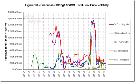
Given that the annual average price is highly sensitive to the volatility inherent in the spot market, we have included another chart (again from NEM-Review) that highlights one measure of volatility.
There are a number of different ways in which to measure volatility – in this case, we’ve just used a simple count of the number of trading periods (half-hours) when the price rose above $100/MWh.
Again, a rolling annual total is used, in order to present a smoother picture.
We can see that average prices are somewhat higher today than was the case in years immediately preceding the drought – however the number of price spikes seen now are no greater than was the case in the pre-drought years.
D. Distribution of Prices in the NEM
Finally, I’ve performed, and previously posted, some additional analysis of the trend in regional prices and included this here, for your reference.
This additional analysis was posted only for the NEM years.


The price hike in 2007 was due to two powerstations reducing output due to a government restriction on taking cooling water. I wonder if privately owned powerstations would have been so quick to cut production in lieue of finding alterate cooling methods? Consequently, it seems that the government owned power stations were the big winners during the drought. Perhaps while the Queensland government retains business interests in the power industry, they should recuse themselves from legislating where such legislation could be seen as favouring their business interests.