
Quick apology –
For those who were expecting this review to appear much sooner than now (given that our reviews for January→September were published in January), we offer our apology.
It’s been quite a year (to date) and we have only managed to find the time to complete this analysis now.
1) The NEM reaches 10
For those who are unaware, 13th December 2008 marked the 10th Anniversary of the inception of the NEM. We released a short review of NEM history on that day to commemorate.
Given the occasion, however, we thought it would be useful to have a look, in more detail, at what has happened over the past 10 years.
Taking a slightly different approach, we’ve opted to review each month at a time – hence, this is one of twelve articles posted on this site at the same time.
2) 10 years of October
Through the NEM-Review software, we have prepared this illustration of how (average and peak) NEM-Wide Demand for electricity has grown over the past 10 years.
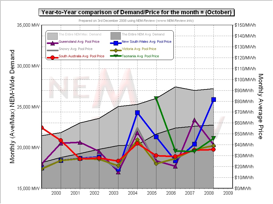
With respect to this chart, two things in particular need to be noted:
- Tasmania only joined the NEM in mid-May 2005 – hence the data for October 2005 shows the effects of Tasmanian region demand for the first time.
- The measure of "demand" calculated in NEM-Review v5.3 is the (30-minute) Trading Demand Target, which is the time-weighted average of the (5-minute) Dispatch Demand Targets over the half hour:
- Hence, the demand shown here is an output from NEMMCO’s NEM-DE (Dispatch Engine) and not a metered demand. In most cases, the numbers will be very similar, but they will vary from figures quoted elsewhere for "maximum demand"
- This is further explained in the glossary on the NEM-Review portal.
3) Quick Links
As the following table is quite lengthy, we’ve included here Quick Links to each of the 10 years included in the table below:
- October 1999;
- October 2000;
- October 2001;
- October 2002;
- October 2003;
- October 2004;
- October 2005 (including Tasmania for the first time, from mid-October);
- October 2006;
- October 2007;
- October 2008
4) Each Year at a time
In the following table, we touch on the highlights of some of the October months that have passed, since the creation of the NEM.
|
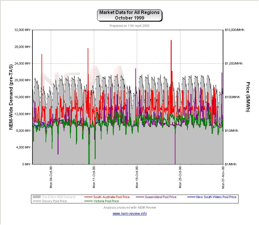
October 1999 |
As highlighted in the diagram above, October 1999 saw very low prices in all regions, with the exception of South Australia.
Note in the chart above that the price spiked high in South Australia on 4 occasions during the month, including one instance (Saturday 23rd October 1999) when the price spiked to VOLL (which was $5000/MWh at the time). We don’t have a NEM-Watch snapshot of this event, as this occurred a few months prior to our company starting. |
|
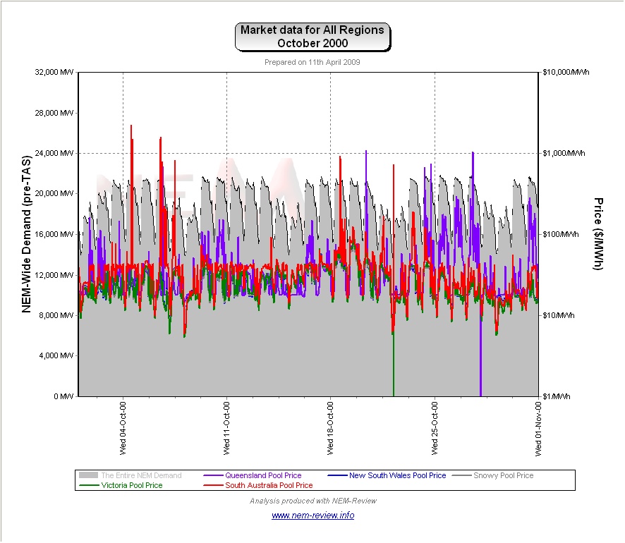
October 2000 |
The main chart (above) illustrates that prices rose in all regions in October 2000 (compared with October 1999) except SA, which softened slightly. The rise was particularly pronounced in QLD.
As can be seen, there were price spikes occurring in both QLD and SA – but not to the extent of the spikes shown in SA twelve months earlier. |
|
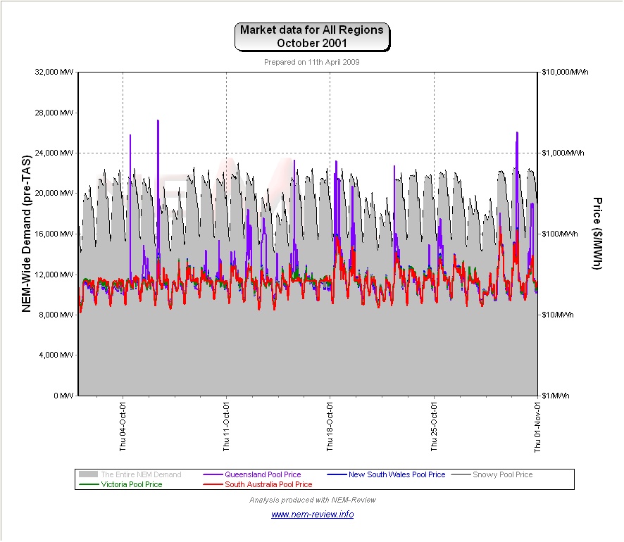
October 2001 |
October 2001 saw prices subside in all regions from their levels in October 2000 – with the exception of QLD.
As can be seen, the pricing pattern for the southern regions followed on from the pattern of flat prices seen in September 2001, with volatility increasing progressively through the month. In contrast, volatility in the QLD region occurred through the month. |
|
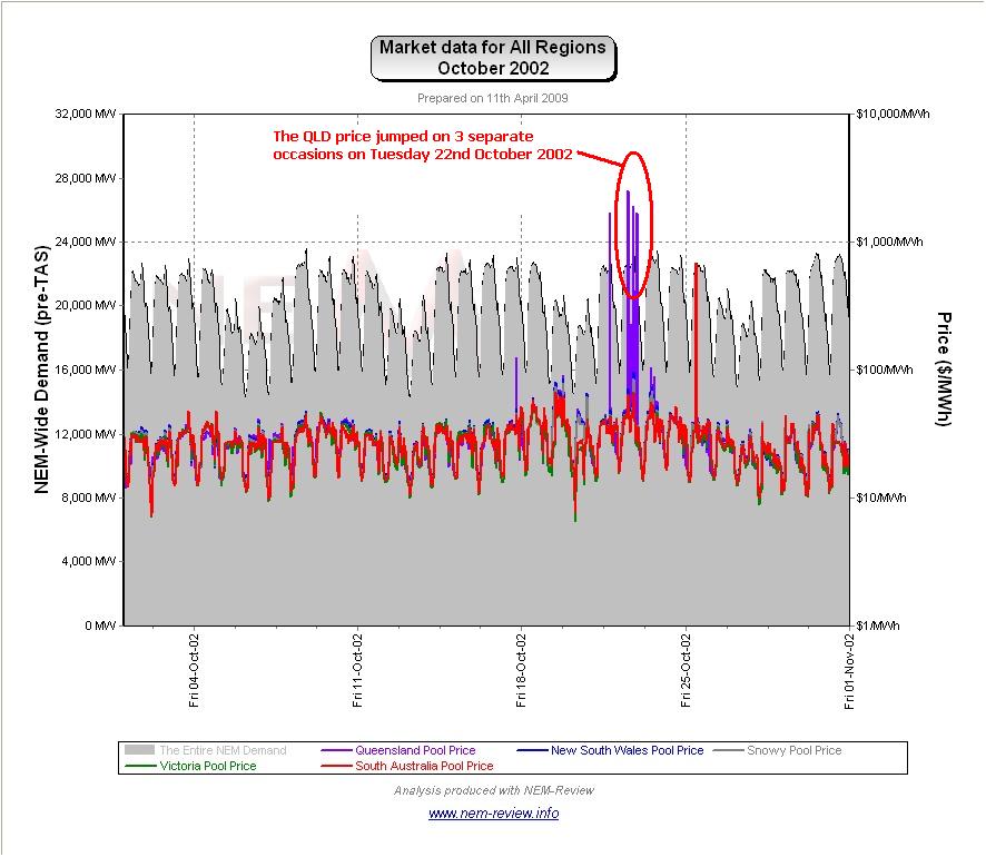
October 2002 |
October 2002 saw average prices soften in QLD, and remain the same in the other regions. The following chart (from NEM-Review version 5.3) provides more detail about what happened over the month.
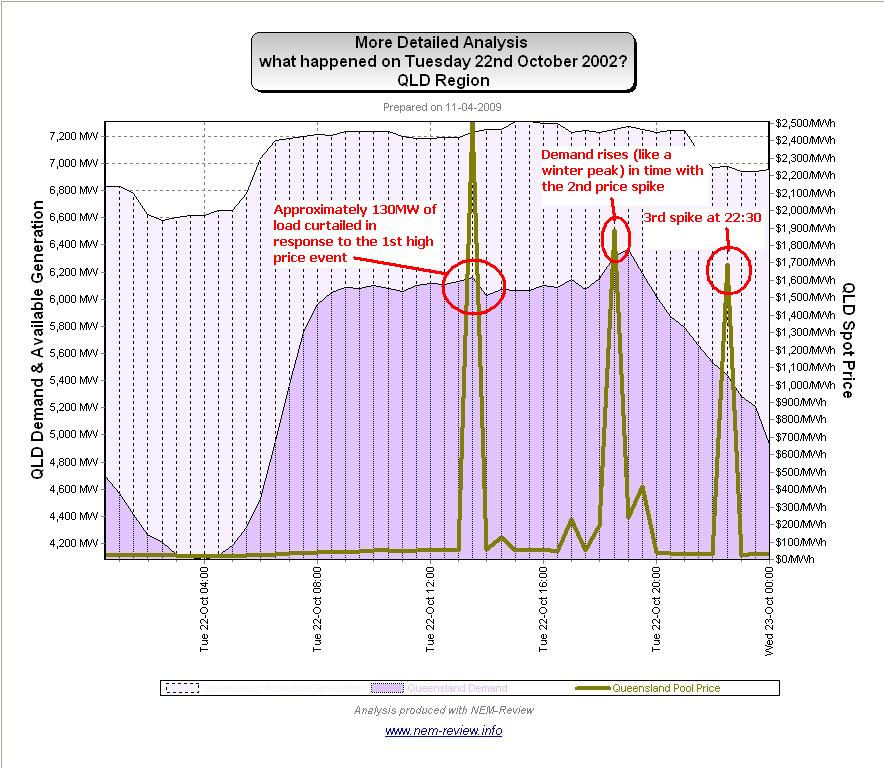
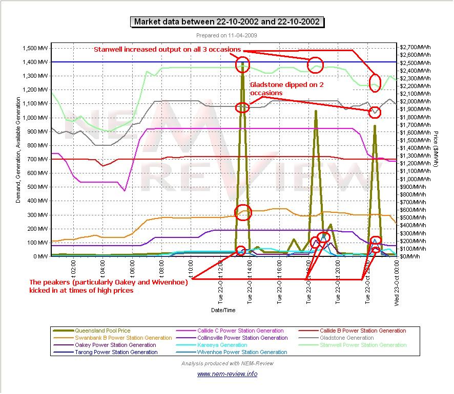
As can be seen in this chart, there were fewer instances of price spikes in the QLD region (compared with 12 months prior). However, of particular interest was what happened in QLD on Tuesday 22nd October 2002.
|
|
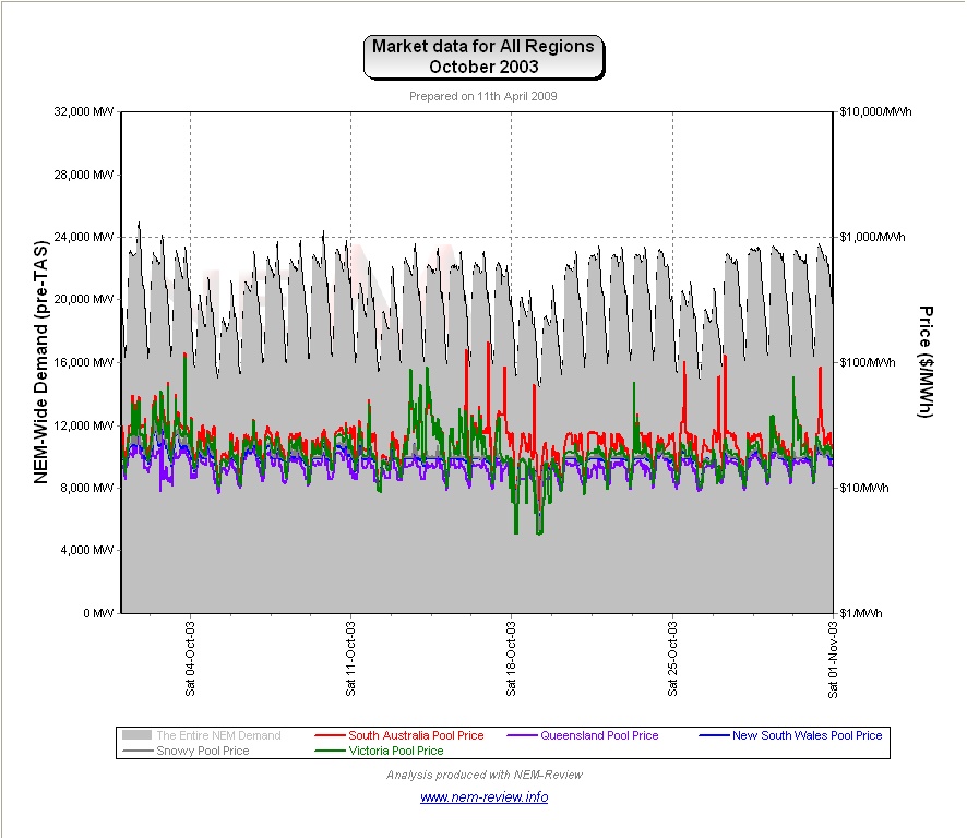
October 2003 |
As noted in the chart above, prices were lower across all regions in October 2003 (the lowest of all 10 x October-months).
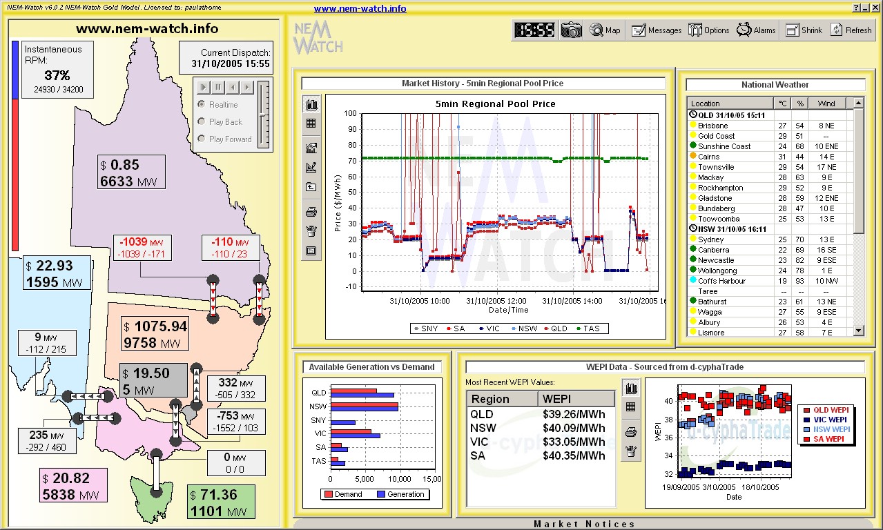
This can be seen in the chart above (drawn with NEM-Review version 5.3). It is noteworthy, however, to see that these low prices occurred despite a significant jump in demand (peak especially) in the 12 months to October 2003. That prices would fall despite a sharp jump in demand is indicative of the large amount of low-cost new capacity that had been brought into the market through 2002 and 2003 (i.e. 1200MW at Millmerran and Tarong North). This is also why prices in QLD were the lowest of all NEM regions. One of many instances when prices were low across all regions is shown in the following snapshot from NEM-Watch (v5):
See in this snapshot that the Instantaneous Reserve Plant Margin (IRPM) is shown to be 37% across the whole of the NEM, indicative of the large surplus in capacity (especially around the time of the morning peak in demand). |
|
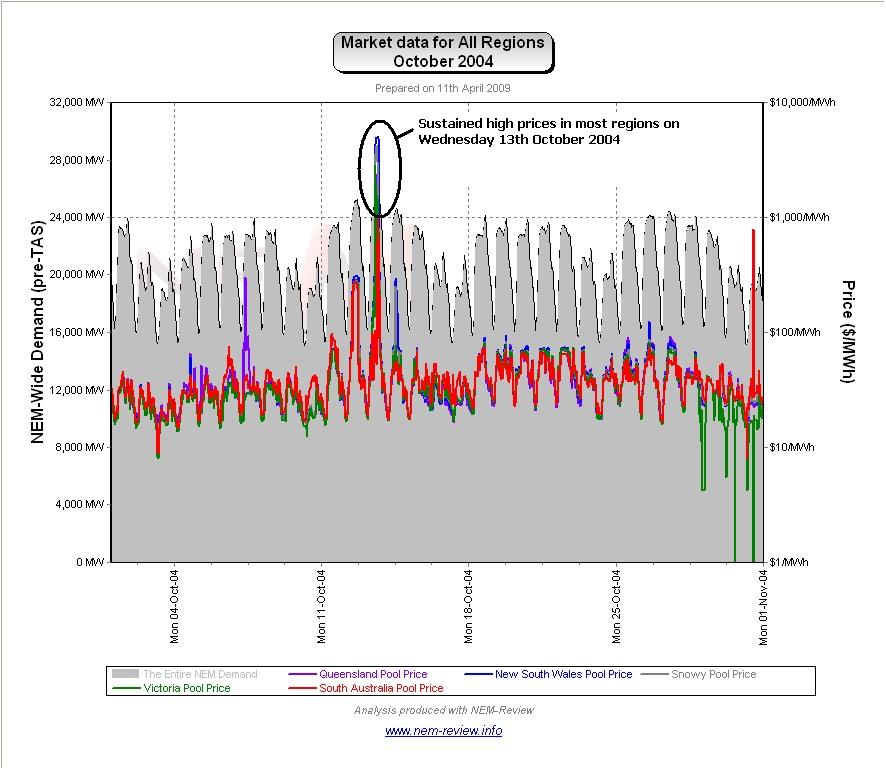
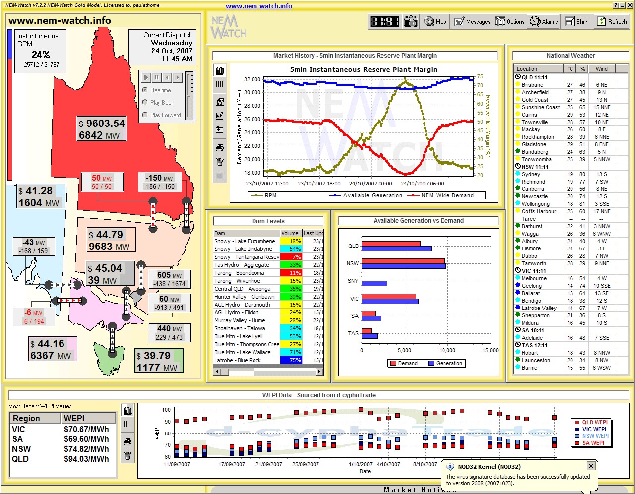
October 2004 |
As shown in the main chart (above) October 2004 saw prices jump significantly. The reason for this substantial change can be seen in the following chart (drawn with NEM-Review version 5.3). As can be seen, several things occurred in October 2004 differently than was the case in October 2003:
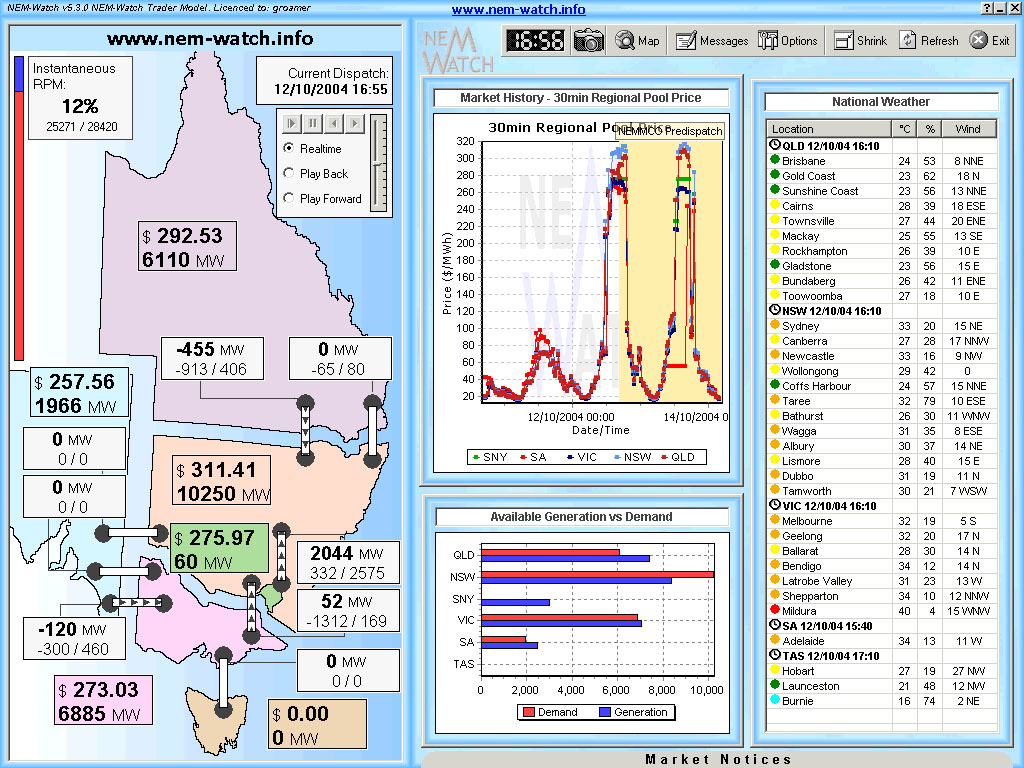
The following snapshot from NEM-Watch (v5) illustrates what was happening on the first of these days of price spikes (i.e. not even the day – shown above – when prices spiked the highest):
See in this snapshot that the Instantaneous Reserve Plant Margin (IRPM) is shown to be 12% across the whole of the NEM, indicative of the tight supply/demand balance (keep in mind that 12% was shown to be the lowest the IRPM had dropped to, up until winter 2007). |
|
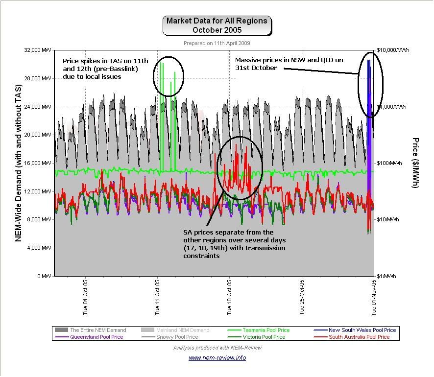
October 2005 |
As noted in the chart above, prices returned to more "typical" levels with the exception of NSW.
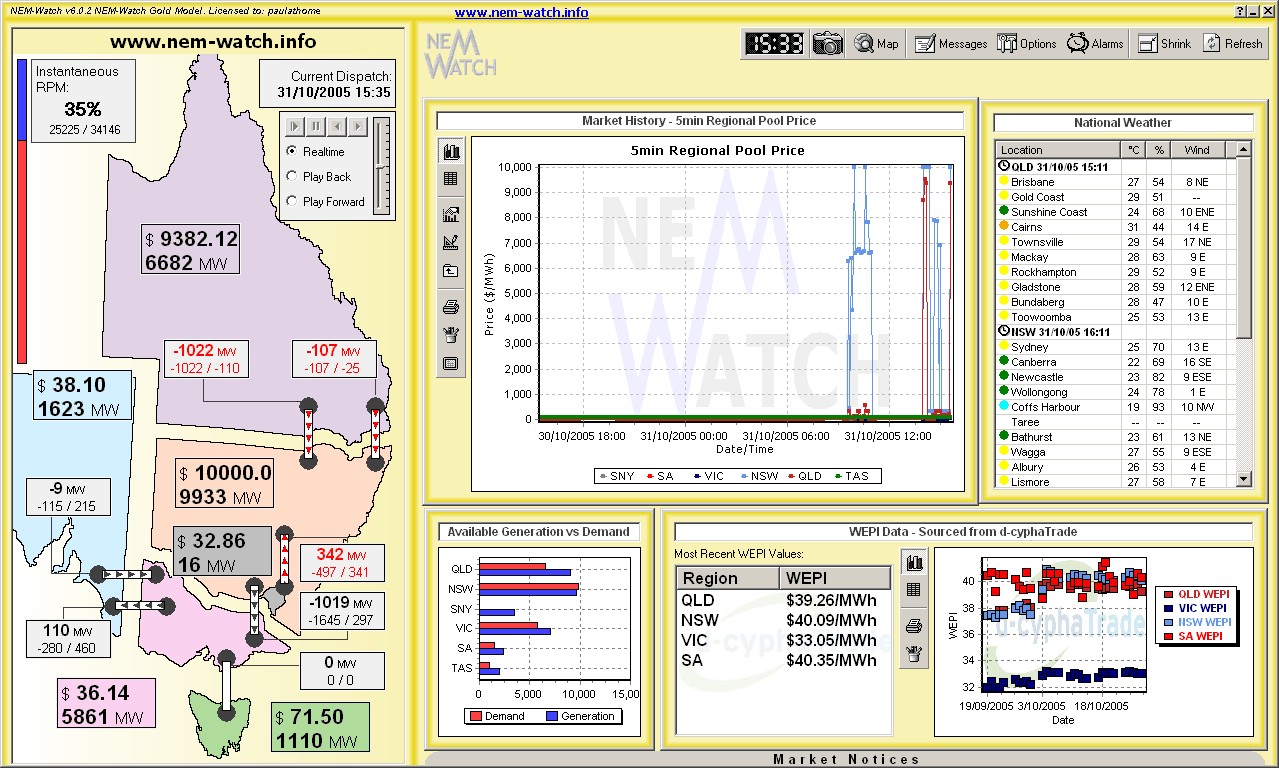
The following snapshot from NEM-Watch (v6) illustrates what was happening during one of the many dispatch intervals on that day when prices were high:
As can be seen (at 15:35), transmission capacity into NSW from the Snowy region was constrained, and at a level considerably below the maximum technical limit on the line. Twenty minutes later, this second snapshot (below) highlights how prices in QLD had dropped to almost nothing – perhaps as a result of generators in QLD and NSW seeking to optimise their positions.
Note in both of the snapshots above that the NEM-Wide IRPM (Instantantaneous Reserve Plant Margin) is shown to be a very healthy 35-37%. Hence, this clarifies that the issue forcing prices up in NSW and QLD were localised ones. Had we had NEM-Watch v8 operational at the time (complete with its real-time display of Economic Islands, and local IRPM), we would have seen this much more clearly. |
|
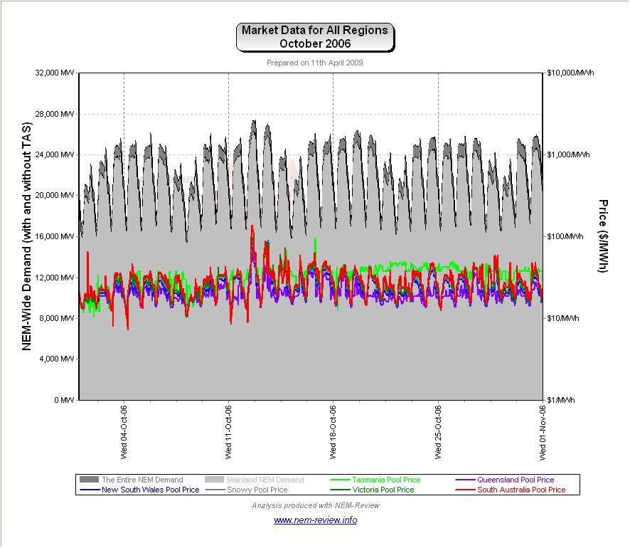
October 2006 |
As the main chart above shows, October 2006 showed that prices continued to trend downwards, compared to previous years – with prices in Tasmania converging on the mainland (given the commissioning of Basslink earlier in the year).
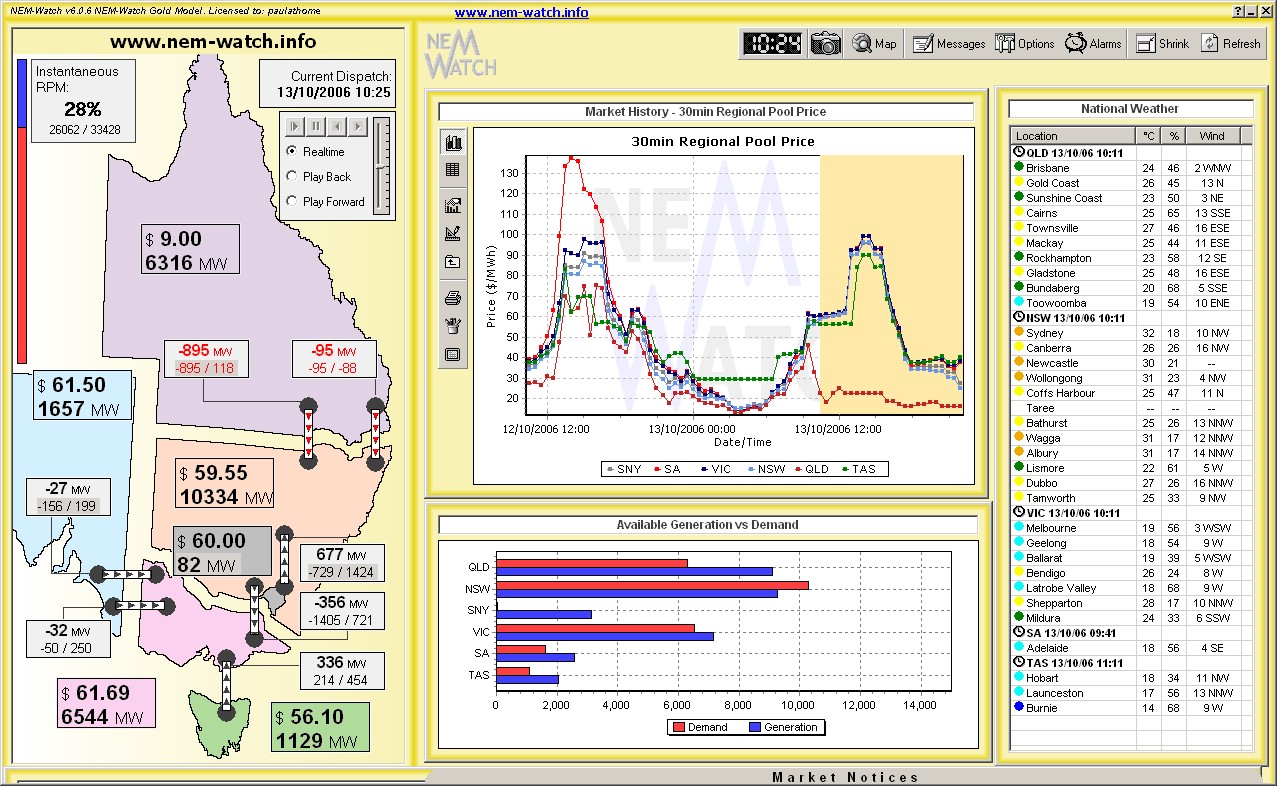
The snapshot above, from NEM-Watch v6, illustrates one dispatch interval when prices in QLD were substantially lower than those in the other regions. |
|
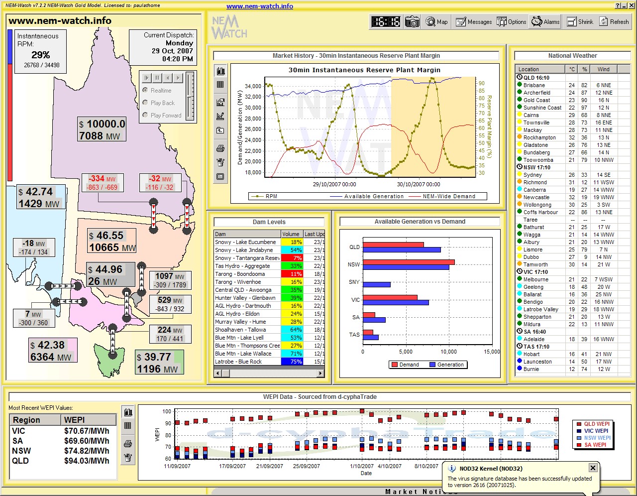
October 2007 |
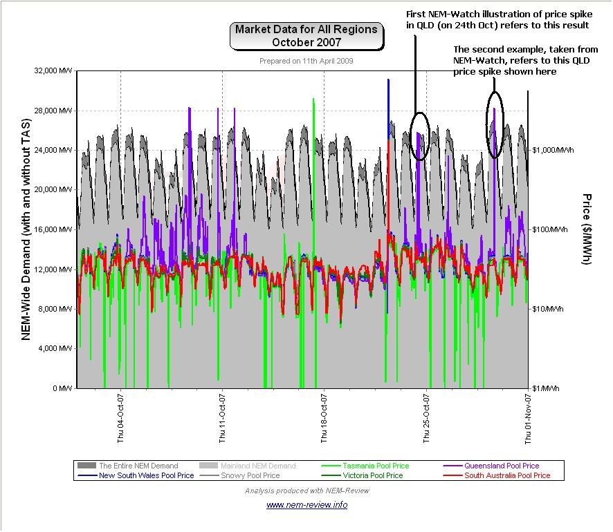
As shown in the main chart (above), average prices in October 2007 jumped sharply for QLD and NSW (most sharply in QLD), whilst climbing only slightly for VIC, SA and TAS. This occurred despite the fact that demand in October 2007 was almost identical to the levels seen for October 2006 (the peak demand actually declined).
From the above chart (drawn with NEM-Review version 5.3), we can see a number of things in particular:
|
|
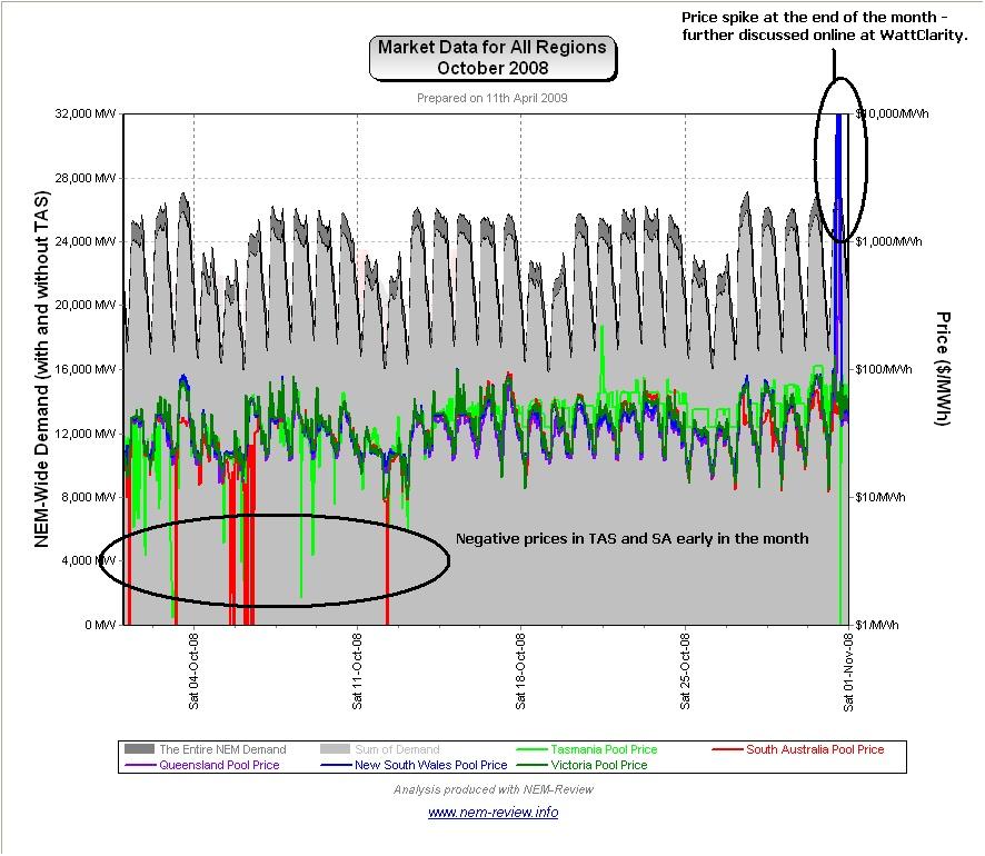
October 2008 |
Finally, we see that prices rose (in all regions except QLD) from the high levels experienced twelve months earlier – most significantly in NSW. This chart from NEM-Review (v5.3) shows more:
From this chart, see two things in particular:
|
.jpg)
.jpg)
Be the first to comment on "October in the NEM (a review of 10 years of history)"