
1) The NEM reaches 10
For those who are unaware, 13th December 2008 marked the 10th Anniversary of the inception of the NEM. We released a short review of NEM history on that day to commemorate.
Given the occasion, however, we thought it would be useful to have a look, in more detail, at what has happened over the past 10 years.
Taking a slightly different approach, we’ve opted to review each month at a time – hence, this is one of twelve articles posted on this site at the same time.
2) 10 years of April
Through the NEM-Review software, we have prepared this illustration of how (average and peak) NEM-Wide Demand for electricity has grown over the past 10 years.
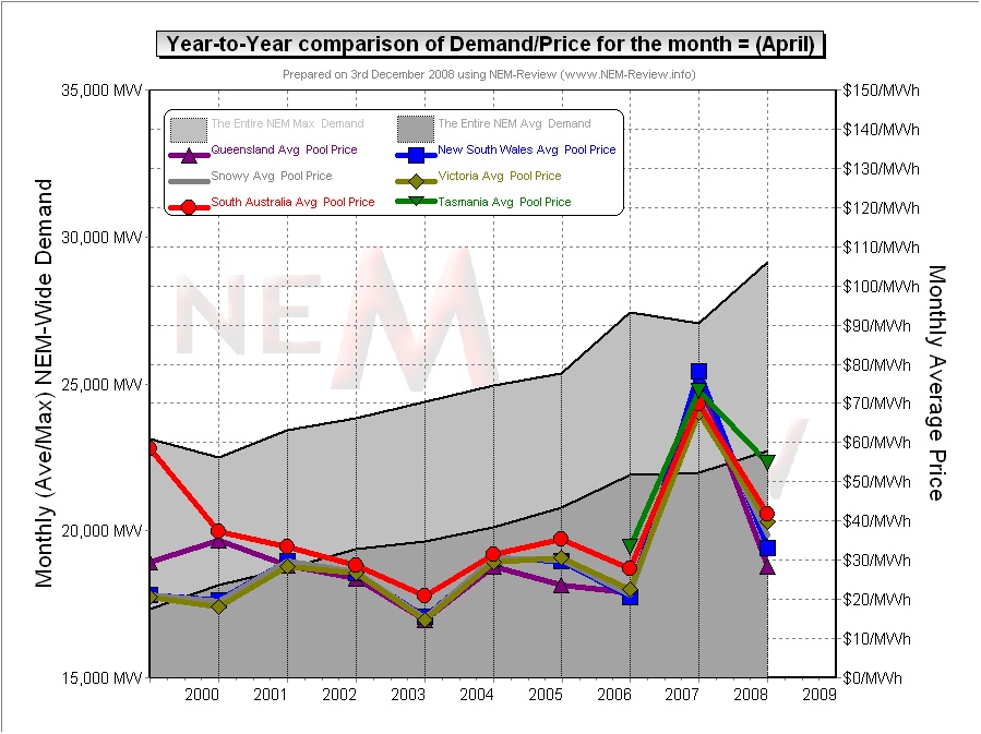
With respect to this chart, two things in particular need to be noted:
- Tasmania only joined the NEM in May 2005 – hence the data for April 2006 shows the effects of Tasmanian region demand for the first time.
- The measure of “demand” calculated in NEM-Review v5.3 is the (30-minute) Trading Demand Target, which is the time-weighted average of the (5-minute) Dispatch Demand Targets over the half hour:
- Hence, the demand shown here is an output from NEMMCO’s NEM-DE (Dispatch Engine) and not a metered demand. In most cases, the numbers will be very similar, but they will vary from figures quoted elsewhere for “maximum demand”
- This is further explained in the glossary on the NEM-Review portal.
3) Quick Links
As the following table is quite lengthy, we’ve included here Quick Links to each of the regional reports included in the table below:
4) Reports for each region
From this chart, it can be seen that, in most years, April has typically been a non-eventful month. Hence, in this article, we’ve opted to take a slightly different approach than the approach we’ve adopted for the other months.
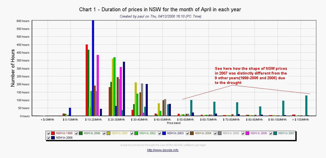
In the “2009 NEM Wall Calendar” we highlighted how prices were substantially higher (in April 2007) than in the other 9 years features (1999-2006 and 2008). We highlighted, through a price distribution curve for NSW, how this was the case in NSW.
In the following table, we’ve expanded on this analysis to include some for each region:
|
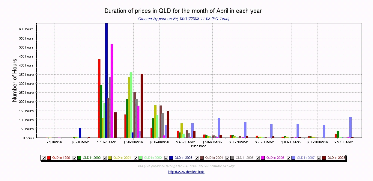
QLD Region |
The following chart (produced with our deSide® software) shows a distribution of QLD spot prices for each April month over the 10-year range (1999-2008).
From this chart, a couple of observations can be made:
|
|
NSW Region |
A similar chart has been included (below) for the distribution of April prices in NSW:
A very similar situation can be seen with respect to NSW prices in April 2007. Because of the different dynamics in the early years, however, we can see a higher incidence of lower prices in NSW in 1999 and 2000 than in most other years (the exception being 2003). This goes a long way to explaining the low prices seen for NSW in April months of 1999, 2000 and 2003. |
|
VIC Region |
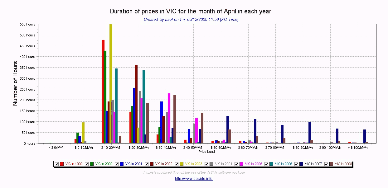
The analogous chart has been included for April spot prices in Victoria, below:
As can be seen, the situation is almost identical to that for NSW – both in terms of:
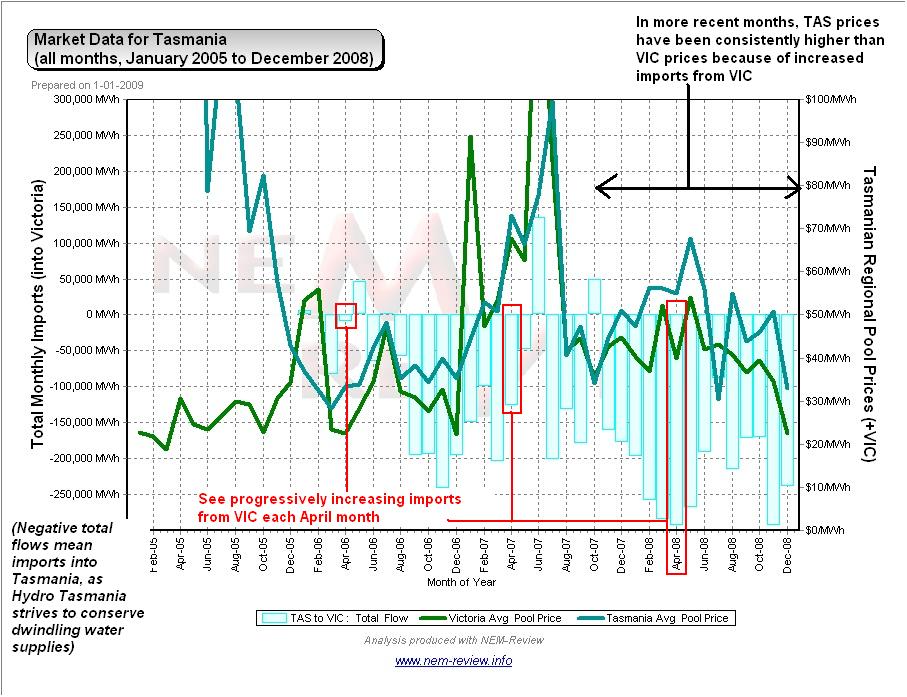
In addition, it can be noted that prices in April 2008 had reverted to previous “typical” patterns to a lesser degree than was shown to be the case in the northern regions of NSW and QLD. We believe that this is due, at least in part, to the fact that water shortages persist to a greater degree in TAS than they do in QLD – hence Hydro Tasmania is still importing a higher amount of energy over the Basslink interconnector than was the case in April 2006, for instance.
Certainly, it can be clearly seen in the above chart (from NEM-Review version 5.3) that the exports from VIC to Tasmania have been increasingly steadily. |
|
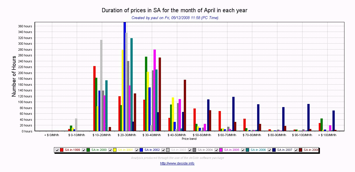
SA Region |
The chart below (from deSide) for South Australia reveals a very similar story to that for QLD.
In particular, we see:
|
|
TAS Region |
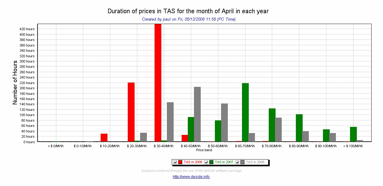
A similar chart has been included for Tasmania, but for only the 3 April months in which it has been a part of the NEM.
Given the chart above (showing aggregate monthly Basslink flows) shows an increase import to Tasmania in April 2008, compared to April 2007, it is no surprise that prices in Tasmania have not subsided to anywhere near the same degree as they have in the mainland regions. |
Leave a comment