For those who were expecting this review to appear much sooner than now (given that our reviews for January→September were published in January), we offer our apology. It’s been quite a year (to date) and we have only managed to find the time to complete this analysis now.
1) The NEM reaches 10
For those who are unaware, 13th December 2008 marked the 10th Anniversary of the inception of the NEM. We released a short review of NEM history on that day to commemorate.
Given the occasion, however, we thought it would be useful to have a look, in more detail, at what has happened over the past 10 years.
Taking a slightly different approach, we’ve opted to review each month at a time – hence, this is one of twelve articles posted on this site at the same time.
2) 10 years of November
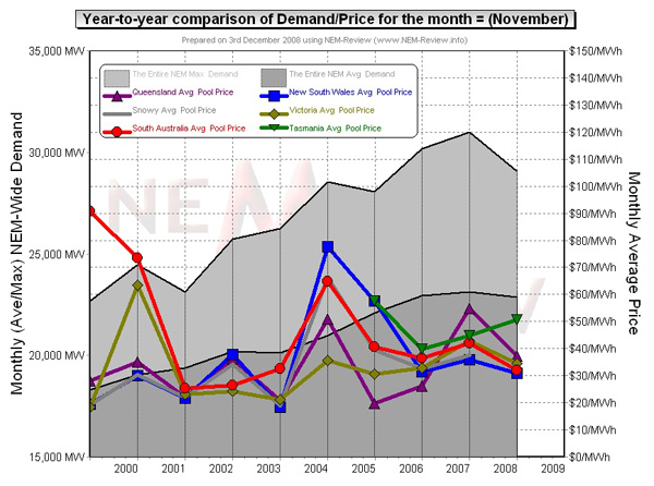
Through the NEM-Review software, we have prepared this illustration of how (average and peak) NEM-Wide Demand for electricity has grown over the past 10 years.
With respect to this chart, two things in particular need to be noted:
- Tasmania only joined the NEM in mid-May 2005 – hence the data for November 2005 shows the effects of Tasmanian region demand for the first time.
- The measure of “demand” calculated in NEM-Review v5.3 is the (30-minute) Trading Demand Target, which is the time-weighted average of the (5-minute) Dispatch Demand Targets over the half hour:
- Hence, the demand shown here is an output from NEMMCO’s NEM-DE (Dispatch Engine) and not a metered demand. In most cases, the numbers will be very similar, but they will vary from figures quoted elsewhere for “maximum demand”
- This is further explained in the glossary on the NEM-Review portal.
3) Quick Links
As the following table is quite lengthy, we’ve included here Quick Links to each of the 10 years included in the table below:
- November 1999;
- November 2000;
- November 2001;
- November 2002;
- November 2003;
- November 2004;
- November 2005 (including Tasmania for the first time, from mid-November);
- November 2006;
- November 2007;
- November 2008
4) Each Year at a time
In the following table, we touch on the highlights of some of the November months that have passed, since the creation of the NEM.
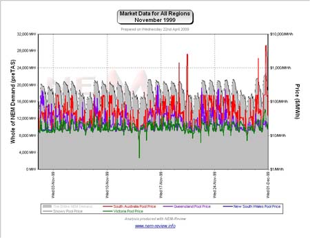
| November 1999 | As highlighted in the diagram above, November 1999 saw moderate prices in all regions, with the exception of South Australia (which exhibited massive prices, averaging $90/MWh over the month).
The chart above (generated in NEM-Review version 5.3) illustrates why this was the case. Specifically, we can see that there was a much higher incidence of volatility in the South Australian region (which suffered from a high incidence of constrained flow over Heywood interconnector over the month). We can also see that prices in QLD operated independently of prices in NSW – as there was no interconnection present at the time. |
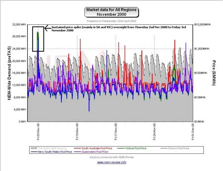
| November 2000 | The main chart (above) illustrates that prices fell slightly in SA, whilst the VIC prices rose to be almost the same level in November 2000.
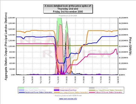
Prices in QLD, NSW and SNO remained moderate. The chart here (generated in NEM-Review version 5.3) illustrates why this was the case. As can be seen, the chart highlights that:
|
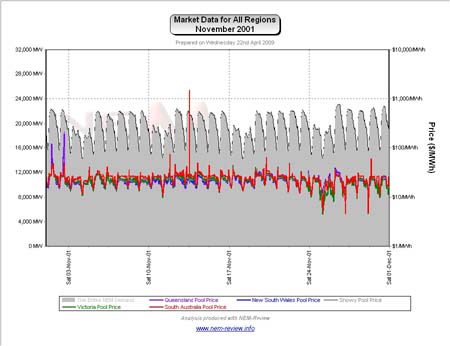
| November 2001 | November 2001 saw prices subside in all regions from their levels in November 2000.
Importantly, we see that average demand increased in the 12 months to November 2001 – but that the peak demand was considerably (approx 1000MW) lower than the peak experienced the previous year. As can be seen in the chart above (generated in NEM-Review version 5.3) we can see that prices were very flat across the month – with a solitary spike in SA on Tuesday 13th November 2001 (for a single trading interval). |
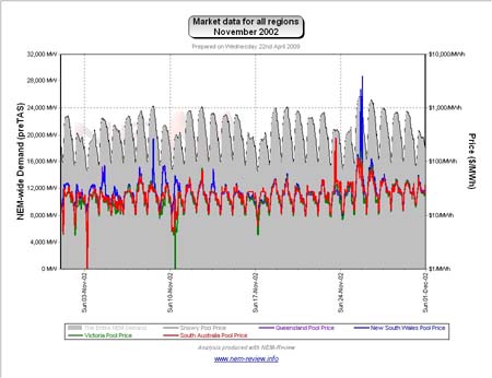
| November 2002 | November 2002 saw average prices climb in NSW, QLD and SNO, whilst remaining moderate in VIC and SA.
The following chart (from NEM-Review version 5.3) shows the price spikes in QLD, NSW and SNO through the month that contributed to this increase in average prices (including a more significant spike on Monday 25th November 2002) |
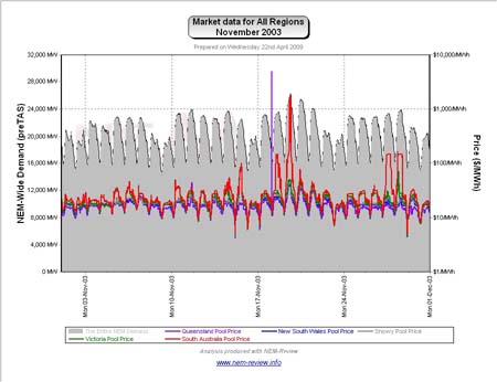
| November 2003 | As noted in the chart above, prices were lower across most regions in November 2003 (the lowest of all 10 x November-months).
The exception here was SA, where prices climbed somewhat – because of the few price spikes that occurred in SA, as shown in the chart below (from NEM-Review version 5.3). Importantly, we see (in the chart at the start of this article) that this occurred despite a jump in demand in the 12 months to November 2003. That prices would fall despite a jump in demand is indicative of the large amount of low-cost new capacity that had been brought into the market through 2002 and 2003 (i.e. 1200MW at Millmerran and Tarong North). This is also why prices in QLD were the lowest of all NEM regions. |
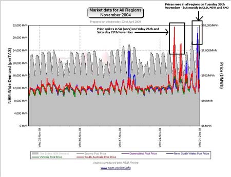
| November 2004 | As shown in the main chart (above) November 2004 saw prices climb significantly – and separate, between regions.
The following chart (drawn with NEM-Review version 5.3) highlights the main reason for this increase – a number of price spikes that occurred at the end of the month, coincident with higher demand days (presumably a result of hotter weather). Coincidentally, we happened to make a record of these two price spike events through version 5 of the NEM-Watch software product. These snapshots have been included below to provide you a picture of what was happening in the market at the time. Note with respect to this version of NEM-Watch:
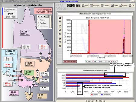
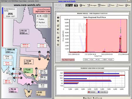
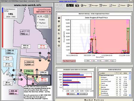
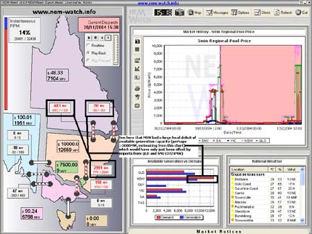
Friday 26th November 2004 (Price spike in SA) We have included two snapshots from NEM-Watch (taken several days later with the playback functionality). At 10:00 on the day, we see that both the Heywood and Murraylink interconnectors were constrained (shown as red in NEM-Watch) with flow being at the limit from VIC into SA. This allowed the prices to separate between SA and VIC (as local generators in SA had market power, and could set the price independent of the rest of the NEM) – hence resulting at prices near VOLL. Also please note (as highlighted on the snapshot) that the demand in SA was marginally higher than the native available generation. It looks from this snapshot that there was a deficit of between 100→200MW, meaning that (after taking into account imports of 490MW) that SA had only about 290→390MW of spare capacity). With the release of NEM-Watch version 8 (early 2009), we have taken this concept a step further with the definition of “Economic Islands”, and the calculation of a local Instantaneous Reserve Plant Margin (IRPM) just for the Economic Islands in existence at any particular point of time. At 12:05 (125 minutes later, shown below) we see that the situation had persisted, with the SA price increasing to almost VOLL with the reduction in transfer over Murraylink by 30MW and the increase in demand in SA by 126MW. Tuesday 30th November 2004 (Price spike in QLD, NSW and SNO) Below, we have included two more snapshots from NEM-Watch, which we happened to take shortly after the prices spikes on Tuesday 30th. At 12:35 (NEM time) on the day, we see that prices had risen above $4000/MWh in QLD, NSW and SNO on the basis of a constrained flow from VIC to SNO (shown as red in NEM-Watch). We note that the flow limit at the time (100MW north) was significantly lower than the typical flow limit on the line, but have not investigated in further detail. Note also that the NEM-wide IRPM had dropped to a relatively low point of 14% – which, as we showed in this article, was close to the lowest level of IRPM experienced in the NEM up until June 2007. At 15:30 (almost 3 hours later) we see that constraints had caused the formation of 4 Economic Islands across the NEM:
Finally, note in these snapshots (taken on 1st December) that the charts show high prices also on the 1st December. We may comment on this further, when we get around to writing our commentary for December 2004. |
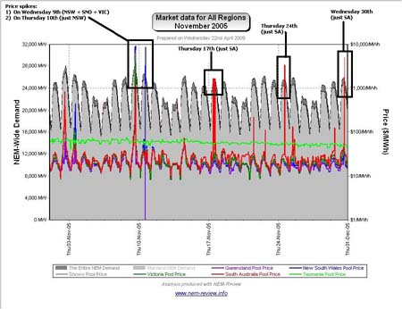
| November 2005 | As noted in the chart above, prices trended down towards more “typical” levels (whilst prices in QLD were very low).
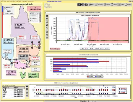
The NEM-Review chart below shows the month was not without volatility, however. A couple of additional notes are included: Wednesday 9th November 2005 (Price spike in NSW, SNO and VIC) Coincidentally, we happened to make a record of this price spike event through version 6 of the NEM-Watch software product. This snapshot has been included below to provide you a picture of what was happening in the market at the time. At 15:45 (NEM time) on the 9th (recorded hours later with the playback functionality) we see that five “Economic Islands” had been created by virtue of transmission constraints (constrained interconnectors are shown as red in NEM-Watch):
Additionally, we’ve included a link to this AER report on this price spike (the AER is required to publish a report within 20 business days of the end of a week in which the spot price exceeds $5000/MWh). Wednesday 30th November 2005 (Price spike in SA) We could not find any snapshots from NEM-Watch of this incident – and we have not taken the time to do further analysis ourselves. However, here’s a link to the AER report on the 30th November price spike – the previous incidents on 17th and 24th did not result in SA prices above $5000/MWh. |
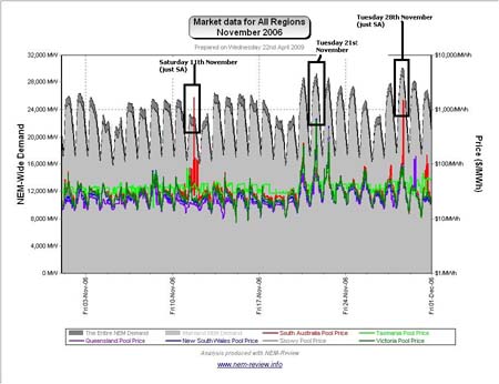
| November 2006 | As the main chart above shows, November 2006 showed that prices converged across all regions, including Tasmania (given the commissioning of Basslink earlier in the year).
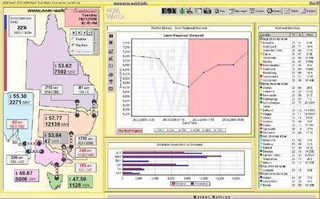
From the NEM-Review chart here, we can clearly see why prices in TAS were still slightly higher than the other prices, whilst prices in QLD were lower. Except for a few minor price spikes, November 2006 exhibited very flat pricing. Tuesday 21st November 2006 (Demand spike in NSW) We had previously written this article analysing the spike in demand seen in the NSW region on 21st November (due to temperatures approaching 40°C in Sydney). This is linked here for completeness. Tuesday 28th November 2006 However, we note from the chart above that the demand on Tuesday a week later was actually higher (on a NEM-wide basis). We had not, however, previously written any analysis about this day. We did, however, find this snapshot from NEM-Watch (a beta of version 7) which shows how (at 14:45 on the day) the VIC demand had dropped by approximately 350MW. We have not investigated this further, but the low prices would suggest that this was probably not a voluntary reduction through demand-side response. |
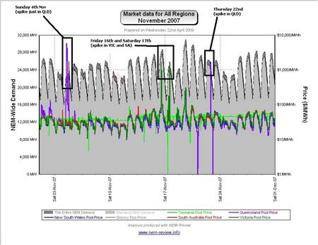
| November 2007 | As shown in the main chart (above), average prices in November 2007 jumped most sharply for QLD, and were higher in all regions (but nowhere near the huge levels seen in other months of 2007).
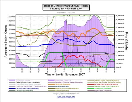
This occurred despite the fact that average demand in November 2007 was almost identical to the levels seen for November 2006 (the peak demand was higher). The NEM-Review chart above shows a period of sustained higher prices in QLD on Saturday 4th November that appears to be the cause of much of the shift in prices. Drought in the NEM in 2007 In addition, however, the drought did have an impact on prices in all regions. Our review for April highlighted the reasons why the drought meant 2007 was a unique year, amongst the 10 years of NEM history to date. As can be seen above, November 2007 still showed an elevation of prices across all regions, in all time periods compared with previous years (but not to the same extent as was the case for earlier months in the year). 4th November 2007 (Price spike in QLD) The following NEM-Review chart illustrates what happened in the QLD region over the day: As can be seen in the chart above:
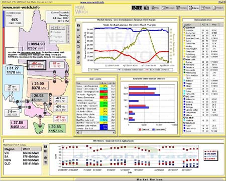
We have also included below a snapshot from NEM-Watch showing the state of the market, more generally, at 12:15 on the day – with QLD prices very close to VOLL. As shown in this snapshot, NEMMCO had constrained the QNI interconnector at the time such that it had to flow south. We have not investigated this further – however, here are links to:
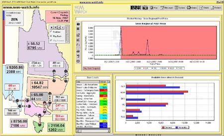
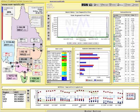
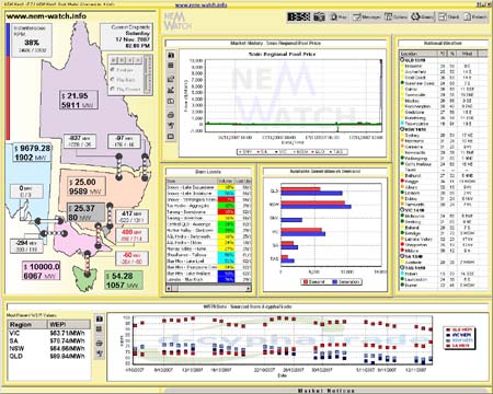
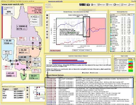
both of which might tell you more… Friday 16th November 2007 (Price spike in VIC/SA) See below two snapshots from NEM-Watch showing the state of the market on the 16th November. The first snapshot (above, playback of 12:25) shows a significant price spike in VIC and SA for a single dispatch interval (with also raised price in TAS). The second snapshot (below, a real-time view of 13:00 NEM time) shows the second spike – only to $1000/MWh in VIC and SA. Note, in both cases, that the flow from Snowy into VIC (-247MW) was constrained, hence allowing prices in the south to separate from prices in the north. Here’s the NEMMCO report for the day (there is no AER report, as prices did not rise above $5000/MWh). Saturday 17th November 2007 (Price spike in VIC/SA) In the snapshot from NEM-Watch (14:00 below) we see that (as distinct from the case the previous day) we have a case where SNO-VIC was constrained but with flow heading north (i.e. known as a “counter-price flow”). 22nd November 2007 (Price spike in QLD) We have also included below a snapshot from NEM-Watch showing a playback of the state of the market, more generally, at 19:05 on the day – with QLD prices at VOLL. As noted in this snapshot, NEMMCO adjusted the constraint limit over QNI to force flow south (for system security reasons) – resulting in a 600MW reversal of flow in a 10-minute period, contributing to the price spike. |
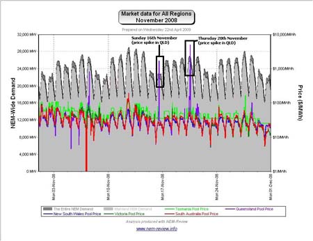
| November 2008 | Finally, we see that prices rose in TAS for November 2008, whereas prices fell back to more “typical” levels ($30/MWh→$40/MWh) in the other regions.
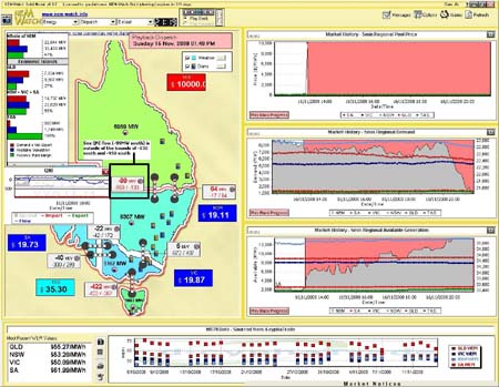
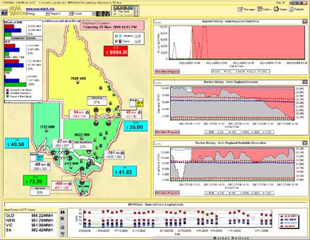
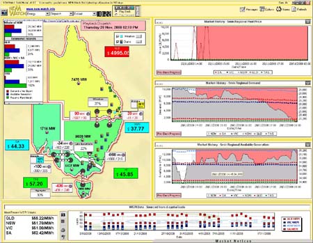
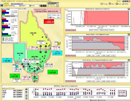
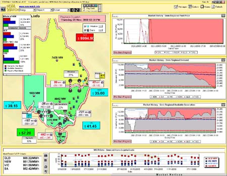
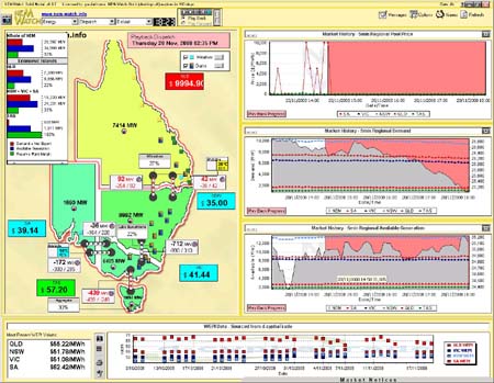
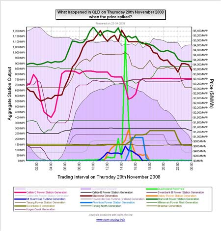
As can be seen in the above NEM-Review chart, there were very few instances of price volatility (in any region) over the month. Sunday 16th November 2008 (Price spike in QLD) The following snapshot from NEM-Watch (which was a playback of 13:40 market time on the day, using an early BETA of the new version 8) shows the single dispatch interval when prices rose to VOLL in QLD. Note that the QNI flow (-99MW) was outside of the bounds of the published constraint limits for the period – meaning an “over-constrained dispatch interval”. It appears from the NEM-Review chart above that the trading price was not significantly revised, on this occasion (NEM-Review, which contains a permanent record, is updated with price revisions – whereas NEM-Watch shows live data, as it is published at the time). Thursday 20th November 2008 (Price spike in QLD) The following snapshot from NEM-Watch (which was a playback of 14:05 market time on the day, using an early BETA of the new version 8) shows the first dispatch interval when prices rose to VOLL in QLD. In this snapshot, see that the QLD region is a yellow-colour, denoting that demand in the region was relatively high (in relation to its historical maximum demand) – here’s some more detail about the NEM-Watch display for v8. Five minutes later (at 14:10) the price had halved in QLD: Note that the demand in QLD (still yellow) had dropped by 81MW – from 7,556MW to 7,475MW. We have a number of clients who use our deSide® software for their demand side response activities in the market, so would speculate that this reduction in demand is likely to have been their curtailment of load due to the high prices. At 14:15 the price dropped to more “normal” levels (no snapshot is included for this). Five minutes afterwards (at 14:20) the price had spiked upwards again, as shown below. Note that demand in QLD had continued to drop. We see (in the price chart above) that the price had dropped in QLD at 14:25. However, 5 minutes later (at 14:30) the price had jumped back to VOLL. Price in QLD remained high 5 minutes later (at 14:35) as shown below: To show more about what happened across the day, we have included the following NEM-Review chart: We can see several interesting things from this chart, including the following:
Finally, here’s a link to the AER report on the 20th November 2008 price spike. We could not find (though we only had a quick look) any NEMMCO report on this event. |


Be the first to comment on "November in the NEM (a review of 10 years of history)"