
1) The NEM reaches 10
For those who are unaware, 13th December 2008 marked the 10th Anniversary of the inception of the NEM. We released a short review of NEM history on that day to commemorate.
Given the occasion, however, we thought it would be useful to have a look, in more detail, at what has happened over the past 10 years.
Taking a slightly different approach, we’ve opted to review each month at a time – hence, this is one of twelve articles posted on this site at the same time.
2) 10 years of May
Through the NEM-Review software, we have prepared this illustration of how (average and peak) NEM-Wide Demand for electricity has grown over the past 10 years.
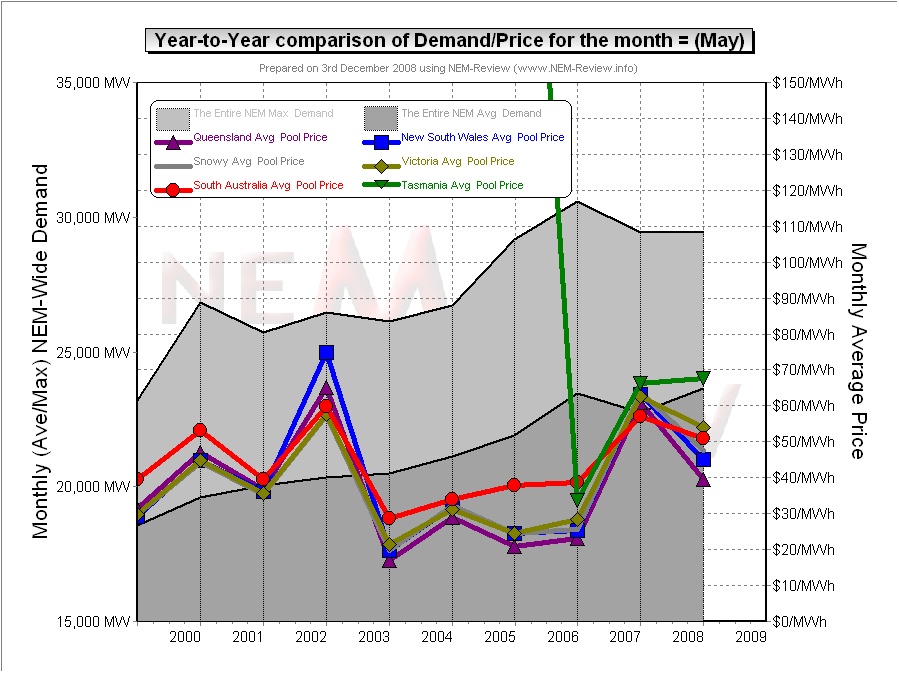
With respect to this chart, two things in particular need to be noted:
- Tasmania only joined the NEM in May 2005 – hence the data for May 2005 shows the effects of Tasmanian region demand for the first time.
- The measure of “demand” calculated in NEM-Review v5.3 is the (30-minute) Trading Demand Target, which is the time-weighted average of the (5-minute) Dispatch Demand Targets over the half hour:
- Hence, the demand shown here is an output from NEMMCO’s NEM-DE (Dispatch Engine) and not a metered demand. In most cases, the numbers will be very similar, but they will vary from figures quoted elsewhere for “maximum demand”
- This is further explained in the glossary on the NEM-Review portal.
3) Quick Links
As the following table is quite lengthy, we’ve included here Quick Links to each of the 10 years included in the table below:
- May 1999;
- May 2000;
- May 2001;
- May 2002;
- May 2003;
- May 2004;
- May 2005 (including Tasmania for the first time, from mid-May);
- May 2006;
- May 2007;
- May 2008
4) Each Year at a time
In the following table, we touch on the highlights of some of the May months that have passed, since the creation of the NEM.
|
May 1999 |
As highlighted in the diagram above, May 1999 saw modest prices in all regions. |
|
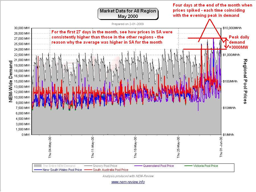
May 2000 |
The main chart (above) illustrates that prices rose in all regions. This can be understood, at least in part, because of the rise in (average, but especially peak) demand across the NEM. It is noteworthy to see that the average price in SA was higher than in the other regions – the following chart (generated in NEM-Review version 5.3) illustrates why this was the case.
It is also interesting to note that the four days of evening price spikes occurring at the end of the month – a precursor of what would become more frequent from May 2002. |
|
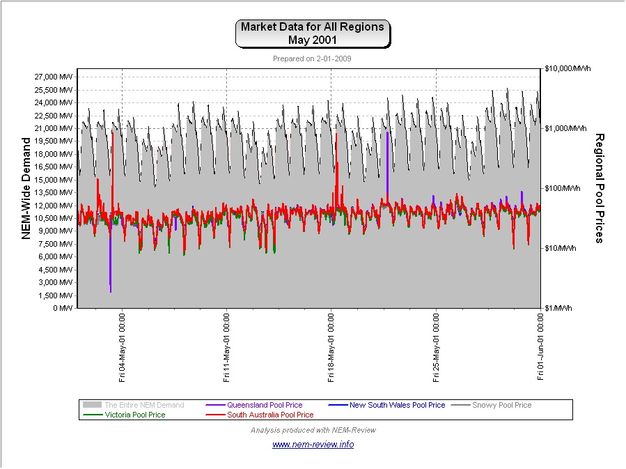
May 2001 |
May 2001 saw prices subside in all regions from their levels in May 2000. The following chart (generated in NEM-Review version 5.3) demonstrates clearly why this is the case:
|
|
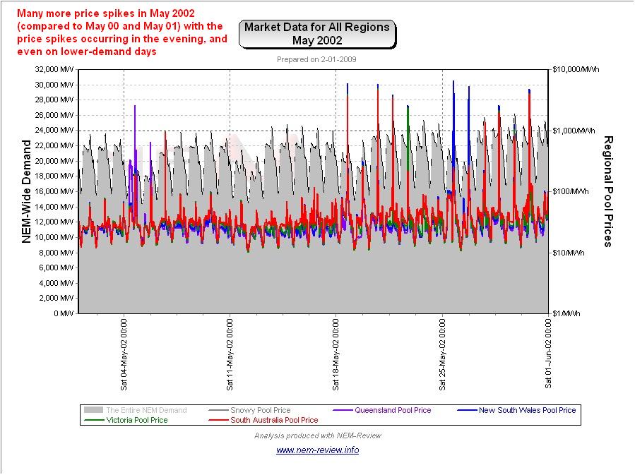
May 2002 |
May 2002 saw a substantial rise in average prices, for all regions. We have previously prepared a more lengthy analysis of this issue – however the following chart (analogous to those above) clearly demonstrates the difference:
In summary, what emerged in winter 2002 was the wide-spread employment of a tactic that has become known by several terms:
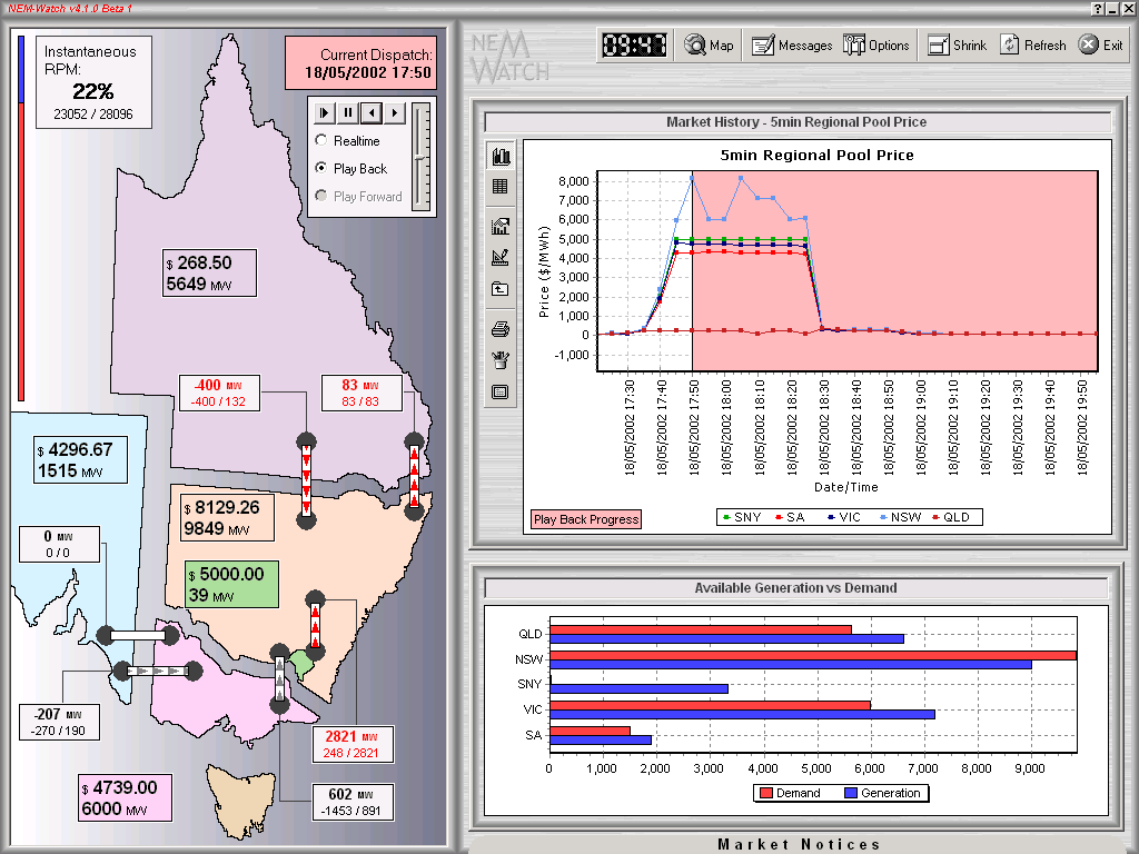
Essentially, generators took advantage of a predictable spike in demand around 18:00 and 18:30 each evening, and changed their offers to the market (pricing some of their capacity more expensively in the knowledge that, on most occasions, it would still need to be dispatched). Hence, generators engineered higher prices for winter peaks in demand – which offered them some relief from the many months of low prices they suffered prior to May 2002. The following snapshot (Playback of 18th May 2002, taken from NEM-Watch version 4) illustrates one of the many instances over winter 2002 when these high prices were engineered.
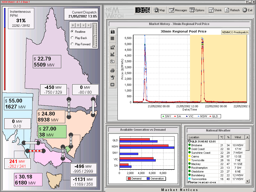
As shown in this snapshot of 21st May 2002 (taken from NEM-Watch version 4) these price spikes coinciding with the evening peak in demand were both regular, and predictable (with the evening spike already shown in NEMMCO’s predispatch forecast at 13:05 on the day)
|
|
May 2003 |
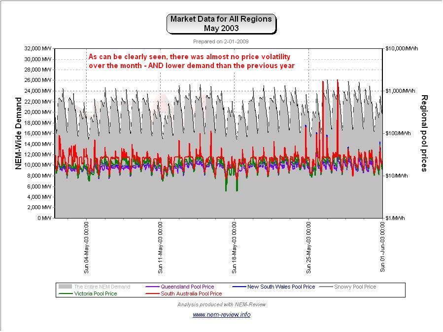
As noted in the chart above, prices were astonishingly low across all regions in May 2003 (marginally higher in South Australia).
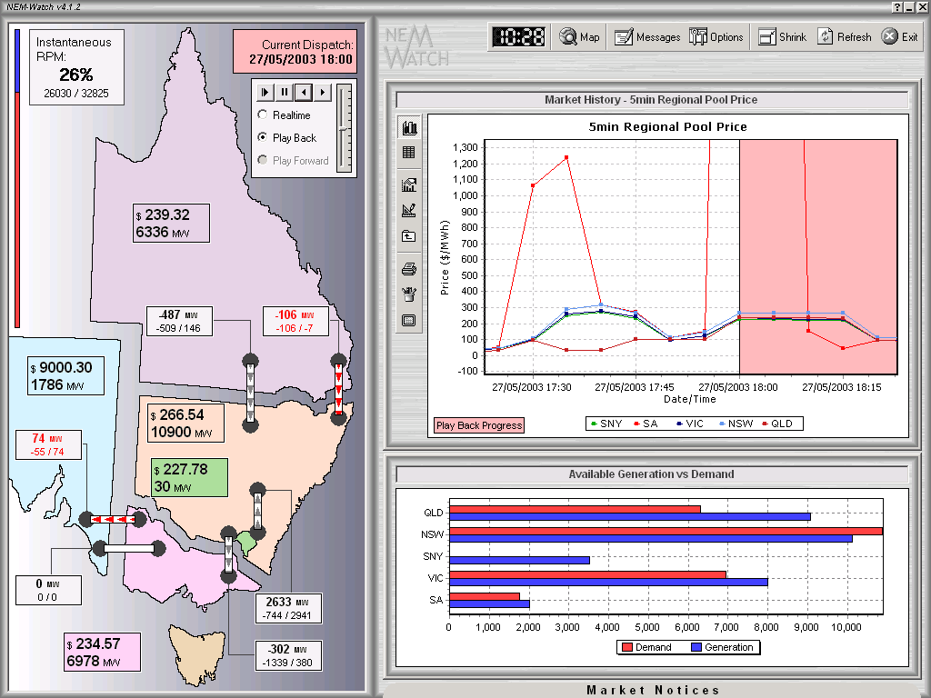
The following snapshot (taken from NEM-Watch version 4) shows one of the only two occasions in May 2003 when prices spiked.
Of note is that the spike occurred in South Australia (the region shown to have the highest average price over the month). |
|
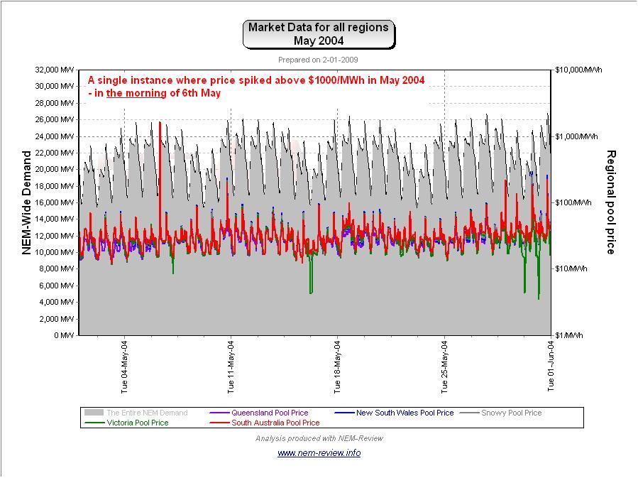
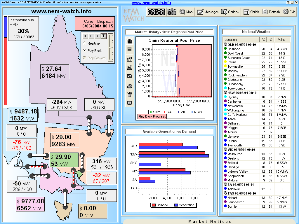
May 2004 |
As shown in the main chart (above) prices in May 2004 were slightly higher.
The NEM-Review chart (shown above) highlights the reason why prices were subdued. As can be seen, there was a single price spike above $1000/MWh, which occurred on 6th May 2004. The following snapshot (taken from NEM-Watch version 5) shows the 08:15 dispatch interval, with the SNO-VIC interconnector forced to export into VIC despite the constraint limits seeming to indicate only flow to the north was possible.
We have not investigated this issue in more detail. |
|
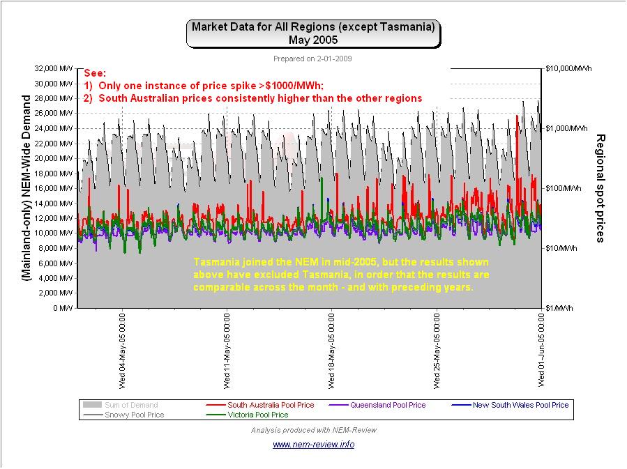
May 2005 |
As noted in the chart above, prices were relatively subdued across all regions in May 2005. It’s not possible to infer directly from the chart above (as demand for TAS is factored in for half of May 2005).
As can be seen from the more detailed chart here, demand across the mainland had not changed much from May 2004 (or even May 2003), except for the last 2 days in the month. |
|
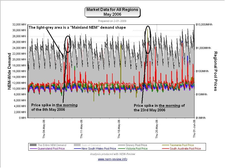
May 2006 |
As the main chart above shows, May 2006 showed modest prices in all regions – with prices subsided in all regions but South Australia.
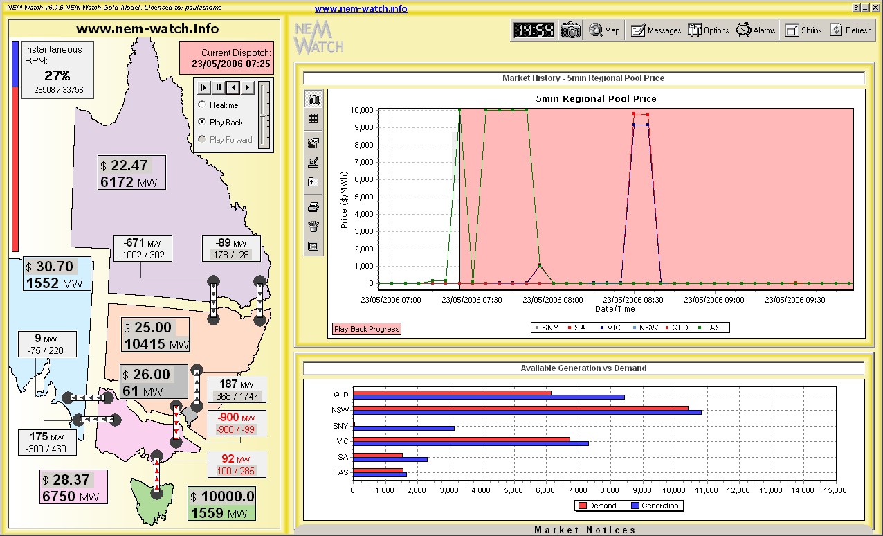
From the above NEM-Review chart, we can clearly see why prices in SA averaged considerably higher than the other regions. We have also highlighted two instances where price spikes occurred in the morning – one of these was on 23rd May 2006. The following snapshot (taken from NEM-Watch version 6) shows playback of the 07:25 dispatch interval, highlighting the VOLL pricing in Tasmania (and also showing, in the chart, high prices that were achieved in other regions later in the day).
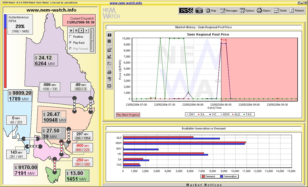
Only 75 minutes later (at 08:30) we see prices high in SA and VIC, with Snowy exporting at its maximum capability into VIC.
We have not had time to analyse this in any further detail. |
|
May 2007 |
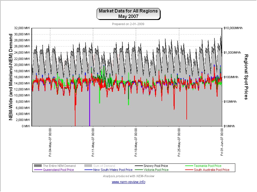
As shown in the main chart (above), prices in May were higher than in the 2 previous years, because of the drought. The intriguing factor in these higher prices is that (as shown in the chart from NEM-Review version 5.3 below) is that the month experienced absolutely no price spikes. Instead, the whole price curve shifted upwards by about $20/MWh because of the impact of energy-(i.e. water)-constrained generation.
This issue was discussed, in more detail, in the review for the month of April. |
|
May 2008 |
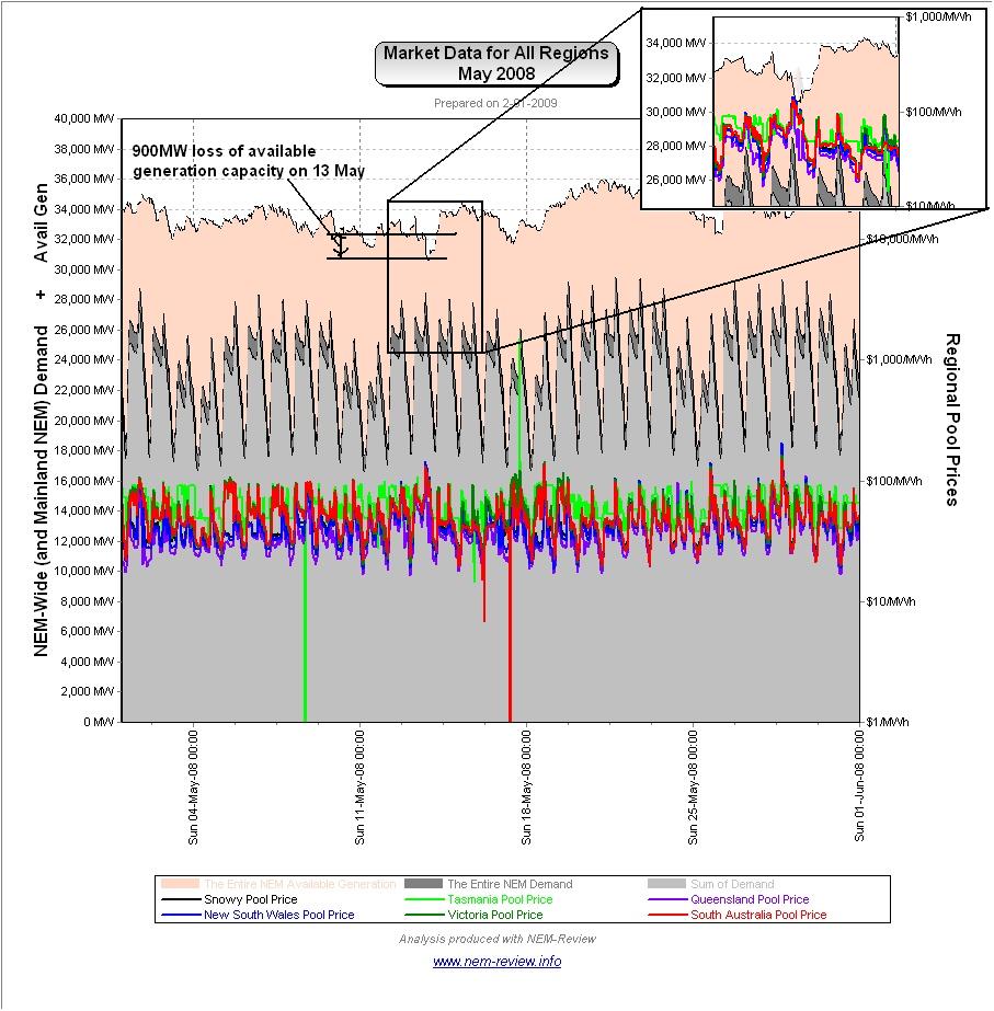
Finally, we see that prices subsided from their May 2007 a year later (in May 2008), with the exception of Tasmania. As we’ve previously noted, prices remained high in Tasmania because of an ongoing (perhaps even worsening) drought situation in that region. The reason for the subsidence (little volatility plus the return of the price shape to more “normal” levels) can be seen in the chart from NEM-Review version 5.3 below:
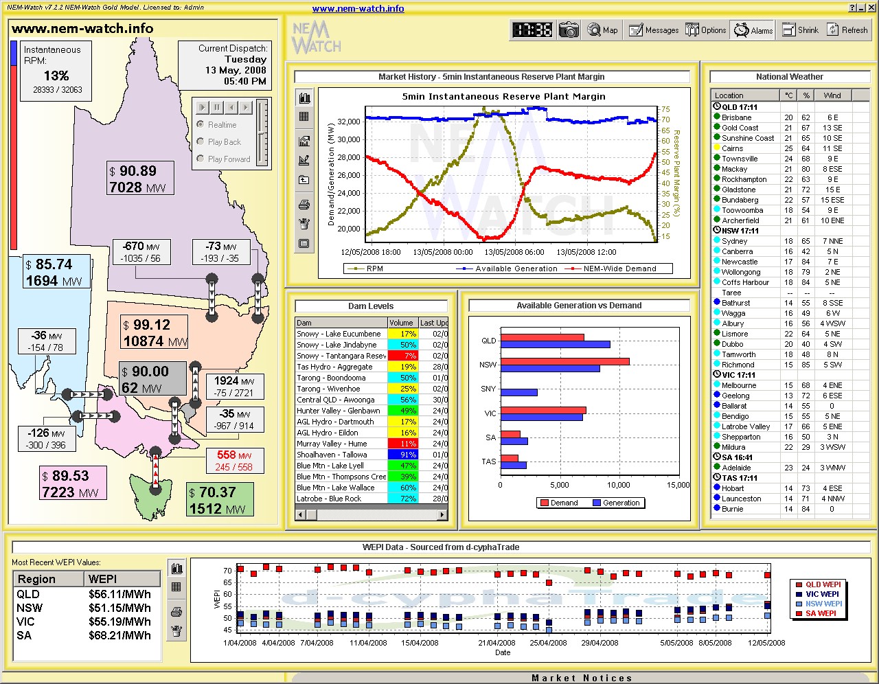
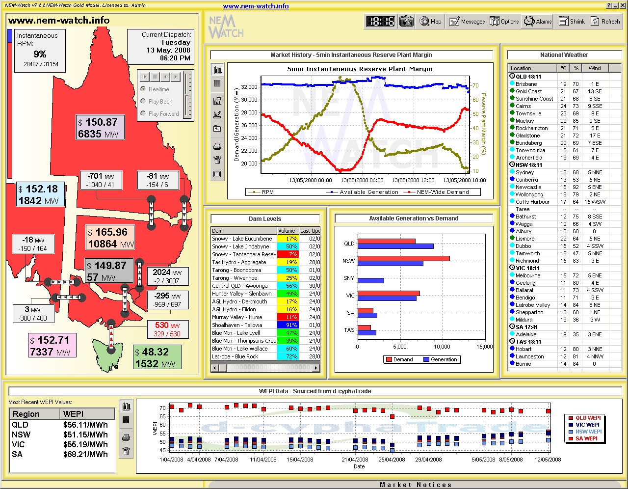
In this diagram, we have also included (unique to May 2008 in this analysis) the trend of NEM-Wide available generation capacity. We’ve done this to highlight the specific case of 13th May 2008, when significant loss of available generation capacity occurred – this is analysed further below: Very Low NEM-Wide IRPM on Tuesday 13th May 2008
As can be seen in this image, the major surplus of available generation capacity was in QLD and SNO (with a small surplus in both SA and TAS). NEM-Watch shows the IRPM to be a healthy 13%. Only 40 minutes later, demand had climbed further (by 74MW to a modest 28,467MW). However the available generation capacity had been reduced by a whopping 909MW. As a result, the NEM-Wide IRPM had fallen to a low of 9.43% – as shown below.
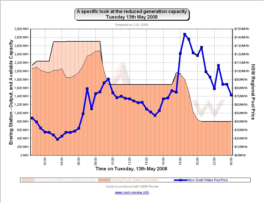
Recall our analysis, completed with respect to the extremely low IRPM experienced in June 2007. In this instance, we see a rare occasion when IRPM dropped below 10%, and yet on this occasion, prices were still relatively modest (unlike June 2007). Further analysis with NEM-Review reveals that the loss in available capacity was due to an outage of several units at the Eraring Power Station in NSW, as shown below:
We had a further look, through NEM-Review, to see that all 4 x units were reduced to output of 200MW each (which would be close to the minimum load of the units). Hence, we would suspect there was some technical reason causing this reduction. We saw no reason to investigate further. |
Be the first to comment on "May in the NEM (a review of 10 years of history)"