This summer, we ran 7 separate competitions, asking entrants to forecast (for the first 6) peak demand across the NEM and/or in each of the NEM regions.
For the 7th competition, given it’s of increasing importance in a number of ways, we asked entrants to forecast peak aggregate wind output across the NEM over the 4-month “Extended Summer” period. Today we have a look at what actually happened.
1) What actually eventuated?
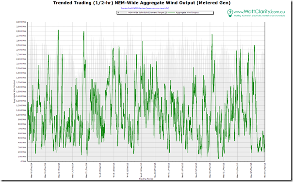
To provide an overview of what happened in terms of wind output, we once again reach for NEM-Review to produce this trend:
As can be expected, given the nature of wind production, the pattern is more random than what we have been seeing with the daily load pattern for the regions studied to date (NEM-wide demand shown shaded behind). We see wind production drop below 100MW on occasions, and reach up towards the 3,000MW mark.
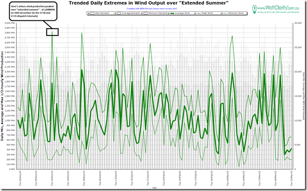
Hence we’ve simplified the analysis in NEM-Review by showing only the daily extremes over the 120 days of the study period:
Highlighted in this chart is the peak in wind output of 2,848MW in the 17:30 and 17:35 dispatch intervals on Tuesday 16th December (so roughly coincident with evening peak in demand on that occasion).
2) How well was this expected?
In Competition #7 (of a total of 7 competitions this summer) we offered a “consolation prize” for the closest to the mark in forecasting what this peak would be.
2a) Did we expect this?
Late in the summer period, I posted this article questioning why we’d not seen wind output as high as I’d been expecting it to be (because of the new farms coming online over summer).
This followed from these tips posted when the competition was opened, illustrating how wind output (both average and peak) had climbed significantly from a zero base back in 2005.
2b) Was it expected, by our competition entrants?
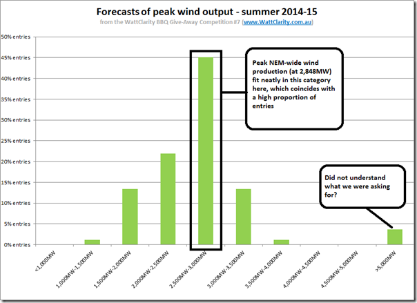
Collating all the entries and plotting a distribution, we see this pattern:
As we can see, the peak wind production coincided nicely with the peak in the distribution of entries – which seems to indicate that peak wind output over summer was more predictable than forecasting peak demand for Victoria, South Australia or NSW (or NEM-wide).
SO WHO WINS THE “CONSOLATION” PRIZE FOR COMPETITION #7 (PEAK WIND OUTPUT) THIS SUMMER?
One person who can now be enjoying their new portable BBQ prize, from Barbeques Galore, is revealed here…
Of ancillary interest to me were the entries we received from some far up on the right.
Initially I thought that it might have been that these entrants did not understand what we were asking, but then an alternative explanation occurred as a possibility – perhaps, despite plentiful reports and media and social media coverage, there’s still lack of widespread understanding (even amongst the market participants, observers and commentators that read WattClarity and enter this competition) of how much wind production actually contributes to the energy mix of the NEM.
Increasing the level of understanding about this, as another important metric relevant to the ongoing change in the NEM, was the reason we added a focus on wind production to our summer competition process (and why we have produced the NEM-Watch widget that’s hosted on RenewEconomy, for instance).
2c) Was it expected, by AEMO?
For each of the regional peak demands, we’ve been able to look back at the AEMO’s forecasts (from the NEFR and the ESOO) of what peak regional demand will be.
I don’t know of any such forecast provided by AEMO (so far ahead), of what the extremes of wind output are likely to be in each region, or across the NEM. Hence it’s not possible for me to investigate that question any further.
If you can point me to a reference from AEMO that would have helped in the lead-up to summer, please do.
3) Looking in more detail?
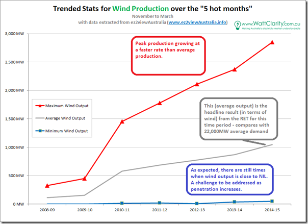
As we have been doing for the other 6 (demand-related) competitions, we include this trend of the headline stats for Wind Production for the “5 hot months” of 2014-15 and the 6 preceding financial years:
As can be clearly seen, the (inclining & regular) trends shown here for wind production are very different from the trends shown:
(a) for average and minimum demand (declining, and reasonably regular) and
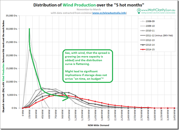
(b) for peak demand (much more irregular) in three regions shown to date – NSW, VIC, and SA.To provide more detail, we generated the following distribution curve for NEM-wide wind production:
With respect to this curve, a few key points are evident:
3a) Minimum output
As shown in the summary stats above, the minimum output from wind farms aggregated across the NEM has remained (and could perhaps always remain?) stuck around 0MW.
This could potentially have significant implications to the cost of energy supply in the future, depending on how penetration rates increase and what replaces existing thermal plant when it closes. I previously discussed “doomsday predictions” for security of supply, touching on this issue.
3b) Median output
As highlighted in the chart, we see the median output increasing fairly* steadily at the same time as the spread of output grows, and hence the incidence at the median output naturally declines.
* Note that I said fairly steady as you’ll see that median output actually fell from 2013-14 and 2014-15 at the same time as the curve widened. I’m guessing this was due to the most recent 5 months being less windy (in the wind farm catchment areas) than the prior period, but wonder if someone can confirm for our readers?
3c) Peak output
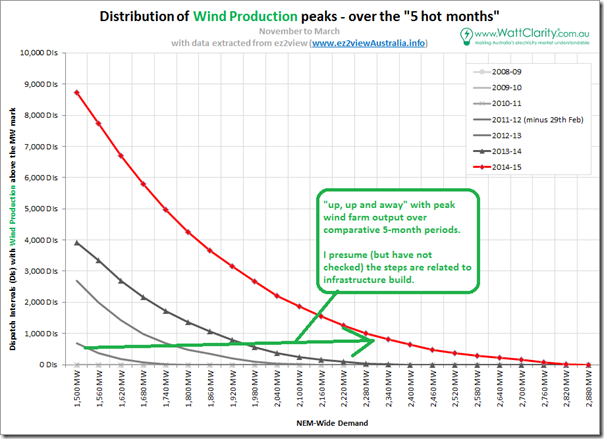
As with the analysis for peak demand at each region, we produce an aggregate distribution curve up the peak end – though it is a little arbitrary what we define as “peak” over 7 summers, given the rapid increase in capacity:
In the chart shown here, we can see a reasonably uniform year-on-year growth in output at the peak end of the curve.
With wind continuing to grow as an energy source for the NEM (though not to the extent we expected to see in terms of peak output this summer!) we will continue to watch with interest – in NEM-Watch and NEM-Review – what unfolds into the future….


Leave a comment