As noted in this earlier article, there was a single sharp price spike in mid-afternoon to the $16,600/MWh Market Price Cap for the 15:10 dispatch interval (NEM time).
Before and after that, the prices had been somewhat elevated (i.e. ~$450/MWh at 15:05 and 15:15) but nowhere near as high as at 15:10. Whilst remembering that the bid price curve would already be at the steeper gradients for the 15:05 dispatch interval (so it would not take all that much to tip it over the edge), we might have a first look this afternoon (i.e. in the absence of the larger ‘next day public’ data sets) to see what we can see about what might have contributed.
A few different factors not forecast (as extreme) in advance
So we’ll start with a few views of the ‘Forecast Convergence’ widget in windows of ez2view, Time-Travelled back to the 15:10 dispatch interval. Remember that you can use this widget to ‘look up a vertical’ to see ‘that other dimension of time’ – that’s something we’re going to do now with a few different variables.
Regional Demand (higher than earlier forecasts)
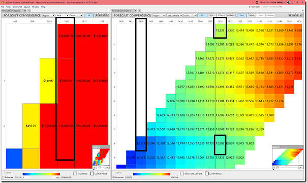
Here’s two different copies of the ‘Forecast Convergence’ widget together:
In the left panel here we show the NSW spot price, and we see the price at 15:10:
1) was higher than the P5 predispatch price for 15;10 produced at around 15:00:40 (with the 15:00 dispatch interval); but also
2) was not higher than the P5 predispatch price for 15;10 produced at around 14:55:40 (with the 15:00 dispatch interval); but also
So, in essence, certainly not ‘out of the blue’.
On the right panel we show NSW ‘Market Demand’ and see that (in both dimensions) the demand was climbing through to 15:10:
1) up the diagonal (i.e. following the natural progression of time) we see the demand grow from 12,xxxMW at the 14:30 dispatch interval to be 13,239MW at the 15:10 dispatch interval; but also (perhaps more importantly)
2) up the vertical (i.e. seeing successive forecasts for the same future time point) we see the forecast for 15:10 grow from 12,806MW forecast (for 15:10) published at the 14:30 time point to be 433MW higher by 15:10:
(a) i.e. 3.3% higher than the forecast for the same time point only 40 minutes earlier
(b) that’s an impressive increase in a short space of time
Available Generation (lower than earlier forecasts)
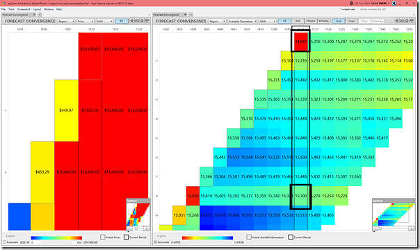
Leaving the widget on the left focused on price, we flip the ‘Forecast Convergence’ widget to look at regional aggregate for Available Generation in NSW:
Comparing the same two time points we see that:
1) up the diagonal (i.e. following the natural progression of time) we see the AvailGen rise from the low point at 14:30 (i.e. 14,870MW) but then drop to the exact same low point (i.e. 14,870MW) for the 15:10 dispatch interval;
2) up the vertical (i.e. seeing successive forecasts for the same future time point) we see the forecast for 15:10 grow drop by 430MW over a 40 minute period:
(a) from a forecast of 15,300MW (at 15;10) published for the 14:30 dispatch interval;
(b) down to the ‘actual’ 14,870MW at 15:10
(c) so a 2.8% drop than the forecast for the same time point only 40 minutes earlier
Adding both changes together, that’s an impressively large 863MW!
UIGF for Wind Farms across NSW (lower than earlier forecasts)
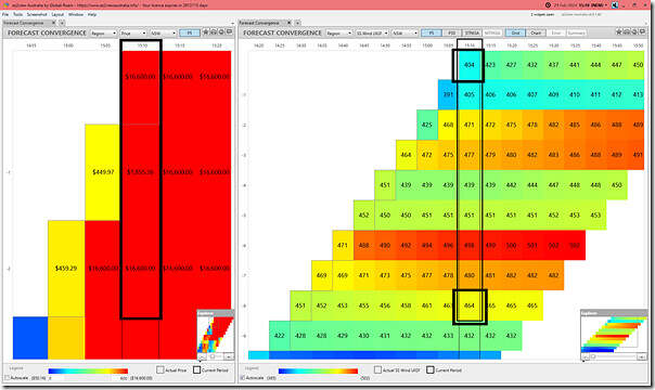
Taking it a step further and looking at wind capability, we flip the ‘Forecast Convergence’ widget to look at regional aggregate for UIGF Wind in NSW:
Comparing the same two time points we see that:
1) up the diagonal (i.e. following the natural progression of time) we see the Wind UIGF rise from 451MW at 14:30 but then drop to the 404MW at the 15:10 dispatch interval;
2) up the vertical (i.e. seeing successive forecasts for the same future time point) we see the forecast for 15:10 grow drop by 60MW over a 40 minute period.
So a 14% component of the 430MW total drop in Available Generation.
UIGF for Solar Farms across NSW (sharply lower than earlier forecasts)
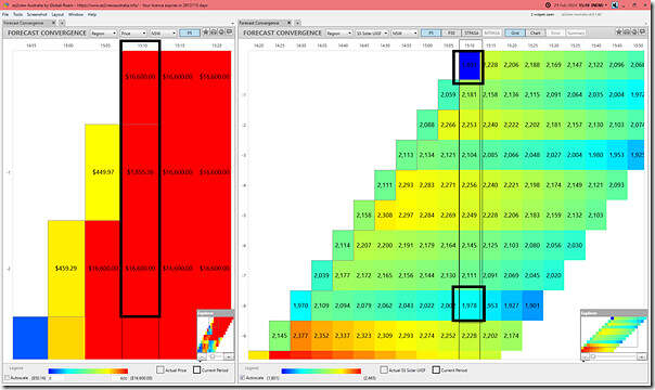
Now we flip the ‘Forecast Convergence’ widget to look at regional aggregate for UIGF Solar in NSW:
Remembering at this time that solar’s already begun its ramp down to sunset at the end of the day, comparing the same two time points we see that:
1) up the diagonal (i.e. following the natural progression of time) we see the Solar UIGF rise from 1,970MW at 14:30 but then drop sharply from 15:05 to be 1,801MW at the 15:10 dispatch interval;
2) up the vertical (i.e. seeing successive forecasts for the same future time point) we see the forecast for 15:10 grow drop by 177MW (from 1,978MW forecast to 1,801MW actual) over a 40 minute period.
So a 41% component of the 430MW total drop in Available Generation.
Other contributions to the drop in Available Generation
We’d need to wait until the ‘next day public’ data tomorrow to see in more detail – because it’s only 237MW (i.e. 55%) of the ‘lower than forecast’ is due to lower than expected VRE (based on the measurement points above).
Something else has also happened with other (fully Scheduled) units …
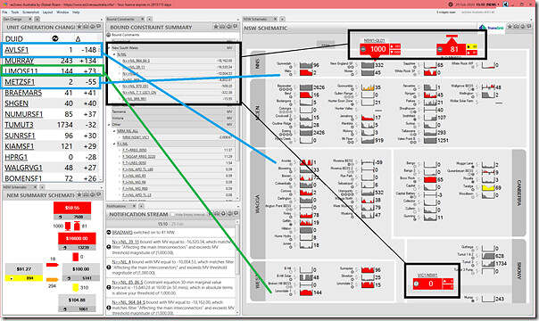
A view of the NSW region at the 15:10 dispatch interval
In this second window, we’re looking at a collage of widgets, with the most important being the ‘NSW Schematic’ widget in a pre-release copy of ez2view version 9.9 (which we’re gearing up for the IESS mid-year changes, so looks a bit different than the one you’re using yourself):
There’s lots to see here, and we don’t have time to delve into much at all, but a few key things to note:
1) Whilst the QNI interconnector is going gangbusters at transferring 1,000MW south (i.e. dispatch target at the import limit in this interval), at the southern end we see the VIC1-NSW1 interconnector stuck at 0MW, with the import and export limits both set at that level. That’s clearly a factor.
2) In the ‘Bound Constraints’ widget we see an impressive list of 7 different bound constraints in the NSW ‘coverage’ area:
(a) Some of these will have affected the interconnectors (the Marginal Value might be a hint as to which ones); but also
(b) These are also bouncing around the outputs of units within NSW
3) In particular:
(a) we see Avonlie Solar Farm having significantly reduced its output:
i. There are four of those seven bound constraint equations impacting on the AVLSF1 unit;
ii. Quickly reviewing the ‘Constraint Dashboard’ widget for each one (not shown here), with AVLSF1 unit in the top half, in terms of LHS factors, for all of these:
1. The ‘N>>NIL_39_11’ constraint equation.
2. The ‘N>>NIL_4’ constraint equation.
3. The ‘N>>NIL_7_1_LSC1_ON’ constraint equation.
4. The ‘N>>NIL_970_051’ constraint equation.
(b) we also see Metz Solar Farm having significantly reduced its output in this dispatch interval:
i. In this case, only 2 bound constraint equations.
ii. In this case it’s clear that it’s the ‘N>>NIL_964_84_S’ constraint equation is driving the curtailment.
(c) Whereas, on the upside, Limondale 1 has increased output by 73MW.
i. In this case, there are 4 bound constraints
ii. But for this dispatch interval, the units CPD Price has risen off –$1,000.01/MWh to be $998.28/MWh which allows dispatch (and demonstrates the unit is most likely bidding –$1,000/MWh as it was the day before)
(d) No time to look through the whole list, but it is many units impacted by constraints…
Hopefully this is the start of helping readers understand that the singular price spike at 15:10 was a complex outcome of actuals being different than forecasts, complex network topology in the heat (hence constraint operation) and other things as well (e.g. no doubt a bit of rebidding).
—
In contrast, Dan’s already noted that prices began spiking at 16:25, and it’s likely (though we have not looked) that this is more a direct function of supply-demand tightness as solar declines more rapidly with Underlying Demand still up.


Leave a comment