Despite Tuesday’s forecasts of an LOR2 Low Reserve Condition for the Victorian region for late Wednesday afternoon, outcomes in the NEM turned out to be significantly milder (though I’m not talking about the temperature).
Piecing together all the different factors contributing to the extent to which Victoria ‘dodged a bullet’ is food for another article sometime.
However yesterday evening when I was out to dinner, my phone continued to buzz for over an hour, alerting me to the fact that outcomes were not quite so mild in the South Australian region of the NEM yesterday. I must admit to being a little distracted through that dinner given the steady stream of market alerts, then followed by questions from various people.
Hence this morning I thought it might be worthwhile to distract myself a little more this morning by preparing a quick review of some of the factors I can see that occurred…. but little did I know it might take many hours more than planned, with ‘the onion’ progressively revealing more interesting stuff…
(A) What happened?
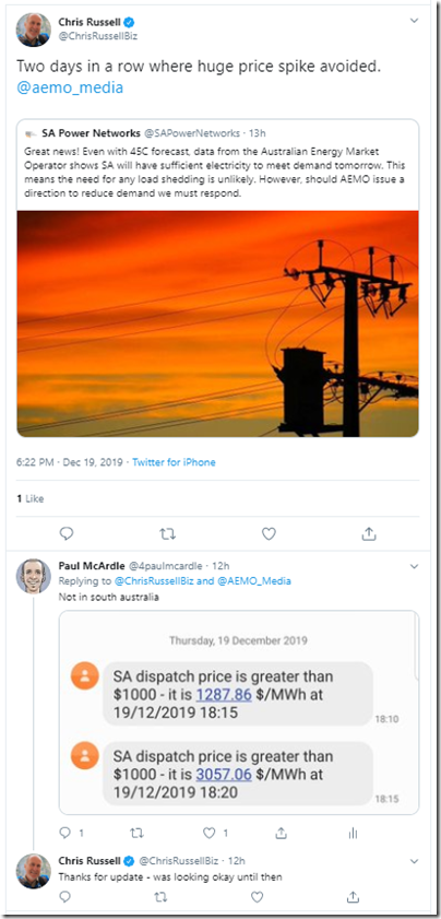
Everyone has had their own experience of ‘spoken too soon’, but I could not help but laugh when seeing this note from Chris Russell (journalist at the Adelaide Advertiser) yesterday evening as our market price alerts started to arrive:
Note that the SA Power Networks message related to the forecasts (as at Thursday evening) for what would unfold in the South Australian region today (Fri 20th). This morning as I write this (well, it was morning when I started!) it still appears to be the case that there will be plenty of spare capacity (ez2view users can see an updated trend here).
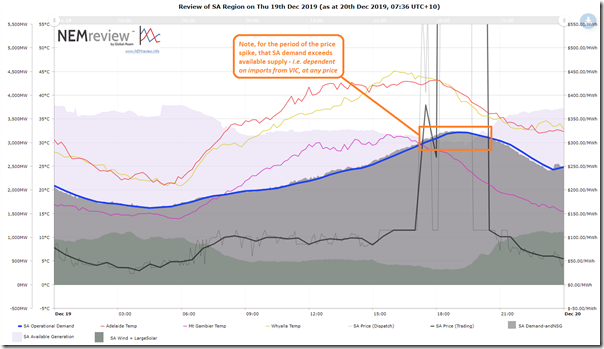
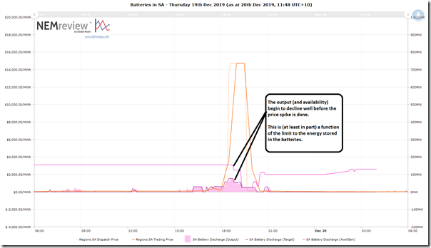
Yesterday evening, though, the Market Price Alerts kept coming for some time – the sense of which might be summed up in the following trend chart produced from NEMreview v7 (those with a licence can access this query here as a starting point to dig further):
The 18:15 dispatch interval (NEM time) was the first one that saw the SA dispatch price spike above $1000/MWh (to $1,287.86/MWh) and the 19:35 dispatch interval ($14,700/MWh – the current Market Price Cap). This meant 13 dispatch intervals at the Market Price Cap, at the end of a total of 17 dispatch intervals above $1,000/MWh. That’s the longest run of high prices I can recall since last summer.
(B) Why did it happen?
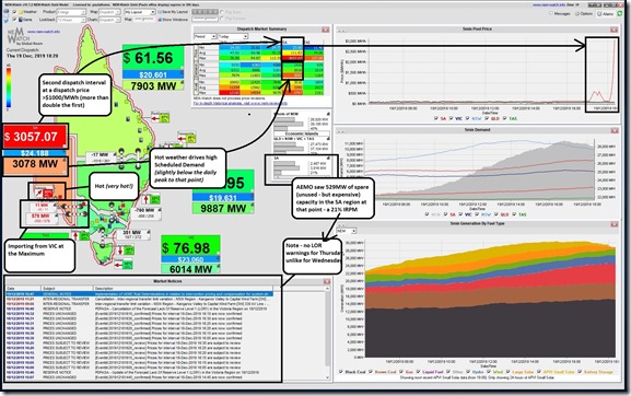
Here’s the snapshot from a display copy of NEMwatch v10 we have permanently running in our office that captured the second price spike (to $3,057.07/MWh – more than double the level of the first spike):
I’ve annotated the image with a few key points, and will expand on these points (and others) below as factors at work through yesterday evening:
Apologies, in advance, for those readers more knowledgeable than me (and who have more time to consider!) – as I am bound to have left a few factors out, and not fully explored those I have listed below. I hope this is (at least) a start…
Factor 1) It was hot, real hot
In plenty of other places much has been written about ‘hottest ever day’ and so on. Without getting bogged down into rabbit holes of measurement method and records and more, the main point is that it was really hot.
According to the ten-minute BOM readings we provide access to through NEMreview v7 and ez2view, and free access in real time in the Energy Consumers Australia sponsored NEMwatch ‘Live Consumption Widget’) the temperature in Adelaide did not drop below 40°C until 19:30 (NEM time), and continued to be above 30°C right through the night (low point, on quick scan, was 32.1 degC at 00:10 this morning after which point it started to climb again). Cripes!
Factor 1a) Temperature drove underlying electricity consumption higher
In the NEMwatch snapshot above, we see that the Scheduled Demand (i.e. TotalDemand target – remembering the nuances of how demand is measured) was 3,078MW in the 18:20 dispatch interval. The reddish colour helps to reinforce that it was up near the all-time maximum for the region (i.e. 3,402MW from Jan 2011) when measured on the same basis.
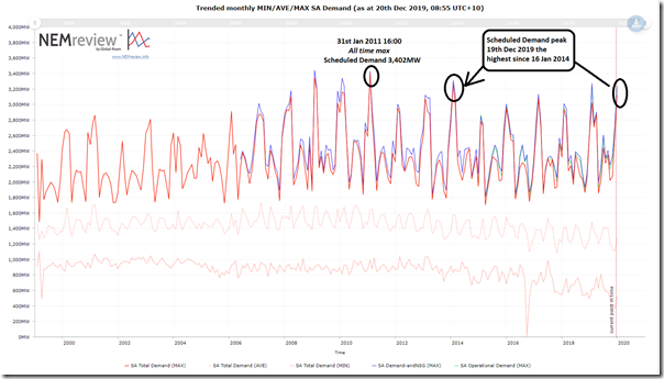
The demand did reach 3,120MW at 18:45 – so 282MW below the all-time max. However the following longer-term trend of Demand from NEMreview can help users understand how extreme the demand was yesterday (i.e. on a day where many businesses would be at lower loads drifting into Christmas):
As noted in this trend, the peak demand experienced yesterday (only one working day from the 2-week hiatus for Christmas and New Year) was the highest seen in almost five years since 16th January 2014 – a month which was, in turn, the only other instance since the all-time record was set on 31st January 2011. Hence it probably qualifies to say that the normal ‘peaky’ demand shape that South Australia sees hit extreme levels yesterday evening, especially considering we’re coasting into the Christmas and New Year shut-down of many businesses.
I, for one, am not looking forward to the demand levels experienced in February and March 2020.
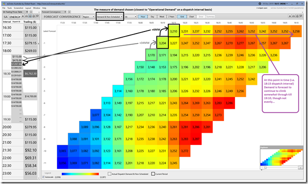
Taking a closer look just within the evening period – using the ‘Forecast Convergence’ Widget within the installed ez2view software we see how quite small increases in demand were able to (in conjunction with other factors, discussed below) ‘pop’ the price out of a more normal pricing range and into the >$1,000/MWh stratosphere:
In this case we have chosen to scale the colour-range dynamically across just the data points in the grid – with blue being the lowest number and red being the highest in the widget. This makes it very clear that quite small increases in demand were enough to tip the scales in pricing in the South Australian region. A very finely balanced supply curve!
Factor 1b) Temperature also impacted in other ways
In this year’s release of the Generator Report Card 2018, we wrote (in Theme 6 within Part 2 of the 180-page analytical component) how the NEM is becoming increasingly dependent on the weather:
Not only is the pattern of weather changing as our climate changes, we’re also seeing these changing weather patterns impact on the supply side of the energy equation in a number of ways as well – and yesterday evening was not an exception to this new dynamic. This is discussed further below.
Factor 2) Imports from Victoria were Maxed Out
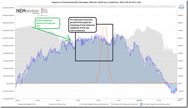
Using this trend in NEMreview v7 we can see that the South Australian region was drawing on maximum supplies from Victoria (and further afield) from around 15:05 on Thursday – including the period of the price spike:
Also noted was the decline in SA’s Import Capability (i.e. in AEMO-MMS-lingo this is ‘Exports’ (from VIC) on these interconnectors) seen through the morning.
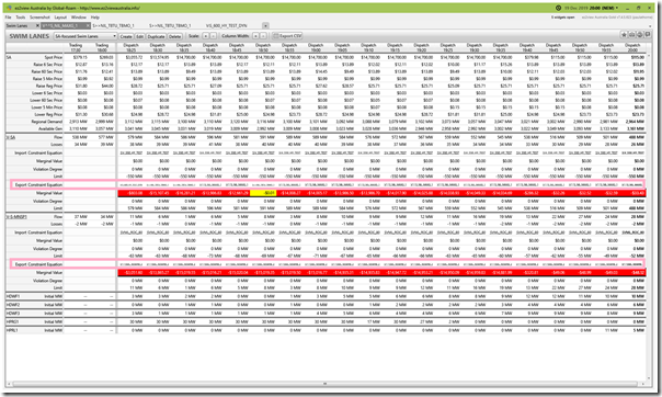
The reasons for this are multiple over that period, but the constraint equation “V^^S_NIL_MAXG_1” was one of the main ones which is a constraint equation always in place (i.e. ‘System Normal’ constraint set) focused on limiting imports to acceptable levels to protect South Australia (voltage stability) in the case of the largest single contingency generation less in the South Australian region. Here’s a view in the ‘Swim Lanes’ Widget within ez2view:
Apologies that the image is a bit busy to the uninitiated. In the wash-up what this meant was that South Australia was on its own to supply any additional MW in demand in the South Australian region – hence it could only rely on generation local to the South Australian region.
Factor 3) Enough spare generation capacity, but it was expensive
First and foremost it is important to note that (because subtracting off the imports from Victoria) the South Australian generation fleet that was available during the period was more than enough to supply the demand. This was the underlying reason why there was no LOR Low Reserve Condition notices issued, or talk of load shedding. Problem is that what was there was all expensively priced!
So let’s take a quick run through the fuel types to see what the situation was:
3a) Rooftop PV was winding up for the day
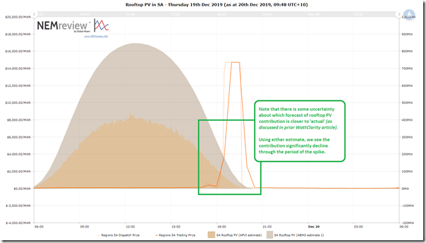
Let’s firstly note that (reminding ourselves of some challenges with the ongoing opacity of rooftop PV that we really need to resolve) the contribution from rooftop PV during the period of the spikes was fast declining (your copy of this Rooftop PV query here):
At the start of the +$1000 price spike period, it was either 200MW or 100MW (depending on which estimate you reference). Certainly it seems like we can be confident that it was in that ball-park. At the end of the price spike period this contribution had faded away to nothing (or almost nothing, depending on which estimate you reference).
3b) Large-Scale PV also headed the same way
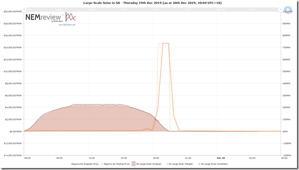
There are only 3 Large-Scale solar units currently registered and operating in South Australia – so lower aggregate capacity than rooftop. Their pattern of output is quite similar to the rooftop PV above (your copy of this Large Solar query here):
I can’t recall if Tailem Bend SF and Bungala 1/2 SF have tracking in place (most do – perhaps someone can confirm), but the curve does seem to suggest that the plant ekes out more from the declining solar resource later in the day.
Adding to the rooftop solar PV, it seems we’re looking at a decline in solar production of between 200MW and 300MW from the start of the >$1000/MWh price dispatch intervals to the end. That’s going to have to have come from somewhere…
3c) Wind – two stories in one
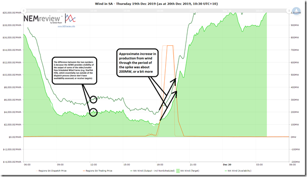
Now, there are a diverse range of readers who read WattClarity – including a number at either extreme of the Emotion-o-meter. When I looked at the following trend for wind in South Australia yesterday, I had to laugh in so clearly seeing two separate stories in the one chart (each story resonating to those at either extreme of this Emotion-o-meter):
You can access your copy of this Wind query here:
Story 1 = Increase in Wind neatly replaced the decline in solar (the ‘glass half full’)
On WattClarity before we have explained why it’s anti-correlation we should be hoping for, and why randomness is not enough.
The 17 dispatch intervals through which South Australia experienced >$1000/MWh prices coincided with an almost text-book like case of anti-correlation between the decline in solar production as the sun set and the increase in wind production from its low point in the period. That probably will have been one significant factor contributing (for instance) to the reason why AEMO did not advance the South Australian region into the LOR Low Reserve Condition territory with the evening decline of solar.
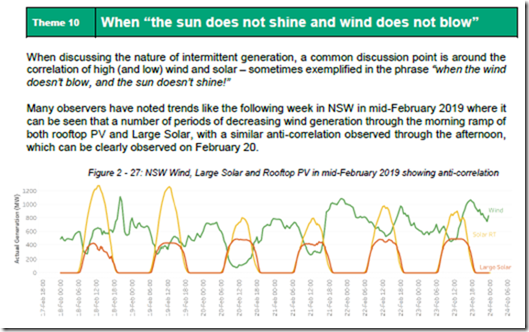
Readers who want to stretch a little further would like to know that in Theme 10 within Part 2 of the 180-page analytical component of the massive Generator Report Card 2018 we completed a multi-year statistical analysis of actual generation data (and also 11-year history of historical wind speed across all Renewable Energy Zones) to delve into the question about how often it occurs that “the sun does not shine and wind does not blow”:
It’s not all the time that we see anti-correlation like this (as discussed in the Generator Report Card) which is why these three charts made me sit back and say ‘Wow!’.
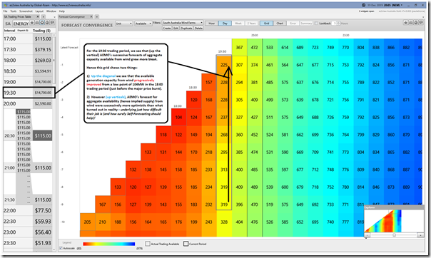
Curious to dig a little further, about I switched over the ‘Forecast Convergence’ Widget in ez2view to look at how AEMO’s forecasts of aggregate wind availability (via AWEFS) had converged on the actual values for each trading period:
I’ve annotated this to explain a bit more – however one of the main points to note is that (on this occasion) reality turned out to be a little bit more pessimistic than successive AEMO AWEFS forecasts, in terms of when (and to what extent) wind would kick back up from its low production point just at the start of the price spike period.
Story 2 = Wind production through the period peaked at only 21% Instantaneous Capacity Factor
That’s only part of the story, however – what’s not shown on the chart for wind, as it would have shrunk the y-axis and made Story 1 more difficult to see, is that the aggregate Maximum Capacity of all the wind farms installed in South Australia on this day was 2,138MW. This means that the aggregate contribution from wind at the start of the >$1,000/MWh pricing run was under 10% of the maximum capacity of all the units installed across South Australia.
The lack of wind was having the effect of these assets ‘bidding themselves at infinity’ and is one of the main reasons why the prices were able to spike so high. So, whilst we might like to point fingers at our favourite Villain below we need to remember that its the disappearance of competitive tension when the market really needed it that enabled these price spikes to eventuate.
We need to be aware that both stories are relevant and important. Unless, and until, we truly consider the implications of each, then we’re going to continue to find this energy transition very difficult to manage.
3d) How did the Batteries perform
Remember that it’s not just a playground for the ‘world’s biggest battery’ (which you can watch live on the Hornsdale Power Reserve website in an ez2view widget at the bottom of the page, thanks to Neoen) – by which I mean that there are a couple batteries in South Australia now – I have attached a similar chart showing the aggregate output of all of the batteries in the South Australian region (your copy of this Batteries query is here):
I haven’t worried about showing the charging side of things in this case – but clients using ez2view or NEMreview can take the starting point linked and add this in themselves.
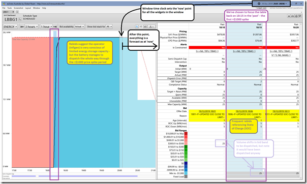
Out of curiosity I thought I would dig further, and use the ‘Unit Dashboard’ Widget in ez2view (v7.4.5.623 for future reference, as it is rapidly evolving) to look in detail at each of the batteries – firstly starting with Lake Bonney BESS (operated by Infigen Energy) as I had not spent as much time looking at this:
The main point here (excuse the busyness for those unfamiliar with the widget) is that the battery was able to dispatch up near the maximum capacity the whole way through the >$1,000/MWh price range.
Also annotated is that the form of these rebids are ‘Not Well Formed (Strict)’ or ‘Well Formed (Loose)’ according to our interpretation of the AER Rebidding Guidelines. In our (a couple weeks from release) Generator Statistical Digest 2019, we will be presenting a comprehensive automated categorisation of how all rebids for CAL 2019 – for all units – fit into each of these categories.
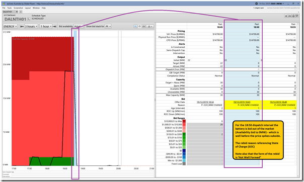
Flipping then to Dalrymple North BESS (operated by AGL Energy) we see a different picture:
It seems clear from this picture that this battery was spent well before the end of the price spike period.
Also annotated is that the form of these rebids are ‘Not Well Formed (Loose)’ according to our interpretation of the AER Rebidding Guidelines. See more in the Generator Statistical Digest 2019.
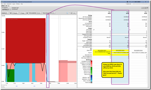
Last, but by no means least, we look at Hornsdale Power Reserve (operated by Neoen and Tesla) and see that this also had to bid itself out of the market because of state of charge – though it lasted a little longer (fully done by 19:25) than Dalrymple (off by 18:50)
Note that these bids were ‘Well Formed (Strict)’ according to our interpretation of the AER Rebidding Guidelines. See more in the Generator Statistical Digest 2019.
I don’t have time to dig further on the batteries – but I am interested to understand the relative energy densities of the three (perhaps some reader can help, in a comment). I guess this is the reason why Lake Bonney BESS lasted longer?
3e) How did the Gas-Fired Gens perform?
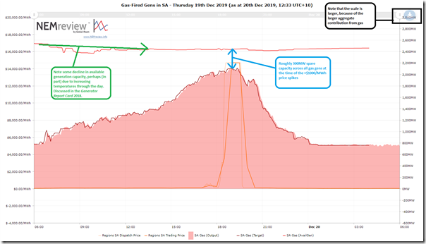
Here’s a similar trend using NEMreview v7 showing aggregate contribution from gas-fired generators (your copy of the Gas Gen query file here):
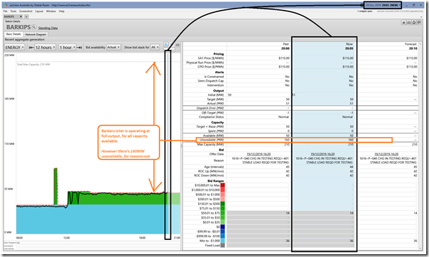
We see that (collectively) the production from gas generators ramped up steadily through the day to meet the peak in demand (and price) – and that, at the time of the peak, there was a little more than 300MW of spare capacity. Out of curiosity, because it’s new, I flipped the ez2view ‘Station Dashboard’ widget to look at the Barkers Inlet peaking station:
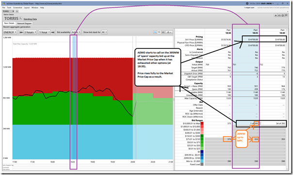
The biggest thing that jumps out to me here is the significant volume of capacity that’s not available at all over that period – for reasons that I have not explored further. Using the same widget I then had a quick look at the whole of Torrens Island (also operated by AGL Energy):
We see here that the 395MW of spare capacity at Torrens (which is pretty much all that’s spare across the whole of South Australia) is bid up at the Market Price Cap. Note also the 20MW increase in volume offered there at the 18:35 dispatch interval. In that dispatch interval the price rises fully to Market Price Cap when the AEMO needs to access 1MW of that volume.
3f) How did the Liquid-fueled peakers perform?
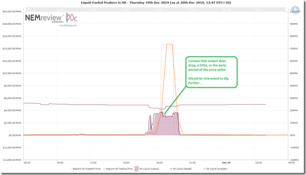
Finally we quickly look at the aggregate output from liquid-fueled peaking plant (your copy of the Liquid Gen query file here):
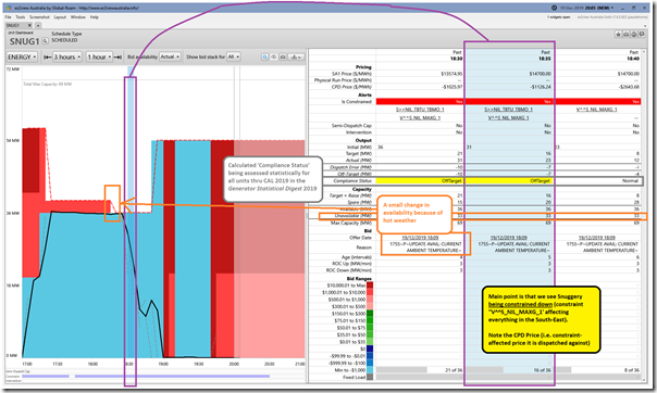
Note that there is a dip of around 30MW or so in output during the early part of the price spike – for reasons that spark a bit of curiosity, so back to the ‘Unit Dashboard widget in ez2view and look particularly at SNUG1 (the unit at Snuggery Power Station – operated by Engie):
Apologies for the busyness here (and lack of time to thoroughly explain) but the key point is that Snuggery is being constrained down (along with other Scheduled and Semi-Scheduled generation in the south-east of South Australia under Constraint Equation ‘V^^S_NIL_MAXG_1’ to protect South Australia – voltage stability – in the case of the loss of the largest generation block in SA (assuming South East Capacitor Available)).
See the note in the image about ‘Off-Target‘ and ‘Compliance Status‘. In our (a couple weeks from release) Generator Statistical Digest 2019, we will be presenting a comprehensive categorisation of both derived measures (for all units, for all dispatch intervals) through CAL 2019.
There’s other stuff going on, but I have run out of time to explore and explain…
(C) Why did it happen on Thursday in South Australia – but not on Wednesday in Victoria?
This is perhaps the more interesting question for me – but I’ll have to dig a little deeper on this one and (depending on how many other distractions the market throws up in what should be a quieter period the next 2 weeks) might have another article up during that period…



I’ll look forward to your assessment of price spikes in Vic and SA on the 20th. They coincided with what appears to be curtailment or poor production from wind farms during the heat. I live near the Macarthur Wind farm and it was blowing a gale at 40 degrees, prices were up to $2500/MWh, but output was only about 20%. Other wind farms were similarly affected, and some also had periods of constrained or nil production during the day including Mt Mercer, Morton’s Lane, Mt Gellibrand, Murra Warra, Oakland, Portland, Waubra, and the SE SA wind farms. If wind and solar are the new baseload we need to make sure their output can reach users during the heat when it’s most needed.
Here are Bureau of Meteorology data on wind speed at Hamilton Airport, which is their nearest observation station for the Macarthur Wind Farm, Morton’s Lane, and Oakland.
http://www.bom.gov.au/products/IDV60801/IDV60801.94829.shtml
Solar, wind, batteries, no doubt great for moving money from customer to industry bank accounts, but the real hero gets mentioned last, the Torrens Island gas power station, rapidly adjusting its massive output as required.
The real problem in SA, and elsewhere in the climate change obsessed world, is that nobody is going to build another Torrens, so the clock is ticking, not to any climate tipping point, but to a breakdown of the electricity system.
Hi Climan,
There is going to be so much cheep power 24/7, we in Australia are going to be making hydrogen, plus exporting heaps of power direct to asia.
Well thats what I am getting from all that i have been reading.
Per market notice 71933, the Heywood M1 500/275 kV transformer (taken offline at 13:55 on Friday 20th) did not return to service at 17:00 when scheduled in notice 71906. This continued to constrain inter-regional power flow from Western Victoria during the period of peak demand.