The rise of intermittent generation supplies being injected into Australia’s National Electricity Market (NEM) has brought some different versions of the same challenges that have been facing electricity system operators since the first networks were built 100 years ago.
There are many talking about these issues. For instance, I noticed this article from Matt Rennie at EY about the looming challenges for system operators. Matt talks about the “invisibility of distributed energy” and the growing challenges that this is likely to present in future. This is currently an issue with distributed, small-scale solar PV, and will increasingly be a challenge (probably a more difficult one) with injections and withdrawals from distributed storage.
Today I’m posting some comments on the invisibility opacity of distributed solar PV.
1) Comparing different estimation methods
We should start by noting that no-one actually KNOWS, in aggregate, how much small-scale solar PV systems are injecting into the NEM (or indeed in any grid).
Aggregating data in real time (or even delayed) to provide clarity about injections seems like the type of internet-of-things + Big Data problem that would have technology companies clamouring over themselves to attack. However, what business problem would they actually be solving?
Today in the NEM there are at least two different methods in use to ESTIMATE aggregate output from the growing number of small-scale PV systems across the NEM:
1a) The ARENA-funded APVI method
As noted on the “Solar Map” project page, ARENA provided $443,238 of funding (75% of the project total) such that the APVI could develop these very useful solar mapping tools and, particularly of interest to us and others, this view of live solar data. The first incarnation of this live map showed data by state, with a worthy enhancement being the provision of an added layer of detail – down to 2-digit postcode level.
My understanding of the methodology used by the APVI in the generation of their estimates amounts to the following:
(i) Sample some of the self-reported small-scale PV output data at PVoutput.org (this release implies a sample size of “more than” 5,500 PV systems – which is relatively small, given more than 1,000,000 systems installed Australia-wide, but better than nothing);
(ii) Aggregated output for a state is then converted to a capacity factor by using the self-reported capacity of the systems being sampled; and
(iii) This capacity factor is then extrapolated up using what the Clean Energy Regulator knows of the installed capacity of solar PV in a state/region (a somewhat delayed metric, but again better than nothing).
Of course there are a number of assumptions made in this method – as there are in any estimation method. Whilst others might want to argue the finer points about the validity of the method, we’ve been much keener to be pragmatic and incorporate the data to help increase awareness and understanding, where we can.
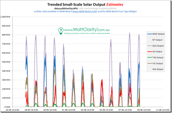
Given other recent developments, we grabbed about a week’s worth of history of this data (we’ve been building an internal record for possible* later use) and trended as follows:
As we can see, solar output’s been highest in the middle of the day, is highest in Queensland (most sunshine, and most PV panels), and is also very subject right across the NEM to coincident weather patterns (i.e. the above implies, worryingly, not as much diversity as might have been hoped for – though perhaps this is partly a result of the sampling method?)
Readers should note that we technically don’t have permission* to publish analysis like this, but are doing so in the interests of sharing some observations to assist in broader understanding of this particular challenge that could become more significant moving forwards.
* the permission we have from the APVI extends only to the inclusion of up to 24 hours of history in products like NEM-Watch (more on this below).
1b) AEMO’s new method
The mid-year release of AEMO’s MMS contains a number of interesting new data sets which we will be incorporating into a range of our products. Today we want to highlight the “ROOFTOP_PV_ACTUAL” data field.
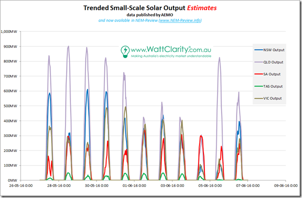
Unlike the name implies, unfortunately, it seems this data is not an ACTUAL sum of but is, instead, another ESTIMATE. We know that it’s created using a method that is slightly different than the APVI method because the quick eyeball comparison we did with the chart included below shows mostly similarities – but also some non-negligible differences (the AEMO method, for instance, seems to produce higher peaks):
A quick scan of the AEMO website did not reveal any details of the method used, but I did pop a quick question into the AEMO.
From what the AEMO explained to me:
1) There is, indeed, a difference in the method used by AEMO compared to the (competing?) ARENA-funded APVI method.
2) The AEMO will publish more details on their website later (there is none there now). When this has happened, if I remember, I will add a relevant link below as a comment – or perhaps one of our readers at the AEMO or elsewhere might do so in case I forget?
1c) Do you know of other methods in use?
As a company focused on aggregating data, delivering it to clients, and making it understandable, we’re always on the lookout for different sources of data.
It’s possible that there are other reasonable methods in use out there that we don’t know about. If so, we’d ask that you please let us know?
2) Accessing this data in our software
We’re pleased to announce that we have now incorporated both of these two different data sets into our software, as follows:
2a) Real time solar PV estimates, from APVI, in NEM-Watch
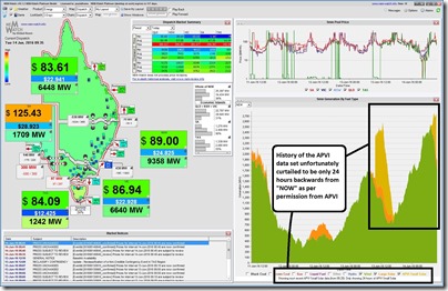
Regular WattClarity readers and others will know that we’ve been pleased to be able to incorporate the APVI’s estimates for aggregated small-scale PV output into our NEM-Watch entry-level market dashboard since the release of v10 early in 2015. Here’s a recent capture highlighting the APVI data:
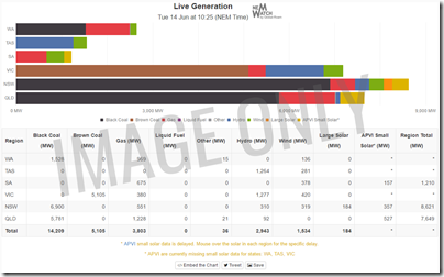
Around the same time as doing this, we also expanded the breadth of the NEM-Watch service by introducing our first NEM-Watch Widget, the Live Generation-by-Fuel-Type mix hosted on the RenewEconomy website, and at a growing number of other locations as well who’ve chosen to embed the widget at no charge:
This data set, and the widget as well, have certainly struck a chord – with a steady stream of congrats coming in since that time, some of which has been highlighted here. We also continue to receive a steady stream of feature requests with respect to the widget, some of which we have already addressed.
Some of the requests/suggestions have been to do with historical data – we’ve been (disappointingly) unable to help these people as we would like, by incorporating the historical small-scale solar PV output estimates into our NEM-Review (trending, slicing & dicing) product.
I understand that there were historical reasons why we were not originally granted permission to include historical data in this way – but, I must admit, I struggle to continue to rationalise this (now a year-and-a-half since we incorporated live data into NEM-Watch, and two-and-a-half years since the APVI map went live), especially in the light of ARENA’s strong knowledge-sharing ethos.
It’s frustrating to know that our diverse range of customers have been denied the opportunity to gain insights into the nature of distributed rooftop PV that we looked to do early in 2015. It’s also unfortunate to say that we’d basically given up on that idea, given the time-lag.
Surely this was not what ARENA had in mind in provision of such a large funding amount, coupled with their keen interest in knowledge sharing?
2b) Historical solar PV estimates, from AEMO, in NEM-Review
Thankfully, the recent mid-year release at the AEMO has helped us over that hurdle.
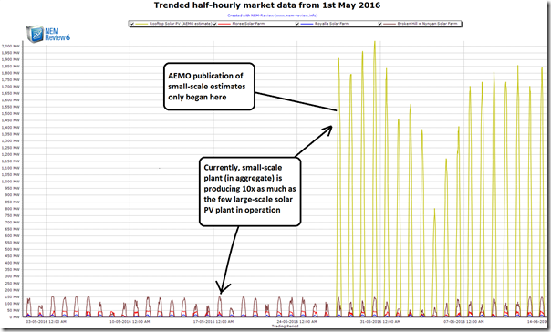
For various reasons to do with the APVI estimate, and the AEMO estimate, we’re not including the AEMO data in our real-time dashboards. However we are now including this into our NEM-Review historical “slicing and dicing” tool:
Existing clients will see that the data has already been flowing through for a few weeks (AEMO has not yet back-published much historical data, but at least in NEM-Review you’ll be able to start trending data from May onwards).
Clients should select “Metered Generation” not “Target Generation”, as noted on the NEM-Review portal here.
We do still have an interest in incorporating the APVI data into NEM-Review in future (clients will probably want to compare between the two different estimates). However the opacity of distributed, small-scale solar PV output has been reduced a little bit, thanks to the AEMO, hence the relative priority for our clients (and hence us) would be lower.
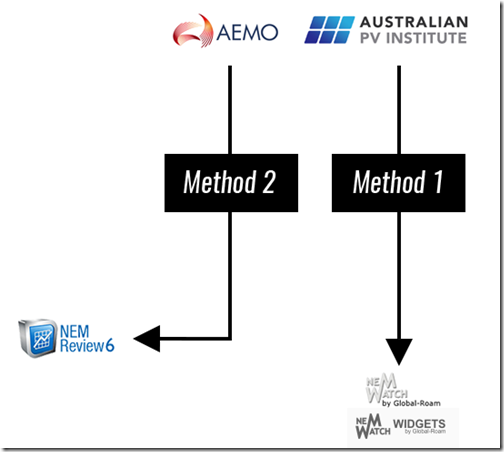
2c) Summing it up, for the NEM
For those who think in pictures, we’ve summed the Australian situation up here:
Note that this is not the end of the story …
3) What about international data?
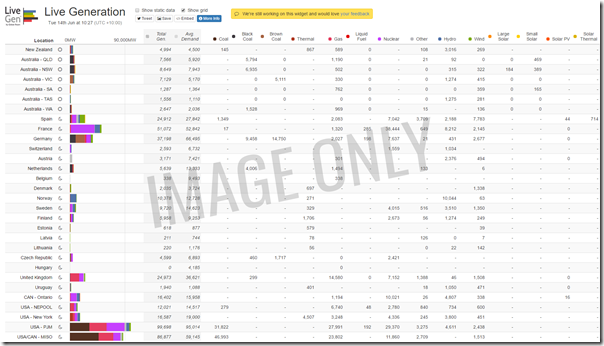
As I noted here back in April, we’re searching for similar estimates of small-scale solar PV injections for the growing number of grids across the world where we are collecting data. We’re seeking to add these into the internationally-focused LiveGen™ widget we’ve been developing (here, with the help of RenewEconomy):
If you know of sources for solar generation data (or, indeed, electricity generation data for ANY type of plant, as we want to provide the fullest possible picture) in different parts of the world, please let us know.
We continue to strive to make complexity understandable, in the energy sector.


Leave a comment