We’ve previously posted about the heatwave that afflicted Victoria and South Australia across Monday 13th, Tuesday 14th, Wednesday 15th and Thursday 16th January.
During the heatwave, and in the week following, we’ve been bombarded with a wide range of views of what’s helped, and what’s hindered in the NEM over that period – including:
1) We’ve heard how solar helped to save the day from Kerry, Ric, the AEMO and others;
2) On WattClarity, we have written how demand side response also helped to balance supply and demand – and others (such as Phil) have posted their views & experiences (or replied privately) as well;
3) We’ve heard how wind farm output did as could be expected and as forecast during the period (whether that’s a good thing, a bad thing, or just one of those things is open to each person’s perspective – and, in particular, whether focusing on the value of energy or capacity);
4) Still others (like Graeme and Phil) have written about how gas-fired generation has played a critical role
5) Others (like Keith) have written how it might have been hasty to talk too loud about “gold plating” on the network side, and how a pattern of declining demand is not as consistent (in terms of peaks, at least) as might have been thought.
[PS and Terry gives credit to coal here]
I’m sure there will be plenty more said as the summer progresses….
(A) Gas-fired generation helps meet demand in the heatwave
One thing that’s been particularly of interest to us, now that we’re able to provide a bit more clarity in terms of what’s been happening on the gas market, on the other side of the fence, is the contribution that gas generation made in meeting the additional demand.
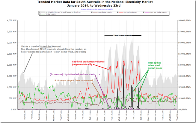
The scale of this contribution is fairly clear in the following chart produced in NEM-Review:
With respect to this chart we can see many things, including
1) The first observation that can be made is just with respect to demand – we see that the demand in the heatwave week was more than double the demand experienced in the early days of the prior week, and double what’s happened this week (so far) – a clear illustration of the strong temperature dependency of electricity demand (particularly in South Australia).
2) We see that production from gas-fired plant in SA increased significantly to provide the lion’s share of this increased demand.
3) Output from Northern (Alinta’s brown coaler) picked up in the heatwave week, with 2 units running heavily at times
4) A number of the liquid fuelled peakers were also called on to run, depending on the commercial drivers of the portfolios that owned them
5) As others have noted, we see that the wind farms continued to produce with the expected intermittent pattern. In particular we see an inverse correlation between wind farm output and spot price, which is entirely expected (after all, as others have pointed out the wind farms help to lower spot prices when the wind blows – so the inverse is to be expected).
6) There are other things that can be seen, of course. If there are particular points you believe we should have made, please include them below.
(B) Heatwave produced increased demand in the gas market
Following through to the gas market, we see that the significant increase in gas supply for generation impacted back in the Short Term Trading Market, as well.
If we select three different days from the date range above (using a pre-release beta version of GasWatch version 2) and perform a before/during/after comparison, the effect of the heatwave becomes fairly clear:
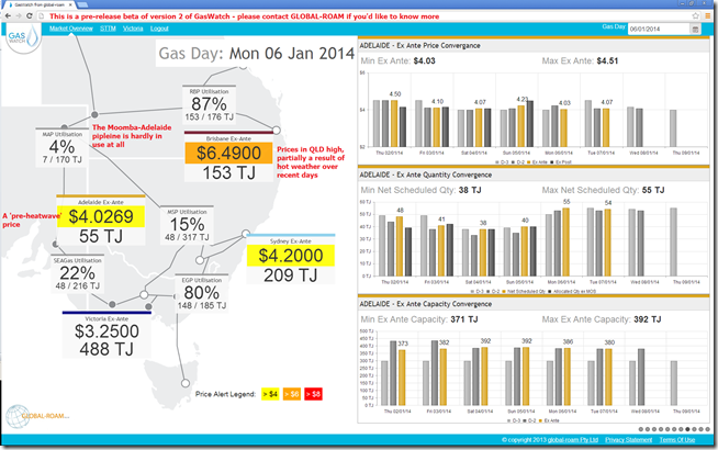
1) Before (Monday 6th January)
As shown in the NEM-Review chart above, demand on the 6th January was well below 1,500MW in South Australia. As a result, production levels from gas-fired plant were running fairly consistently at a little below 500MW.
Back at that time, we see the daily gas price at the Adelaide hub being a little more than $4/GJ and the utilisation of the Moomba-to-Adelaide pipeline being very low – which, together with the SEAGas pipeline, delivered scheduled quantity of 55TJ for the day.
In the charts on the right, we see the gas price having been fairly consistent over the previous week in the low $4/GJ range.
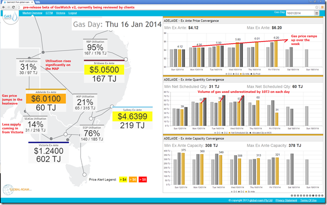
2) During (Thursday 16th January)
Moving into the heatwave week and we see a very different picture:
From NEM-Review, we saw that the South Australian demand peaked well above 3,000MW on the day (so more than twice what was the case on 6th January), and that the production from gas-fired plant peaked at over four times as much (over 2,000MW contributed at peak demand times).
This flowed through to the gas market – as we see the volumes required in the gas market surprised by more than 10TJ on each of the previous days (Monday 13th, Tuesday 14th and Wednesday 15th), and we see prices trend upwards as this effect is felt.
The Moomba-to-Adelaide pipeline is called on to supply these additional quantities to the gas peaking plant.
[for those who are interested, the market price shown in Victoria is the 10pm market price, coming on the back of the other 4 prices in the day of just below $4/GJ – other screens show this detail]
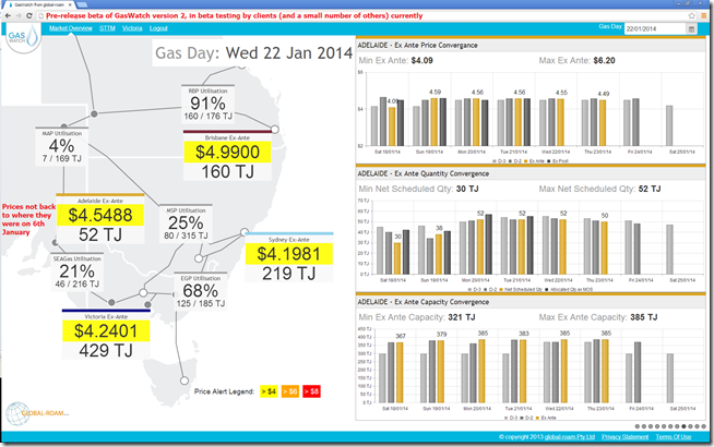
3) After (Wednesday 22nd January – yesterday)
This week we see (in the NEM-Review chart above) that demand in South Australia has subsided back to more “normal” levels – about half of what they were the prior week. With that, production volumes from gas-fired plants have also scaled back.
It should not surprise that this has also wound back gas prices at the Adelaide hub, as shown:
Part of the reasoning behind the formation of the AEMO in the first place (by merging together NEMMCO, Vencorp and other organisations) was that the gas and electricity markets were becoming more closely linked. The above is just one illustration of that.
(C) Gas prices flow through to electricity market bidding
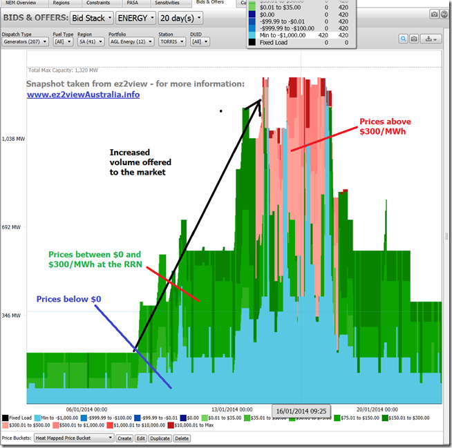
As also would be expected (especially for the gas-fired stations that ramped up to meet the peak in demand) this gas price increase was reflected in bidding behaviour over the period. Focusing in on the Torrens Island station (because it was one of the ones that contributed significantly to that increased production in the region) we see the following pattern of bidding behaviour:
In this snapshot from ez2view over a 20 day range spanning the 3 days above, we see a significant increase in the volumes bid into the market, we see the use of price buckets above $300/MWh over the period of the heatwave.
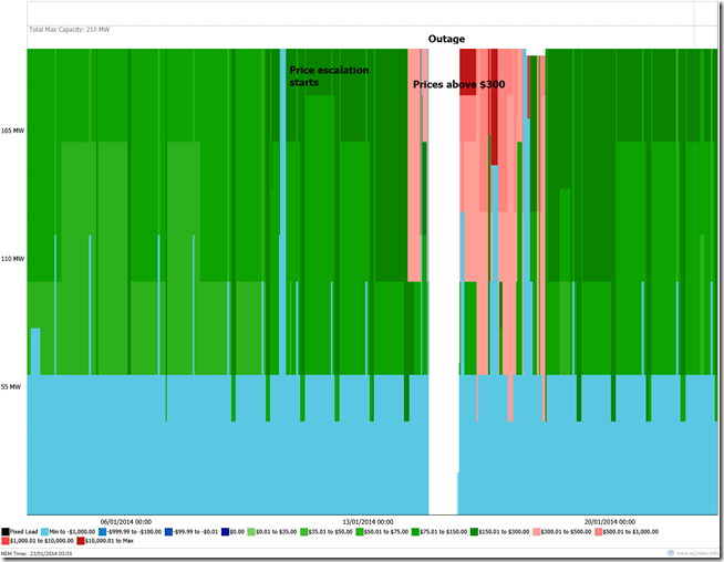
Narrowing down the filter more to just look at Torrens B3, we see that bid prices were escalated above $150 leading into the heatwave, and then further above $300 during the heatwave. The spike in gas prices (above) would have been part of the reason for this – though there would also have been opportunistic behaviour involved as well.
[more to come, time permitting …]


>”5) As others have noted, we see that the wind farms continued to produce with the expected intermittent pattern. In particular we see an inverse correlation between wind farm output and spot price, which is entirely expected (after all, as others have pointed out the wind farms help to lower spot prices when the wind blows – so the inverse is to be expected).”
Is this an impartial statement? I would have said the most obvious conclusion regarding wind in this chart is that when demand is high wind power drops.
We could draw the following conclusions about wind generation from this chart: Wind does not show up to work when most need and capacity credit should probably be lower than AEMO says.
It is likely wind is causing a lot more increase in the cost of electricity than simply the spot prices might suggest.
Importantly, these issues will become much more of a problem, and electricity prices will be forced disproportionately higher the more wind capacity is added to the NEM.
Hi Peter,
Wind IS proportionally lower during peaks, about 20% less on average in SA. It can seem like more because the older wind farms are non-scheduled and their production is subtracted from demand. In NSW wind production is more closely correlated with demand. This can be seen by the dispatch weighted prices that wind farms receive. In SA a WF gets about 20% lower spot prices than the average, in NSW it’s only a few %. Seems fair given my first statement?
There are no capacity credits in the NEM. In WA where there are capacity credits WFs receive a much smaller credit. The credit was originally equal and the IMO reduced it after review.
In fact WFs are lowering the wholesale price of electricity. This is necessarily true of any new generator that produces energy. In SA wholesale prices have dropped over the last 6 years while they have risen in all other NEM states, during which time the only new generators installed have been WFs. Also of interest the frequency of very high prices has fallen more than the frequency of very high demand days. Sometimes the wind does blow at the right time, however this makes for a boring headline.
This whole discussion about who did what is rather silly. The only conclusion I take from this is that a diverse mix of generators is ideal.
“Gas power does what it is supposed to”
“Wind power doesn’t do what it wasn’t built for”
Unfortunately all of this partizan bickering is making the average Australian even more confused about energy. Thanks for the wrap up Paul.
No problems, Tom
We’re keen to do what we can to help making energy markets more understandable.
Regards
Paul
Hey Tom,
Dr Mark Diesendorf told us for years that a fleet of geographically dispersed wind farms will
displace base load coal-fired powerstations. Policymakers are still proceeding on the basis of his
now-famous “The Base Load Fallacy”. Remember it? So, let me correct your statement above here
to now read: “Wind power doesn’t do what it was built for, which was to generate base load
power in place of coal”. And to add, “What’s more, it doesn’t matter how many wind farms are
built, it never will.”
Nobody is “bickering” here, Tom. Peter Lang is merely stating the facts as they are. He is
absolutely correct when he says that wind does not show up to work when it is most needed.
Wind is an abject, futile, hideously expensive, and dangerous-to-grid-security, failure.
May I too add: Thank you for the analysis, Paul. It is most informative.
Regards,
Paul
Renewable energy primary justification is that it is expected to cut CO2 emissions. But it is ineffective at doing so and hugely expensive.
Renewable energy proponents like to make claims about how much capacity has been built, and the rate of growth of capacity. But these claims are highly misleading. They should talk only about how much firm capacity has been added; the cost per kW of firm capacity; the proportion of firm capacity compared to the total firm capacity of the grid; and the cost per tonne CO2 avoided.
About 5%-10% of wind capacity is firm capacity and that will decrease as the proportion of wind capacity increases in the grid.
The proportion of solar PV that is firm capacity is also very low, and will decrease as the proportion of PV in the grid increases.
Wind and solar are about half as effective at avoiding CO2 emissions as is claimed by their proponents. And they become less effective as their proportion of the electricity generation increases.
Because of the low abatement effectiveness, the abatement cost ($/toinne CO2 abated) is about double what is claimed by the proponents.
I agree with Tom. “Unfortunately all of this partizan bickering is making the average Australian even more confused about energy.” The ridiculous claims and twaddle by the renewable energy proponents should stop.