I was invited to speak at the FutureGAS conference this morning about the nexus between electricity, gas and emissions.
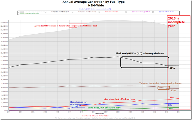
We’ll post more of the analysis behind my presentation later, but were requested to post the following NEM-Review chart straight away – as it highlights the way that black coal-fired production has been declining markedly over the course of the past couple years – crunched between the declining demand in the NEM, and the increases in production from other fuel sources.
As can be seen:
1) Gas-fired electricity generation volumes have increased significantly (more than doubled over the past 6 years) as a result of Queensland’s own “dash for gas” (making it the largest change in the generation mix, to date);
2) Hydro levels have increases since the lows of the drought years around 2007 – though not much more increase should be expected here (as there’s no new capacity being built, or likely to be built); and
3) Wind production levels have increased from a zero base only 7 years ago.
4) Not shown on this chart (as it’s not metered data published by AEMO) is the energy generated from rooftop solar PV – based on the best numbers we’ve been able to find, thus far, we estimate that the 2012 year saw solar production equate to something like 2% of total energy generated in the NEM.
[if anyone has some better numbers than this for solar PV, and can link to their source, please do include both in a comment below]
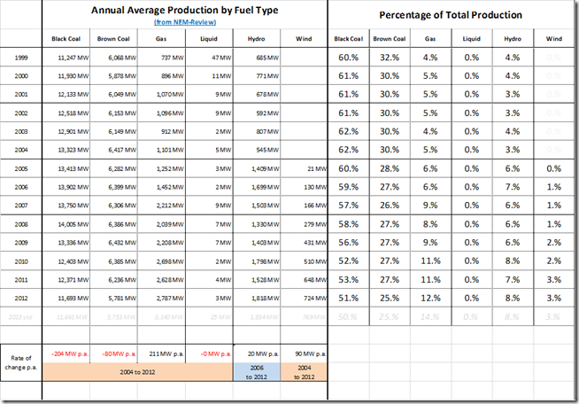
For those who like to read the numbers, they are included in the following table:
As we can see, coal still generates the lion’s share of our electricity consumption, and still will (most likely) for many years to come. Scenarios presented by Jon Stanford of Insight Economics in the same session showed a large-scale change-over from coal not occurring for another 20 years or so.
Paul Balfe (of ACIL Tasman) commented this morning that it does feel somewhat like there may be a longer-term shift in the nature of electricity production, delivery and consumption in its early stages – though our sense is that this shift is not occurring as quickly as some people might prophesy, or wish for.
However it would be wise to keep in mind the infamous “S-Curve” for technology adoption that indicates that change might (but not will) occur faster than the initial trajectory would seem to imply. There’s certainly significant money being invested in alternate technologies in this space, but all still have their own challenges – and no silver bullet exists.


Shouldn’t the drop in brown coal production be attributed to the carbon price? Yallourn was back in action not that long after the carbon price came into play. Sure, the initial drop was due to Yallourn but it’s been 9 months already. If the drop in brown coal was only due to Yallourn then brown coal should have bounced back by now.
Hi Tom
Thanks for the question – and apologies for this belated response.
I’ve noted a number of people stating “the NEM is a complex place” the past couple weeks – the challenge in your question is that it’s not just one factor that is delivering change (and varying degrees of change dependent on participant, technology, commercial and other considerations).
Regards
Paul
Amidst the fuss that switch to gas is an essential transition, have always been doubtful about this on suspicion that power stations extract brown coal for free, no $$$ per tonne royalty, resource rent depletion tax etc etc.
This being so, why would they switch, unless taxpayers make gas available for free? Any chance you can confirm or deny this suspicion?