As we noted on Tuesday, recent spot price volatility in Queensland has been remarkable, but not totally unique.
It’s certainly caught the attention of some in the media (such as last Friday and Tuesday this week in the Courier Mail). There’s been a number of claims about what’s causing the prices to be high, hence we’ve invested some time to identify, and analyse, a number of factors that have all combined to deliver the higher prices:
[Note, however, that this is not a complete list – if anyone wants to highlight others, please do include them in comments below]
Factor #1) Demand in Queensland was high
We noted (as it was occurring) how demand in the region remained stubbornly high, over the weekend, on the back of some oppressive temperatures around the state.
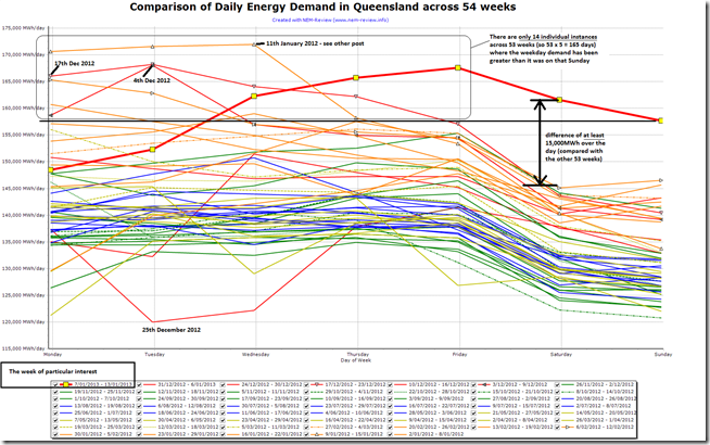
To provide some illustration of just how extreme the demand levels were for a weekend, we have (through NEM-Review) compared the daily aggregate energy consumption across 54 consecutive weeks ending this most recent Sunday. For clarity we’ve designated that each week ends on a Sunday (enabling Saturday and Sunday to be seen together on a chart).
Comparing only the weeks in the current year makes it more likely that any differences between weeks will be due to climatic factors and less due to these more systemic factors contributing to why demand patterns have been changing over the past 6 years or so.
As can be seen here, there is daylight between the Saturday/Sunday of this hot week and every other Saturday/Sunday in the study.
Specifically – there is a clear gap of about 15,000MWh over an entire day between the load profile of last Saturday and Sunday and the next-most-energy-intensive day in that range. Across 8 daylight hours (say) this would equate to a difference of 1,875MW (or 625MW average over 24 hours) – indicating the scale of a difference where the all-time maximum demand is around 9,000MW.
Indeed, it can be seen from the above that demand on Saturday and Sunday in that week was higher than the daily demand in almost all of the working week days in the 53 other weeks shown in the summary. That’s another indication of how extreme the demand was.
In the interests of completeness, this chart also identifies previous weeks where demand in Queensland has been high, including:
1) Monday 9th, Tuesday 10th and Wednesday 11th January 2012.
2) Monday 6th and Tuesday 7th February 2012.
3) Tuesday 4th December 2012.
4) Monday 17th, Tuesday 18th, Wednesday 19th and Thursday 20th December 2012.In terms of the weeks with high demand, there does seem to be a very slight pattern (except in the week just past) where demand is higher earlier in the working week and tapers off later in the week – though we suspect that this just appears because of the small sample size.
Factor #2) Available Supplies were down.
2a) Station closures and retirements
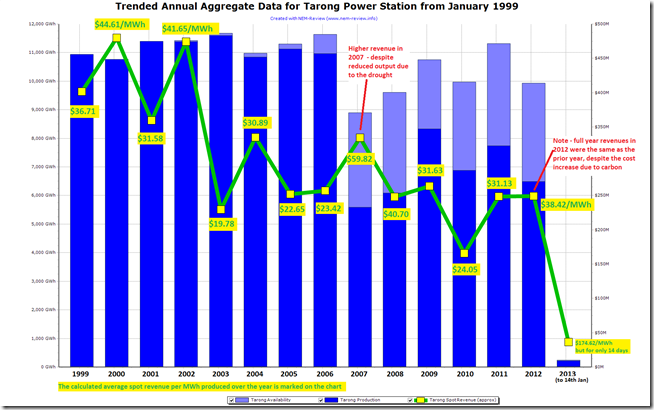
It’s been noted in the media that one of the contributing factors is that two units at Tarong Power Station are now offline – in response to the poor market conditions that have been in place for many months leading up to this summer (as highlighted here in the longer-term price trend).
We can see the reasons behind this withdrawal of capacity at Tarong in the following trend from NEM-Review :
As can be seen, there has been an uplift in cost from 1st July 2012 (with the Carbon Tax) but there’s not been the equivalent amount of uplift in revenues (not just for Tarong station, but across the board – despite the short-term excitement in early July).
Hence, it can be seen that the closure of two units at Tarong was the rational response from Stanwell Corporation to the squeeze created by declining demand and increased production costs (including, but not limited to, the Carbon Tax). This is along the lines of the comments made by ACIL Tasman in the Courier Mail yesterday.
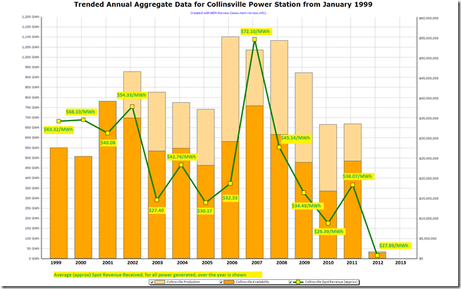
There’s more than one participant that operates in the Queensland region of the NEM – and all of them have been feeling similar pressures. One of the other recent responses has been the de-registration of the Collinsville power station in North Queensland.
The similar chart for Collinsville indicates clearly why the decision was made to remove the station from the market:
2b) Station maintenance
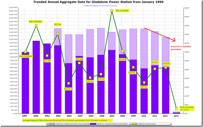
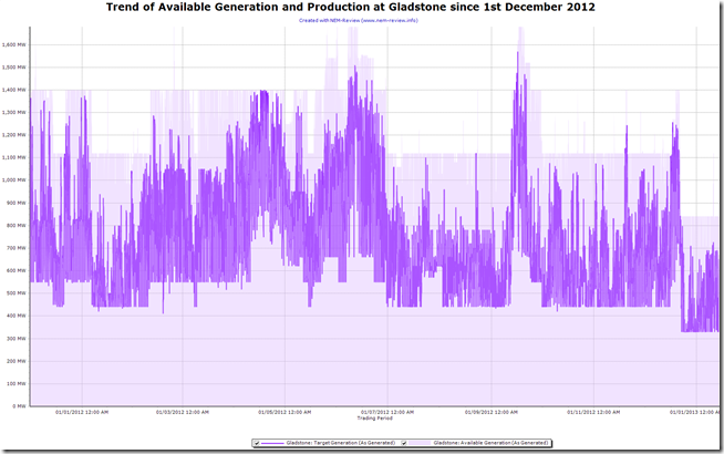
In addition, we’re seeing that the availability of the Gladstone station has been reduced through 2012 and into 2013. The same chart as above is included here for Gladstone to illustrate their situation:
Through summer 2011-12 we saw the available generation at the station as high as 1,400MW – currently the station capacity available is 560MW lower, at 840MW:
1) Unit 1 came offline on Friday 11th January and has not returned to service yet.
2) Unit 2 came offline on Saturday 22nd December 2012 – after only being available for a few weeks beforehand – and has not yet returned to service (i.e an outage of more than 3 weeks duration currently)
3) Unit 5 came offline just a few hours earlier (late on Friday 21st December 2012) and has not yet returned to service (i.e an outage of more than 3 weeks duration currently).
This is shown in the trend below:As can be seen in the chart above, Gladstone almost always has at least one unit unavailable, and has had two units unavailable for much of the latter half of 2012 – this is the first time in 14 months that three have been unavailable.
We have not investigated further, to understand what types of difficulties are causing three units to be offline at a time when demand is quite high – if any of our readers want to chip in with more detail, please do?
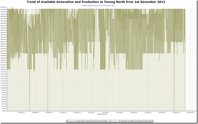
The similar chart for Tarong North is also shown below – showing how this one-unit station has been offline since just before Christmas (from 20th December):
2c) Aggregated across the region
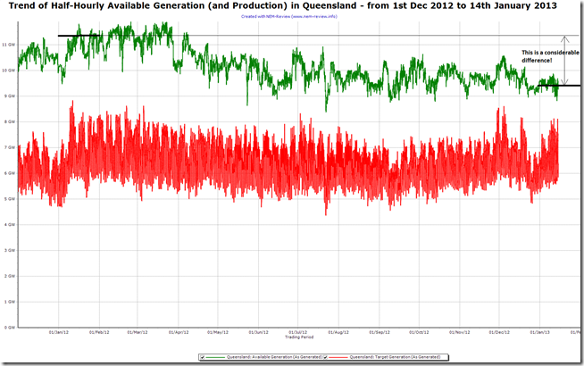
Combining factors such as these together, we see that the available generation capacity bid into AEMO (at any price) is considerably lower this summer than it was over the previous summer period. The following trend from NEM-Review shows Trading Interval data over a 13.5 month period:
As can be seen, there is approximately 2,000MW less capacity available this January than there was in the latter part of January 2012.
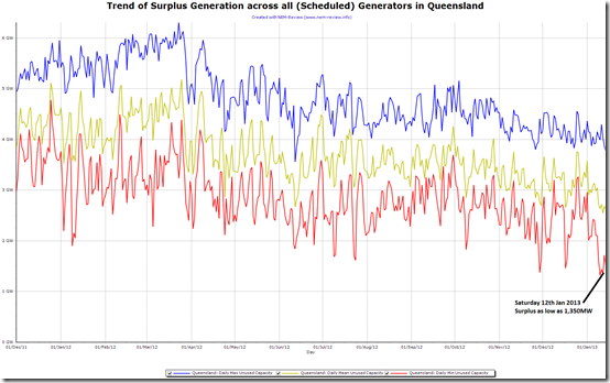
Taken together, the higher demand and the lower available generation capacity have combined to produce a lower generation surplus for Queensland in January 2013 than was the case in January 2012. This is clearly shown as follows:
As can be seen in this NEM-Review chart, the surplus capacity (at any price) was as low as only 1,350MW (on a trading interval basis) on Saturday 12th January.
Specifically, on the weekend…
In highlighting the factors above, we have utilised NEM-Review for longer-term trending and analysis. This has helped to highlight the underlying condition of the market leading up to the price excursions on Saturday 12th and Sunday 13th January 2013.
In looking at other factors in the market, we’ll use ez2viewAustralia, our real-time dashboard for what’s happening in the market on a Dispatch Interval –by– Dispatch Interval basis in the NEM. It’s the NEM’s most powerful dashboard, in the tradition of our NEM-Watch application.
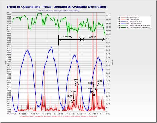
First-up, to enable us to zoom in on particular periods of interest for further analysis, we’ve produced the following trend in the Custom Charts function within the application – showing the 96 hours leading up till the start of Monday morning (following the weekend in question). I have annotated the chart some of the significant price spikes (Trading Prices highlighted) experienced over these periods:
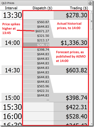
We can use “Time Travel” within ez2viewAustralia to reset the display to a selectable point in the past and see what was apparent in the market at that point in time. The tables included below highlight the dispatch and pre-dispatch prices that were apparent in ez2view at each of the trading intervals highlighted above as being the six significant price spikes on the weekend.
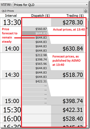
For each occasion we include a table showing two views of prices:
(a) on the LEFT we have a view of the prices at the end of the Trading Interval, showing which dispatch interval(s) contained the high price events that pushed the trading price;
(b) on the RIGHT we shown the view of the market immediately prior to the price spike, to highlight what AEMO’s predispatch forecast was for those periods prior to the spike.We discuss each result in turn.
Saturday 12th at 14:00 Trading Interval
We can see here that the Trading Price for Saturday 14:00 turned out to be $1,336.30/MWh:
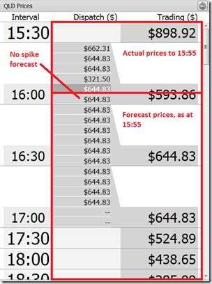
Actual Prices in the Trading Interval Forecast Prices Leading up to the Spike As can be seen in the above comparison, as little as five minutes prior to the 13:45 Dispatch Interval, prices were forecast to remain steady at the already elevated levels – and not spike to the eventual level of $6,071.27/MWh for the 13:45 Dispatch Interval.
This is an indication of the types of challenges that have presented themselves to a wide range of wholesale market participants and observers over the course of this summer.
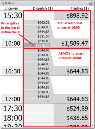
Saturday 12th at 16:00 Trading Interval
We can see here that the Trading Price for Saturday 16:00 turned out to be $1,589.47/MWh – driven by a spike in the last Dispatch Interval within the Trading Interval:
Actual Prices in the Trading Interval Forecast Prices Leading up to the Spike As shown here, the second significant price spike for the day was also not forecast, immediately prior, in predispatch {note that it may have been forecast in earlier predispatch runs – we’re running out of time in this analysis and so have not re-wound further to see}.
Saturday 12th at 19:00 Trading Interval
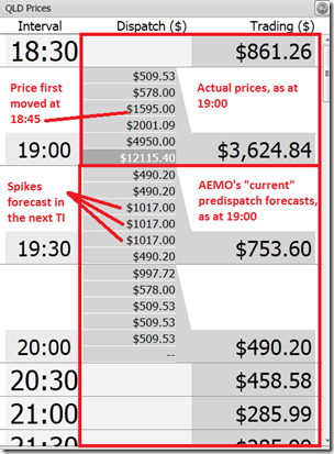
We can see here that the Trading Price for Saturday 19:00 turned out to be the highest level for the day, $3,624.84/MWh, driven by four Dispatch Interval prices above $1,000/MWh:
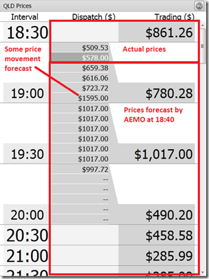
Actual Prices in the Trading Interval Forecast Prices Leading up to the Spike As can be seen here, there was some price movement forecast – but to a smaller degree than what happened in reality.
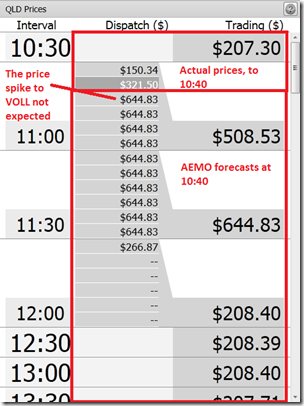
Sunday 13th at 11:00 Trading Interval
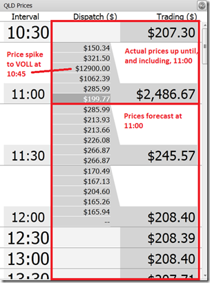
We can see here that the Trading Price for Sunday 11:00 turned out to be $2,486.67/MWh – driven there by a single spike to the Market Price Cap at 10:45:
Actual Prices in the Trading Interval Forecast Prices Leading up to the Spike The price spike to the MPC at 10:45 was not expected only 5 minutes earlier, at 10:40.
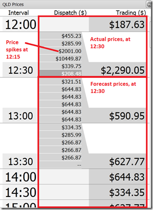
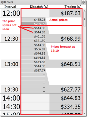
Sunday 13th at 12:30 Trading Interval
We can see here that the Trading Price for Sunday 12:30 turned out to be $2,290.05/MWh – driven by prices that were in the thousands for the 12:15 and 12:20 dispatch intervals:
Actual Prices in the Trading Interval Forecast Prices Leading up to the Spike However, the additional kick in prices – from the levels of the hundreds of dollars where they had been sitting all day – was not forecast directly in the predispatch price forecast immediately prior to the spike occurring.
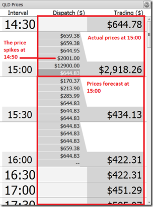
Sunday 13th at 15:00 Trading Interval
We can see here that the Trading Price for Sunday 15:00 turned out to be $2,918.26/MWh – driven by higher prices in the 14:50 and 14:55 (MPC) dispatch intervals:
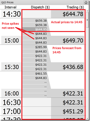
Actual Prices in the Trading Interval Forecast Prices Leading up to the Spike Likewise, the price spikes at 14:50 and 14:55 were not foreseen at 14:45.
In summary, on 5 of the 6 occasions shown above there was no direct warning, in the immediately preceding predispatch price forecast, that the price was going to jump even higher from its already elevated level.
This can be understood because of the tight nature of the supply/demand balance that existed at the time, and the presence of transmission constraints (discussed below). By virtue of these factors, prices in Queensland were at a tipping point, where only small changes in the market (in demand, or bids, or other parameters) could deliver significant uplift in price.
Factor 3) Imports were constrained
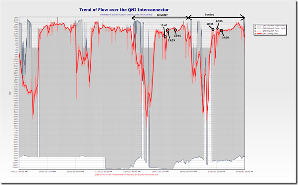
The following is a chart (from ez2view) of the interconnector flows across QNI over the 96 hour time-range leading up until Monday morning:
AEMO numbering convention is such that positive flows are flows north (or west) on interconnectors – hence we see how flows were primarily towards the north through this four-day period, and primarily at the limits possible for the line at each Dispatch Interval.
To put the 6 dispatch intervals where the price spiked most significantly over the weekend into context, they have been identified on the chart above – in relation to what the QNI flows were at the time. As can be seen, QNI was flowing north at its limit (and near the top of what it’s maximum range had been over the four-day period) when the price spiked. In other words, no more power could be brought in from NSW to mitigate the effect of the price spike.
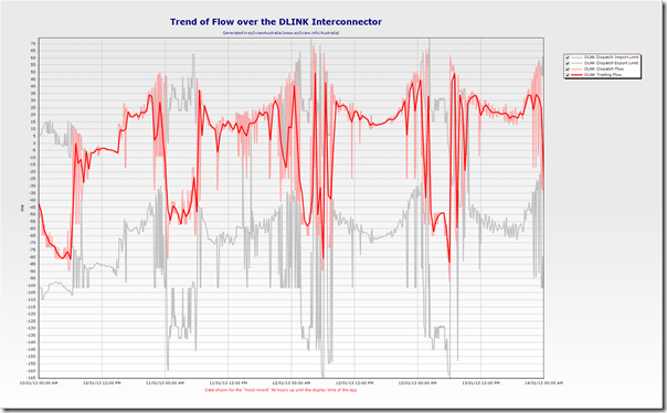
The same representation for the Directlink (Terranora) interconnector is shown in the following chart:
We have not annotated this chart in the same way – but the two charts are aligned, and it can be seen that a similar situation was occurring with respect to Directlink as well.
Factor #4) Transmission Constraints were at work within Queensland
We’ve noted before that the 855-871 constraint has been a significant factor that has enabled the price spikes to occur, and to be so sustained, this summer.
As we noted here, there were 30 dispatch intervals where the Queensland Dispatch Price spiked above $1000/MWh over last summer period (coinciding with when the constraint was bound) – as summer demand was more lacklustre, the effect of these constraints were not as significant as we are seeing now.
Rather than re-invent the wheel, for those who want to understand the detail of how this constraint comes about, and what its implications are, the AEMO produced this useful report about the prior summer.
Of keen interest, to some, will be the AEMO conclusion that “… network congestion issues will continue to arise, but the events of summer 2012 demonstrate that their market impact is as much an outcome of the electricity market design as network limits or participant behaviours.”
Our understanding of what is meant here relates (for instance) to the fact that the NEM operates with regional, rather than nodal pricing (an alternative market design).
Much the same situation applies for the current summer.
Hence, the 855-871 constraint is one factor that returned this summer to provide added risk of volatility. It’s important to note, however, that the presence of the constraint does not guarantee volatility – just make it more likely.
Unlike the case for summer 2011-12 (where demand was low and supplies were plentiful) we see a number of other factors (discussed above) also present for this summer – leading to more remarkable outcomes, in terms of prices.
These constraints have been prevalent for much of the summer period – but we will specifically address their impact leading into the 6 volatile Dispatch Intervals (identified in the price tables above) which contained the most significant spikes over the weekend. We have done this, in the section below, as bidding behaviour needs to be assessed in tandem with the prices
This AEMO report references this information from Powerlink that provides a broad overview of a project due for completion in 2013 that will reduce the likelihood of this constraint being material to the market over future summers.
Other factors…
We’ve run out of time, this week, to document a number of the factors that were combining to lead to the remarkable volatility we saw. We’ll return to this investigation, as our other commitments permit – hence please stay tuned for more on WattClarity.
Some references – for further information
For those interested in reading more, to understand more, the following are some suggestions:
1) AEMO has published, and will update, this pricing report for January 2013. This provides some additional details.
2) AER will be in the process of preparing a more forensic review of what happened – this should be online here within the next couple weeks.
If any readers can suggest resources people can read to understand more, please add as a comment below?


Leave a comment