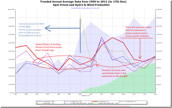
Prompted by some discussions here on the “Yes! to Renewables” blog (and at numerous other places online and offline), I’ve included the following chart that trends annual average spot prices in each region (except Snowy for the early years) and average output of Hydro and Wind for all years of the NEM:
As I noted in a comment on that post, there is interest in the degree to which wind farms are helping to reduce wholesale (spot and contract) prices.
Some wind farm advocates have been seeming to claim that wind farms have, singlehandedly, delivered significant savings in wholesale prices.
As can be seen from the chart above, doing a simple comparison of 2007/2008 (drought-affected prices) to 2011/12 (relatively awash with hydro) is overly simplistic in the first place.
As noted in the chart, seen over a longer term time range, the increase in 2007-2009 could be more clearly seen as an excursion from an “underlying normal” level of prices, and that prices have just reverted to a more normal level, more recently – probably for a number of reasons.
Secondly, the chart above highlights the error in assuming that the reversion to normal is entirely (or perhaps even significantly) due to wind.
In output terms, we can see that (right across the NEM) the amount of reduction in hydro output during the drought (approx 400MW average output difference from 2008 to 2010) is about twice as much as the amount by which wind farm output increased (right across the NEM).
As a crude measure, then, it could be said that the increase of hydro output (post drought) had a more significant effect on reducing spot prices. This does not also take into account the compounding effect of changes in the bidding strategies of the hydro generators (comparing during the drought and after the drought)
Furthermore, the three “renewable” factors (hydro and wind – with solar being relatively minor currently) are only three of a number of factors at play.
There are a number of others that, when we have time, we will further explore on WattClarity – such as the overall decline in peak demand, driven by La Nina and other factors in more recent times.
Note – this is not to say that the increase in wind farm output in South Australia (and elsewhere) has not helped to deliver a reduction in prices from the highs seen in 2007-2009. It is, however, a note of caution to anyone who believes that any single factor (and in particular wind) can be held up as the major contributing factor.


Paul,
Finally, it’s good to see someone post a sensible description of the issues in play in the observation of lower spot prices.
Hi Paul,
I assume those prices aren’t adjusted for inflation?
$35 in 2002 would be equivalent to $47 in 2012 (3%). I guess it’s still not a huge difference.
I would be interested to see the increase in demand over that time period. Did the dry conditions also drive higher consumption?
Cheers,
Tom
Hi Tom
Prices shown are not adjusted in any way – they are published spot prices from NEMMCO/AEMO.
As many have noted, wholesale spot prices have not really escalated over that period, but instead can be understood by supply/demand dynamics (i.e. higher prices when short generation, lower prices when long).
With respect to your other question about demand levels, you’d be able to easily perform your own analysis with a licence to NEM-Review.
Does this help?
Paul